Mozilla has officially revealed its new logo for Firefox as part of a new family of icons for one of the most used browsers among users of a computer and a mobile device.
Un new core logo for Firefox which is characterized by the curved lines in the line finishes and those well-used color gradients to leave a very elegant logo full of vitality and strength.
We are talking about some designs that have led more than 18 months of work to have them already in our hands and wait for them to arrive in the respective updates in apps and more.
![]()
Mozilla's goal is to redirect your presence to the entire family of Firefox apps and services; which by the way, are quite a few. To this day, Mozilla has had to brainstorm potential ideas for the entire logo design process.
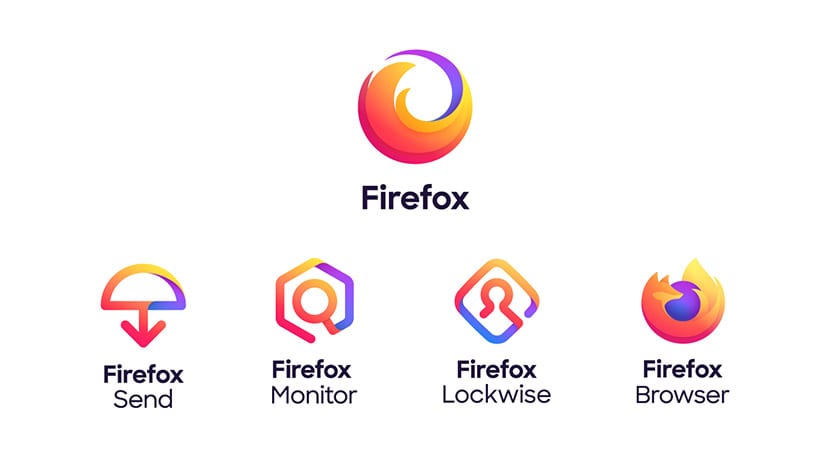
It is Sean Martel who has taken his Twitter account to show little by little his development. The design appears on the new branding system like the logo of the Firefox browser. Three others have also been included for services like Send, Monitor and Lockwise. The entire entire system is under the umbrella of the Firefox logo of an umbrella.
At video presentation you can witness the evolution of the Firefox brand and how the umbrella logo for Firefox has been a step up from what it had been before.
It also has an ideological base with four basic words: radical, class, open and dogmatic. Between the designers who have been linked in the process we find Michael Johnson, who designed the original Firefox logo; Jon Hicks, who has given advice from him; and Michael Chu of Ramotion, who has been the alma mater behind the new brand.
If Mozilla were a Spanish public company, this redesign would have cost 140.000 euros.