
Flat graphic design o Flat design was launched into the world of graphic design and the web a few years ago and it seems that it came to stay for a long time and it is not only a fad or passing trend, but it is a response to the need for functionality that seeks to adapt to responsive design.
Something for which it is really useful, regardless of whether it is used on large devices or on small mobile screens, so it can be used as a tool in the UX Design, What does it mean "User Experience Design”, In order to provide users with a better experience by allowing them to use it completely easily.
Origin of flat design
It is Microsoft, next to the interface of its zune mp3 player device, who began to lay the foundations for this trend during 2006 and then in 2010 with the launch of the Windows Phone 7. It then launches the Windows 8 operating system, which makes use of Metro, a user interface that was initially created by Microsoft to be used on their mobiles.
Clear app screens, sharp corners, use of a grid, bright tones, neat and simple typography, etc., are designated as “authentically digital”By Microsoft.
It is at least something "extraordinary", the fact that this time it is not Apple but Microsoft the author of a breakthrough in design. It actually took Apple a little longer to finish coming out of its realistic mode, which is called "eskeumorphism" that allows digital interfaces to look like real objects, but it was not until 2013, together with the launch of its iOS 7, that it began to add it.
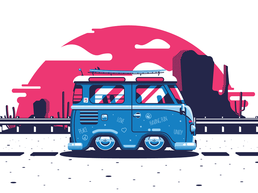
Flat design
The flat design allows the removal of reliefs, contrasts, textures, ornaments, blurred, gradients and any effect of three-dimensionality is that graphic design currently turns out to be much cleaner, more distinguished, sharper, without depth and with slightly more solid edges.
In addition, the shapes it has are totally geometric.
Likewise, it is fully adapted to the small touch screens that mobile devices have and the use of empty space turns out to be really essential, since clicking with a mouse is not the same as clicking with your finger, which is why normally the size of the typographic font and icons they are big. These are the primary and secondary colors; the brightest that in addition to benefiting the contrast, do so mainly with dark backgrounds and images, in addition optimizes visibility when using natural daylight.
Likewise, pastel and very little saturated color ranges are used, taking into account a retro trend, where yellow, turquoise, orange tones, etc. are used. and is that by using only one color, this black or white is added in order to elaborate the different nuances. Using color is also a tool that serves as a guide for users to move through the information.
Typography is very important in flat design
The sans-serif typefaces, of little thickness, simple and with large bodies. The messages are generally shorter, clearer and above all, direct, using only the words that are really required to be understandable.
A variant, the Long Shadow Design
The Long Shadow Design, consists of a trend in logo or icon design which is born from flat design, which allows adding a fairly long shadow, completely contrary to the shadows used in realistic designs. It is a variant that allows add depth without losing the essence of flat design, and also allows it to be possible to stretch the shadow around 45 degrees towards the edges.
Currently I want to explore on the screen what I have implemented for years on paper and this article has been of my complete use, great flat design, formidable!
my personal high-quality custom portrait site: http://galeriadelretrato.com/
HAPPY NEW YEAR GUYS CREATIVOS ONLINE!