
On several occasions we have told you that it is not good to use many different fonts in the designs, because the viewer loses the whole a bit. But it could be two sources. But, how to make font combinations? Can two very different ones be mixed together? Do you have to follow rules?
This topic may interest you whether you are a graphic designer or simply a writer, as it will give you the keys to know what the best combinations are so that the text or the project looks perfect. Go for it?
What you should keep in mind when combining fonts
Before giving you examples of font combinations, we want you to keep two things in mind.
The first is that you should not combine more than 2 fonts in the same text. The reason is that you overload the space too much, and not only that, but you lose the viewer's interest.
For example, imagine you have a cover. You put the title with a font; the subtitle with another. And the author with another. Do you think they are the same? What does the project include? The safest thing is that it does not, which means that the user who sees it does not know what to expect.
Also, different fonts can make it too cluttered. Therefore, it is always better to make a maximum of two font changes.
The second aspect that you must control concerns the types of fonts. In case you don't know, there are different fonts that you should consider when combining. To give you an idea, you have:
- Serif: it is a typography that is characterized by having a small finish at the end of the letters. This does not have to be seen as an excessive decoration, but it can also be small. It is like an ornament that is put on it.
- Sans serif: if before we told you that the letters had an ornament, in this case this type of font lacks it, being simpler.
- Script: Also known as handwritten typeface. It is a typeface that seems to be written by hand, with flourishes and special details.
- Slab serif: It is a type of typeface that is identified by a thick, blocky serif (adornment).
Check the alignment and reading of the text
Another aspect that very few take into account, and that is very important when choosing typography combinations, is the alignment of the text as well as its reading.
We start with the alignment, that is, if the text is going to be read aligned to the left, to the right, to the center or justified. Depending on this, the font to be used will be different, because normally, and in this case we are talking about graphic designs, some decoration would be placed around it.
On the other hand, there would be the reading of the text, that is, if it is going to be from left to right, from right to left or vertically. In the latter case, choosing a font that is well legible and allows you to read without losing sight of the word is more important than the decoration you put on it.
Typography combinations that are a hit
As we also want to be practical and that you can have examples of font combinations, here are some ideas that can come in handy.
Montserrat and Courier New
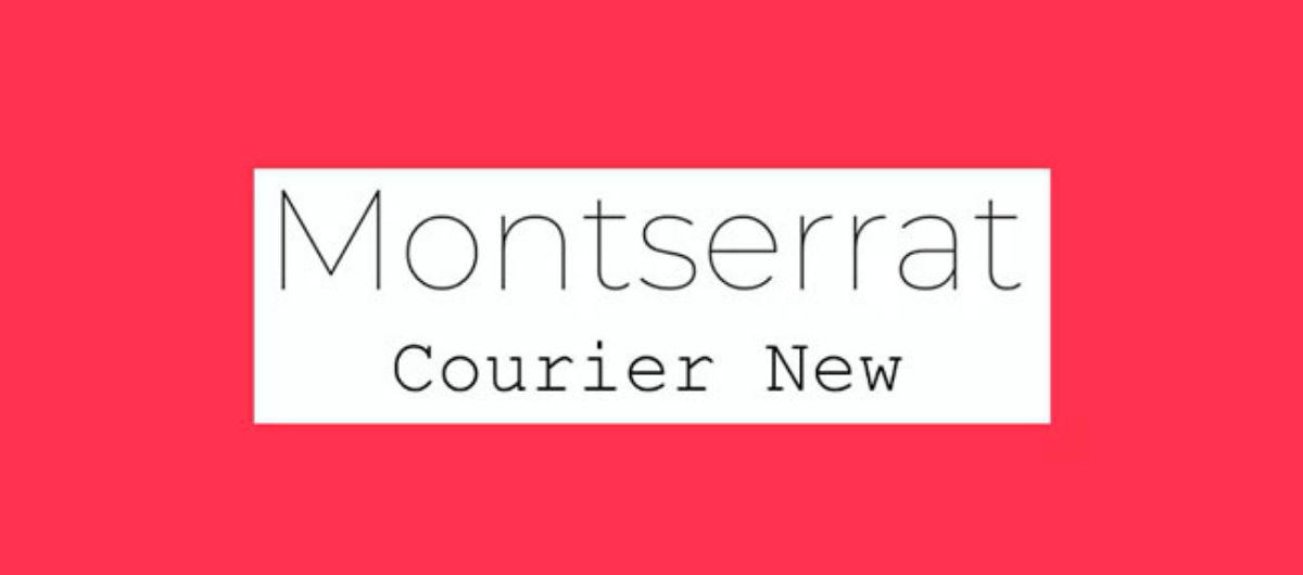
Source: gtechdesign
The Montserrat font is one that we have told you about on other occasions because it is one of the best for making headlines and headlines. Therefore, we have started with it.
It is characterized by being a full-bodied and round font in its letters. It is thick.
Therefore, the best one to combine with this is one with a soft, light stroke. We have chosen Courier New because it is a typeface that looks like a typewriter but that highlights the whole itself. But if you don't want that, you can choose a handwritten typeface (that simulates handwriting) that is legible and not too frilly. Or even Times New Roman font.
League Spartan and Free Baskerville
Here we have another example that follows the rhythm of the previous one. That is to say, we place a thick font as the header or title, such as League Spartan (which is sans serif) and as a font for the text we use Libre Baskerville, which if you look has small ornaments but it is fine, very legible. and that makes a good contrast with the previous one.
Even for header subtitles you can also use Libre Baskerville at a larger size.
Nixie One and Lato Light
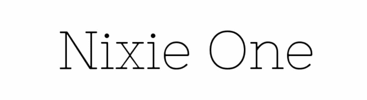
In this case we are going to give you another example of typographic combinations that can come in handy. And it is that both can be light, but if you look, they are different from each other.
On the one hand, we have Nixie One, a type of serif font that we put in all caps to make it stand out as a title. On the other hand, you have Lato light, which is sans serif and manages to create an elegant and light design.
Actually both fonts are light, but the text having a little more space between the letters allows it to be more spaced and readable; while the title has the most attached letters and is recharged a little more.
Josefin Slab and Fauna One
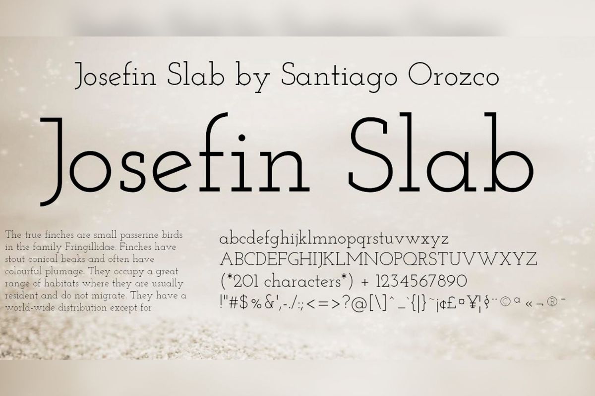
Josefin Slab is one of the most used letter fonts, especially for titles and even for logos because it draws a lot of attention and achieves a very interesting effect. In addition, although it may not seem like it, the finishes are robust.
So, you have to choose a typeface that softens the whole, and for this you can opt for Fauna One, but we also suggest Nunito Light or Merriweather that are similar and also achieve that effect.
Trade Gothic and Sabon
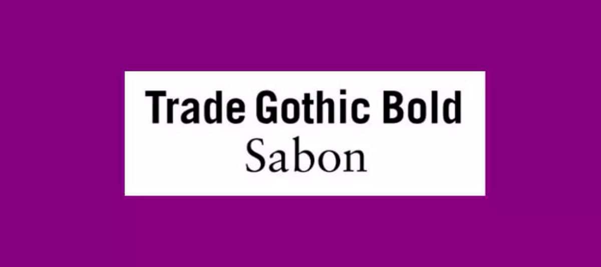
Source: gtechdesign
In this case, instead of choosing a serif font for the text, we have chosen it for the headline, in such a way that we focus the user's attention there and, later, combine it with a sans series typeface, easier to read and to be possible with a smoother stroke than that of the headline.
Now that you know the font combinations, you may have an idea of how to choose the different fonts for your designs or projects. Can you think of any other set of fonts? Leave it to us in comments!