
Let's thank typeface designer Adrian Frutiger for creating a successful reference material on contemporary classics. Knowing and following the development of some of the most used fonts is essential. For this reason, this publication is going to talk about the Avenir typography.
This typography is one of the most used in the creation of corporate brands. Many designers consider it one of the best designed fonts to date. It has been, and still is, a design masterpiece as well as continuing to be one of the most popular.
Who is the creator of Avenir?
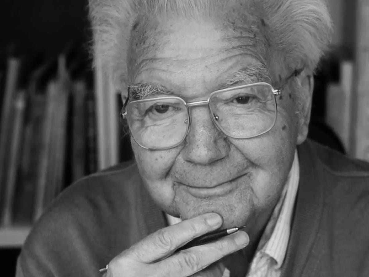
As we have mentioned in the previous section, the Avenir typeface was designed by Adrian Frutiger, who has created multiple other well-known typefaces, such as Univers, Frutiger, Iridium, etc.
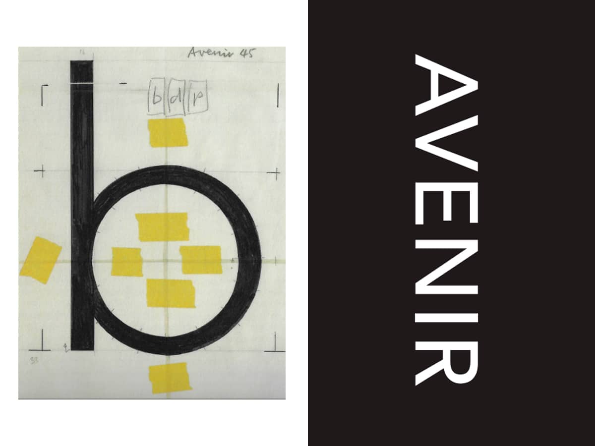
It was launched in the year 1988, but it was designed a year ago, in 1987. Avenir, was composed of three different weights for its characters, which were later expanded to six.
There are many designers and even Frutiger himself, who calls Avenir a masterpiece of type design.
What is the Avenir typography like?
In this section, we are going to talk to you about this font family developed by Adrian Frutiger, so that you know and learn from one of the greatest typographers to date.
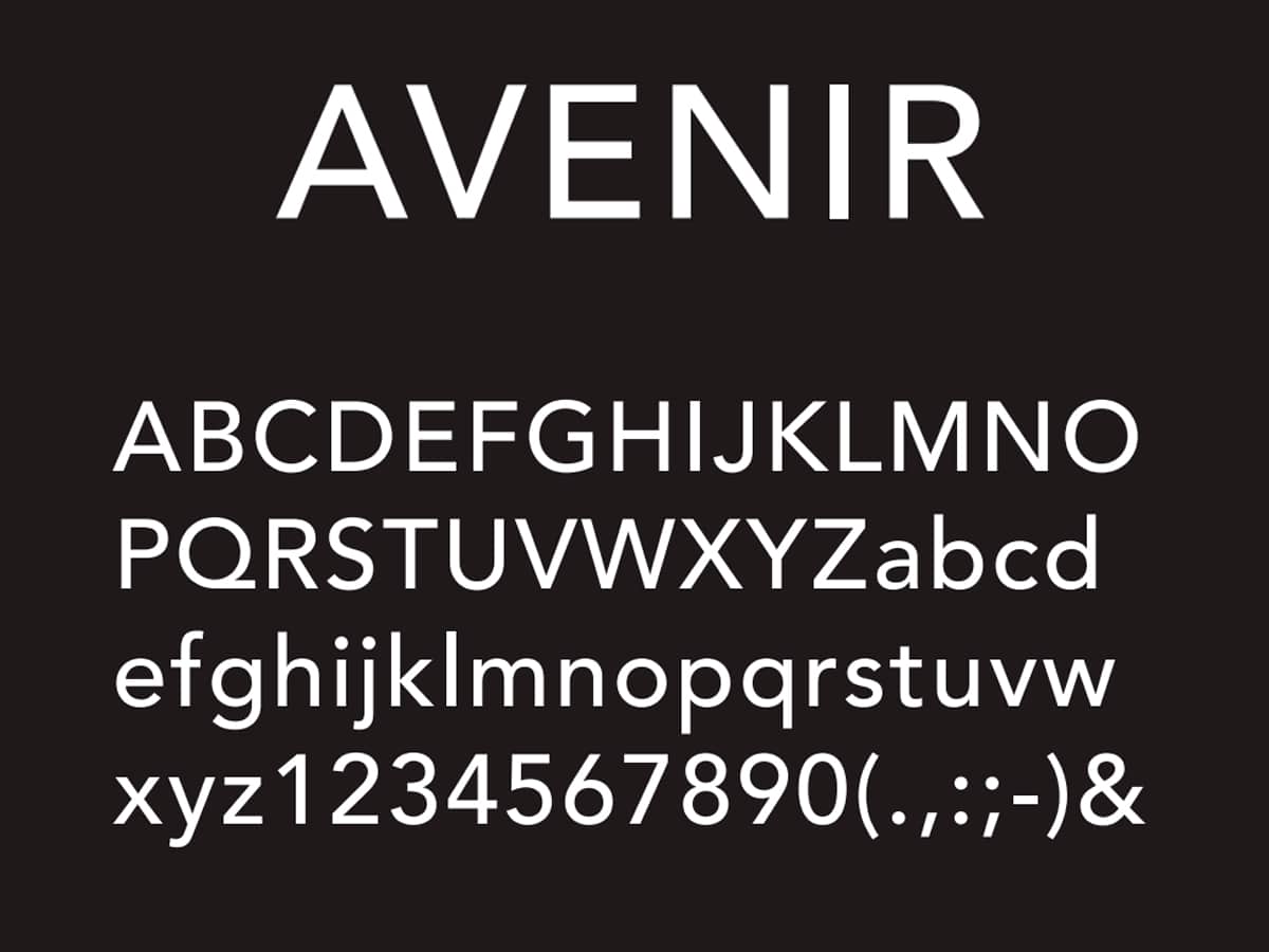
Avenir is a sans serif typeface, that is, without serifs, which was based on the traditional styles of geometric typefaces.
is classified within geometric typefaces, although it is true that Avenir has some humanistic aspects that make it a quality typeface with a good opening.
We are talking about one of the most used typefaces in the development and creation of corporate brand identities. There are many recognized companies that lean towards this typeface. We can find, from bank, railway companies, to technology companies.
It is an exceptional font in terms of design and legibility, which makes it a Very versatile typeface to be used in both text and block headings.
Over time, Following the successful trajectory of the Avenir typeface, Linotype went back to its designer for a redesign of it.. This new typography configuration was based on an extended version of Avenir.
Together with another designer, the Avenir Next typeface was created, launched in 2004. This typeface was developing and expanding during the following three years.
Avenir Next, is a very subtly edited version of the original. One of the most notable differences is the tracking, since it is very generous. For those who don't know, tracking is the spacing between the letters. This space gives the typography a more contemporary look.
This version was chosen by the electronic company LG, for the lower characters of their mobiles, due to its high readability. Another of the brands that Avenir Next chose was the British television channel BBC for its logos and promotional material.
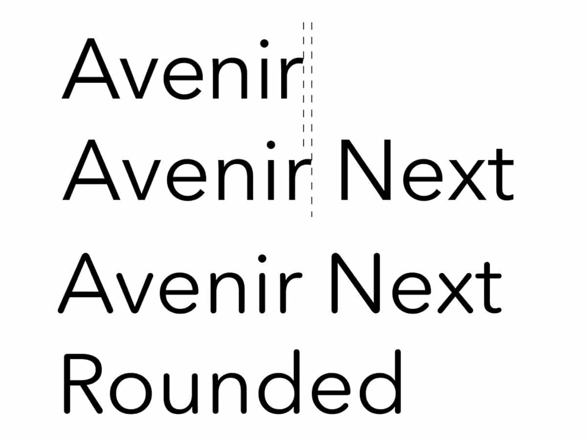
For To commemorate Avenir's 25th anniversary, in 2013, designer Akira Kobayashi developed a third version of the typeface.
For this new version, the characters were rounded in the geometric shapes that built Avenir Netx, which created a feeling of closeness. Avenir Next Rounded has an optimistic personality that sets it apart from other geometric typefaces.
Despite the appearance and popular acceptance of these two versions, there are many designers who catalog the first generation of Avenir as the masterpiece of the house. Avenir is a safe bet in the creation of brand logos.
Alternatives to Avenir typeface
We already know that It is one of the best-selling fonts in history.. But if you don't have the means to acquire it, don't worry, here are some fonts that can serve as an alternative to Avenir.
Swith fonts with a minimalist and clean style, such as Avenir. With updates to adapt to both online and offline media.
hamlin
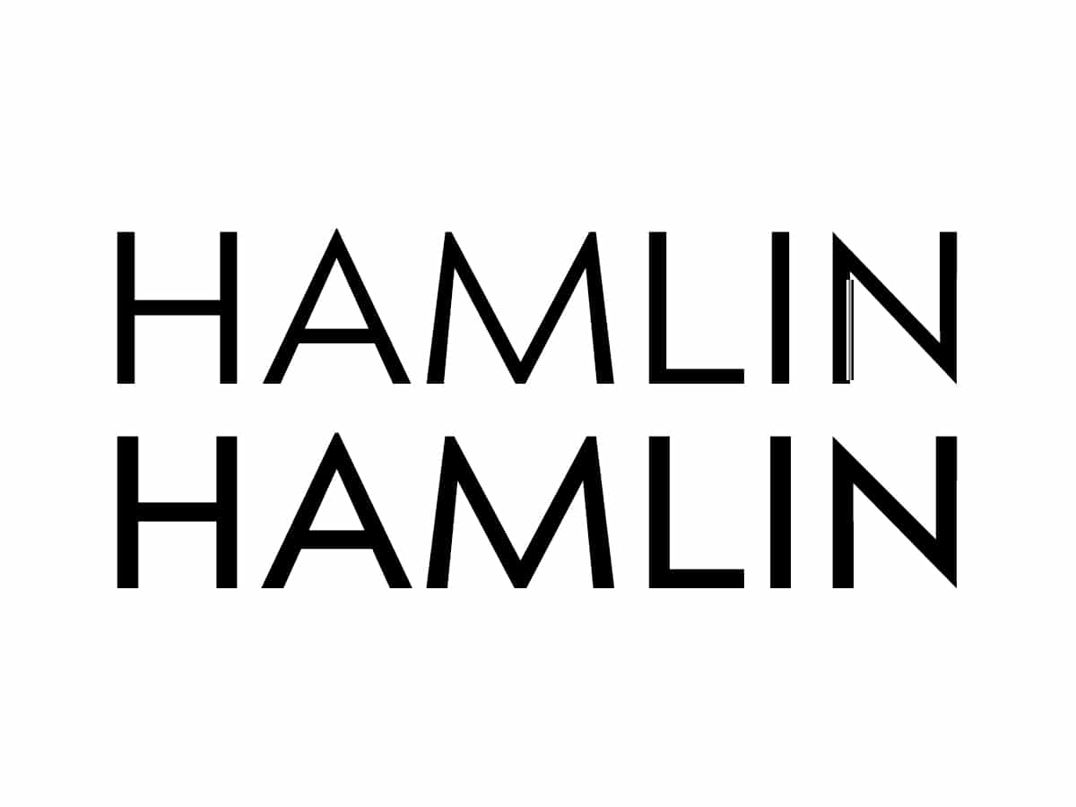
Sans serif typeface with a minimalist style, with a more contemporary character than the one designed by Frutiger. You can use it both in identity design, as in text blocks or websites, as it will give you a clean and stylish look.
Muli
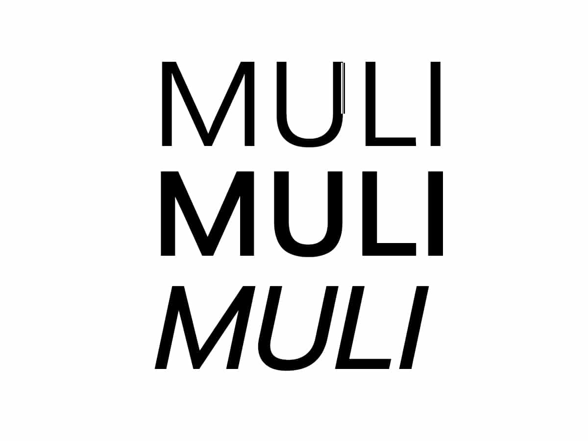
Sans serif font that can be used in both print and web media. It is an alternative to the Avenir Next typeface. They coincide in the design of some of their characters, such as the lowercase g and the y.
Brooklyn
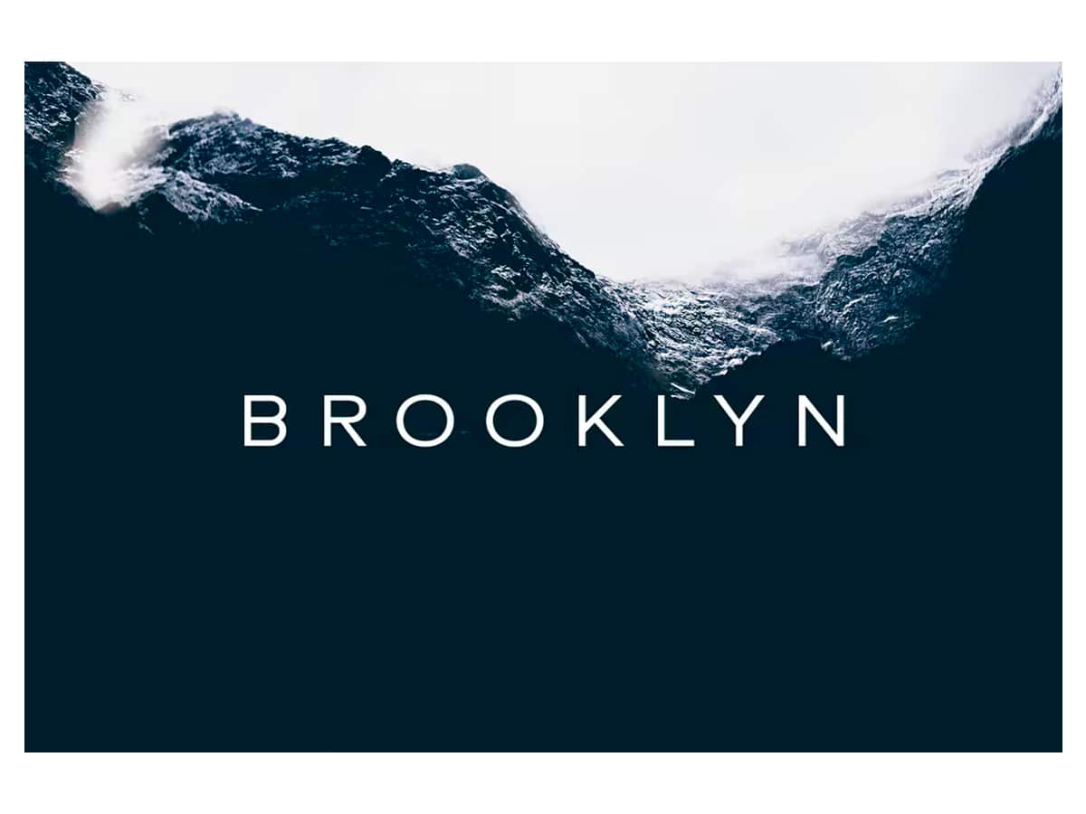
A style similar to the geometric typography that we have talked about. In this case, it is a More robust typography thanks to the reduced height of the X. There is a clear inspiration in the 90s in its design. It works perfectly both in logos, as in packaging design or editorials.
Prompt
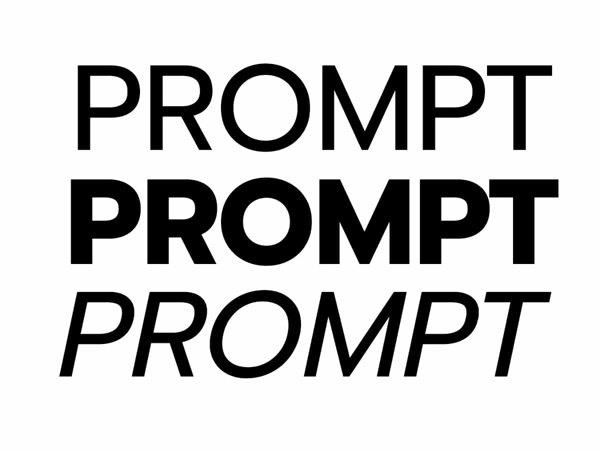
If you don't have Avenir font at your fingertips, Prompt is a good variant for several reasons. One of them is that their lowercase letters coincide, that is, in appearance they are almost the same, the only thing that changes is that this typeface has more weight.
Normal
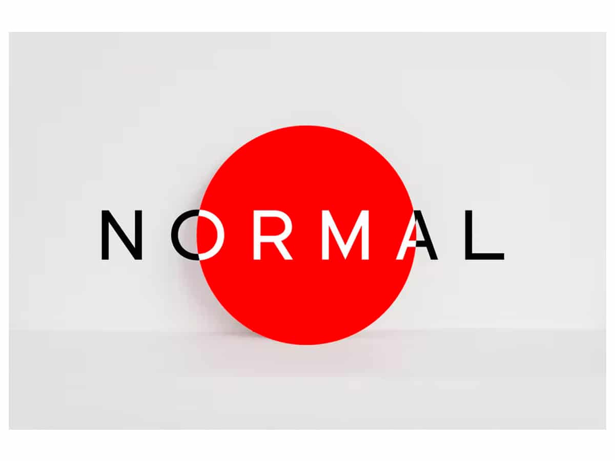
With a minimalist and neat style, the Normal typeface is presented. It is a font for all types of designs, it works in logos, headers, text blocks, etc. Inspired by modernism as it offers a combination with colored graphics.
Nunito
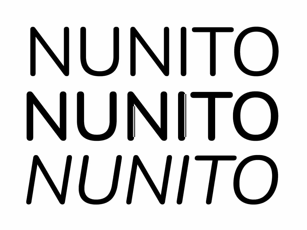
As a replacement for the Avenir Next variant, Nunito will work just fine. The vast majority of its characters coincide with those of the Avenir font. One of the differences is that Nunito is composed of more rounded letters.
Berlin
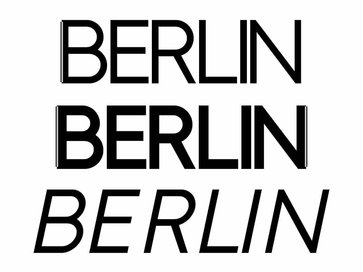
Finally, we bring you this typeface with a minimalist, neat and contemporary style, all of which are also brought together by the Avenir typeface. In this case, the Berlin characters exaggerate their geometric shapes. It works well for headlines, minimal designs, and logos for luxury brands.
As you can see, There are alternatives for the Avenir typography with which we can bring our projects to life. There will never be a typography that imitates it perfectly, since designs of this level only happen once in a lifetime. Avenir and its variants are and will be a benchmark in terms of typographic design.