
Lettering with Illustrator allows us to create all kinds of vectorized texts, with the advantages of adapting to the medium and size we want later. However, it is very easy to fall for such a program in a flat, simple style with little personality. Giving your lettering a more complex look can be as simple as adding depth to your design.
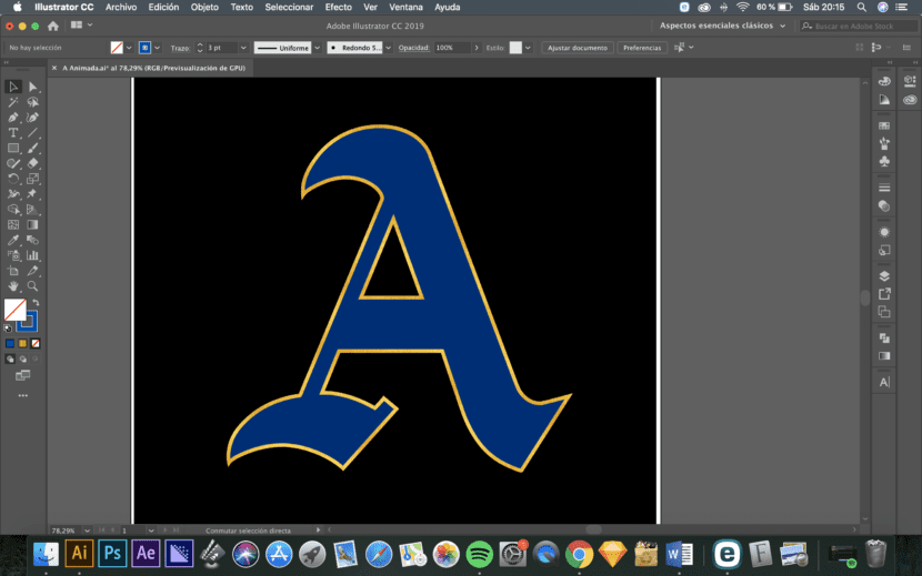
Without resorting to 3D programs, a few simple steps in Illustrator can allow you to create figures with depth that allow you to make your designs stand out. So suppose we have the basic layout of, say, a single letter.
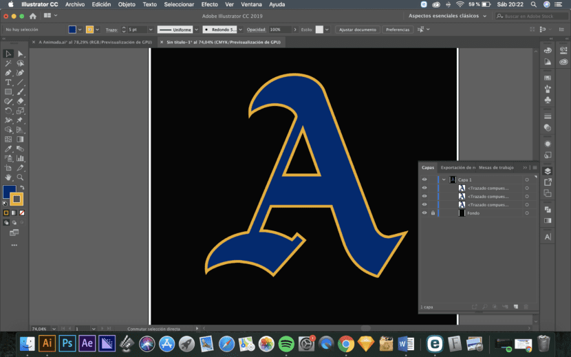
If we want to add depth to our lettering with Illustrator and build a perspective, we must duplicate this initial letter 2 times.
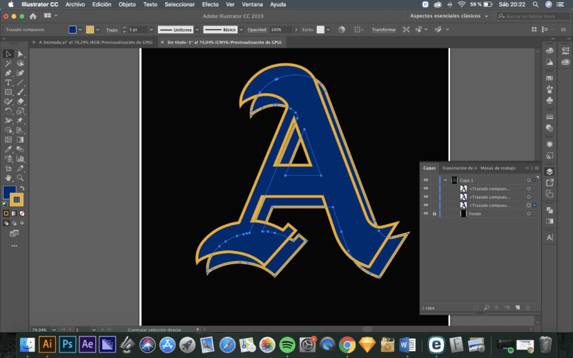
Next, move the last letter as they are in the layer order in the direction you want to create the perspective.
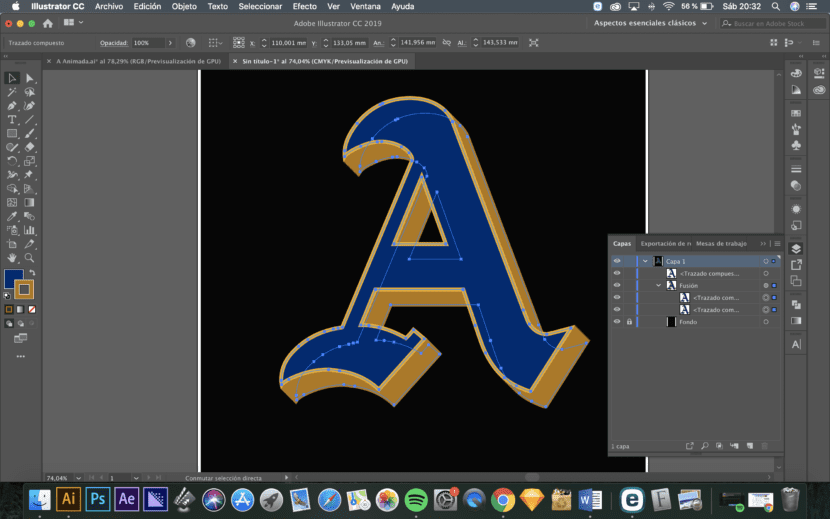
Now you have to join the penultimate and last letters through a fusion for which, it is best to set the parameters of the fusion before (Object / Blend / Blend Options) and establish specific steps to avoid overloading the graphics card.
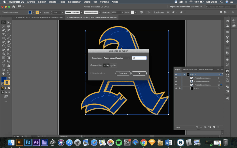
We now have to select the penultimate and last letters and create the merge (Object / Fusion / Create).
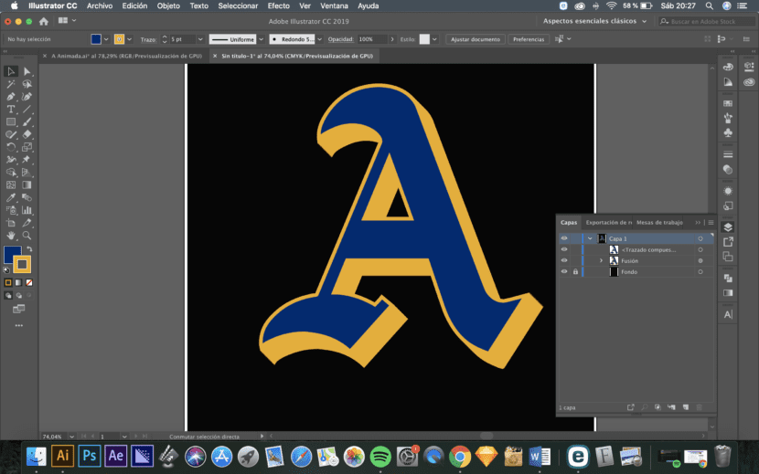
To differentiate the perspective effect created from the front face of the letter, it is best to darken the color of the two merged copies. To do this, you have to access the blend in the layers menu, select both and change, in our case, the color of the stroke.
Finally, if we want to play with this effect even more, we can give the two copies of the merged letter two different colors and thus create a color fade effect.