Forms of communication have evolved at breakneck speed in recent years, however the use of paper-based Christmas cards remains an entrenched alternative on significant dates such as the celebration of Christmas. It is a good way to return to the past for a few moments and perhaps that is why it has an endearing and close character. In this sense we find some differences in the way of presenting the contents. Since the greeting on paper and the greeting on digital (or web) support have different implications, they will also have different communication strategies and therefore different aesthetic features or manifestations.
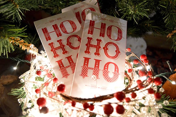
I am sure that many of you will resort to this alternative to congratulate your loved ones on the beginning of the new year and that is why today I am going to share with you the most used designs in printed greetings. As you can see the innocent and almost childish component that they have is undeniable, an element very present in these festivities since the center of everything is the child, let's not forget that it is a party with a strong spiritual component and whose underlying message is the birth of Jesus Christ. We hope you find these five trends inspiring and you can apply them to your congratulations:
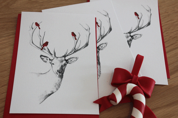
- Freehand
In a way, it represents a kind of tribute to the crafts and designs that prevailed during the XNUMXth century. The essence of hand drawing and perfection in detail are retaken. This type of design will provide very important elements such as closeness, humanization and warmth. These types of cards are usually made with a pencil or charcoal texturing and often dispensing with color details.
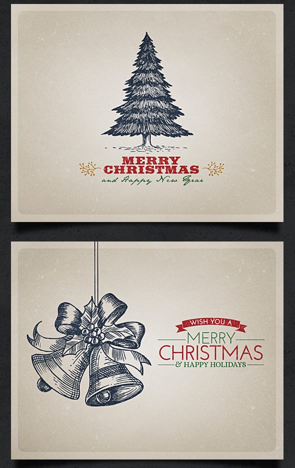
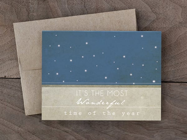
- Retro or vintage
It is nothing new that the past has returned to become avant-garde. For some years now, designers have brought to life techniques, proposals and trends that were in force in previous decades. It is something that has been quite successful in the field of fashion, in the world of decoration and of course in graphic design. In these designs, compositions with certain romantic nuances and a melancholic touch are developed that manage to transfer us to another era. Old-fashion fonts are often used and there is also a great weight in the use of handwritten or script fonts. Regarding the chromatic choice, the most used tones usually lie in pale solutions. In addition to old photographs and illustrations set in characters, events and times gone by.
<
- Minimalist
Minimalism emerged as a current towards the decade of the sixties in the United States although it continues to remain in force and even intensifies today in all areas of graphic design. The essence of minimalism is the pursuit of the splendid through simplicity. All unnecessary ornament and structure is removed to pay attention only to those elements that have a function and therefore are essential. One of the bases of minimalism is that when a single object is well defined (this is in a clear and unequivocal way) we have reached a perfect representation of an idea or message.
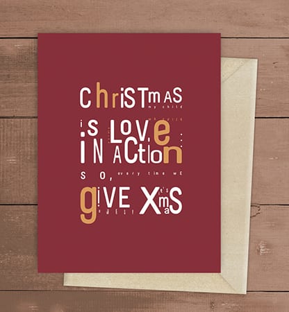
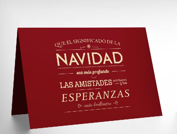
- MultiType
As you can guess, it is a design that is based on the use of different fonts to build a single text. It is a kind of typographic collage that gives a carefree and youthful air to the overall composition. Generally, it is usually used at most typographic alternatives, always looking for a harmonious combination. In this sense, you have to be careful because there are sources that alone provide a very good result, but when combined with other inappropriate ones, we find a result that is in harmony and therefore without aesthetic weight.
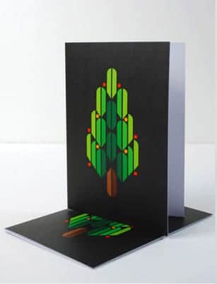
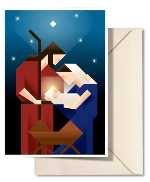
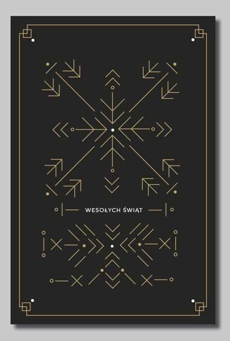
- Geometric
It is an alternative that is inspired by the Japanese art called Origami. The result is a design dominated by straight lines and the use of flat colors to create fragmented landscapes, objects and characters. It can be quite complex especially if we try to reproduce the maximum range of details and nuances. In this sense we can find the so-called super geometric style that is only based on the use of straight lines and the geometric style in which curved lines also have a place.