
Source: Ideakreativa
At present, we find infinite signs, whether in shops, restaurants, cafes, etc. Each label is designed in a different way and complies with the values that the company represents. This design derives from what we call "fonts".
Typography is defined as the technique or design of types (letters). This process is developed for later printing and we can say that it is one of the aspects of graphic design. But, Have you heard of handwritten or script fonts? In this post, we will explain what they are and what characterizes this typeface family so much.
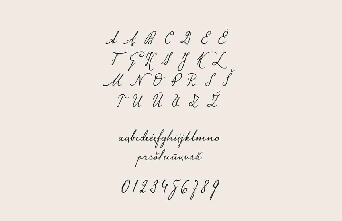
Meet this typeface family
Source: Graffica
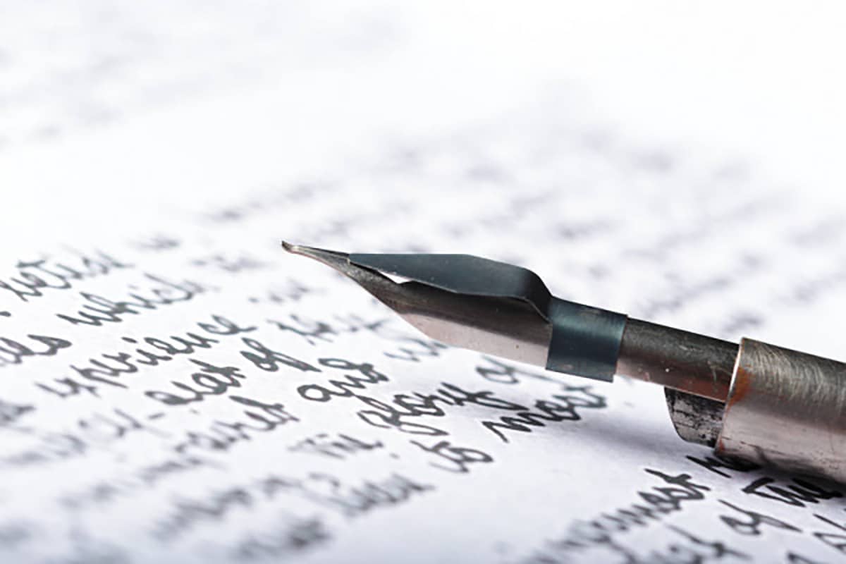
Throughout history, design has entered our lives in such a way that it has reached our books, articles and even the oldest writings. But how can we define the term "handwritten typography"? The handwritten typeface or also named script, receives its name for being typefaces that have been designed by handFor this reason, most of them have an appearance similar to cursive or calligraphic and are part of what we call typeface families.
Font families They are defined as the set of a group of characters / types that are based on the same font but that present some variationsThese variations can be seen represented in their width or thickness, but they always maintain similar characteristics.
Throughout the article, we will show you that this typographic style does not come from today but, with the passage of time, it has evolved and its typographic character has also done so. Next we will give a historical twist to the post and you will know why it presents a high personality range.
A bit of historical context
Source: Lightfield Studios
Before we begin to introduce ourselves to the origin of this typeface family, we must know that the typeface with which we know it, was made possible by the invention of the printing press and the first designs were developed much earlier than we think. Many of the serif fonts that we use today derive, for example, from ancient Roman letters such as the famous Times New Roman.
The emergence of Gutenberg's Gothic design
Source: Wikipedia
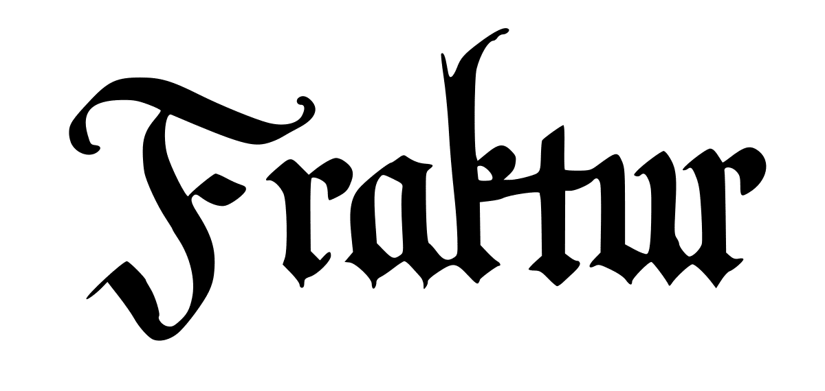
Around the XNUMXth century, handwritten typefaces were a perfect avenue and development for art in Europe. Many people, including monks, were already writing manuscripts that were designed by ornate letters. This writing that the monks practiced is now known as Gothic calligraphy.
After the invention of the printing press, Johannes Gutenberg created a kind of machine that made it possible to print a large quantity of what we now call dies and ink sheets. This inventor, in addition to creating a machine that allowed the advancement in typography, also designed the first type of font: Blackletter / Gothic. Thanks to Gutenberg's invention, typeface designs were available to a greater number of people, as it allowed rapid reproduction and printing of catalogs or brochures, which were already beginning to form part of editorial design as well.
The most prominent gothic fonts
Old English Text
It was developed in England and is very famous for the construction of its lines. At present, this font is used both andn breweries, action movies, public transportation signs, and tattoo designs.
Saint Mark
This typeface became famous for its round shape and for having a much more linear and straight design. Its shape is due to the great influence it has on Roman culture, especially in Italy and Spain. It is usually used in religious events, due to its familiar and warm aspect. Currently, it is represented both in greeting cards, food restaurants, classic pizzerias and children's books.
Wilhem Klingsby Gotisch
This peculiar typeface was designed by Rudolph Koch. The typeface is characterized by its thin finishes and by containing firm and straight lines. Currently, it has become one of the most important typefaces in commercial design.
From the Gothic style to the Roman style
Source: Wikipedia
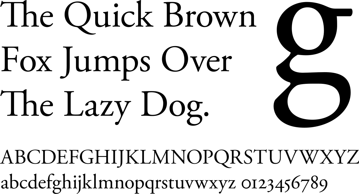
Roman typefaces were handwritten typefaces since their designs were chiseled by hand and in marble stones. These Roman styles became popular around the 1470th and XNUMXth centuries. In the year XNUMX in Venice, a designer named Nicolas Jenson, modernized the Roman style and created what was the most used style of the time and the one that today receives the name of Old style. Its design consisted in contrasting the larger lines with the finer ones.
Ancient Roman fonts are characterized by being fonts with a high range of legibility and are visually aesthetic. This made it become the most used and important typeface style of the time.
The most important Roman sources
Garamond
The Garamond typeface is one of the oldest and most famous Roman typefaces. It was designed in the XNUMXth century by Claude Garamond in France. It is considered a readable serif font and suitable for use in printing applications. It is quite ecological since ink is hardly lost and we can currently find it in magazines, books or websites.
It is characterized by the length of its ascendants and descendants, the eye of the letter P, and in italics, capital letters are less inclined than lowercase letters.
Minion
The Minion typeface, shares a style similar to the old typefaces of the Renaissance. It was designed in 1990 by Robert Slimbach. It was designed exclusively for Adobe and is characterized by its beauty, elegance and its high range of readability.
Among its applications, it stands out that it was designed for text, although it is also adapted digitally. It is currently in books, magazines or articles.
Bembo
This typeface originated in 1945. A Venice printer whose owner goes by the name of Aldus Manutius, used this typeface, which was previously designed by Francesco Griffo, to print a literary work called "De Aetna." What characterizes this typeface is that it is one of the oldest along with Garamond.
In 1929, the Monotype Corporation company, used Bembo as a typeface for a Stanley Morison project, which years later would receive the name Bembo. After some changes in its designs, the Bembo, despite being an old style typeface or Old Style, part of the base is a legible font due to its functional shapes, and its beauty and classic style make it suitable for infinite uses.
According to your personality and its use
Source: Frogx Three
When we design a typeface or execute a lettering project, it is important to know what we want to transmit with our source and what uses we can offer to others so that they recognize it.
Handwritten fonts have always been characterized by transmitting a serious character and an elegant presence coupled with a very creative personality. Currently, the vast majority of graphic designers use this typographic style to design identities that fit with the values that we have mentioned above and in this way satisfy the target audience.
And now that we have started talking about identity, surely you have seen infinite logos and you have not realized what their typeface family is and above all, what they have wanted to convey. We are going to show you some examples of several recognized brands around the world where they have used this type of font.
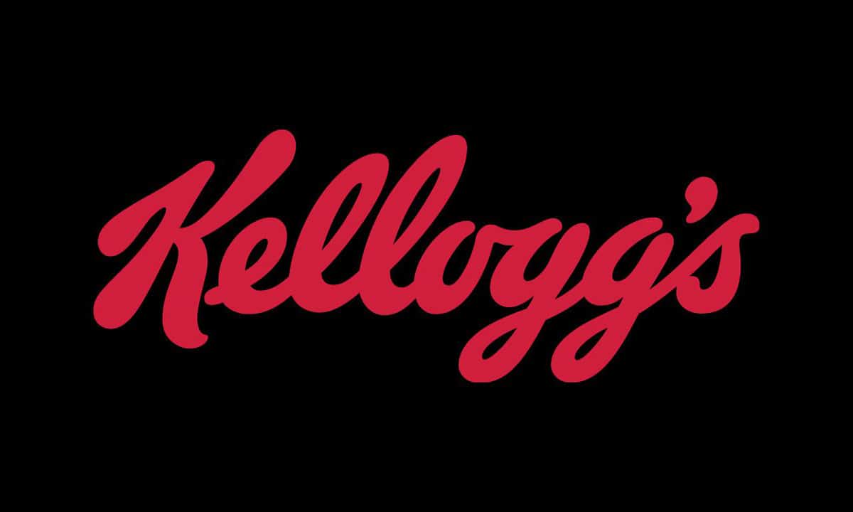
Kellogg's
Source: 1000 marks
The brand that we show you belongs to the American multinational cereal company. Throughout its history, as a corporate identity, this company has been creating redesigns until reaching the current design.
The design that we show you was made in 2012 by Mickey Rossi and who developed the brand was Ferris Crane. In it, a new color palette and a much more modern typography than the previous ones are shown. The font is drawn by hand and currently, the typeface that most closely matches this design is called Ballpark Weiner.
What characterizes the logo is that the typography, despite being handwritten, is perfectly balanced. It is a brand that is quickly recognized and both its colors and typography they express values such as quality, energy and trust.
Disney

Source: Wikipedia
Disney is an American animation industry, formed by its creator Walt Disney. Not only is he recognized worldwide for his animations and drawings, but his brand has been an important hallmark for his viewers and all other industries for many years.
The Disney logo maintains a lively and joyful story as it symbolizes the magic behind its cartoons. It is one of the most personal and creative brands, because the animated typography of the logo (Walt Disney typography) it is based solely on the letter of the founder of the company.
This hand-drawn typeface indicates that Disney from the beginning has always wanted to convey to its viewers the charm, fantasy and animated world.
Coca-Cola
Source: Tentulogo
The Coca Cola company is dedicated to the manufacture and sale of soft drinks and soft drinks. It was originated in 1888 by a pharmacist and has since been recognized around the world.
A designer named Robinson created a unique logo from a calligraphic typeface called Spencerian, a very famous manual typeface in the XNUMXth century. The designer has not only managed to design a brand that was functional with the company's product, but he also managed to design a legible typeface suitable for everyone, regardless of the country.
For this reason, the bright colors provided by the brand, together with its typography, make the company maintain its values; leadership, collaboration, integrity, performance, passion, diversity and quality.
Handwritten fonts and their variants
When we talk about handwritten fonts, we are not only talking about designs that have been made manually, but also, depending on the gesture of the line, its thickness and its aesthetics, they receive different names. These fonts are part of the same family and it is interesting that we get to know them to discover what designs are hidden behind these fonts.
B
Brush typeface is a type of digital font, which reproduces the same style as handwritten fonts but with a brush. It is usually a style suitable for large headlines due to its line and its creative aspect.
Calligraphic
Calligraphic fonts are inspired by handwritten fonts since their appearance is similar. They are usually designed in different ways, depending on their appearance, they can be longer, rounder, more exclamatory and powerful or kinder.
Formal and Semi - formal
Depending on the line, they are also classified as formal or semi-formal, this term indicates the range of seriousness that the typography has. As we have seen previously, some designers use these resources to represent some values or others.
Why are handwritten fonts a good choice?
Whenever you are looking for any typeface for your projects, you will find infinite varieties and categories according to its family. But above all, whenever you want to give it a more serious and formal touch, do not hesitate to have this type of font.
Thanks to handwritten fonts, you can achieve endless projects full of personality and creativity. You also have thousands of pages where you can download these fonts for free. Some of them are: Google Fonts, Font Squirrel, Dafont, Adobe Fonts, Font River, Urban Fonts, Font Space, Free Premium Fonts, 1001 Free Fonts, Font Freak, Font Struct, Font Zone, Typedebot or Font Fabric.
Have you tried them already?