
En of the book «The New Typography», Jan Tschichold claims to have arrived at the infallible method to create a perfect page layout design. In fact, such a method existed long before computers, the press, and units of measurement came along.
The secret canon and the harmony of the page
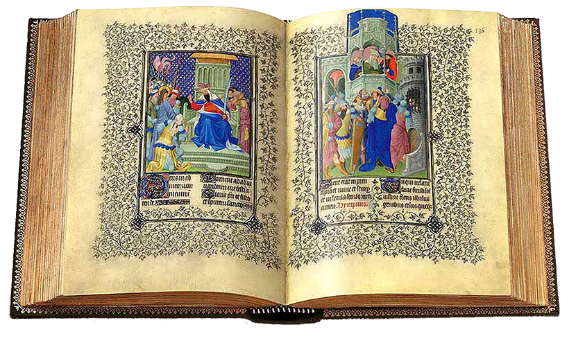
Back in the Middle Ages, books were a luxury object reserved for the nobility and clergy since their production took years.
These objects were written by monks -write-, who created a system to design the perfect book. This is how, based on a secret canon, they produced their illuminated manuscripts taking into account the harmony and unity in the blocks of text and the page on which the elements were perched.
The canon used by medieval scribes was so sophisticated that years later modern designers independently re-discovered it and saw that they shared the same principles than those of those first graphic pieces.
Now we will show you in short and simple steps the secret of the great editorial designers.
What is the perfect page about?
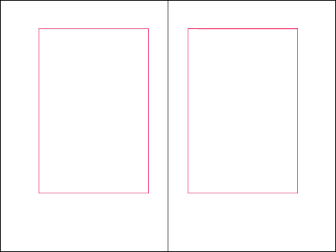
Let's start by analyzing a simple page without the guides… We see that it has a block that floats towards the top center of the page. In this way it allows ample space for manipulation. We also see a text block space that allows us to maintain a fluid reading rhythm.
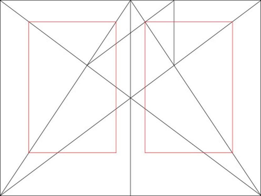
Now we see the guides generated with the Villard de Honnecourt diagram applied to the previous basic page. This is the 2: 3 diagram that Tschichold recommends using in his book.
The beauty of the text block is in the position, size and relationship it has on the page on which it is contained.
The canon shown not only positions the text block in the perfect space on the page. It also provides it to have perfectly whole units. These units will allow us to work with a modular grid, facilitating the layout.

No matter how big the page is, you will always end up with a 9 × 9 grid. Composed of a block of text 1/9 from the upper and inner margin and 2/9 towards the lower and outer margin
But how do you get to this composition?
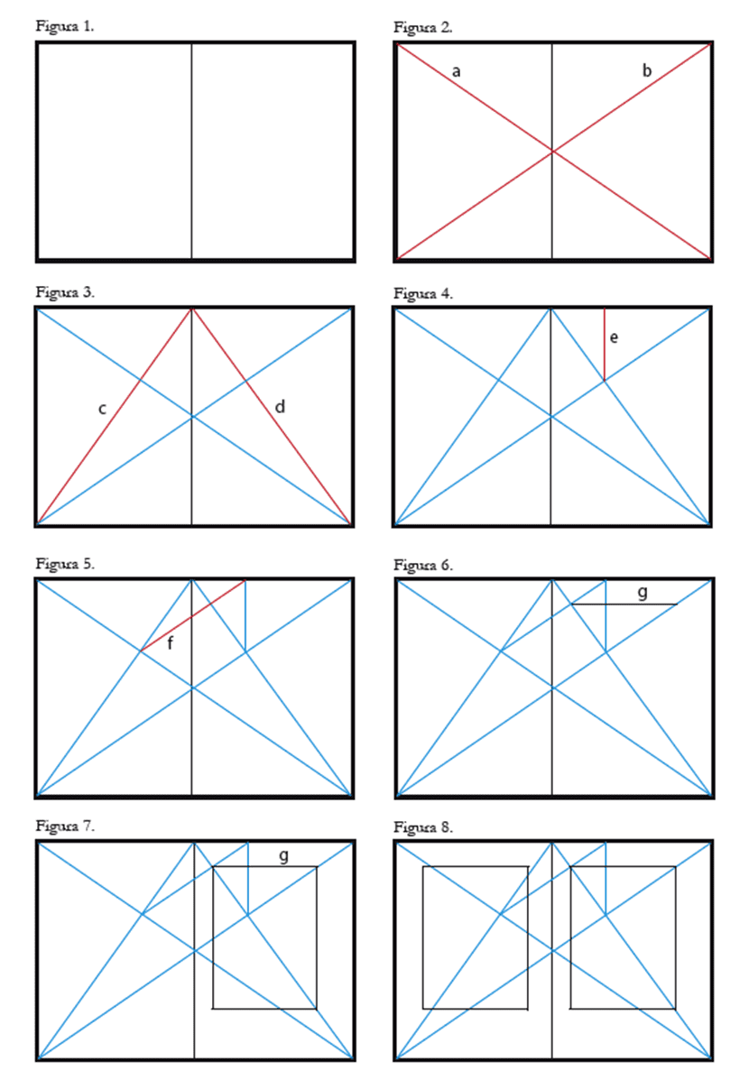
Let's explain how this happens ... A module is to a grid what a cell is to a table. First, we have the proportion of 2: 3. The margin interior has the proportion of 2 parts out of 3 compared to the top margin. On the other hand, the bottom margin and the outside are twice that. So the margin outside is 4/9 and bottom 6/9.
But not only that, on the sheet, the Text blocks on both pages will have the same distance between them. And if it were less, we will have a height of the text block that is equivalent to the width of the page
Follow these steps in the image to generate the text block of your page layout:
I did not know this theory or methodology, and the truth did not make any sense to it. The same thing happens to me as when displaying a logo in a grid .. not because the logo or page design responds to a grid or super well explained metric logic is going to be good. There are horrible logos, badly resolved that put them in a grid and with them "justify" that it is a good design because it has "logic. The same thing happens with this example page. I think this page proposal is a waste of paper, it does not take advantage of the page and worse still, it leaves the blocks very close together in the center of the book, when in real life, the filling or sewing of the book always takes away space for reading of that area (if it is very in the center you have to open the book to the maximum to be able to read the words located near the center) ... On the other hand it does not speak of the size of the font or the line spacing, because if we think of a block size we need to solve these aspects to know how many words per line your block has and how many lines your page will have, in order to complete the experience and be able to evaluate it as good or bad ... Anyway. I think it is a very logical approach but they forget that reading a book is an experience that one has with an object. It is not just "seeing something", it is interacting with it. regards
I am with Bruno. As in any theory, it is time for testing and practice.
In reality, style and usability also mark limits and realities.