
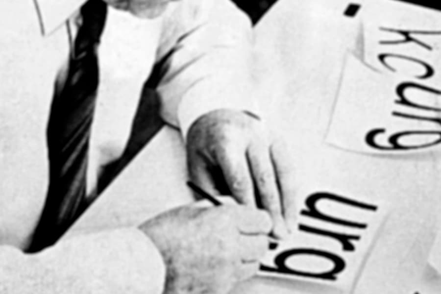
The fountain typeface, designed by Max Miedinger and Edouard Hoffman, Helvetica, has been transformed After many years of history, to which today we know as Helvetica Now. The last known modification of the font is in 1982, when it was renamed Helvetica Neue.
These two designers they were the fathers, back in 1957, of the Neue Haas Grotesk typeface. Four years later, the Typeface company acquired the rights to this font. So if we look at it that way, it was this company that baptized it with the name we know today.
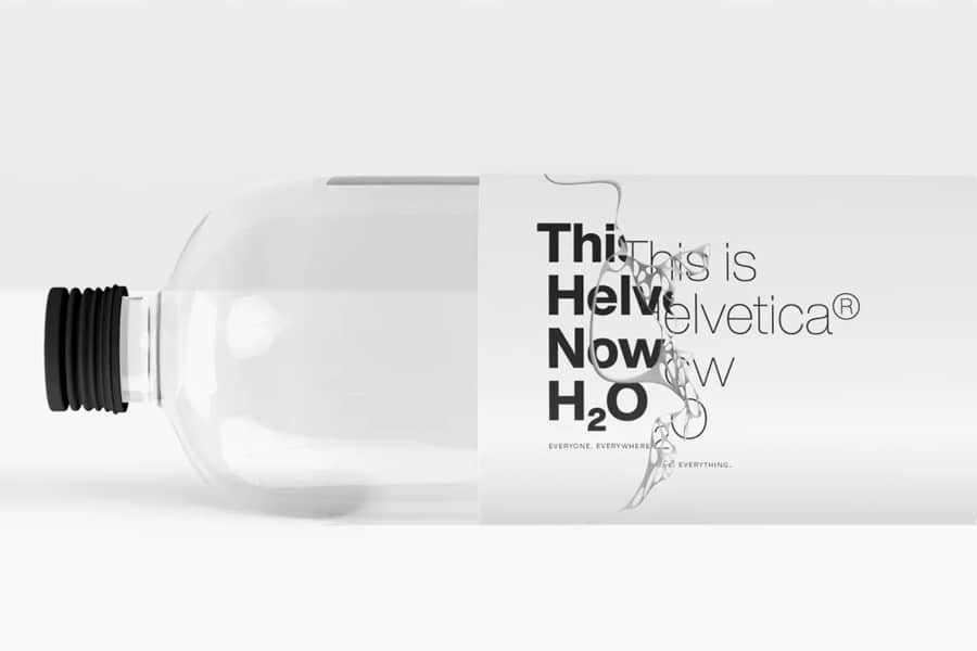
Under the name of, Helvetica Now, the Monotype studio, has created a new typeface family whose purpose is to adapt to new uses in the world of design, as well as on the screens of different digital devices; mobiles, televisions, computers, etc.
A new font is born: Helvetica Now
The modifications that the typographical font has undergone, based on the work done by its main creators, Max Miedinger and Edouard Hoffmann.
Helvetica has since become one of the most widely used fonts in the world. But he wasn't so lucky in this whole story, after a period of time of popularity, Helvetica, from one moment to another fell into disuse.
For this reason, the director of the Monotype company ordered the redesign of all the characters that included it. The objective of this update was to achieve a new attractive typography.
Following that decision by the director of Monotype, Helvetica Now was born. In this updated version, we find 48 different styles, which are grouped into three categories, text, micro and display.
El micro style, is one of the novelties presented by this typeface, is a style that carries with it typographical changes. Such as spacing, character shapes, larger accent elements, etc. which supports better readability, if it appears on different screen sizes.
Helvetica Now Display, is intended to match the kerning when using large font sizes. And the style, Helvetica Now Text, seeks to make reading easier of texts with a lot of density.
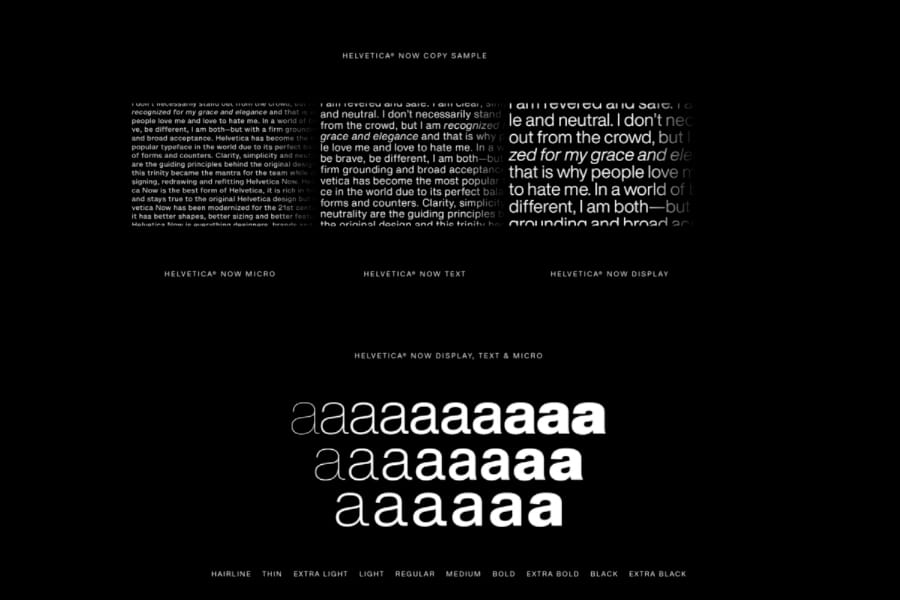
Furthermore, the weights that includes Helvetica Now, are found from hairline, to extra black. That is, from a very fine layout, to an extra thick one.
As we have commented at the beginning of this publication, the typography underwent a redesign before the one we are talking about.
It was in 1983, where the Helvetica Neue typeface was created, in which some of its characters had been modified, perfecting punctuation marks and even heights.
But it has been with Helvetica Now, when the Helvetica typeface, has undergone the biggest redesign. Since the changes have been more noticeable, and a typeface with so much history has been sought to adapt to the times in which we live.
each of his glyphs, has gone through the redraw and redesign process, to bring back the origins of the Neue Sans Grotesk and achieve that essence of simplicity and readability.
Is Helvetica Now necessary?
Helvetica typography has released a new version, Helvetica Now. A typeface that guaranteed to be the only one you'll use when facing future designs typographic applications. A typeface for everything and everyone.
Helvetica was a typeface loved but at the same time hated by many designers. And you will think, this typeface was not enough for the world of design. Well, the answer is a resounding no.
This new version, It responds correctly to its reproduction in both low and high resolution situations. In addition to working correctly, on small and large screens. And in the same way, in digital or printed works in different materials.
There are many designers, who call the appearance of the Helvetica Now, like a breath of fresh air, and in that its components are like a gift. A typeface, which has better forms and functions, as well as new glyphs. It is considered, as the best Helvetica to date, necessary and well redesigned.
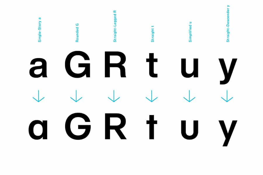
One of the most peculiar characteristics of this typography is that in the letter uppercase R, there are options for the glyph. This is also the case with the lowercase i., who has a different option in his punctuation symbol, being able to be round.
Therefore, it can be said that this redesign came at the best possible time. What has led to becoming a necessary typography for designers that unifies good design and good readability and adaptability.
In 2007, the premiere Documentary about Helvetica. From that moment, we have been able to see and understand how technology has been advancing and its side, the same typography evolving.. It is essential that the fonts are constantly updated to the new technological media that are appearing.
Helvetica is one of the typographic fonts most used both in design and outside this area. Both companies and individuals who are interested in getting the new version will have to pay to get the license.
La The reception of this new typeface was positive. Its design team said they were proud of the final result achieved. Charles Nix, director of Monotype, spoke of Helvetica Now, saying that it is a font that offers designers maximum power and creative freedom, in terms of typographic expression.
It's a version, bundle your different styles into one pack in an organized way, allowing designers to mix, match and even customize their projects.
Thanks to its wide catalog of styles, designers can fit more information, in less space. This is a positive point, for web designs and designs that are going to be included in small supports, for example the screen of a smartwatch.
It is a font worked from scratch, so it has become an exquisite typography. Helvetica Now represents everything that Helvetica is. It has become the favorite typeface for the world.
Se stays true to its original design, through aesthetics and sophistication. But this redesign, they have added points including better ones that give it even greater versatility, adapting to the new times.