
The new YouTube is coming in 2017! And it is that the most striking platform of the giant Google has been chosen for a new look by its designers. To achieve this change, several years of small modifications have passed in terms of image and player, as well as the comment box and other novelties that have emerged.
The video platform that generates billions of views every day and in which more than a third of the population that maintains internet in their homes are registered, it needed a renovation. From Google, or YouTube, they say that it is a cleaner, uncluttered design, so that "it is easier to navigate through it" and give more prominence to the channels that appear in it. Because yes, because they deserve it.
It is something that should not be explained, YouTube would be nothing, without the thousands or millions of channels active daily that support the platform through advertisements. That is why they may have thought they deserved a touch-up. To access to see it for yourself you just have to go to the following link and hit «Go to YouTube».
Analysis of changes in design
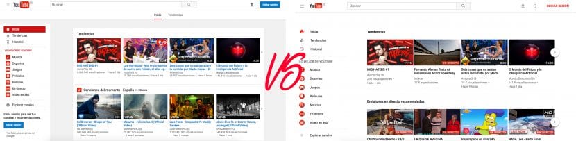
Background: There are many changes in this new YouTube design. One of them and very striking as soon as you enter, is color. Before it kept a gray in the background (R: 241 G: 241 B: 241) to differentiate it from the blocks where it had contained. Now they have decided to eliminate them and leave a single color and therefore a flat shape to the web. With a feeling of minimalism and cleanliness.
Size: In a 100% proportion of both designs, the miniatures seem to have more prominence. Before they would be somewhat smaller than now and seem more brought to the fore. Something that with a small resolution may not be very attractive, as it looks agglutinated. It also changes the size of the videos, completely occupying the screen, yes, not the video.
Panel: Before the panel on the right would appear automatically only if in your last session it had stayed like this, now it always appears. And it must be because three elements appeared at the top before: «Home». "Trends". "Subscriptions". Now it only appears in the user panel on the left.
I also have to say that it is in the process of change, perhaps some features will appear later
Users: As I said before, according to them, users are now more important in this new design. But, I do not perceive it that way. One feature that I hope they add that they used to have is to place the mouse over a youtuber and see a preview of your channel. As is your profile and background image, subscribers and your additional information.
Additional information box: There is a very striking change here, and it is that if you specify well who was the maker of the video (in the case of video clips), who produced or participated in it, it will no longer appear as a simple written by the author. Now it will look more professional and well organized. It is something that I needed and it seems very correct.
Mode ... Dark!
More than a modification in the design to get closer to the new times, dark mode is a totally separate feature. Something that many wish has come true. Sometimes, we are in situations, that the white color can annoy other people or yourself. This is why dark mode was necessary.
For all those who do not see it, I give an example: Imagine that you are going on a train or bus at night and there are many people sleeping. If you have the dark mode, the light that your laptop will reflect will not be as striking in black as if you carry it in white. It is in these types of situations where it is useful. And many will surely appreciate it.
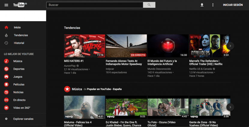
To change it to dark mode, go to the new user panel that YouTube has prepared for you. Where before you could only change user and log out, now you can do more. Like dark mode, language or restricted access, among others. There you will see the option 'Dark Mode: No' and change it to yes. Remember that if you change your computer or even your browser, you will have to activate the dark mode again.
There are enough reasons to switch from YouTube right now and remove all the corners of the platform to find new news, What are you waiting for?