
Who does not know the LEGO brand? It is easy for any of us to have memories of these toys come to mind. And it is that, the brand has been accompanying different generations, who have played with these construction pieces, creating fantastic worlds, for a long time.
The LEGO brand is known everywhere, but not everyone knows how it became a brand that continues to be a benchmark in construction games, so in this publication we are going to learn about its evolution. We will talk about the history of the LEGO logo and everything that surrounds it.
As we know, the success of a brand depends on several factors, but one of the most important in terms of that success, is the logo. This design element can even be the one that determines the success or failure of a brand.
lego history
How many hours we have spent playing with LEGO blocks, impossible to calculate right. One of the most positive aspects of the brand is that has managed to endure over time, and it doesn't matter how old you are or if you are a LEGO lover, you will never stop creating one of its scenarios.
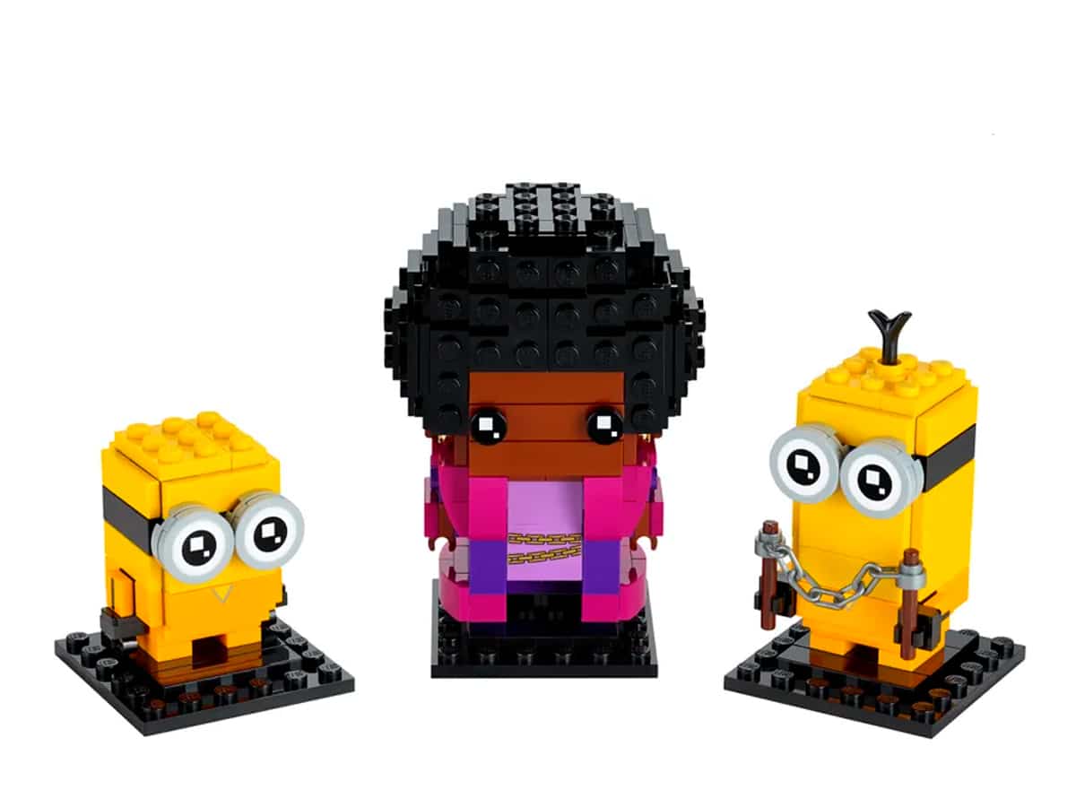
LEGOs are an addiction and a challenge, for our mind, since you can build countless characters or scenarios. From superheroes, Adidas sneakers, the Bernabéu stadium, Diagon Alley from Harry Potter, etc.
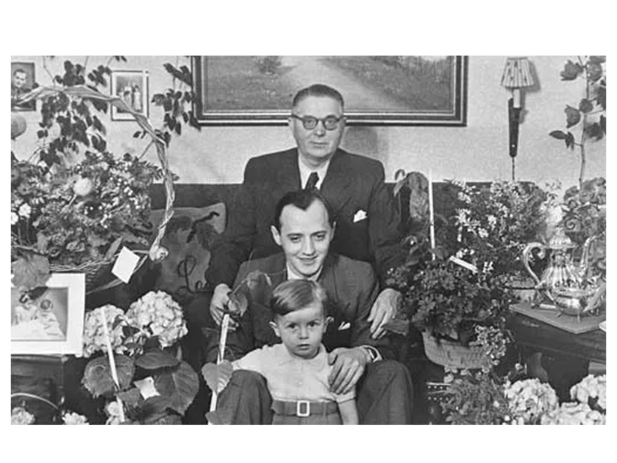
The history of LEGO begins in the year 1932 in Denmark. Ole Kirk Kristiansen, opened a small carpentry business in the town of Billund, where made wooden toys, ladders, stools, etc. with her 12-year-old son.
History of the LEGO logo
It was in 1934, when the small business adopted the name of LEGO. East name comes from the Danish abbreviation of two words, leg dot, meaning play well.
At this stage, it is when the first logo of the brand is unveiled. This logo was reproduced on different materials such as bags, envelopes, stamps, stickers, etc. It did not yet appear as a brand on the toys or other products they made.
As can be seen, it is a simple logo, built by a typography with a black border, whose reproduction only went on documents or other printable items.
In 1936, the logo undergoes its first change and also, begins to be placed in the products that they made, on the wooden toys, with the imprinted seal of LEGO Fabriken Billund.
Over the years, the company has grown larger and larger, reaching 10 employees. And years later, he presents a new logo design, which was used by the toy brand for ten years.
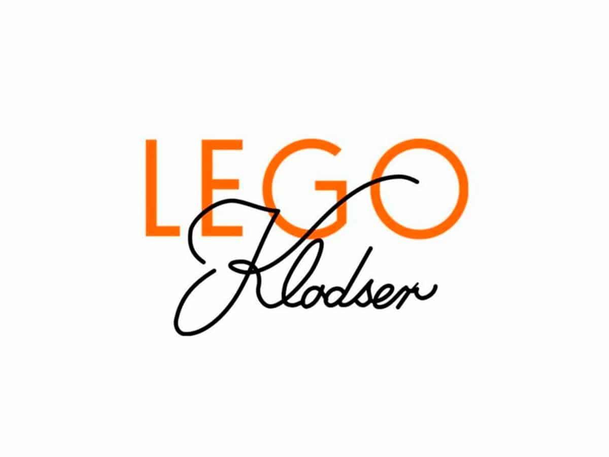
La first known color version of the brand, appears in 1946. The logo was constructed of a sans serif typeface for the LEGO name and a cursive font for the Klodster name.
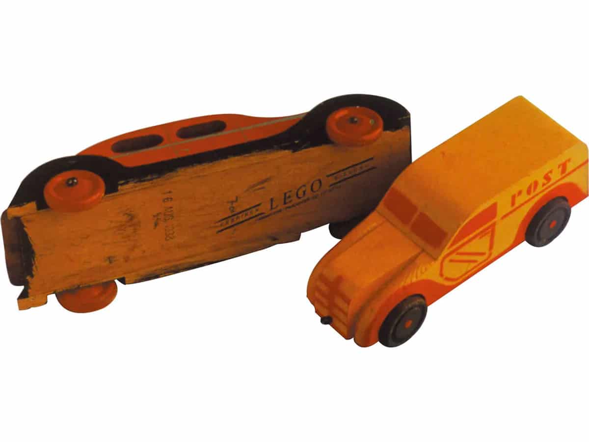
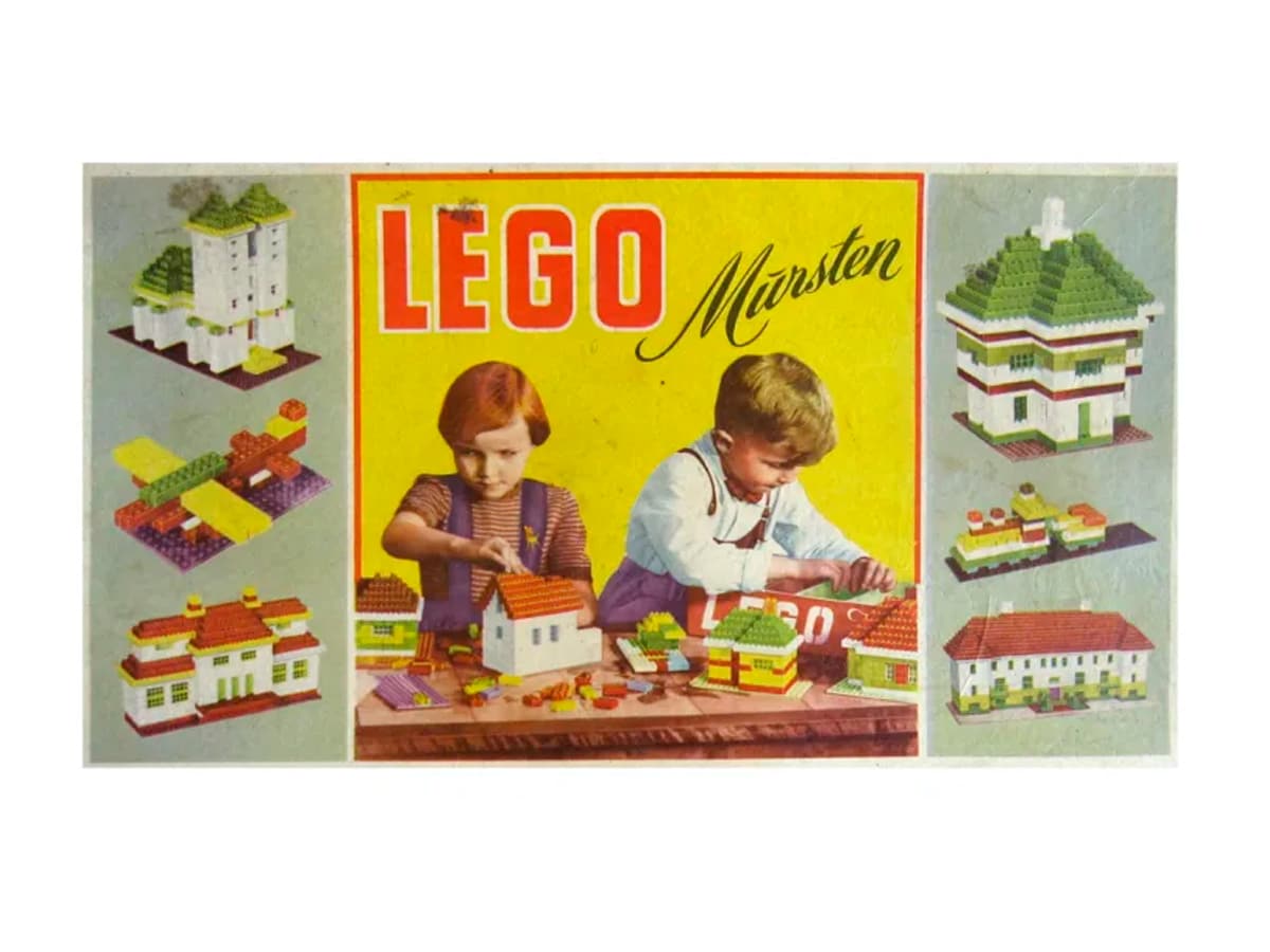
Between 1949 and 1950, the block brand begins to manufacture the famous plastic pieces. The product they presented were some building bricks that could interlock with each other and what they called self-binding blocks.
A year later, in 1951, the brand name changes from Self-Joining Blocks to LEGO Mursten, which means, LEGO blocks. This decision was made by Ole's son and brought with him a new logo design in which red was the predominant color.
In the stage of 50s, the brand used three logos simultaneously They were similar, but not the same. Each of them had the LEGO name in a bold, sans serif font.
Two of these versions had the brand name in red. placed on a yellow background or a picture. On the other hand, the other version was a black cursive typeface, on a white background.
In the mid 50s, the logo chose to include an oval shape pick up the brand name. At this stage, it is when the typography of the LEGO name takes a 360 degree turn.
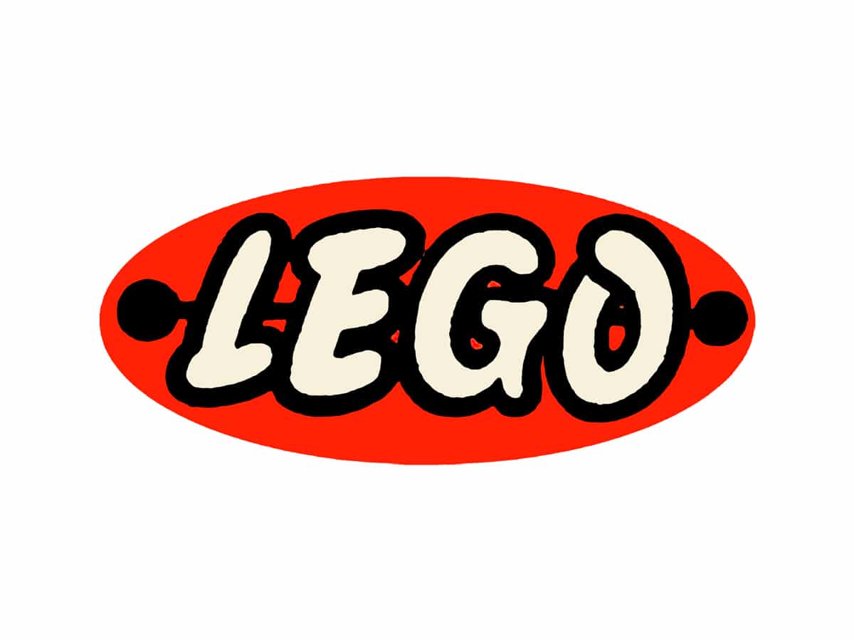
The previously used sans-serif typefaces and gives way to a typeface with a closer and more friendly appearance. It is a font with curved lines and voluminous characters, very similar to the typeface used today.
In the logo of this stage, highlighted the red oval on the black text, and furthermore, two points on each of the sides of this shape, which were connected by a horizontal line.
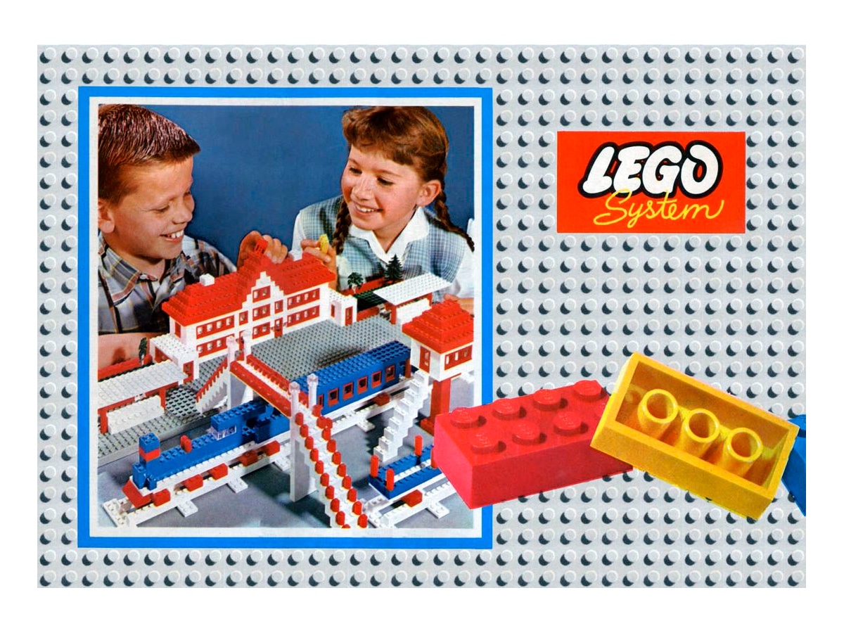
Five years later, in 1960, the oval shape that surrounded the brand name was changed to a square. In this version, apart from the LEGO name, the word System appeared.
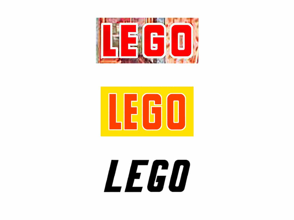
It's not until 1973, when a logo was created that is the starting point of the one that the brand uses today. In these years the company begins to manufacture and market with the United States.
LEGO, adopt a more standardized logo, as we have said, very similar to the current one. This logo was composed of white characters outlined in black and yellow, and was placed as no, on a rectangular red background.
Furthermore, the typography is very similar to the one used in the 50s, but this time a little thicker, giving a fatter appearance, more bubble.
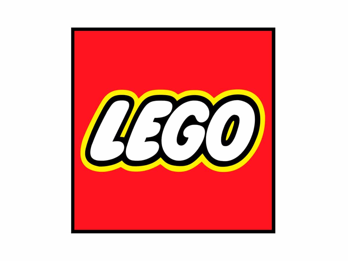
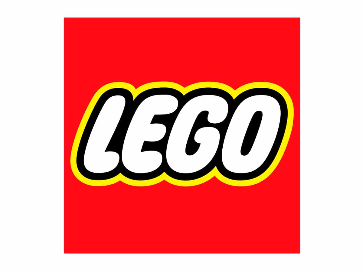
This last logo is maintained until the year 1998, where the last redesign of the brand was carried out and which forms the logo that we know today. In which the typography was stylized and the outline of the letters is larger.
La color combination present in the logo since 1960, white, black, red and yellow, according to the brand, is inspired by the range of basic colors present in the building blocks of its games.
For the time being, the brand has remained unchanged in its brand image, and since its inception it has become one of the most solid and transcendental companies in history. It is a desired brand, both by the smallest of the house and by adults.