
The logo is a symbol of identity for the corporate image of many brands., and it is necessary that its design is representative and elaborated with great care.
In today's post, we are going to talk about the history of google logo. We can talk about Google, as one of the most important brands on the current scene, since we have it present in our day to day, through the multiple functionalities that it presents us in our devices, both computers and mobiles.
Not everyone is aware of the history behind the Google logo, where its origin comes from, whether it has undergone many changes, etc. That's why it's never too much, immerse ourselves in the growth and evolution of one of the largest companies in the world.
What is Google?

Google is not just a search engine, but it contains much more around it. It is one of the United States companies best known worldwide, and is specialized in computer services and products related to the Internet.
Google's name comes from a mathematical term called "Googol" which symbolizes 10 raised to 100, was named like this by its creators Brin and Page when they began to develop this search engine.
History of the Google logo
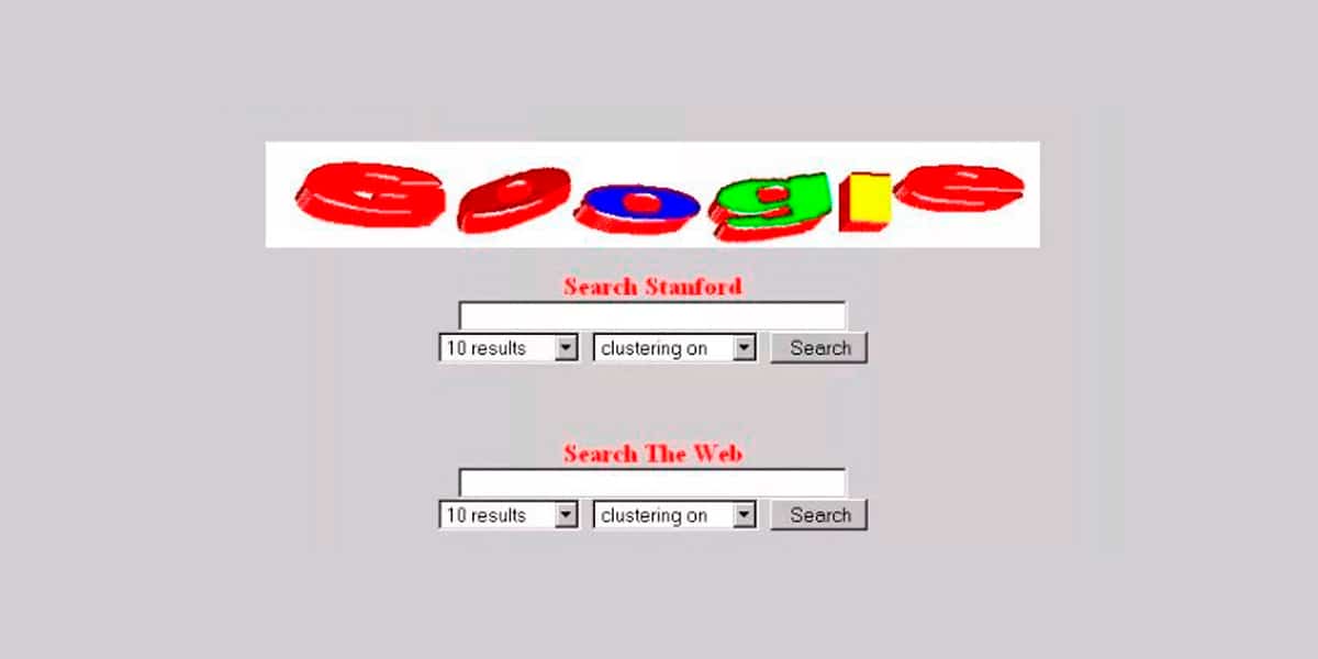
In the year 1997, what is considered the first design of the Google logo emerged, logo created by Brin himself, by means of an image editing program.
As we see the logo of that time had nothing transcendent, it is more reminiscent of the letters that we can create through WordArt.
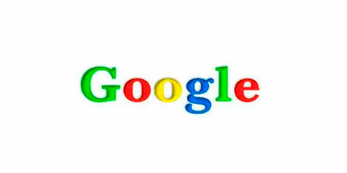
Less than a year later, in 1998, the first redesign of the logo was produced, a design in which the name of the brand can be seen in a more legible way and in which the color combination was already present that we know today.
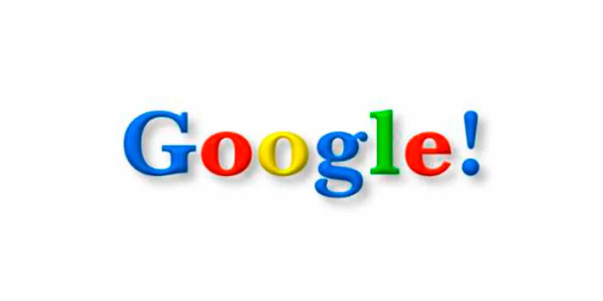
Between 1998 and 1999, the logo was added a shadow effect and exclamation mark at the end of the name, plus a change in color. They say that with this logo they wanted to imitate the internet portal Yahoo!.
In this last year, in 1999, they decided to give the logo a more professional look. This change came hand in hand with the designer Ruth Kedar. It can be seen that the design is based on a typography with serifs and with the same color combination as the previous logo.
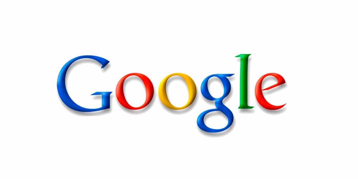
This logo remains for quite some time as the corporate image of the search engine, from its creation in 1999, until 2010.
In this year 2010, the logo undergoes a small and simple redesign, and that is that the typeface has a thickness and subtler shading.
Three years later, in 2013, the shadow effect disappears showing a simpler logo with a minimalist style.
In 2014, Google presents the designs that encompass all its products and services. A design proposal based on geometric shapes. Google took a risk and changed its typeface to a sans serif, a typeface without serifs. The objective of this change is to be able to adapt to mobile phone systems.
In addition to this change in the logo, Google also introduced an icon with a very important role in its application on mobile phones.
Google colors
Source: The List
We cannot talk about the Google logo without referring to the use of color; those colors that are simple but fascinating.
The use of these four colors, blue, red, green and yellow, it was not a random decision, but his choice is inspired by the Lego construction game.
The story goes that the first computer Brin and Page used to work on their browser was built with Lego pieces in the four colors of the logo.
One of the variants of the logo as far as color is concerned, it appears when a tragic event happens or an important event in history is commemorated. It can not only appear in a monochrome version but also adapts its characters including icons of the event to be commemorated.
What are Doodles?
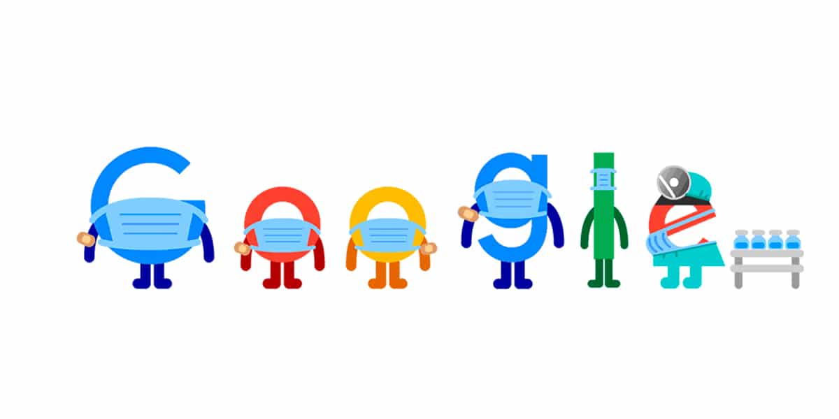
We cannot talk about Google without referring to its famous Doodles, which surprise us with every important event in the world. There are nearly 2 Doodles presented all over the world, some of them only used in a certain country due to their theme.
For example, this one that we see below that encourages us to get vaccinated and use the mask to save lives.
More than 20 years have passed since 1997 when we met the first Google logo, which has evolved to become one of the leading brands today.
It has gone through seven redesigns, until reaching a simple, subtle and close corporate image, in addition to its great versatility.
But not all are good news, There have also been criticisms and it has been said that the G symbol that represents Google was not aligned, and it was not geometric, therefore the company has not correctly created the corporate image that represents them.
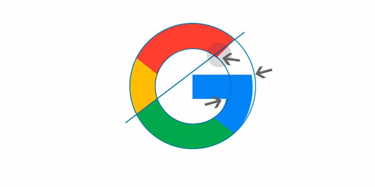
These criticisms were silenced by various experts who stated that they are totally intentional decisions, since, when adjusting the logo to the construction grid, the letter G gives the sensation of a perfect circumference, even though it is not.
Without a doubt, It is one of the most recognized logos in the world, as it is viewed by millions of users every day. Google has known how to adapt to changes.
The Google logo has been based throughout its history on four main points in its design, simplicity, use of color, clarity and adaptability. Four aspects respected in each of its redesigns.
Will Google change its logo again? We cannot answer this question with certainty, but taking into account his background, we would not answer one hundred percent no. The latest visual identity that Google has, the one of today, represents what Google is and its evolution, it is not simply a search engine, but it dominates different operating systems.