![]()
Although for many years psychology has been a taboo for society, besides a rather strange place that few common people frequented, Today much is said about her. Trying to eliminate that stigma that it has, where only if "you are crazy" is when you should go. They have always worked together with medicine to save lives and have also developed a brand and a story. That is why we are going to talk about the history of the psychology logo.
Psychology is a fascinating discipline that has evolved throughout history and, with it, its symbolism has also changed.. The logo of psychology has been a key piece in the identity of the discipline, and has gone through several changes throughout its history. In this article, we will explore the history of the psychology logo and how it has been influenced by changes in the discipline over time.
Because as we said, the little knowledge of society has not prevented them from creating a firm identity, with a functional and recognizable corporate image that can be useful for the population as a whole. We now not only see this brand as a representation of science, but also many professionals in the sector use it as a support element to create their own clinic, where the activity that the person does is recognized. Just like when we talked about the barbershop pole.
The original logo of psychology
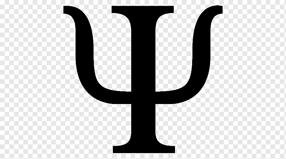
This first image has something mythological, since it traces its first steps in the Greek alphabet. The composition of the name, starting with "psi", which was a letter of the Greek alphabet (more specifically number 23) and that the Romans translated it as "psyche". That although its meaning was "butterfly", it was also translated something like “breath” or “soul”. This Greek letter had a very peculiar shape, by which the symbol of psychology has been defined until today.
The first logo, as an institution, of psychology was designed in 1879 by Wilhelm Wundt, Considered the father of experimental psychology. This logo was created from the story we tell, with two edges, symbolizing observation and experimentation. This logo was used mainly in Germany and other European countries. and became a symbol of experimental psychology.
Today it is used as an iconic item to represent the study of the mind.. Psychologists, as we indicated at the beginning, use this symbol as part of their corporate image. Either directly or with tweaks of the symbols themselves. Some more modern ones have even made a representation of the symbol, but wanting to have a more current touch.
The APA logo
In 1945, the American Psychological Association (APA) designed its own logo., which became the most recognized symbol of psychology throughout the world. The APA logo presents a flame surrounded by a "C" and an "H", representing science and humanity, respectively. The flame symbolizes knowledge and wisdom, while the use of the letters "C" and "H" represents the union of science and humanity.
This logo had a great impact on psychology, as it reflected the moment when the discipline began to focus on the study of the human mind instead of behavior. The flame symbolizing knowledge and wisdom reflects psychologists' interest in understanding the human mind, while the letters "C" and "H" represent psychology's interdisciplinary approach.
Until a few years ago, where the APA decided to change the logo to what it currently reflects. This forms a symbol that represents the different aspects of thought. Behavior, cognitive, etc. They make them see themselves represented under the same identifying seal.
New APA logo

The current logo of the American Psychological Association returns to the origins. A representation that everyone has adopted and that has fallen in favor with professionals. This symbol, as we have been saying, recognizable, is an acknowledgment of the study of mind and behavior by the APA. In this way, the same science can be unified under a symbol that has been with us for centuries. Of course, if we look at it from the design side, as we do in Creative, the design is in rather bad taste.
Since, as we can see, the logo and typography are not exactly a design up to the level of an association like this. A basic, robust, black typeface accompanied by a logo with the PSI symbol, surrounded by a hatched circle. This circle that is also similar to others such as the newspaper of «El Mundo» or Planet editions. But that also makes its interior less legible. We understand that making a circle is adapting it to the needs of now, such as social networks. But it doesn't work as well in other formats.
In fact, to make it more readable, in some applications they have chosen to put it in kinder colors, like the light blue we see in the photograph. Even so, I believe that an institution of this caliber should always play with a simple and recognizable format, but not as poor as making a hatched circle.
Conclusions
The psychology logo has evolved throughout its history, from Wundt's eye to the contemporary APA design. and the new logo adopted in 2018. Each design has symbolized the evolution of the discipline and its focus on observation, experimentation, and understanding of the human mind. As psychology continues to develop, we will likely see more changes to the logo. and other aspects of the identity of the discipline.
In short, the psychology logo is a visual representation of the evolution of the discipline and its focus on the human mind. Through the changes in its design, we can see how psychology has been evolving and adapting to the new challenges and approaches of the discipline.