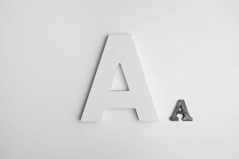
When we are designing a graphic identity, one of the most important choices that we have to make and that sometimes takes us a long time, is to the fonts that will represent the brand. Una good combination of fonts will result in a consistent and solid image.
The color palette that represents a brand is made up of various shades. The same happens with fonts, we cannot keep just one, but we have to choose at least 2 or 3 that are combined correctly and are visually appealing. Yes, once these sources are chosen, we must stick to them and do not add others randomly because this will decrease brand recognition.
If we use 2 or 3 fonts only and we do it frequently, your customers will always be able to identify you. A brand that is easy to recognizing transmits seriousness and confidence, which will eventually lead to more sales and new customers.
This principle applies to all kinds of companies and brands, as if you are a freelance designer or if you run a blog on the internet. You will always need a well thought out and solid graphic identity.
How to choose fonts and their uses
To choose your fonts, You must first have an idea of what you are looking for. Is your brand youthful and fun? Or is it rather sober and simple? We recommend that you write some 3 words that describe the personality of your brand and based on those words you will search for the fonts.
The two or 3 fonts you need should have this use:
Font for Titles or Headings
This is the font you are going to use for titles, headings or any text that needs to get attention in the first place. It is best to choose one easy to read typeface, and that, depending on the personality of your brand is strong and striking.
Font for Bodies of texts
This is the typeface that you will use for all text bodies, paragraphs and even subtitles. Taking into account that you are going to write large amounts of text in this font and that it will be smaller, it has to be as legible and simple as possible so as not to visually burden the reader. When choosing it, you must take into account that make a good match with the font of the titles, and to some extent they may be related.
Accent font
In case you decide to use a third font, you can add an accent font, that is, a font that serves to accentuate or highlight a certain word or phrase. It is extremely useful especially if you need to generate a visual focus of attention that is not a title or that have to be more striking than normal. We recommend that you choose a bold font that is different from the other two, for example, if your previous two fonts are Sans serif, you can choose an accent cursive font.
Now that you know the use of each font, you can start looking for them based on the words you have chosen reference. Here are some examples:
If your brand is classic, elegant and serene, You can choose a Serif typeface, thick, tall and striking for the titles, and another thin and simple Sans serif for the texts. Accent typeface can be an italic font that looks elegant and stylish.
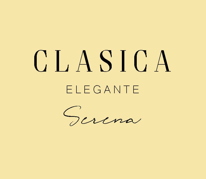
Combination of Serif, Sans Serif and Italic fonts.
If your brand is minimalist, modern and simple, you can choose a rounded and wide sans serif typeface for the titles, and a thinner and square sans serif for the texts. Accent typeface can be slightly thick italic that breaks away from the sans serif aesthetic.
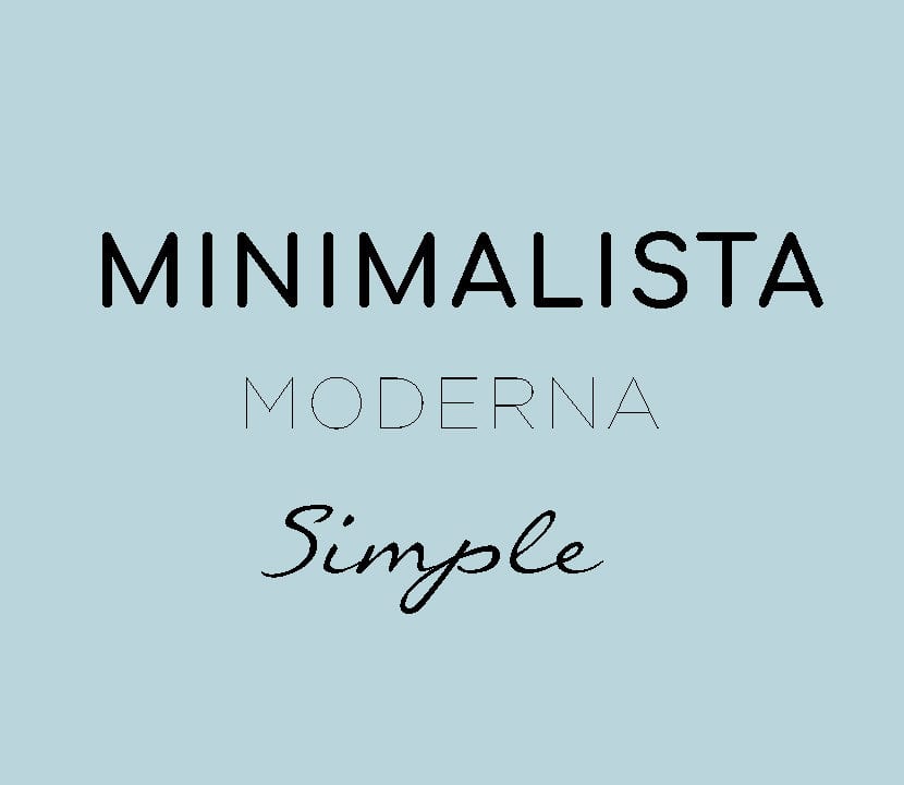
Combination of Sans Serif and italic fonts.
If your brand is trendy, current and fun, You can choose a typeface with a thick and very striking Serif, like the ones that are fashionable in social networks, and another with a light and thin serif for the texts. Accent typeface can be very bold and thick italics.
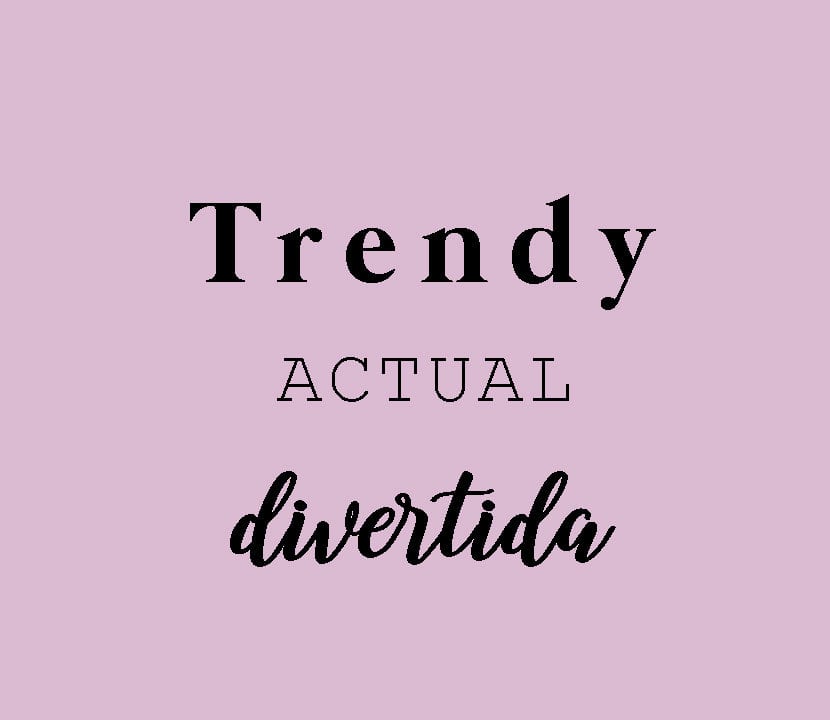
Combination of Serif and italic fonts.
Some rules for combining fonts
Visual order and hierarchy
Make sure the fonts you have chosen comply with a visual hierarchy, that is, the most important and striking one can be distinguished from the others. This goes to establish an order in the way the information is processed. To achieve this hierarchy, not only the choice of fonts is enough but also the proper use of colors, font size, bold, etc.
Opposites attract
This cliche applies when combining fonts. If your title typeface is thick and serif, your text typeface can be thin and sans serif. The idea is to generate contrast that attracts attention.
Don't combine very similar fonts
To some extent, fonts can be related or have something in common, however, two fonts that look almost the same do not work properly. It may even seem like a mistake on the part of the designer. Make sure the differentiation between the fonts is clear.