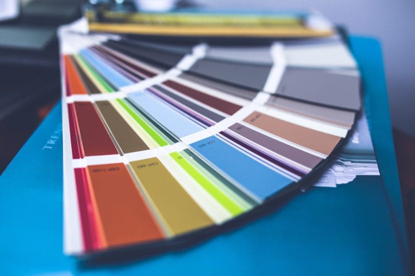
When we are designing the visual identity of a brand, one of the first things we have to define is the color palette. The logo + color palette combination is the hallmark of your brand, which will make a client recognize you as you position yourself in the market.
But, it is not always easy to find the right color palette. Even if we are defining our own visual identity as designers, we may find ourselves a bit lost in the middle of the road. I mean, we sure have some idea what main colors might work for us, but the full palette is not just the main color of your logo, but all the colors that accompany it and that will be applied to your products, packaging, website, social networks, etc.
The same happens when we are working for a client, he may have some color in mind, but the rest of them are left for us to define. We have to find the best color combination that fits the personality of your brand.
How many colors should the palette have?
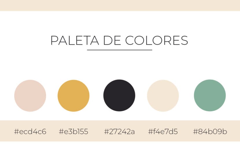
Normally the graphic identity of a brand should have 4 to 5 colors on the palette. Two or three of them should be the dominant ones, and the rest will be the colors that complement or combine with the first ones.
If you are, for example, applying the color palette to your web page, the names of the sections can go in your two main colors: About me, Products, Services, Contact, etc., while the buttons that connect to your social networks In the Contact section, they can go in complementary colors. That is to say, according to the importance of the content, the colors will be applied.
Color palette for branding
How to choose them?
A good way to choose colors is first select keywords that describe your brand. You can brainstorm with all the ones that come to mind, and of those you will only stay with the most important ones. 5-10 words is fine.
If you are not working with your own brand, provide your client with a questionnaire or briefing so that he himself defines the words of his company.
For example, if you are developing the graphic identity of a hotel, you can put words like: rest, nature, luxury, tropical, beach, ecotourism, etc.
Once you have selected them, search in Pinterest all visual references that fit your words: photographs, colors, illustrations, patterns, textures, etc. Save them on a board or in a folder on your computer, and you will realize that those images have color schemes that predominate and that are similar to each other.
You can even make a Moodboard to help you better visualize the references you have collected. Here we leave you an article so you can learn how to create a Moodboard.
With this done, you will notice that there are colors that better convey the personality of your brand. Of all of them, you will select a dominant color around which all the others will be chosen.
Make sure your dominant color is striking and preferably strong (at least compared to the rest of your choice). Remember that this color will be the one that represents your brand, so it should be memorable and customers should be able to easily associate it with the company.
To this dominant color you must add one more color that matches. It can go in contrast or in a complementary way with the first, and these will be the main ones in your palette.
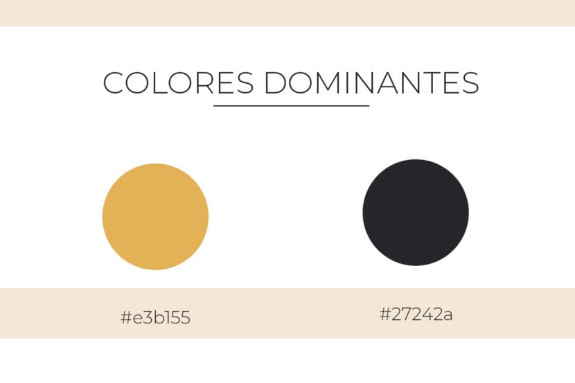
Dominant colors selected for color palette.
Now you just need to choose the rest of secondary colors that will support the principals. It is preferable that they are lighter, less conspicuous and not attracting attention above the rest. To achieve a harmonious combination between dominants and supporters, you can use some tools that help you combine colors.
Adobe color
This tool is free and very easy to use. It helps you to create color palettes from a color you select in the chromatic circle that appears there. Once chosen, the program will give you all the possible combinations by categories: Analogs, Complementary, Triad, Compounds, Tones and Custom.
Also, if you log into CreativeCloud, you can save the color schemes you liked the most and use them for future work.
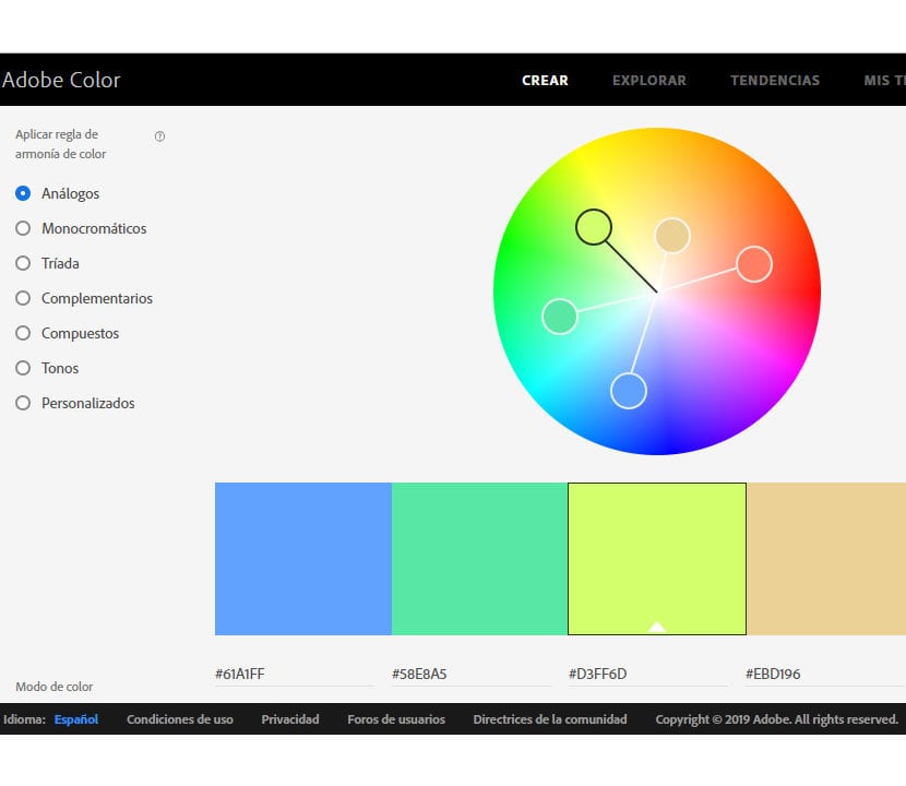
Color palette generated in Adobe Color
Coolors.com
Unlike Adobe Color, this tool randomly generate color palettes just by pressing the space bar on the keyboard. It is very useful if you are looking for a quick and accurate solution. It also allows you search for a specific color by typing its code value and generate their respective palettes.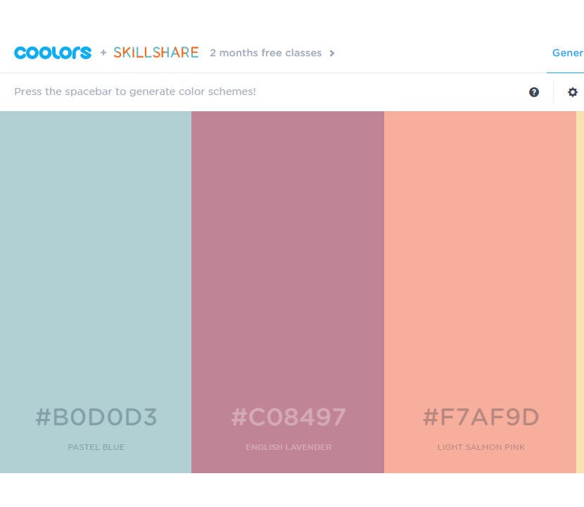
Color palette generated at Coolors.co Once you have defined your two or three secondary colors, You already have your brand's color palette ready!
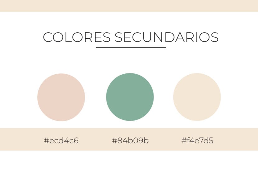
Secondary colors for color palette