
Online stores, banking applications, hotel reservations or freelance jobs, more and more the tasks that are handled through the internet and that have replaced in some cases, the conventional media.
This rapid growth of digital operations has made it easier for us in many aspects life. It saves us time since transactions are faster and there is no need to travel to any physical establishment, and of course, new media have been created that did not exist before and that now most people use, such as social networks, streaming movies and series on platforms such as Netflix, or online payment systems such as Paypal.
With this rise of the digital world it is essential invest in the development of accessible and well-designed interfaces For the users. However, we cannot forget that there are users who suffer from disabilities physical or psychological that considerably limit their experience and their ability to use computers and mobiles.
Although there are some disabilities, such as people who use wheelchairs, that do not interfere with internet use, others, such as vision problems or blindness, motor coordination problems, deafness, or autism, they can seriously hamper your ability to navigate the web. For these cases, some have already been created devices like screen readers, who assist and support users in areas where they have disabilities.
But this is only the first part of solving the problem. Thinking of these users, we have to design web page interfaces that facilitate your experience and suit your needs. There are some principles when designing that we can apply.
Content and sources
Starting with the most basic, you have to set priorities in content design. The header and menu bar must be visually easily locatable and must be the first thing the user sees. The elements on the home page, the images and the relevant information will be the second to locate.
Ads or advertising banners appear on many pages. If in itself this is annoying for all users, for those with visual impairments it is a problem since it causes a lot of confusion, and interferes with the reading of the web diagram. That is why it is essential that you create a general editorial design of the page that is organized logically and understandable, and elements are sized appropriately, so that even if there are other distractions, users can focus on the important content.
The fonts you use preferably they have to be large and legible. The type Sans serif and bold They make reading much easier for people who may suffer from dyslexia. Other recommended fonts are: Arial, Times New Roman, Helvetica, Tahoma, Calibri, and Verdana.
And of course, you should always take care that there is a clear differentiation between the text and the background. Do not use similar colors, choose rather contrasting colors.

Using Sans Serif Bold fonts allow a better visualization of the text.
Alternative text
El Alternative Text or the Alt Tag, are the descriptions that are placed on the images on the web pages. Although this text is not available for users to read, a well-written description is a tool that helps us achieve better SEO positioning.
But the usefulness of the Alt Tag is not only reduced to that. For those users using screen readers for visual impairments, the descriptions of the images are the only reference they have to know what the appearance is of what is exposed on the page. So if we are going to place, for example, a photograph of some succulents, a good alternative text would be: Three succulent plants in pink pots. A very short text like: Potted plants, It is not a description that gives relevant details and therefore does not work.
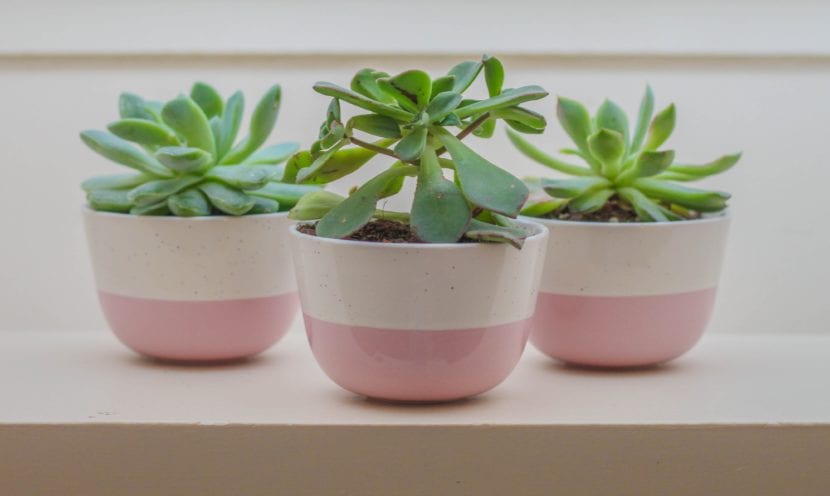
Three succulent plants in pink pots. Alternative text example.
Adaptability
When designing we also have to take into account all the presentations in which our interface will be showneither in web or mobile version. The experience will always be different depending on the medium where we are viewing it.
When we use the mobile, we can be exposed to different environments that make reading difficult Of content from the screen. If we are outdoors for example, the brightness of the sun will make the screen look very dark, and the noise will not allow us to hear the audio well. That is why it is important to think about these details well, so that the mobile version has large letters and dark colors, and the videos should have subtitles in case it is difficult to hear them.
Adapt the interface design so that it is readable on both mobile phones and computers.
Consistency in design
Editorial design what we do with our website must be the same regardless of section where you are. The same menu bar icons should appear in the Home section as in the Contacts section. We must not change the style nor the location of the key buttons of the web.
It is also not convenient for us to place videos that play automatically when opening the page. For users using screen readers, it is difficult to know how to pause them.
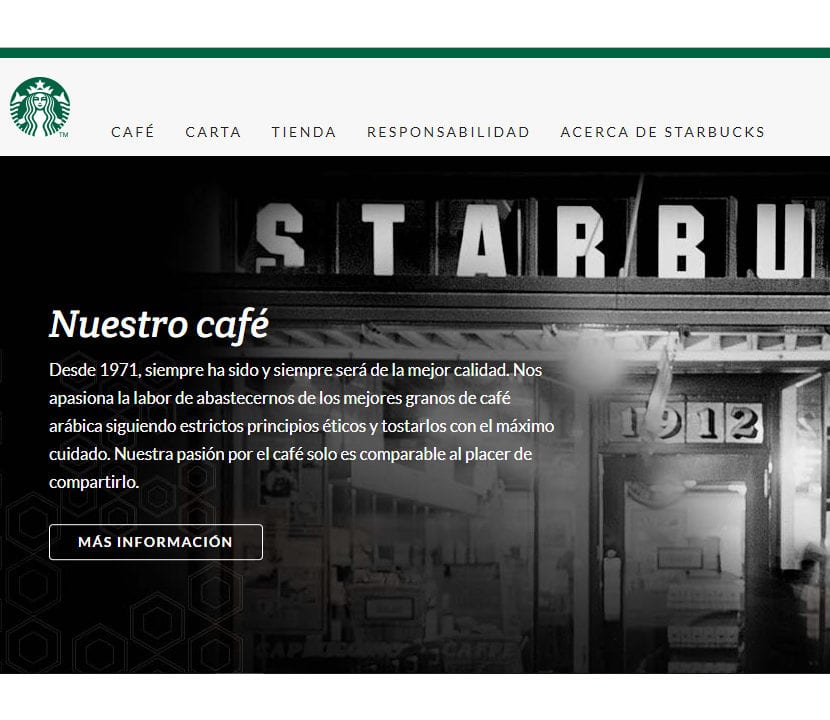
The menu bar on the Starbucks page is the same in all sections.
Keyboard navigation
Lastly, some users with motor coordination problems have difficulty grasping a computer mouse or using a laptop's touchpad, and rely solely on the keyboard. Be sure to that your website is designed in a way that can be completely functional only with the keyboard buttons.