
Source: Graph
Brands, along with logo design, are currently the most seen and recognizable in the industry of the graphic design. However, many times we forget the corresponding steps, to design a brand that is functional, and at the same time, that is creative and personal.
We remember the basics: colors or inks, fonts, graphic elements, graphics, textures, geometric elements, etc. But we do not take into account other aspects that can benefit us, when creating the first sketches or contratypes.
In this post, we are going to show you some tips or tips that will help you create fascinating logos.
The logo as a brand
Source: Web Design
The logo is defined as a sign of identification. It is through this that the public will identify your product and / or service in the midst of so many others. What few know is that, after the creation of a logo, there is an extensive work of investigation.
That is, part of a development of theoretical assumptions where what we know as design and psychology, involving semiotics, color, composition, concept, etc. For this, it takes a designer a long time to arrive at the ideal symbol, since more importance is given to the fact that it is beautiful and functional, for the specific need of the client.
Next, we will help you to ensure that designing a specific brand does not pose any problem for you. In addition, if the cost of the work requested by the client exceeds your budget, it will be necessary to intervene as soon as possible, and if necessary, return to the first starting point of the design process. Sometimes we hire a designer and we have no idea how a logo is conceived, and knowing about those steps can help you to be clearer and better align your ideas like those of a professional, having a much more satisfactory result.
It is important to remember that there is no magic wand to create a logo. Each designer has their own method.
Tips
Source: Pc world
Simplicity

Source: Canva
First of all, we must understand that the logo must be simple. We understand as simple, the design that does not need to tell what it wants to say, but only tells it. Since the logo is a graphic representation of your company and that must be synthesized in a way that is easily identified, without unnecessary information.
Suppose we have at our disposal a catalog of very elaborate logos, which are loaded with elements and effects, the logical thing is that they convey a feeling of disorganization. So that you understand it better, a logo is when we join the icon that gives the face of your brand, to the title / name of it.
That is, that means that your logo is half "design" and half text. And sometimes, in addition to your brand name, some text from support or slogan is added. This being the case, that simplicity must also be maintained in the font family with which that text will be written. Notice that "source" was cited in the singular. Using more than one font in a logo is not recommended. A uniform typography in your logo generates visual conformity, things combine better and you engrave in the visual memory of your client, the name of your brand in that specific font.
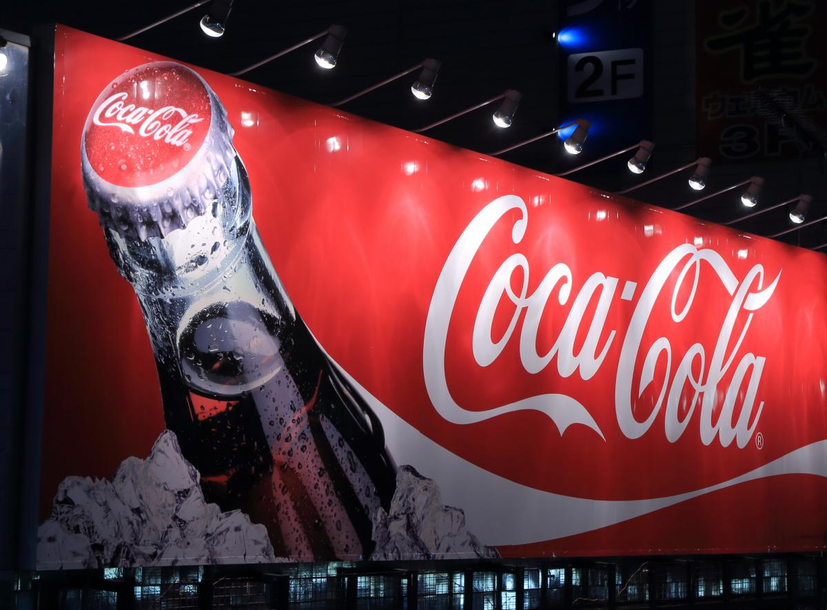
Do a lot of research

Source: Macworld
A very important part of creating a good logo is the research as a first step. This is not exactly the way things are, but having good references is essential to creating an interesting logo.
Carrying out a good research phase, leads to a correct analysis and creation of the steps that come later. That is, if we start by sketching something that we do not know exactly what it is, the result will be the same as not having done anything. That is why designers insist on investigating, on be documented.
First, think about the logos you like the most. Those logos that you look at and know exactly what they are about. Examples such as Nike, Coca-Cola and Apple are always cited because it is indisputable that these brands are market leaders in their segments and easily recognized by their logos.
competition
Source: Nike
Believe it or not, there are companies that make the same product as you or maybe they do it in a similar way that is close to what you want to sell. When this happens, it is important that you analyze your competition.
Analyzing your competition does not mean copying exactly what they sell and how they sell it. But know your method and think how we could to improve so that our company can position itself at the top of the market.
Marketing strategy may sound familiar to you, well, this is where marketing and its different strategies come into play. We give you the following example so that you understand it better: Imagine that you have to create a brand for a company that sells sneakers. The first thing we have to do after investigating is to analyze possible competitions. To do this, we will carry out a search for internal and external competences, such as Nike. Nike It could be a good internal competition since it manufactures sneakers and its way of selling them may be close to what you are going to sell and how you are going to sell it.
The target

Source: GMI
Well, if we have previously mentioned the competition, now we explain what point comes next. The target is nothing more than what we know in marketing as a target audience. The target, so that you understand it better, the audience we are going to address is defined. That is to say, if Nike sells sneakers, the most logical thing is that it is directed to athletes and not to nurses or cooks. But this does not end here, since the target includes the age, tastes and hobbies and the sociocultural level they have.
That is why, before creating a brand, you need to know who your company is going to address.
Create new trends
Source: Computer Hoy
After knowing what your competition is doing and analyzing the target, you have to update yourself and look for everything that is happening in relation to design. Design is something that is constantly changing. What was done in the 90s is completely different from what was done in the 2000s, which is different, too, from what is done today. That is why, when we talk about design, we talk about a series of events that have been unleashed over time and that the old is transformed into something new so that the new can be old over time and bring new designs and so on constantly.
Looking for logos made today and taking them as a reference, prevents the creation of something outdated or out of current patterns. It may seem like a good idea to do something out of the box to easily stand out, but that way your brand can be associated with something very old-fashioned or in bad taste, without a neat visual identity, which is lousy. Also remembering that there is hardly any "A trend" current. The tendencies coexist, they mix, they divide.
Conceptualization
When we have already investigated everything we need, it is necessary to move on to conceptualization. This process is nothing more than a collection of concepts, that is, words that summarize everything we want to project in our design and in our company. Normally, a list is made of those concepts that are both tangible as abstract.
And why is this point so important? Well, because it is the previous step for the sketching process. That is, when we have all these concepts in the form of words, it will be time to start transforming them into first graphics, small sketches that show first-hand what we want to say.
Next, we explain the next step that we have told you about: the sketching phase.
Sketches
Sketches are defined as early graphics, or scratches for you to understand better. These graphics will be refined with the passage of time and the process. In other words, we will start from a first idea that will tell something about our project, and we will improve it so that at the end, it tells everything.
The sketches can be eliminated or selected, depending on the functionality that we want to give to our design. That is why the sketching phase is one of the phases that offers us help to reach the final result we want to obtain.
Digitization and final art
Once we have the chosen and refined design, it is digitized. We must take into account which program we are going to work with and how we are going to work it once we transfer it to the PC. Therefore, it is very important to have a prior study of how we want the lines, typography, chromatic inks or color palette etc.
Once it is digitized, the last modifications are finished designing and retouching and the final art.
Conclusion
When we talk about creative design, we refer to a set of processes that we have to achieve so that design, in addition to being creative and personal, is also functional. A creative design that is not functional for a brand does not work.
Now is the time to start designing and follow the steps.