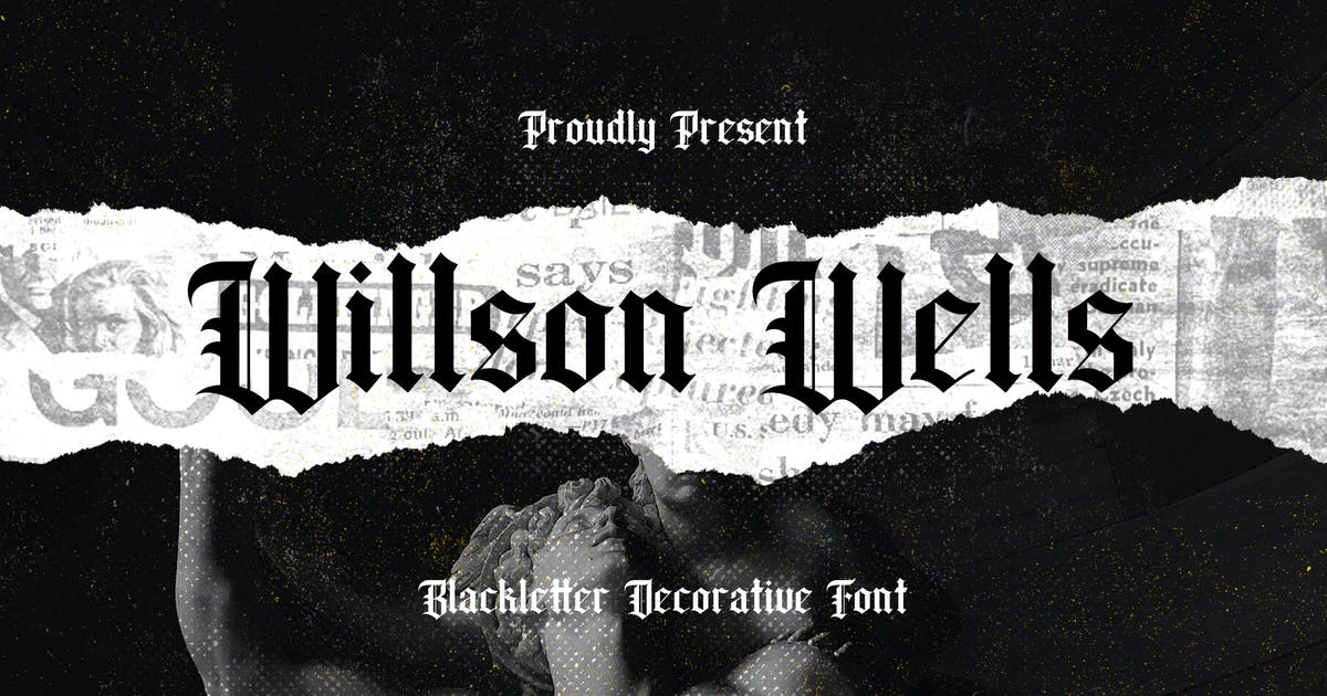
Source: Envato elements
Designing typefaces is today another of the phases that are included in the world of graphic design. That is why we find fonts of all kinds, with elongated serifs, sans-serifs, geometric rounds, etc.
Today we bring you a typographic style that was not born today, but has been in force for many years and today has managed to modernize and be the protagonist of many music album labels, posters and even restaurant menus, Indeed, we are talking about Gothic fonts.
In this post, we explain how to design them so you can create great projects.
gothic typography
Source: Canva
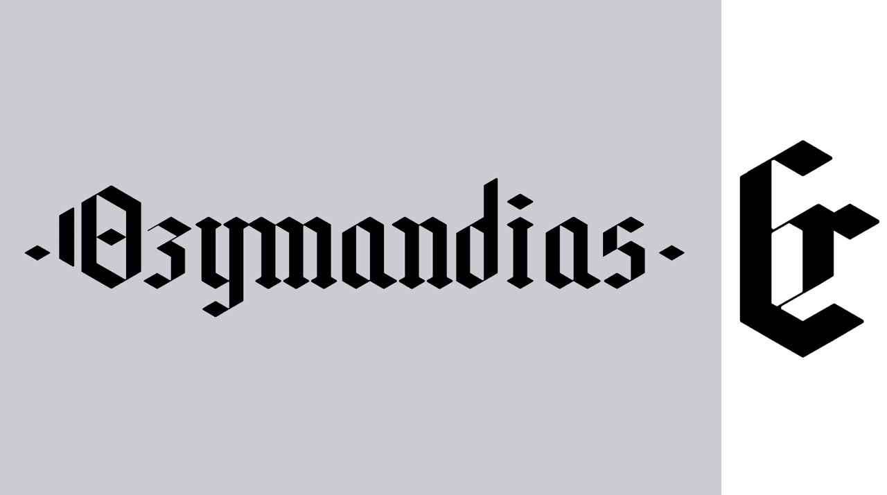
Gothic typefaces, also known as fractured or fractal, are based on medieval calligraphy, that is, they come from medieval times and emanate from the Latin alphabet. They began to be used over time and Gutenberg's 42-line Bible stands out, evolving into modern typography: Fraktur, which was used to write German texts from the 1941th century until Hitler banned its use in XNUMX. Currently many type designers are creating new typefaces from the old gothic typefaces.
Features
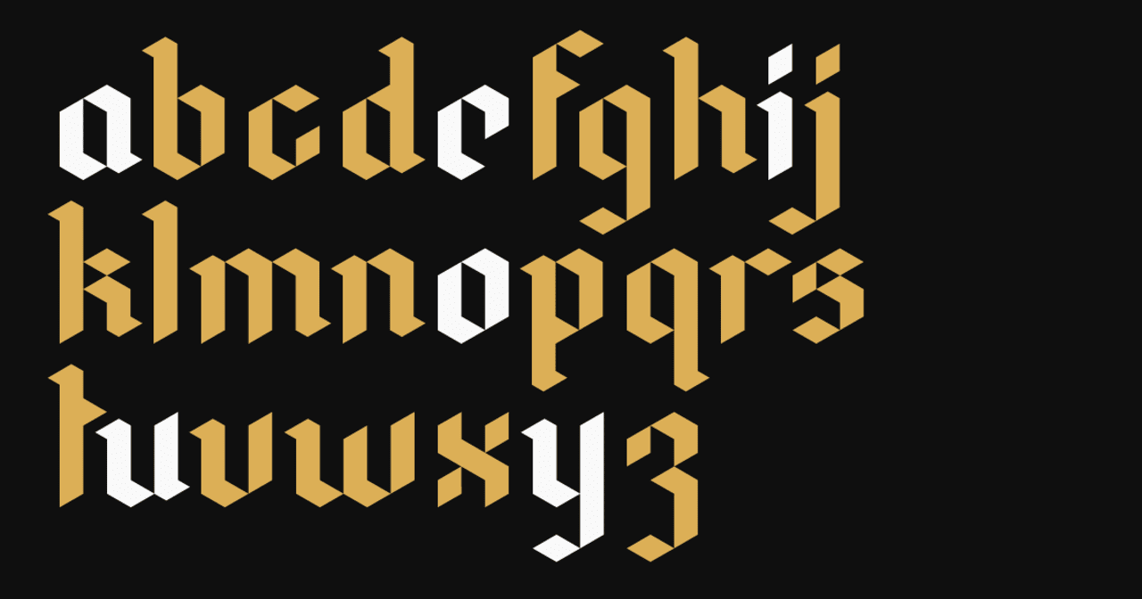
The formal characteristics of this typographic family are:
- Horizontal and vertical thick strokes
- Thin and faint oblique strokes
- Short ascending and descending strokes
- Very elaborate shots
All this makes Gothic typefaces the fonts in general with the most calligraphic ductus, that is, more difficult to write calligraphically.
Regarding the uses, we can affirm that they have been used in designs with an important historical touch, in this way, we can find them in old streets, cheese or biscuit packaging and in a multitude of drinks with a historical tradition, such as beers.
Classification
Grotesque: Due to its austere and curious form, it was at the beginning of the XNUMXth century that the Gothic ones began to be known as grotesque. Although at first they had to separate themselves from history due to the great strength that didonas and meccans had in their time. His characters are narrow and his stroke homogeneous. His "g" have two heights and his "G" chin, unlike the grotesque. Also noteworthy is the height of the x in lowercase, which plays in favor of choosing this style of letters when the printing must be in small bodies.
Neogrotesque: As we have said, in the XNUMXs, the process was reversed and the rejected Gothic women were revived. The simplicity and straightness of the grotesques made them the best adapted for the new age of technology that was coming. But the grotesques were little thought out, they were still meccans without serifs, which is why typographers began to create more systematic constructions, with even more homogeneous strokes: the neogrotesques. We can say that the maximum splendor of the neogrotesques, we find it in Swiss typography after the Second World War. We know it Helvetica Neue.
Geometric: This type of Gothic seems to have been traced with a ruler and compass. Straight and round typefaces, thoughtful, almost mathematical. They were addressed in the twenties, the era of functionalism and the Bauhaus school. We distinguish it by the roundness of the “o”, the absence of the chin of the “G” and in general because they seem to be made with a square, bevel and compass. On many occasions we find the "a" making, in turn, a round, very similar to the "d" or the "o".
Humanists: Early Humanist Gothic derives from calligraphic script and classical capital capital proportions like roman and lowercase like humanist italics. They are usually shown to us with asymmetrical weights in their rings and angular endings. Like the grotesques, they have a "g" of two heights, but unlike these they lack the chin on the "G". The lower arc of the “e” points to the right. In short, they would be Roman without finials.
How to Design Gothic Typefaces: Tutorial
Source: Canva
After brief information about Gothic fonts, we are going to explain step by step how to design them. You just have to follow the steps that we show you below and you will become an expert of fonts.
To complete this tutorial, you need to have a camera and an editing program at hand. We also suggest that you look for any object that may contain this typographic style: newspapers, magazines, paintings, etc.
Step 1:
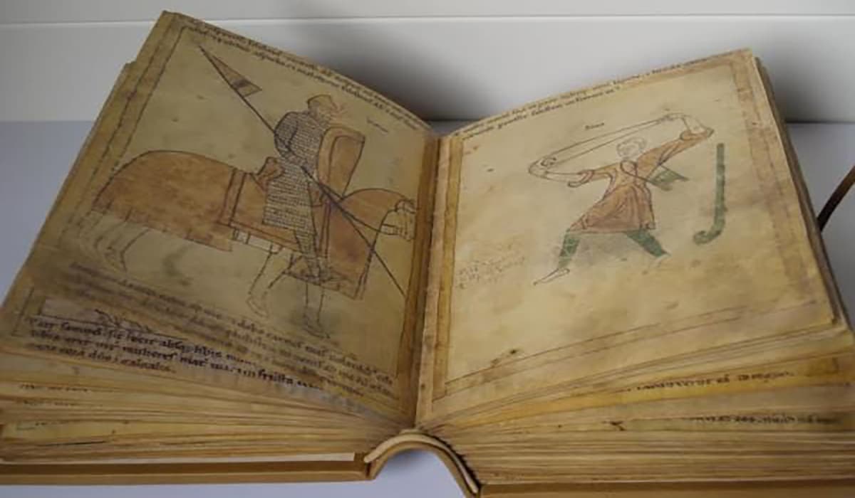
Using a digital camera or scanner, take digital photos of documents that you have found that have gothic letters. In this case you will have to edit, to make them bigger, the letters with an editing program.
Source: BestBuy
Step 2:
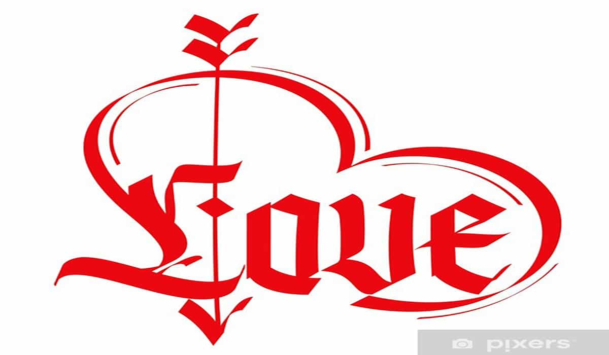
Print the image, you can do it with your printer or at a copy shop so that they can print it for you, if you want a vinyl you can print it directly on this paper and then paste it wherever you want. You can also transform your design into a gothic tattoo, in the image below you have an example.
Source: Pixers
Other forms
- Print the image, you can do it with your printer or else go to a copy shop so they can print it for you, yes you want a vinyl you can print it directly on this paper and then paste it wherever you want. You can too transform your design into a gothic tattoo, in the image on the left you have an example.
- If what you want is to surprise your friends by writing their name in Gothic letters, what you must do to learn calligraphy is to trace the letters and repeat them a few times, then you will be ready to write your name or what you want in gothic letters.
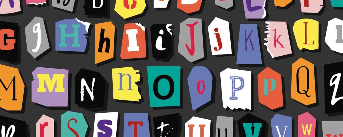
- You can also download a gothic alphabet. Download the image and print it you can make a collage with the gothic letters. In some images you can also use the gothic numbers, for your birthday or Halloween party.
Evaluate your work by leaning it against a wall and looking at it from at least 10 feet (3m) away.. Also, keep a mirror in front of your work and look at it through the mirror. This will make the words harder to read, forcing the mind to focus on the artistic qualities of the words, such as their composition, balance, and harmony. Write down the impressions of your work during the evaluation. For example, you can write: "The punchlines don't stand out enough."
Review the drawing based on the notes you made in the previous step. Repeat this process of self-criticism and revision until you are satisfied with your picture of the word.
typeface designers
Source: Ipsoideas Agency
Here is a list of some of the best typeface designers to keep you inspired. Some of them you will know and others you will discover.
Marian Bantjes
She has been commonly described as a typographer, designer, artist and writer. Working from his base on a small island off the West Coast of Canada, his graphic, personal, obsessive and at times bizarre work has earned him international recognition. Following her interests in complexity and structure, Marian is known for her custom typefaces, detailed and precise vector art, her obsessive handwork, and his skill with templates and ornaments.
white noah
She is an independent graphic and typeface designer based in Barcelona, the city where she grew up and where she studied graphic design at Bau, Center Universitari de Disseny. He then took a Master's in Advanced Typography at Eina, where he began to experiment with type design.
Since 2008 she has worked as a graphic designer for different studios in Barcelona until in 2010 she decided to move to the Netherlands. It is there that in 2011 he studied the Master Type and Media at the KABK in The Hague.
He currently works as a freelance for clients from various parts of the world and teaches typography classes at Bau. Among his latest projects, it is worth highlighting the collaborations he has done for Underware, Jordi Embodas.
Veronika burian
She is a designer who has lived and It has been formed in cities as disparate as Munich, Vienna and Milan. Recently the name of this type and character design enthusiast has become part of the select group of 53 typographers chosen by the Association Typographique Internationale (ATypI) within the second Letter 2 international type design competition.
The Maiola typeface, which Burian began to design in 2003 and which he published in 2005 in TypeTogether, is responsible for his entry into this club in which only typographic design excellence fits.
Laura Meseguer
She is a graphic designer and typographer, she works in Barcelona, where she was born in 1968. She has her own foundry, Type-Ø-Tones. She is also known for being a Typography teacher at Eina, Elisava and teaches workshops throughout Spain. It has two Laus awards and two Certificates of Typographic Excellence and the Letter.2 award from AtypI.
She is the author of TypoMag, typography in magazines and co-author of the book «How to create fonts». From sketch to screen, with Cristóbal Henestrosa and José Scaglione.
Conclusion
We hope that you continue designing many more typefaces and that you have been inspired and learned. In addition, you can also visit some articles that we have written for you and where you can continue learning more about fonts.