
Source: Black Market
There are brands that maintain a specific history, and that are precisely known for that reason. There are others, which have made a huge mark in a certain sector, and they have created a new way of sharing and savoring experiences.
Brands not only show us a clean and serious image of what a company or sector is, but also, thanks to the services they offer, they invite us to discover new ways of experiencing their products, and in this way be able to share them with the public. rest.
In this post, we have come to show you the history of the KFC logo, a fast food sector, which has been in use for many years, and which hides a very interesting story behind its smiling logo.
KFC: what is it
Source: Notimerica
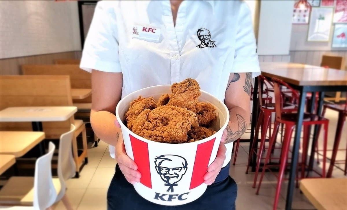
KFC (Kentucky Fried Chicken), is a fast food brand that originated in the United States. It is also part of a restaurant that has managed to fill thousands and thousands of locations and countries around the world.
Its main element, so characteristic, is fried chicken, although they also work with different foods such as French fries or hamburgers.. The main headquarters or chain of restaurants, was established in the American city of Kentucky, and currently, it already has around 22.000 restaurants in all countries.
The famous fried chicken restaurant was created with the aim of providing the citizens of America and the rest of the world with a unique and exclusive flavor. KFC was created with nothing more or less than an unusual preparation, where a very characteristic fried chicken was prepared that little by little it spread and drew the attention of the rest of the citizens.
Features
- Not only does it have the ability to cook fried chicken, but now, there is the possibility of being able to try their hamburgers, fries and chicken combos so interesting and so catch the attention of customers.
- Like any franchise It started as a small place where only a few people attended. Little by little, and over time, it became a good chain of restaurants.
- Their products are prepared and cooked in such a way that they are enjoyed at different times of the day. It is a good way to give yourself a break between long hours of the day and enjoy its taste.
Next, we will talk about the logo that is so characteristic of KFC and we will tell you about its history.
KFC logo: characteristics and history
Source: 1000 marks
1952 – 1978
The first KFC logo followed the same line as always in terms of its designs. In this case we find the same color palette, the portrait of the founder and his famous initials. The first logo is presented designed with a handwritten typography, where we can appreciate its different letters that form the design of the logo.
In this case, we find a completely monochrome palette and something more elegant than what we usually see from the brand so far.
Source: 1000 marks
1978 – 1991
In 1978, a redesign of the brand was created with the aim of updating it in its timeline. The emblem was represented on the left side of the brand. The typography also changed and was updated, thus creating a brand of the 70s, 80s and 90s.
A new design that caught the attention of an entire public.
Source: 1000 marks
1991 – 1997
What seemed like an overly long and sprawling brand name, the brand itself, was turned 180 degrees and renamed KFC. In this way, they used the initials of the previous naming, to create a new brand to play with and combine a new image, with a new way of offering a service and a product.
The logo also changed, which was already presented with corporate colors that attracted much more attention.
Source: 1000 marks
1997 – 2006
Years later, the company decided to redesign the logo again. This time, the logo was presented through a square shape where the famous emblem was also presented. The background was red and white, the two corporate colors of the brand.
In this way, it was possible to renew the logo from a much updated form at the time, and tried to attract the attention of many more customers.
Source: 1000 marks
Today
Currently the KFC logo is shown represented through a redesign that was made in 2018. This time they used a trapezoid, where they can unify the emblem with the brand logo. The corporate colors of the brand continue to be used, that we can see them reflected on a reddish and white background that draws a lot of attention and that we can see it from km.
A new way of representing an updated and renewed logo, full of great successes, which already position the brand as one of the best fast food chains on the market.