Source: Lanjaron
Each of the brands that are designed are not only known for their image, but rather for everything they represent. There are endless brands that, we would never say where each of the logos that our mind is capable of managing and guessing, have come from.
When we buy a product, we always look at the label in its design, and consequently at what is engraved, but something always stands out more than the rest, its corporate image.
The colors, the typography and each one of the graphic elements that make up said logo, are unified to create a unique and representative imprint of a product. In this case, we have come to talk to you about Lanjarón and the meaning of its brand.
What is Lanjaron?

Source: Lanjaron
Lanjarón is defined as a brand of natural mineral water and already has to be one of the brands whose property is managed by the Danone brand. Its spring origin is Lanjarón, a massif found in Sierra Nevada, Granada province.
As for the history of the company, it is said that the waters of Lanjarón were discovered at the end of the XNUMXth century. During historical times, many of the citizens of the surrounding towns traveled to Lanjarón to collect water from its natural and unique springs.
Years later, the Sierra Nevada spring is declared one of the healthiest and most natural springs in the province of Andalusia, leaving a mark among the many who currently continue to enjoy these springs year after year.
We can find these products in any supermarket in Spain. What characterizes your product is its famous label with the brand's logo inserted. A spring that has been ensuring great natural work and benefits for the Andalusians and the rest of the Spanish for many years.
History and evolution of the Lanjarón logo

Source: Slogan
First logo
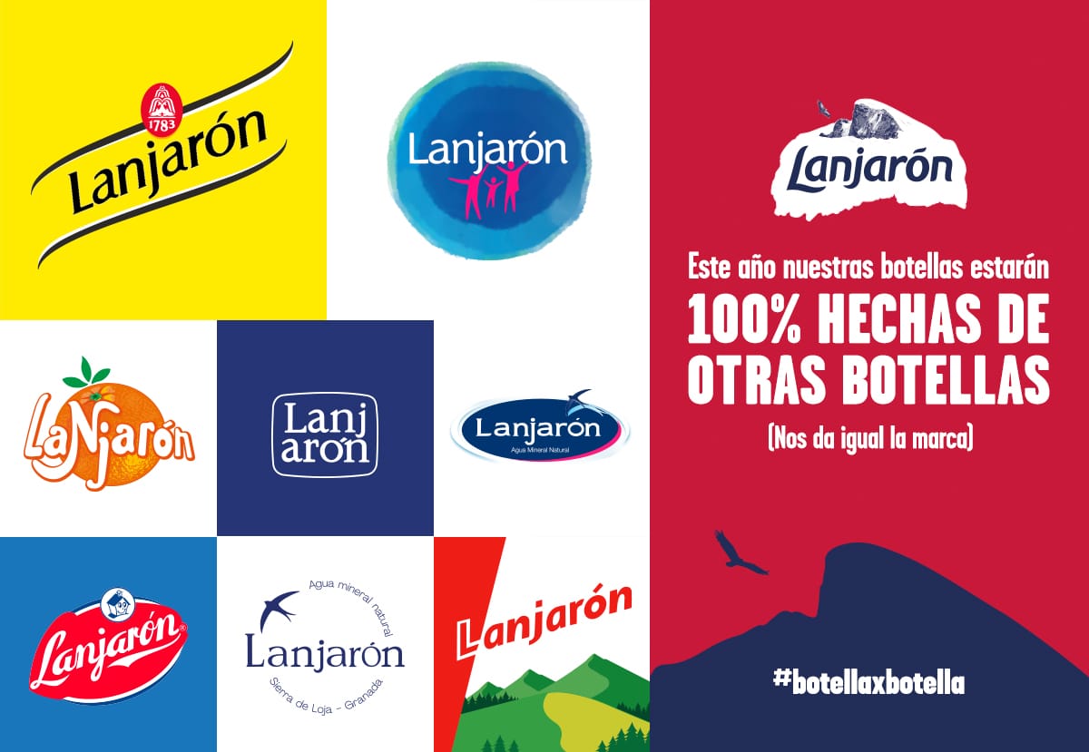
The first Lanjarón logo was characterized by its orange color and hue. In fact, the color orange became the corporate color of the brand.
What characterized this logo so much was, without a doubt, its typography, a very lively typography where a figurative orange background was applied that accompanied with the naming of the brand, and that offered all the personality and creativity to the design.
The design was changed years later and consequently its colors.
second logo
The second logo of Lanjarón was characterized by containing a corporate color of the freshest and bluish. So much so, that Lanjarón and the famous La Casera brand merged and created a single brand. The brand carried the famous seal and icon of a house in the form of a vector, where his famous typography and his reddish seal followed.
A brand that revolutionized the sector and with it the possible competitions. But like any brand, there was an evolution that continued to turn the tables, in the world of logos and brand creation.
third logo
Lanjarón continued with the same line of blue tones in its corporate colors. So much so that we can find three logos or versions of their logos with that characteristic and changing blue tone. Without a doubt, if we highlight the following Lanjarón logo for something, it is its simplicity and minimalism, leaving aside any overloaded brand and any logo full of elements that are left over.
A unique and brief brand was created that managed to say a lot with little and above all, managed to be the same brand image that all its public expected with its product.
fourth logo
The fourth logo came from the hand of schweppes, the famous brand of carbonated drink that we have tasted at times in summer times. Well, let's say that both brands were unified to create a single logo. This time they left behind the typical corporate blue color of the brand, to go to a bright yellow of the most striking and typical of the schweppes brand.
Without a doubt, it is one of the most successful versions due to its striking color, although many campaigns have opted for other colors that go much better with the product that Lanjarón sells.
Conclusion
The Lanjarón brand has passed from generation to generation. In addition, it has been part of many secondary brands such as Danone, which gives it all the prominence and further enriches the brand.
Without a doubt, Lanjarón is a brand with a long history, a story that begins in the famous Sierra Nevada springs in Granada and that offers all the freshness and naturalness to the province of Andalusia. A province full of life and health and well-being.
We hope you have learned something more about this famous brand that has revolutionized the market so much and especially its different and varied designs.