
Source: LedBak
Whenever we go outside, we are invaded by the variety of elements such as colors, images or even letters (fonts). When we look at posters or signs of any establishment, we realize the great variety of fonts that we have around us, and yet we have never stopped to think what those letters really are and what their origin is.
If you want to get the answers, in this post we will not only continue to introduce you to the wonderful world of fonts, but we will also explain which is the best option for each type of label and why design has a lot to do with it. .
Shall we start?
What is a label?
A title is defined as a descriptive text represented in some label, document or even some poster. The main function of a label is to warn and inform about a specific topic. Ultimately, the labels contain information that has a lot to do with what it is intended to label.
The labels are usually protagonists in companies or work sectors, since they are the ones in charge of carrying out the entire logistics process and whose destination is the one that directs the type of label, which will be placed on the package in a certain way.
With this process, it is achieved, for example, that the recipient and owner of the package receives their item in perfect condition and correctly. On the other hand, the label also fulfills the function of indicating what any item is for, in this case we take as an example the label of a piece of furniture that is not yet assembled, this label will inform the user how it should be assembled.
Uses and examples
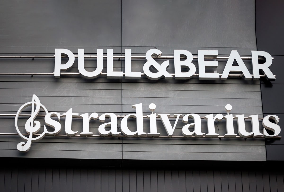
These messages are usually placed in commercial areas located outside, but sometimes they are also found inside and complement their design with the establishment. The placement of these signs will be conditioned by the type of business we have, for example, if our business is in a little-traveled or isolated street, it is best to place a small sign at the beginning of that street so that users know where is your business.
What characterizes a label is the brevity and easy compression with which the message to be communicated must go, since the user who shares space with a label must understand its message and what it communicates. If we realize the importance of labels, we come to the conclusion that this visual communication mechanism is part of our daily life, since it also locates and advises us.
There are several types of labels: Neon sign, LED lighting signs, one-car signs, two-sided signs or signs with indirect light.
Next, we will move away from the definitions and enter once again, in the wonderful world of design without moving away from the theme. And what role does design play in the labels and the choice of fonts? In the next point we will explain it to you.
Visual communication
Source: High Level
We call labeling the action of labeling, but how do we know which typeface is best for our label or which colors are the most appropriate for our label? The fact is that there is no magic potion that tells us, but we can help ourselves with what the graphic designers name "Communication strategies" or rather "digital marketing".
Visual communication has as its main objective the transmission of messages through different elements composed of images or symbols. What really makes the communication of ideas possible. These ideas must fit the message and the end result must be a correct understanding between the user or viewer and the graphic element (fonts, colors, images). Here not only acts the choice of our designs but how they manage to communicate later.
For this reason, every time we design a sign, we previously carry out a study where we position our company, that is, here the target audience and the values it represents come into contact.
So what is labeling?
The truth is that we call labeling the graphic line of the drawing, its contours and its range of legibility where the psychology of color, the choice of a font and its images come into contact.
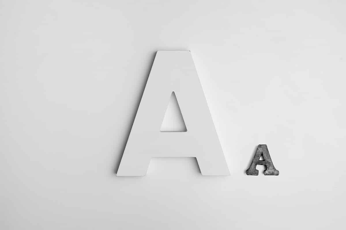
Types of letters
Source: Odyssey
When it comes time to make the choice of fonts, we have an endless number of fonts that could perfectly match our company. In this post, we are going to show you those that are best adapted and have the best readability.
Roman fonts
Roman fonts are those that contain serifs or serifs, that is, those small elements that we find at the ends of each of the strokes.
They usually have a serious character and are very traditional since according to their history, they were the famous typefaces designed by hand with stones. They are usually suitable for long texts since, thanks to their shape, a perfect reading is achieved.
For this reason, in many labels we usually always find fonts such as: Times new-roman, Garamond or even the famous Book Old.
Sans serif typefaces (dry stick)
Unlike Roman typefaces, non-serif typefaces are those that are characterized by the absence of finials or terminals and their lines barely present contrasts. These fonts are very commercial since they are usually in most of the labels that are designed.
This is because they present suitable results in headline impressions or little text, that is, in posters and advertising. This font style is characterized as it evokes modernity, security, neutrality and minimalism.
Although this type of typographic font does not have that invisible line that Serif fonts achieve for long texts, it is also suitable for text on the screen and texts in small sizes. Since its absence of terminals and finials, makes it more legible in small texts.
Some examples of San Serif fonts are: Futura, Helvetica, Arial, Gotham or Avenir.
Handwritten fonts (italics)
I make a small paragraph to tell you that, if you have not yet read our post that talks about this type of fonts, I recommend that you do not hesitate to do so since it explains in a more comprehensive way what characterizes style so much.
That said, handwritten fonts are also named italics or script. These typefaces represent and imitate handwritten calligraphy, this is the main reason why they can also be named as calligraphic fonts.
This type of fonts are characterized by containing an italic or italic tendency. That is, the letters are joined together and we can see that they contain more pronounced curves than in serif or sans-serif typefaces.
As they evoke and are united with calligraphy, they have a somewhat more personal and close personality. Some italic fonts could be Beckham Script or Parisienne.
Decorative or animated fonts
They are also called as animated fonts. They are considered fun fonts, more casual, but they can convey a wide variety of sensations, due to their creative aspect.
They have a very strong character and personality. From the point of view of typographic psychology, they are eye-catching fonts and help to attract more attention. That is, the range of readability that these types of fonts have is much smaller.
They are definitely not ideal fonts for paragraphs of text, as they can convey a lack of care or disinterest in the design.
Conclusion
As we have seen, to design a sign it is not enough to write what we want to communicate, but we have to go through a series of processes to ensure that this message reaches a successful conclusion and, therefore, is suitable for other users.
When the time comes to design, we can use many fonts, that is, we do not want you to apply only those that we have shown you, but to investigate and after many sketches, you can reach a correct final result. When you go abroad, the important thing before designing a sign is to take a good look at what the rest of the people have done before you, it is the key to getting the information you need and at the same time finding inspiration in sources that you were completely unaware of.
Many brands have not only had to design their own logo but have had to adapt it according to their area of respect and corresponding measures, to an outdoor space. This space has served to attract the attention of those who constantly see stores or establishments, whatever their type: hospitality, clothing stores, supermarkets, etc.
Now that you have an endless number of signs around you, the right time has come for you to let yourself go and above all to free the designer that you carry inside. Remember, get out of your comfort zone, visualize, get inspired, investigate, do many sketching routes and ask yourself if it is the correct one and what benefits it can bring to the rest of the people who see it.
Your time has come.