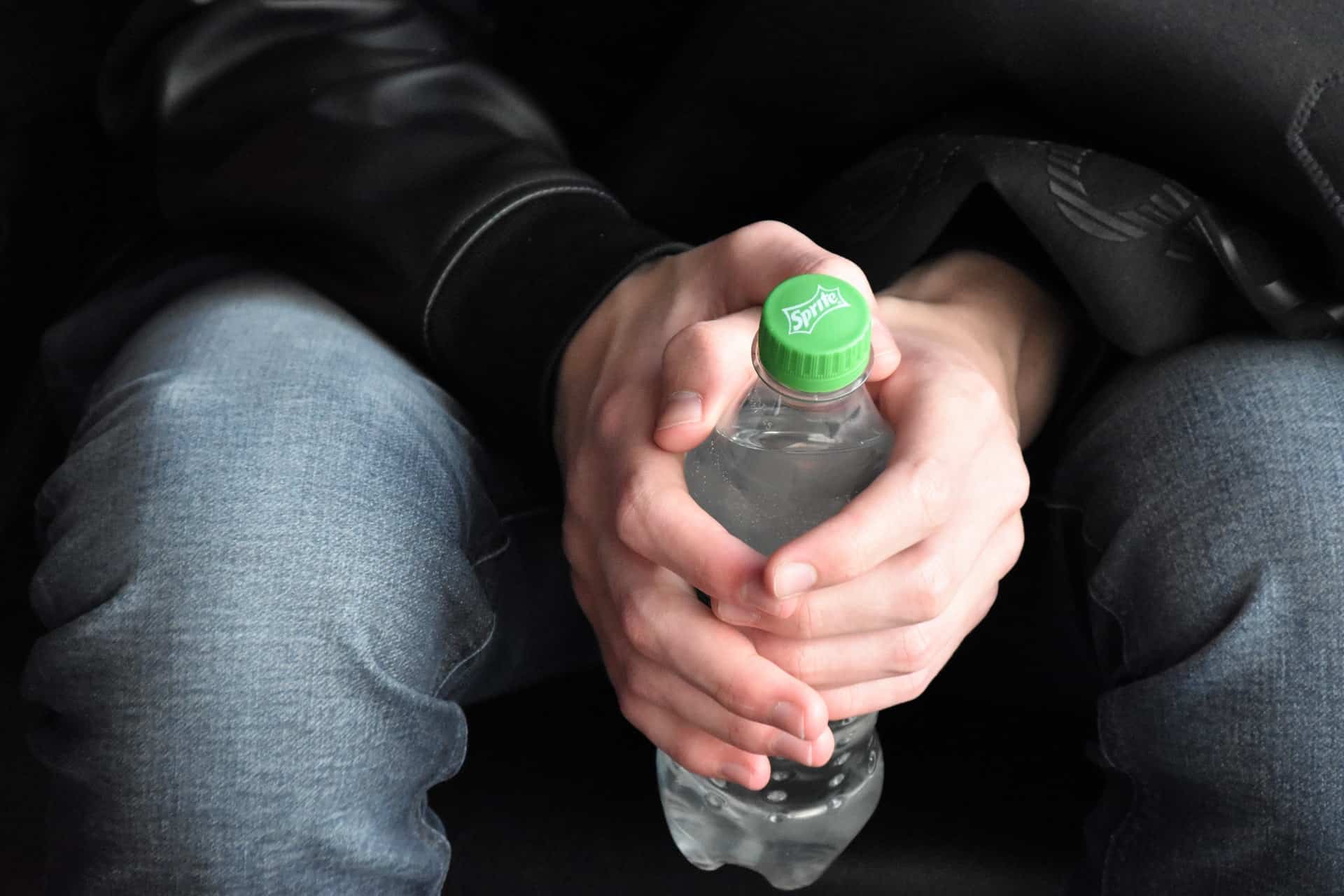
The Coca Cola company and the Turner Duckworth agency have worked side by side to give the Sprite brand a new image, which coincidentally coincides with the launch of a new global platform, Heat Happens. The Sprite logo is one of the best-known identities worldwide but which has been modified multiple times throughout its history., as we will see in the following sections.
This trade mark, It is firmly at the top of the list of lemon-lime flavored soft drinks and one of the brands of the Coca Cola company with the highest turnover worldwide., is positioned as the third. Its great success is obvious, but the brand had a big problem, it did not have a unified visual identity in the different countries where it is consumed. Therefore, a fundamental decision was made, to change this problem and ensure a successful result for the brand by creating a new unified identity.
History of the Sprite logo
As we mentioned at the beginning of this post, Sprite is a beverage brand that first appeared in 1961, from the hand of Coca-Cola. This refreshing drink is known for its sour lemon-lime flavor.
When creating a brand image that represents the values of said drink, The aim was to develop a design that conveyed freshness and that could be differentiated with a single glance. As we will see in the different versions of the brand logo, the color palette and the graphic elements that the logo presents do not vary significantly over the years.
1961 – 1964
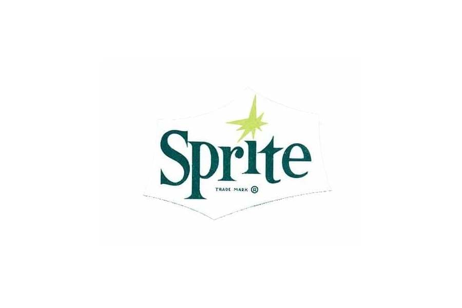
The first logo of the brand appears in 1961, which was composed of serif typefaces in a dark green tone, which were given a movement style by placing the characters at different levels of height. If we look at the letter “i”, the decision is made to replace the point with an eight-pointed star in green plus yellow.
To unite all these elements, a decorative element is used that includes the name of the brand and the decorative graphic icon. This decorative element, as we can see in the following image, is almost imperceptible since the layout is very fine.
1964 – 1974
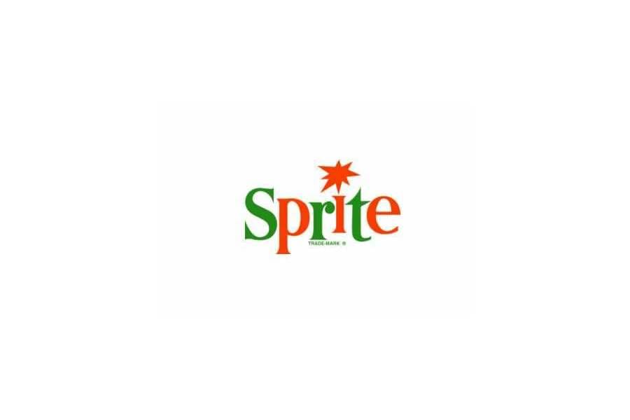
The first version of the logo lasted a few years, since in 1964 the first redesign of the brand identity took place. The color of the brand name changed radically, and a lighter green color and a shade of red were used. Both colors were used, in a skipped way in the brand's characters.
The idea of changing the dot of the “i” to a star was kept in this new logo, but it became much more striking by coloring it with a red color. As a whole, the typography appears much more compact and follows the same set of height levels.
1974- 1989
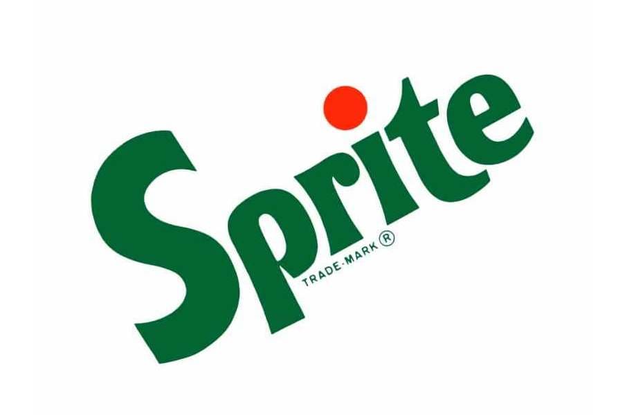
During these years, there is a second change in the brand logo and this time a somewhat more radical change than the previous one. The redesign that took place in 1974 brought with it a new typography and a new identity composition.
The name of the brand now appeared written diagonally and, with a totally different typeface from the previous one. A sans-serif font was chosen, with a thicker outline and smoother angles.
Regarding the color of the logo, Green and red continued to be used, but this time applied in a more balanced way. The brand name appeared entirely in green. As for the dot of the "i", the idea of continuing to use a red star is eliminated and replaced by a classic dot.
1989 – 1995
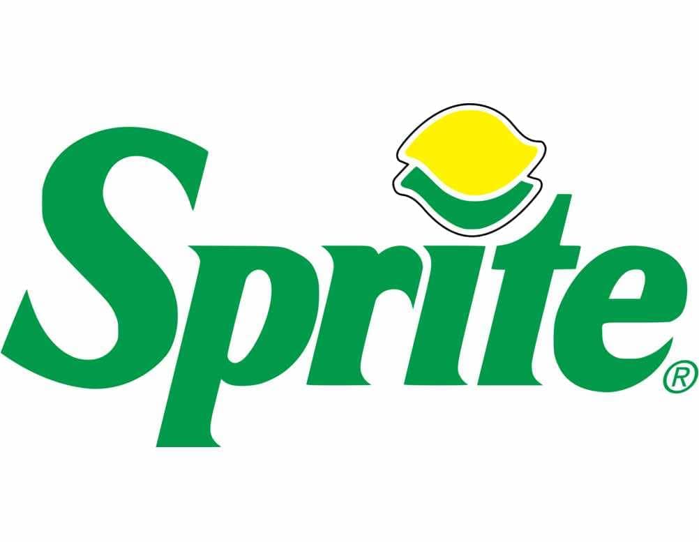
After approximately 15 years with the same identity, the brand decides that it is time to make a change of image and this takes place in 1989. The typography is modified by a much more elegant and powerful font due to its weight. It is a script typeface, with very striking pointed serifs.
As we have been seeing throughout the evolution of the beverage brand logo, the punctuation element of the "i" has been changing over the years and at this stage it was not going to be less. In this new version, the classic idea of keeping the point is replaced by a design in which a lime and a lemon appear superimposed between them. In terms of color, as can be seen, more refreshing green colors are chosen.
1995 - 2002/2003
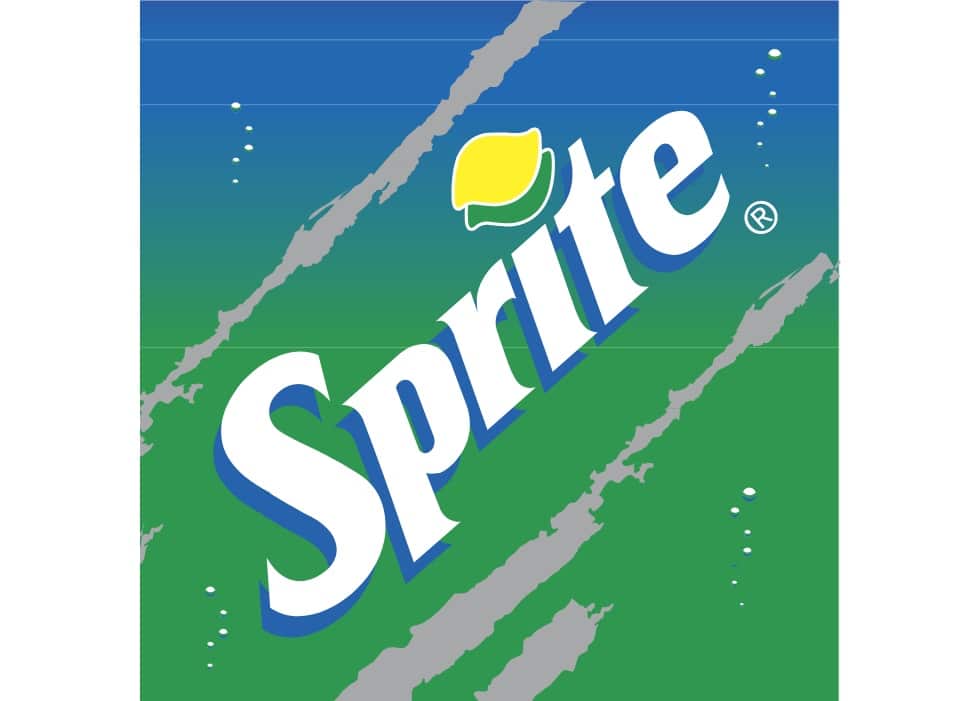
After about 6 years, the soft drink brand logo undergoes a new redesign to a version with a more abstract style than the previous ones. In this new version, the brand logo appears with white typography, placed in a much more inclined direction than the previous version.
The name of the brand is located on a background in which you can see gradient blue and green colors, in which lines and circles also appear that seek to imitate the bubbles of the drink. To make the brand name stand out much more, a volume effect is used with blue shadows.
The decorative element that appears on the letter "i" is changed again, this time the drawings of the fruits disappear and a more classic design is chosen, two circles one on top of the other, but the color of lime and lemon is maintained.
2002 – 2010
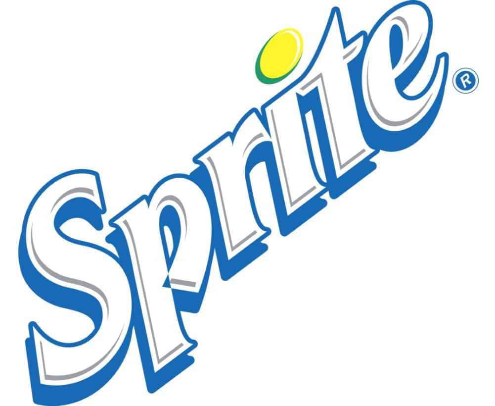
In the year 2002, a new brand identity for Sprite is presented. In it, the typography used in the logo had undergone some changes, becoming more modern, more polished and adding some very distinctive edges.
The white color was kept in the brand name and, added a new powerful dark blue outline. Completing the emblem, the punctuation of the letter "i" becomes more elegant and smooth by modifying the shape of the point and the colors.
The version presented during this stage, they also have a horizontal version, where the shadows that accompany the letters are much thicker and the decorative element of LA lime and lemon, is much larger in terms of size.
2008 – 2022
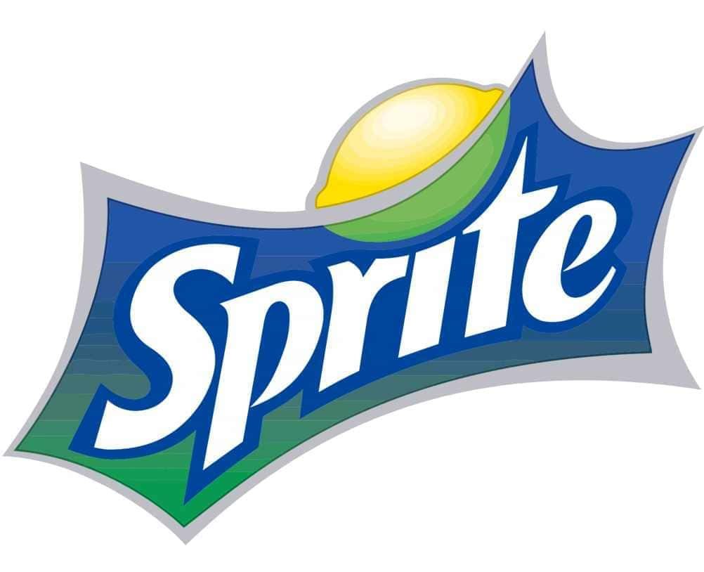
In the year 2008, as we can see, the Sprite logo becomes more refined and the font used for the brand name softens. The border that accompanies the name becomes a darker color and all this is collected in a five-pointed insignia arched by its union paths.
The decorative element placed on the letter "i" changes again and, in this version an oversized lemon and lime design are featured which occupies the upper part of the logo badge.
Over the years, this version is being refined and the blue and green background is removed, to make way for a much cleaner logo like the one we see below that appears in the year 2014.
Four years later, the logo of the beverage brand goes through a new redesign where the decorative element that has been accompanying the letter "i" disappears for so many years. Simply, the name of the brand and the badge that collects it appear, all in a lime green color.
The penultimate redesign of the brand is presented in 2019, where the brand changes the colors used in the logo. The name reappears in white and the badge is filled in a fresh green color. As for the emblem icon, a yellow dot reappears, which seeks to represent the flavor and freshness of the drink.
Sprite Global Rebranding
The soft drink brand this year 2022, has presented its latest redesign in its identity. The brand presented a clear problem and it was the lack of solidity in a global market., that is, his visual balance was null and the coherence in his communication even more so.
It is for all this, that a change was needed, it was necessary to delve deeper and seek coherence. The rebranding to which the brand underwent this last year has been very satisfactory since a much simpler logo has been created.
Currently, the beverage brand has eliminated the logo that included the brand name in order to give the name much more prominence by Sprite. What, if it is necessary to point out, is that this element is still maintained in the caps of the glass bottles.
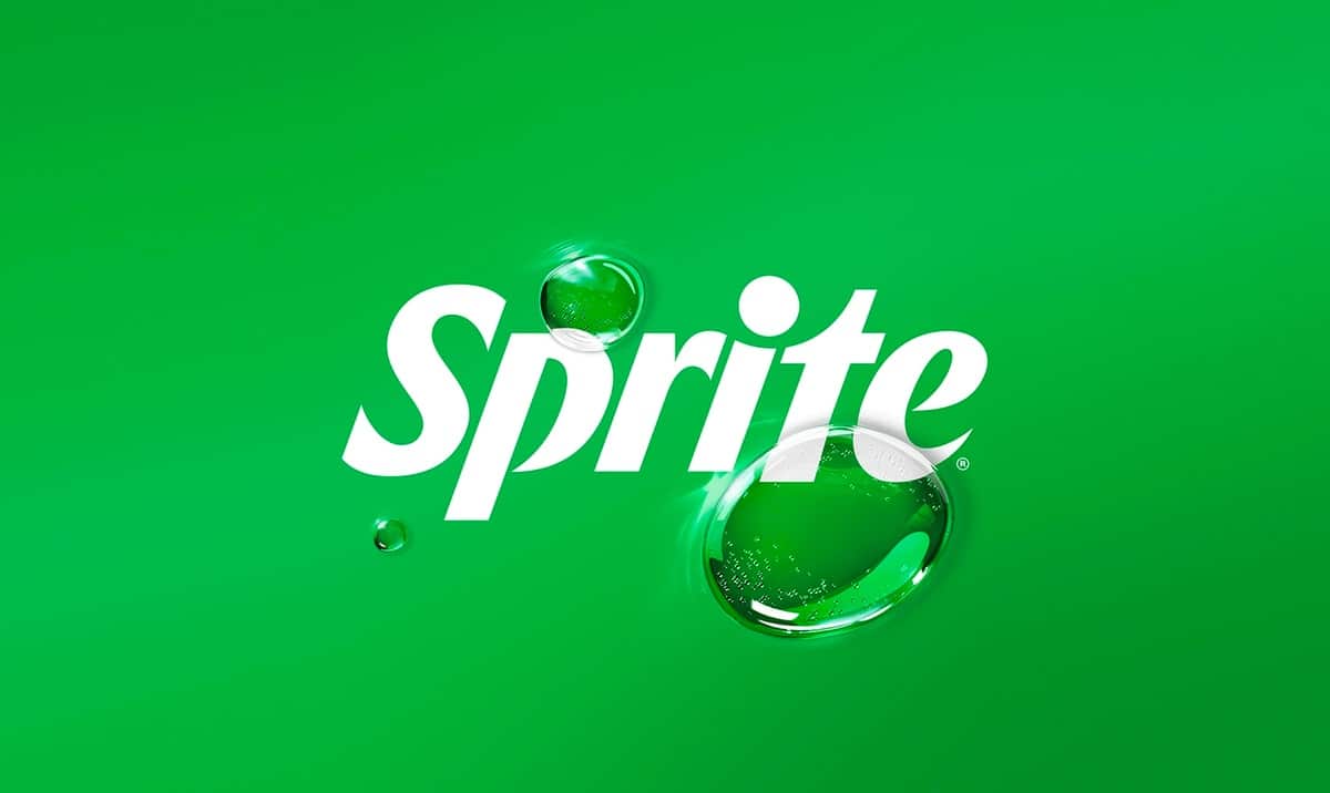
With this new redesign, We have sought to create the same appearance globally, a uniform and consistent appearance. The main objective of the graphics used is to preserve the green so associated with the brand. In reference to the logo, as can be seen, it is a sharp, clear, bold design that transmits dynamism, freshness and modernity.
This new change has been a surprise since Sprite recently presented a new identity, just two years ago. With these new changes, Sprite has sought to create a more striking and impactful identity. He seeks to be true to his strong personality and authenticity, which represents his refreshing character.
We can conclude by pointing out that this new and latest version of the Sprite logo is understood as the definitive design option that unifies the soft drink brand on a global level.