
On many occasions we have shared with you quite a few selections of inspiring logos and we have influenced on many occasions in the process of designing logos and corporate images. Although design and art are different things, it is true that both branches have undeniable links and that they inevitably feed back. For this reason, I would like to analyze some of these connections in a new series of articles in which we will relate the most relevant artistic currents of recent times with logo design.
I would like to start this special with a tremendously representative school, The Bauhaus which reflects very well the connections that exist between the world of art and graphic design.
Etymologically, Bauhaus means "house of construction" and although it was largely an art school, the truth is that it brought together some other disciplines such as architecture and design. His origin dates back to 1919 in Germany and we could say that his father was the architect Walter Gropius. It was not an archetypal school but on the contrary it stood out to the point of being considered by many scholars as the best school of art and design of the XNUMXth century. After the first Great War Gropius set out to develop a new public and state-level art school. The main incentive of this project, and which did a great favor to graphic design by the way, was to include within it the schools of arts and crafts. This became a revolution at all levels since at the social level it suppressed any kind of difference between two basic figures in the art world: that of the artist and that of the craftsman. Equating both figures at the same level, graphic design would be conceived from then on as an artistic trend sharing the same value and esteem as painting or sculpture. All of this meant that from the very beginning it caused great repercussions on the artistic scene and was always involved in debates and controversies. The truth is that there is no doubt that the foundations proposed by our school needed, especially contextualizing it on a historical and social level, great courage from all those pioneers. In addition, the working methods they used were innovative and revitalized the way of understanding each of the disciplines involved, something that drew the attention of the educational and teaching dimension and made the community of teachers and students involved in the current multiply vertiginously. Along with Gropius were from the beginning figures of the stature of Paul Klee, Vassily Kandinsky, the painter and designer Oskar Schlemmer, or the designer and photographer Moholy-Nagy; in short, some of the most innovative artists of the time.
Where did La Bauhaus come from and what features characterize it?
Our current was founded in Weimar, Germany and we could say that more than a study center or an academic trend it became a philosophy or way of life, managing to transcend the limitations imposed on the society of that time. It shares certain similarities with the postulates of Art Deco and was a clear basis for the subsequent emergence of minimalism (remember that the latter arose after the Second World War) since among its main characteristics and lines of development is the idea of rationalizing. Our artists conceived the process of creation from a prism that tried to eliminate and suppress all those superfluous elements in order to achieve a decomposition in the design in its most basic elements. Below we will see in a more graphic way these examples adapted to logo design and graphic and corporate identity.
Corporate identity and logo design
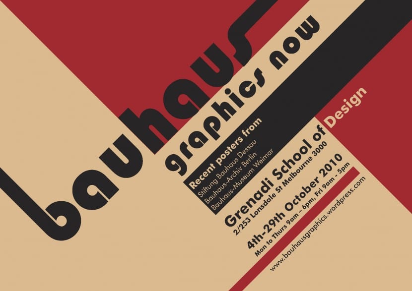
From an artistic perspective, the Bauhaus also includes within its proposals some lines of work quite similar to those used by the Russian Constructivists who also drank from simplicity and courage when making proposals. The result of his work was an easy assimilation by the public due to the lack of ornaments and its simple, brutal and at the same time beautiful component. At the chromatic level we find colors and ranges that are very representative, highlighting the red colors and the black colors. Although these two options are very representative, the truth is that any color that had a clean finish and that was part of a flat and contrasted composition worked very well as an identification of this movement. In the cinema there was also an impact and a good reflection of this are Wes Anderson's films, especially Los Tenenbaums, where there is a marked use of the Futura typeface, a font that although it was not created at the Bauhaus Yes, it was developed at the same time and has very rationalist connotations as well as avant-garde aesthetics.
As you may have noticed all these features, understanding them broadly under a balanced minimalism, they can still be found today in modern design, being very good examples the Faboo Taboo and Axion logos.