Source: 1000 marks
The redesigns have always helped to a large extent to develop other new logos that contain characteristics similar to the previous one but always with a much more renewed and characteristic version.
We also find logos, which completely resemble other designs that have also been created with the aim of showing a public image, both on television and in other media.
That is why in this post, We are going to show you a series of logos that resemble the famous Netflix series that so much turmoil has caused after the premiere of the fourth season, Stranger Things. A logo that has escaped from the 70s/80s, to offer us a wide variety of vintage themes and designs.
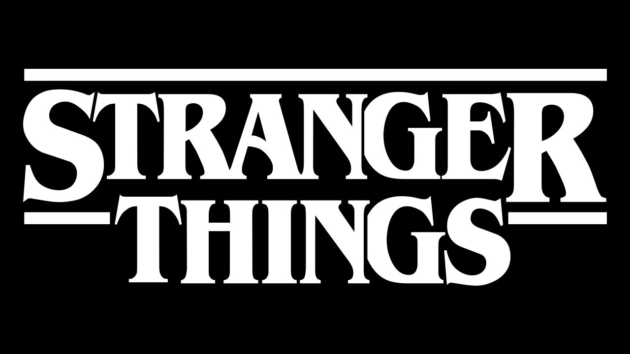
Stranger Things Logo
Source: Graffica
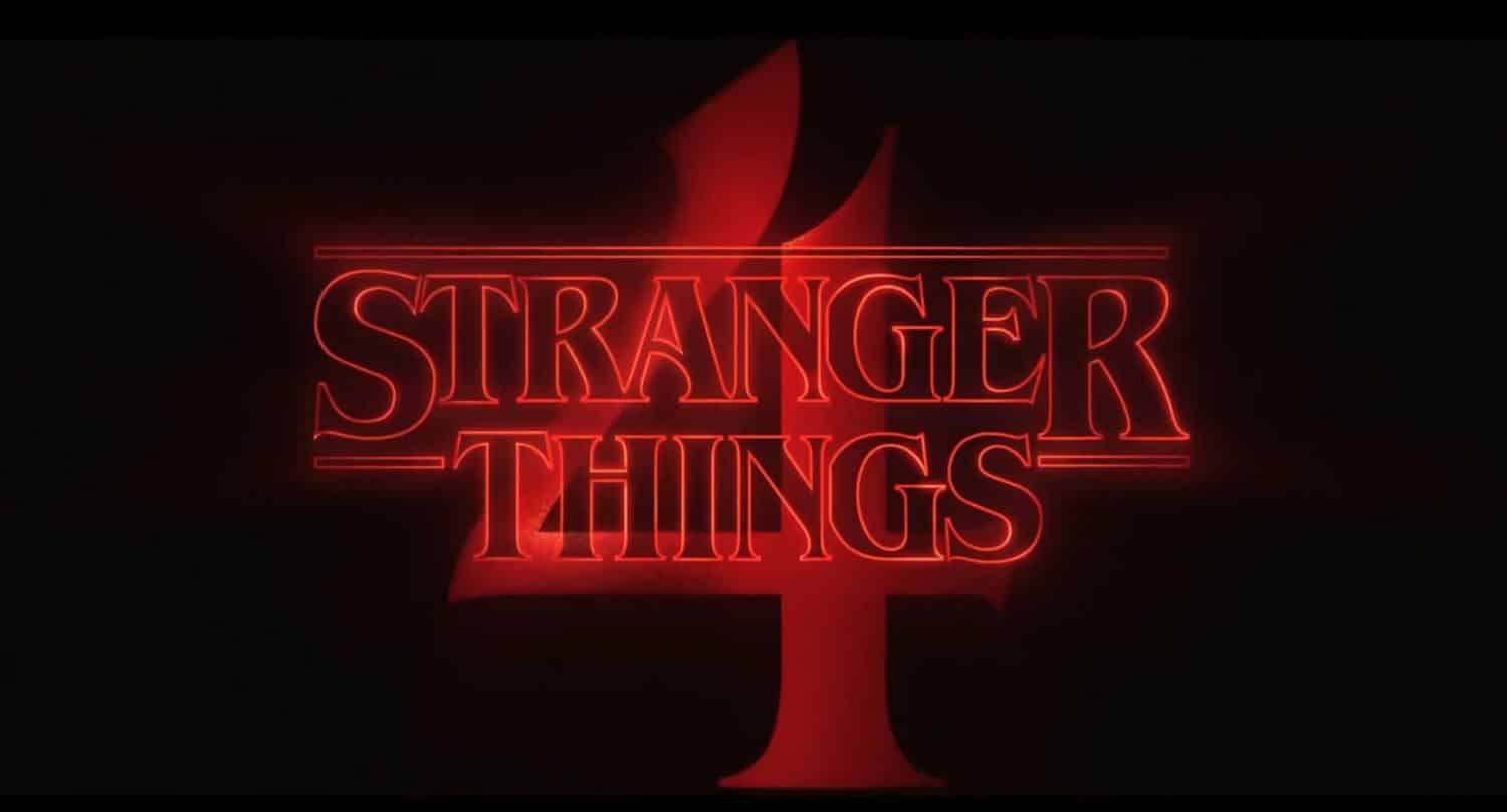
Stranger Things is a Netflix series, set in the famous town of Hawkins, United States. The series boasts an aesthetic and vibe that hails from the '80s. A series with a lot of vintage design that has also crossed the screen, and not precisely because of the plot, but because of the design of its image, in this case the logo.
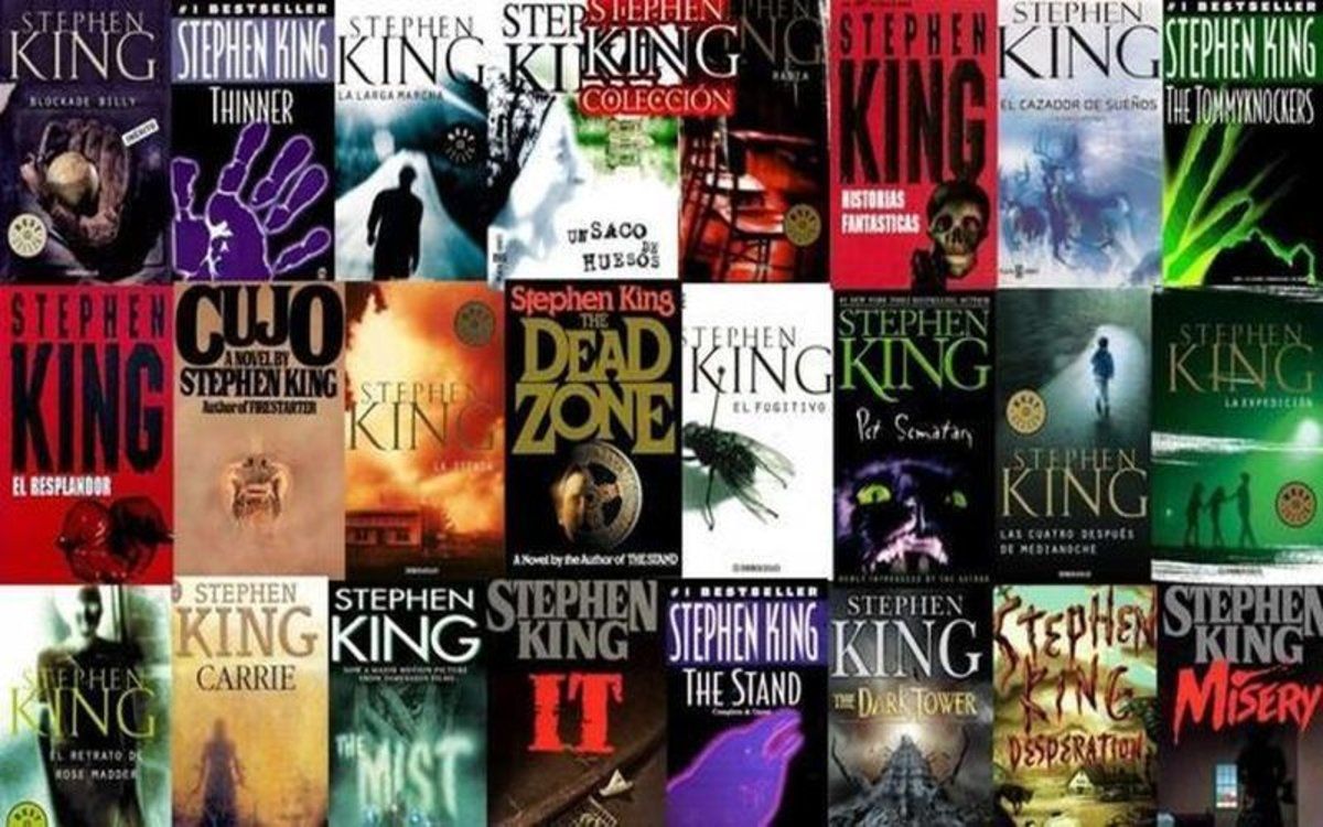
What you didn't know is to design the famous logo, were inspired by some of the covers of Stephen King movies. The famous science fiction writer has been the main influence in the design of the logo that is part of the series.
Source: The newspaper
In this way, this led to a constant capture of influences by different designers, including Richard Greenberg, the designer and creator of the titles for the Aliens or The Goonies movies. A whole aesthetic of mystery set in retro design, which leaves behind all expectations of comedy, to move on to drama and science fiction, with connotations typical of a bygone and revolutionary era such as the 80s.
Without a doubt, if we agree on something about the Stranger Things logo, it is that it not only combines design, but also animation. Every time we see an episode of the series, we can see how it has an introductory part where the logo takes center stage on the series, since it contains a small animation. This type of animation was very popular in many films of the 80s, taking the logo or symbol as the main reference, in this way, it did not become a background element for many of the spectators or fans who see the film. Serie.
similar logos
Jaws 2
Source: design
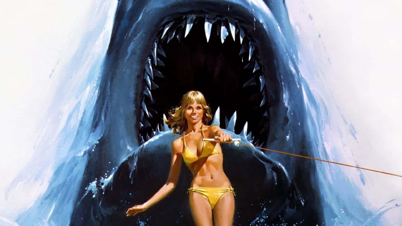
One of the designs similar to the aesthetics of Stranger Things, is undoubtedly the cover of the movie shark 2. Not only because it is a movie set in the terror of the 80s, but rather, for the series of illustrations that the designer himself recreated for its cover, and in this way, manage to captivate the attraction of an entire audience, which became a great fan of this film.
Undoubtedly, Shark 2 has also left a mark on the cinema and not only because of the plot of the film, but also because of the striking design of its cover.
Mad Max 2
Another of the films or designs that also maintains an aesthetic similar to Stranger Things is undoubtedly Mad Max 2. The famous science fiction film, It has been crowned as one of the key designs set in a bygone era.
It is another example where the logo designer and the producer of Stranger Things have been inspired for the logo design. As you can see, not only does it have an aspect typical of the 80s, but they have also managed to turn the design around to opt for other possibilities.
Los Goonies
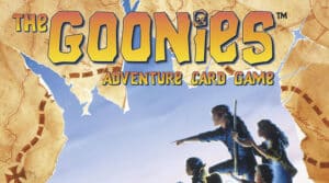
Source: Ludonews
The Goonies have been another of the designs so characteristic of the influence of the Stranger Things logo. Without a doubt, it is another of the references to take into account during the design phase of the logo.
A series also set in the 80s, something more lively than the aesthetic so mysterious of Stephen King, but that has managed to captivate the attention of many of the spectators.
Without a doubt, a design that goes beyond the plot, and that is also classified as one of the best designs in the history of cinema.
Conclusion
There are many redesigns or designs that have been created that are similar to each other. Some of them have been the result of research and the inspiration of other designs.
As we have been able to verify, there is a wide variety of designs that not only meet the expectations of the design of one of the best Netflix series, but rather, the designer himself has also chosen to maintain a unique and incomparable aesthetic.
We hope you have learned more about this type of design, and about the Stranger Things logo, which has already revolutionized thousands and thousands of screens.