
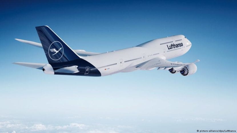
The famous German airline Lufthansa will introduce changes in logo design over 100 years old. The new identity will be officially announced from February 7, 2018 at an event in Frankfurt called #ExploreTheNew. It happened that some images of the new identity were seen for the first time last Thursday. The passengers of a Boeing 747-8 saw the brand in an advertisement for the new edition of the in-flight magazine. Therefore, the brand had to communicate the new changes during a conference in Cape Town.
The new logo will keep its iconic crane but will abandon the yellow color to replace it with the blue and white duo. In this way, we will see the crane and its container circle on a dark blue background. According to Lufthansa CEO Carsten Spohr, the redesign of the brand responds to the need for modernization of the airline's vision.
Criticism of the new logo
On February 1, Andreas Spaeth, aviation journalist, tweeted a post with the first news. In it, Spohr was holding a tablet presenting the new render with an aircraft of the new fleet. The description of the image stated that they plan to paint 80 aircraft by the end of the year and that it would take them eight years to paint the entire fleet.
However, the criticism was not long in coming. Social media was filled with controversy when airline users criticized the The airline's decision to ditch its iconic yellow color. According to customer comments this is a great differentiator and replacing it would be like denying the identity of the brand.
On the other hand, the aviation writer Enrique Perralla wrote that the re-design is soft and meaningless. Also, industrial designer Clemens Weisshaar provided his opinion. He defined the new corporate strategy as a "plank" explaining that the new concept ignores the legacy of Aicher's design. The designer also criticizes that these colors are related to a bad insurance company or a decaying bank, with that dark blue so belonging to capitalism.
The history of the logo
During the sixties the by graphic designer Otto Aicher updated the identity. Together with his group of students «Gruppe E5» belonging to the Ulm school redesigned the logo. In this way, they added the characteristic yellow color of the brand. This color provided great ability to differentiate. Since in the competition the white and blue or red colors of most contemporary airlines predominated. On the other hand, they replaced the previous typeface with a Helvetica Bold in low box. As well they re-drew the crane generating a more aesthetic and proportionate composition.