There are many brands that you can look at to get inspiration when creating logos. But also to know the history and better understand the essence and meaning of the logos (the choice of color, icons, etc.). That is why we have focused on the Maserati logo. What do you know about her?
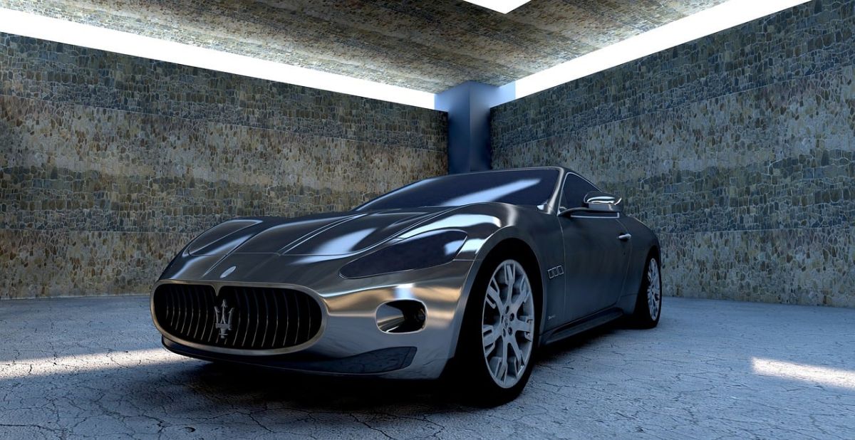
This brand is one of the best known in the automotive sector and is related to a high range of vehicles. She was born in 1914 in Italy, but now she is known all over the world. And although in 1990 she became part of the Fiat Chrysler Group, she continues to maintain her origin.
Maserati's history

Before going on to talk about the Maserati logo and its evolution, meaning, etc. you should know a little more about the brand itself.
In this case, Maserati was born on December 1, 1914. At that time, the Maserati brothers launched their project, but it was not a high-end brand nor was it a car brand itself. Actually, it was a car workshop.
They founded it at 1 Via de' Pepoli in Bologna, and in their spare time they began designing cars. Especially since they were caught up in World War I and didn't have much work (although it was also around this time that they decided to open a spark plug manufacturing business in Milan, the Fabbrica Candele Maserati). Still, that made Alfieri, one of the brothers, would like to go one step further and transform his designs into something real. For this reason, he looked for a disused factory in Pontevecchio and they moved there to found a new company: Officine Alfieri Maserati SA
The birth of a logo
The Maserati logo was not born as soon as the company was created. In fact, it took them a year to realize that they needed that reference image and to help them identify themselves among their competitors. For this reason, Mario Maserati, one of the brothers who was not interested in engines (and was interested in creativity), was in charge of designing it.
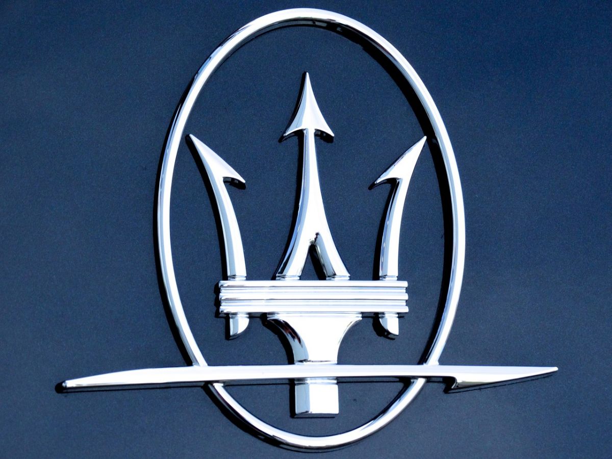
If you've seen the logo, you'll know it's a trident. Many think that this has to do with the devil or with being "bad", not in the sense of quality, but of being superior and worthy of a god. But in reality the inspiration of Mario Maserati is more earthly.
He noticed the Fountain of Neptune that is on the Playa Mayor in Bologna. In case you don't know, this statue means vigor and strength, and that is what this brother wanted people who saw the logo to make them feel.
After thought about the color palette, and used red and blue because they are part of the colors of the Bologna flag which was where they were settled at that time (we are talking about 1920).
So we can say that the trident is that of Neptune who, as you know, used it to channel his power and thus subdue his enemies.
The evolution of the Maserati logo

And now yes, we are going to tell you a little about the evolution that the Maserati logo has undergone. Keep in mind that, since 1920 when they decided to have a logo, many years have passed and they have been modernizing it over time.
However, we've had trouble finding the first real logo (if there was one before 1926). And it is that some publications talk about the logo being introduced in 1926, which makes a total of 6 years where we do not know if Mario Maserati designed another previous logo or not). If we take into account what we have told you about the origin of the logo, we would say yes, because the one that was maintained from 1926 to 1937 does not seem to have color.
De 1926 a 1937
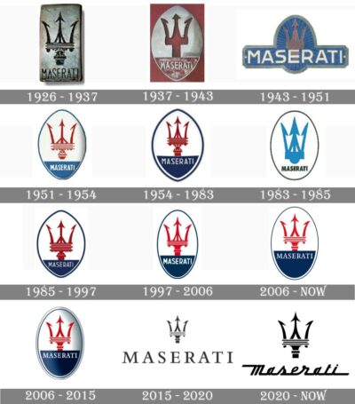
We start with one of the oldest logos. This, Introduced in 1926, it was a vertical rectangle with a silver-colored base. Inside it was the mythical trident with some grilles simulating a radiator. It was composed of 3 horizontal black lines separating the harpoon from the base of the trident.
Right below they put the Maserati brand, all in capital letters, and in sans serif. The letters were all the same size and the trident was prioritized over the brand name itself.
The first change of the Maserati logo
During the years 1937 and 1943, the Maserati logo changed. In this case, Inside the vertical rectangle in red, they put an oval in gray also vertically. And within this they redesigned the trident for a simpler one.
Then, at the bottom, the Maserati name was placed, all the letters in capital letters, with a red background.
Maserati's biggest change
It was in 1943 when the Maserati logo changed almost completely. In this case they used a different color palette, with blue, white and gray. They got rid of the rectangle, keeping the oval, with a blue background, which contained only the trident. This was crossed by the name of the brand, Maserati, in white and all capital letters and the same size.
One more twist
The next evolution only lasted a few years, from 1951 to 1954. In this case looks a lot more like the 37s logo, where you had the oval and separated the trident (which almost returned to its origin) and a part for the name, within the same oval, and with white letters. The background was blue in the case of the letters and white in the trident, which appeared in red with all the blue border.
De 1954 a 1983
Actually, we could think of this Maserati logo as a kind of "polishing" the previous one, because it really preserves all the elements that we have mentioned, only that it was done in a clearer way and with a more professional result.
1983 to 1985
Despite the fact that the previous one lasted a long time, this one was not well received and for this reason it was withdrawn soon. It still kept the oval with a blue border, but the crown was redesigned in blue and the Maserati name appeared below in black (but with rather small letters).
1985 to 1997
So they went back to 1954, with some minor tweaks.
De 1997 a 2006
Following the base of the previous logo, in this case they refined the oval with respect to the one they had before, keeping all the other elements. One of the main changes was that the letters were thicker without losing clarity and sharpness.
2006 to 2015
The new change only had to do with the size of the oval, which put it in a more "perfect" shape. It still had the original trident in red and the blue background for the word Maserati in capital letters.
In addition, it was also used at that time the logo in a three-dimensional way using gray gradients. In this case the logo was made a little smaller, but it was still readable.
2015 to 2020, a change of direction
This is where we can find the biggest change of the Maserati logo, losing the oval and leaving only the trident in black and, below, being larger, the word Maserati. It was in the E where the trident fell. And all in black.
2020 to 2023

Until now, the logo is also kept in black, only, although the trident does not change (it gets bigger) and remains in the position of the E, the typography of the word does. is modified to a font of joined letters, as if they wanted to signify a movement.
Have you analyzed the Maserati logo like this?