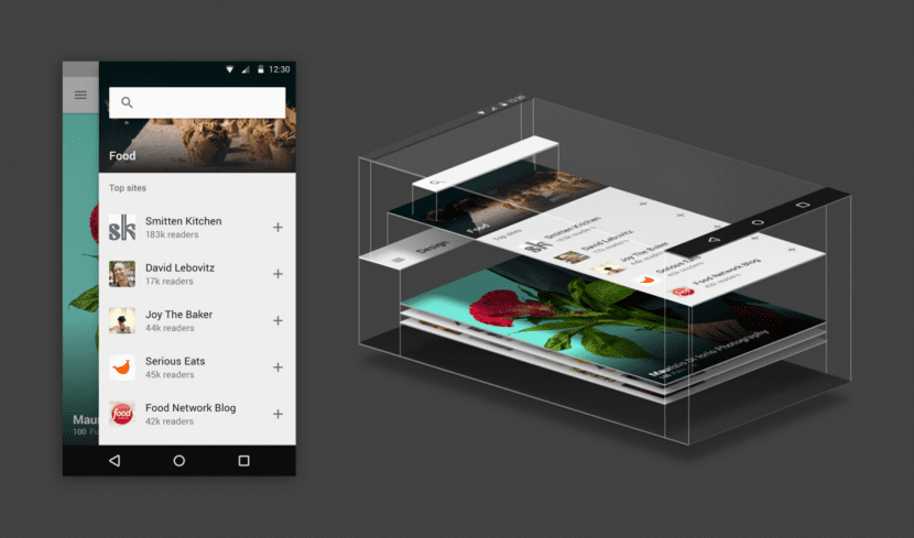
It's been almost two years since Google developed and announced at the Google I / O conference the Material Design as a design regulation that would be implemented and that although at first it was focused on the reproduction of content in the Android operating system, it was intended to become a trend on the web and on any platform, something that we can confirm today. Although we have mentioned it on occasion, the truth is that we have never stopped to see this encoding in depth, so today we are going to review its principles and its most characteristic features.
What are the defining features of material design? What does it have to do with the Flat Design movement?
What to say about this trend in web design?
Its name comes from its most practical sense, matter or materials need to be organized and structured as efficiently as possible and you will focus on it. This movement seeks above all flexibility, ergonomics and the ability to fold and simplify the construction of a website. But not only the spatial dimension will occupy an important place, but also that of time, since now the elements will occupy certain positions at certain times, that is, dynamism will also be a key factor. In addition, these factors will be inevitably guided by the intellect and logic, which ends up leading to a search for realism and the spatial representation of physical matter, in fact it takes into account the laws of physics and with it the elements (images, buttons , panels ...) cannot cross each other because they have greater weight and visual density, instead what they will do is overlap each other.
Order, clarity, readability
All these principles derive, of course, from the way in which the graphic components are managed and distributed, including typography, which will above all be a clear readable solution, the textual structure will be conventional and fluid, visual hierarchy motivated by the use of more or less strong tones generating contrasts that will also be nuanced through size and order.
Lighting and realism
The logic is manifested above all in the use of lighting effects and the management of both lights and shadows. Lighting is a great indicator of proximity, relevance and situation, so this will become a fundamental tool to influence that hierarchy of which we were talking. Now, buttons, images and all the elements will have shadows that will indicate the degree of proximity and will help us to position ourselves on the web stage.
Movement is the most effective tool to capture the attention and guide the viewer
Its language will be obvious, graphic and enlightening in the eyes of the user. When choosing an option or tool, it will approach us, expanding its dimensions and vice versa when we stop using it. Also, an item will change color or blink if it absolutely needs to attract our attention.
Rhythm, order, language
Let's not forget that deep down we are speaking in a mode of discourse. We go through the resources that web design offers us and therefore all the technical-expressive parameters have a meaning: From the order of appearance, for example first the images and then the floating buttons, to the speed at which they appear, in what direction they do it and to what end they move. All this is important because not only is the user indicated where the information comes from, but also the journey is facilitated, the elements are arranged in order to make the reading process intuitive, easy and enjoyable. Undoubtedly animation and dynamism is a basic pillar.
Unlimited coding
All these principles or standards that we are reviewing are designed and developed for implementation on any medium and platform, regardless of its nature and the screen size it presents. From mobile phones, tablets or computers. All possible supports and destinations support this visual language and in fact its transversality and compatibility is one of its essential ingredients.
Flat design is not the same as Material Design
Although they share many points in common, such as the commitment to the most resounding minimalism, there are also enormous differences between both codes. However, they are not incompatible and can certainly be perfectly combined to obtain the best finishes, but we will talk about that in a later post.
Fran, I found your publication very interesting. There is not much information in Spanish on this topic. So, if you're interested, I have the Spanish translation of the Material Design specification on my blog. Like you, my interest is that the information reaches the largest number of people, so that they can take advantage of it.
regards
Very good article!! I did not know anything about "Material Design" but about "Flat Design", if only for particular tastes. I will try to follow some of the tips.
All the best
David