
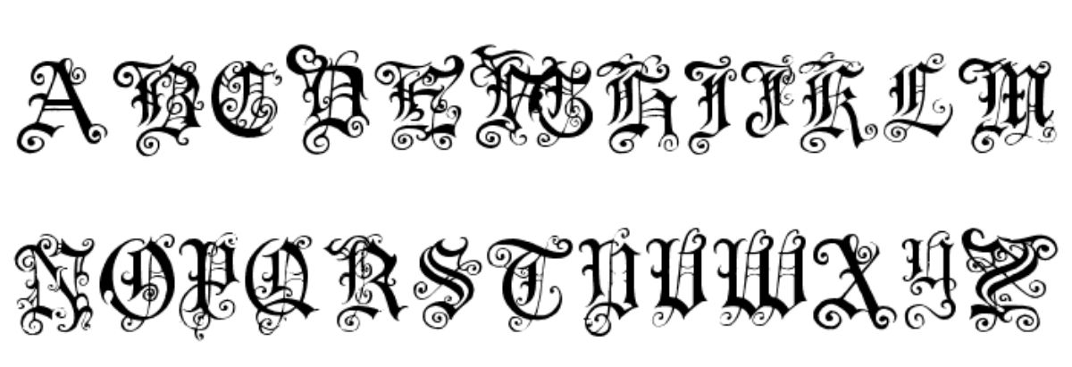
Medieval typeface, also known as a gothic font, is one of the most elegant and ancient you can find. Using it evokes the Middle Ages, times of knights, castles and fights between fierce warriors.
And although today we left that time behind long ago, as a designer you may find yourself at some point with a project that needs this type of typography. Therefore, it doesn't hurt that you have a few medieval sources to be able to present different proposals to your client, don't you think? We talk about the medieval typography.
Medieval typography: what is its origin
Medieval typeface, or gothic typeface, It was created in the XNUMXth century and its objective was to write the Gothic language, which was the one spoken by the Goths. Its origin is found in the so-called Codex Argenteus, or in its translation, "Silver Book or Bible." This was written in Latin and was written by Bishop Ulfilas. However, it was actually a translation from Greek from a XNUMXth century bible to Gothic.
If you notice, the original gothic was quite "understandable", since the lyrics did not have much paraphernalia. There are also some letters that now differ by what you would say (for example the g that looks like an r; or the j that looks like a g).
In the Middle Ages, this typeface was recovered and used as a graphic variety but giving it a more bombastic style.
13 Medieval Typography Fonts You Can Download
Since we want you to have a choice, we have made a selection of several medieval letter fonts that may be interesting. And varied. That project you have in hand can be a logo, a poster or even the cover of a book, and as with many other things, there will be a medieval typeface that fits perfectly with each project.
Pauls Swirly Gothic Font
We start with a medieval typeface that will attract your attention for the flourishes it has. And it is that its design is completely gothic. Now, you must bear in mind that it is really the capital letters that have that most ornate design; lowercase, although they are gothic, they are more softened.
On the one hand it is fine, because you can use capital letters to capture attention and lowercase letters so that the message is understood or the text you put is read well.
Cloister black
This type of medieval fountain is one of the best known, and the capital letters are those that carry a design with more flourishes while the lower case are much simpler.
Old English
In this case, with a medieval typeface that bets on fine lines, you will find one that appears italic in its lower case, But in the case of capital letters, these are designed in a somewhat more curious way, since within some of the letters it seems that a kind of flag or a drawing similar to one appears.
Faith collapsing
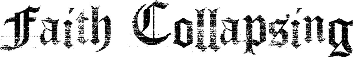
This medieval fountain is one of the ones we like the most for that appearance like mist it generates. Ideal, for example, for Scottish novels or if you want to give the project a touch between ghostly, gothic, old and mysterious.
Black family
Talking about Black Family will be long. And it is that all this medieval typeface has different variants that can help you find the one you prefer. The you have completely black, with some shading, with a relief effect (simulating a 3D), etc.
Ancient
With thick strokes, Ancient comes across as a fairly easy-to-understand typeface. Yes, his layout affects both uppercase and lowercase; and it is that these last ones seem, in some cases, to be formed by spears or points (for example the letter ene).
Medieval typeface: Angel Wish
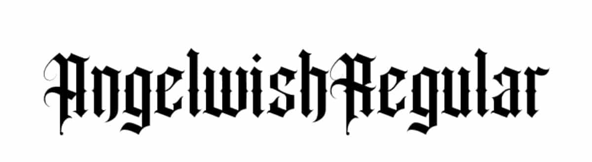
Source: FFonts
This is one of the medieval letter fonts for personal use only, which means that you can't use them commercially, but it doesn't hurt to know it. It is a little thicker than the one we have recommended from Olde English, but it follows a pattern very similar to this.
Its design seeks to lengthen the letters to achieve an interlaced effect between words.
ruritania
In this case, you have a medieval typeface that both uppercase and lowercase letters come with a lot of flourishes. That makes it difficult to read in many cases, especially depending on the word you put. We recommend that you do not use it in too much text.
For the rest, there is no doubt that it is very beautiful.
Cardinal
Another of the medieval typefaces of a style very elegant, neat and, best of all, legible, it's Cardinal. It is characterized by a line that is usually fine, and with minimal details (mainly lengthening some parts of certain letters (uppercase and some lowercase letters).
Medieval typeface: Medici Text
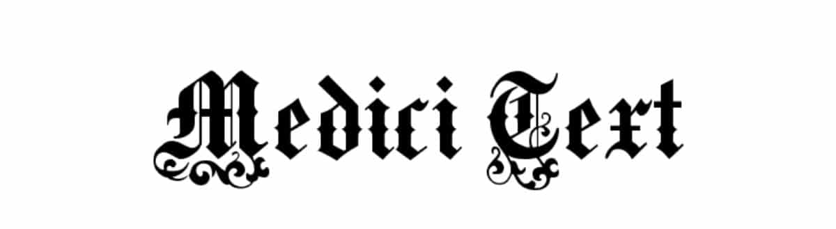
Source: FFonts
If you are looking for a letter whose ornamentation is in the lower part of the letter, this font may be perfect. If you pay attention, capital letters have many flourishes but almost all of them are located at the base of the letter, while the lower case letters are somewhat clearer, even so, they also make reading a bit difficult.
zenda
Zenda is a clarita medieval typeface, both uppercase and lowercase. Although, it has one characteristic and that is that all lowercase letters usually have diagonal lines that come out from the top and bottom. In the case of capital letters, it has a design between thin and thick lines that is very elegant. Try capitalizing the entire word to see the effect.
Vlad Tepes II
We could say that this typeface is a script because its design is very flowery, not because of flowers, but because of details. That makes it quite difficult to read, and we recommend it only for single letters, maybe you want to highlight a part, because if you put it, there will be words that do not understand anything because the lines blur each other.
Medieval Typeface: Frax Handwritten

Looking for a medieval typeface that looks like handwritten? Well you have this, Frax Handwritten, from very simple line that looks like it really has been made by hand. Of course, uppercase and lowercase letters are very simple, which makes them read clearly (with some you may have some difficulty, especially that, the ele ...