
Who would tell the arch-powerful Microsoft that in its beginnings, one of its logosIt seemed more like that of a rock band than that of a company dedicated to new technologies; mainly for being the one that changed the landscape of PCs until today.
And there is a logo that could pass for being the one from Megadeath or heavy music bands back in the 80s. Curious how the design language has changed and how that same company has been modifying its logo to put aside those oblique and very long shapes that we can find in the M, the R and the F.
It was back in 1980 when Microsoft took a step forward with a logo redesign that will go down in history, as it looked more like a metal band than a company dedicated to software development.
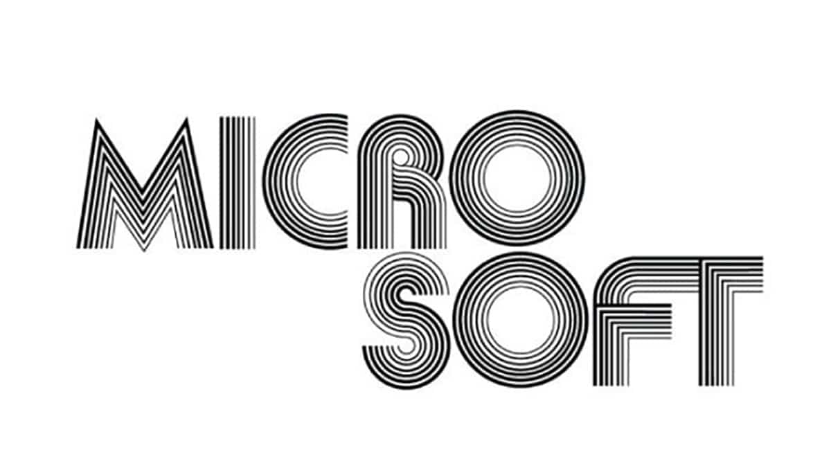
The shapes and those oblique letters with closed angles are curious and that it does not look like Microsoft itself. But is that if we go to 1975It almost seems that we are going to disco music with that funky that was so successful in that decade.
If things already changed their mind when we go to 1982 and the source take a more serious look with that middle vowel that is approaching what would be a technology company. And in 1987 we are getting closer to that visual memory and that we have closely linked to what this company dedicated to its operating system has been, although then it has been getting closer to other segments such as entertainment.
Not many people know this, but Microsoft was a metal band from 1980–1982. pic.twitter.com/8sP3dv2lU8
- Ian Bogost (@ibogost) November 19, 2019
Una evolution in the logo more than curious and that can not be compared to others like Apple in which the color was what stood out. It will remain there for the study and the future of this company that is one of the current software giants.