
Today, Microsoft, together with other brands such as Apple or Google, form the group of the largest and most powerful companies worldwide. Surely the vast majority of all of us, at some point in our lives, have worked with one of the products that Microsoft offers us, be it Word, Power Point, Windows, etc. This brand has been with us for more than 40 years, so let's see how the Microsoft logo has evolved over the years.
Do we know what the first logo of that company was like? We are going to start a trip to which we have to go several years ago and, with which we will discover the origins of this company. This brand has formed and continues to form part of the lives of many of us and, above all, of the history of humanity.. Stay tuned, as we begin this exciting journey into the past.
What is the story behind Microsoft?
computerhoy.com
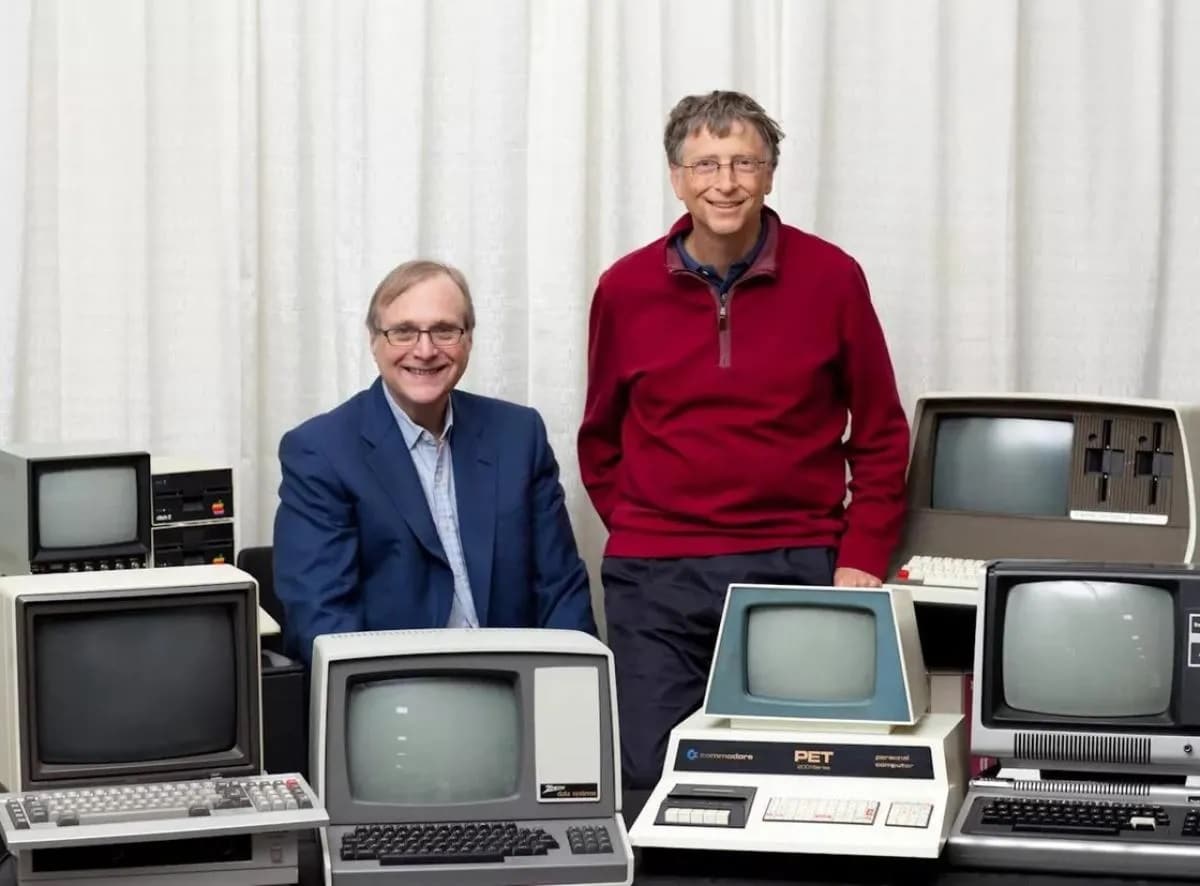
Surely, when you hear someone pronounce this name, you think not only of the company but also of the figure that represents it, its founder Bill Gates, something that is not surprising. The company was founded in 1975, by Bill Gates and Paul Allen, in the city of Albuquerque. In the blink of an eye, due to their specialization in the development and sale of information programs, they soon managed to become subcontractors of IBM.
In the 90s, the world-renowned Windows operating system appeared.. Over time, other successes also came, such as the development of Internet Explorer, the Encarta dictionary, the Office suite and games.
More than one of you, almost certainly, will have wondered where the name Microsoft comes from, well, they come from two English words; microcomputer and software, a very simple thing at first glance, isn't it? The company, in its beginnings, raised the idea of writing its name separating the abbreviations of the two words by means of a hyphen, but this idea quickly disappeared to give way to the name as we know it today.
A trip to the past: History of the Microsoft logo
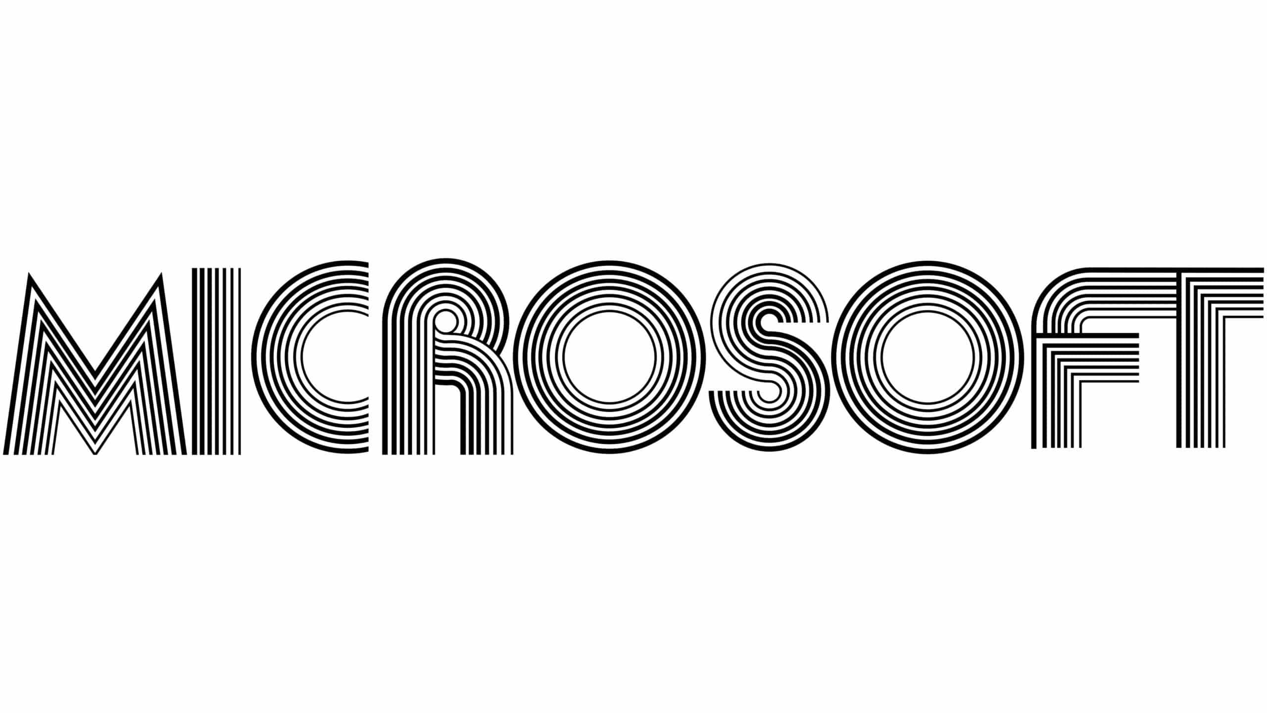
Both founders, named in the previous section, were involved in the design process of the company's identity. What were you thinking to design this logo? Well, we really don't know for sure. It is said that the founders found a vinyl plate and from there they thought that a record-inspired font would be a good idea.
Another of the assumptions that are made and with which many people agree, is that the typography used for the design of the company logo was inspired by the language used for programming. A logo made up of a sans serif font, original for the time and faithfully representing the 70s. A somewhat retro style.
1980: rocker redesign
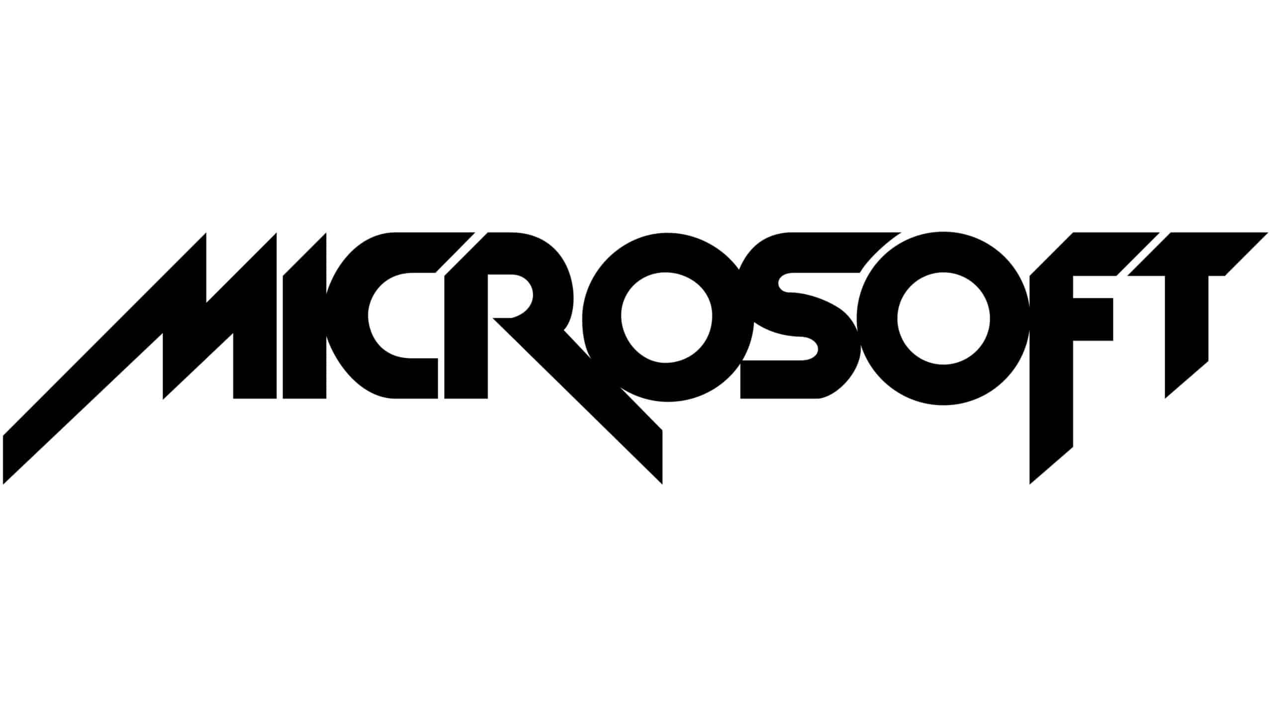
As we indicated, in 1980 the first redesign of the brand appeared. They present a new image in which an inspiration can be sensed in the music groups of the time. A totally different style from the previous stage.
The name of the company is written on the same line, not on two as could be seen in the previous step. Also, the typographic font used is much more compact and with a somewhat striking drawing in its characters and we could even say aggressive due to the pointed angles, elements that remind us of the Metallica group logo.
1982: Welcome Blibbet
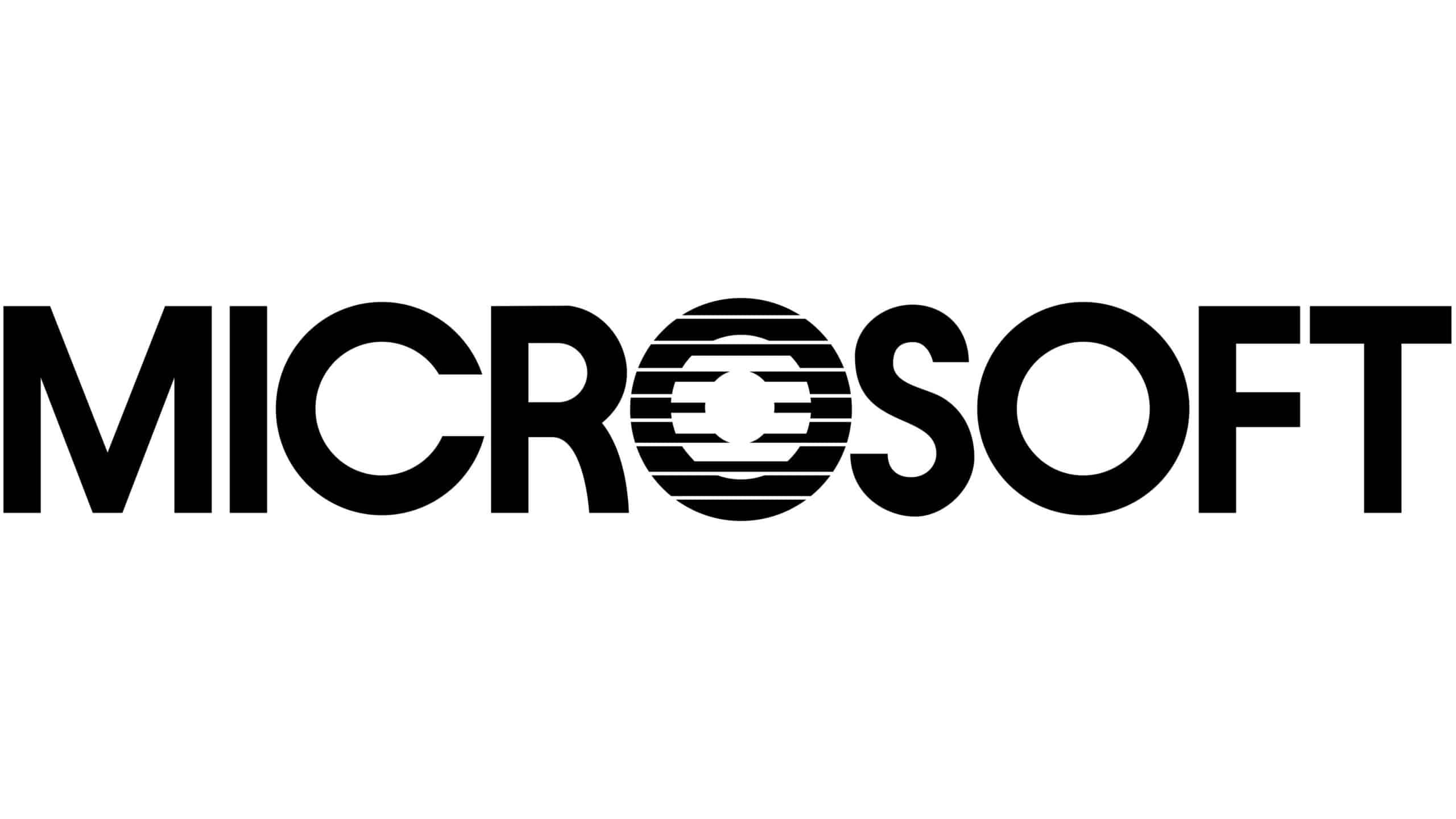
Two years after the appearance of the rocker logo, the nickname "Blibbet" emerges. The company leaves aside that style of musical group that we have talked about, and it focuses on a much more measured and corporate aspect.
For the name of the identity, a sans serif font widely used in design is used. The only thing that made it stand out was the use of horizontal lines on the O character which made for a CD-like effect. This made, that this letter, was used as the logo symbol of the company.
Late 80s: Pac Man World
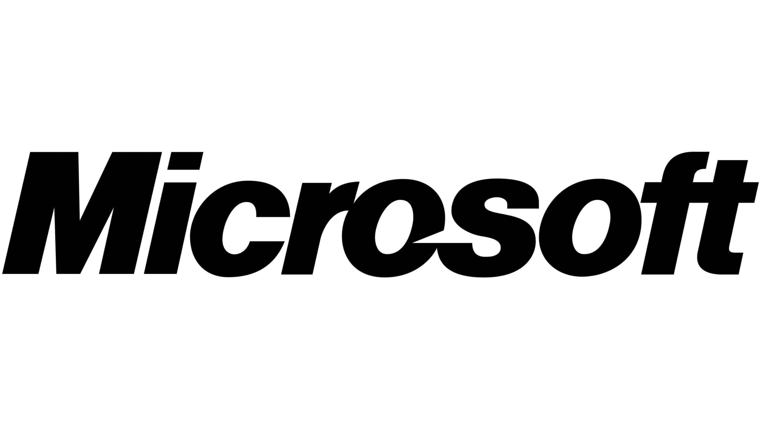
One of the longest used company logos was created in the late 80s. Many people dubbed it the Pac Man logo, now we will see the cause of this nickname. With this design, what the company was looking for was to demonstrate both its strength and its importance in the market.
One of the most common typefaces in the world of design was the one chosen for its composition, Helvetica.. A font that is still being used both a few years ago and today. As in the previous case, it can be seen that there is a somewhat striking spacing between the letters O and S, which is intuited as a nod to when the company was written and called Micro-soft.
In 2011, the company changed its motto and with it there was a slight change in the design of its identity. The designers reduced the tilt that existed between the characters.
Current era
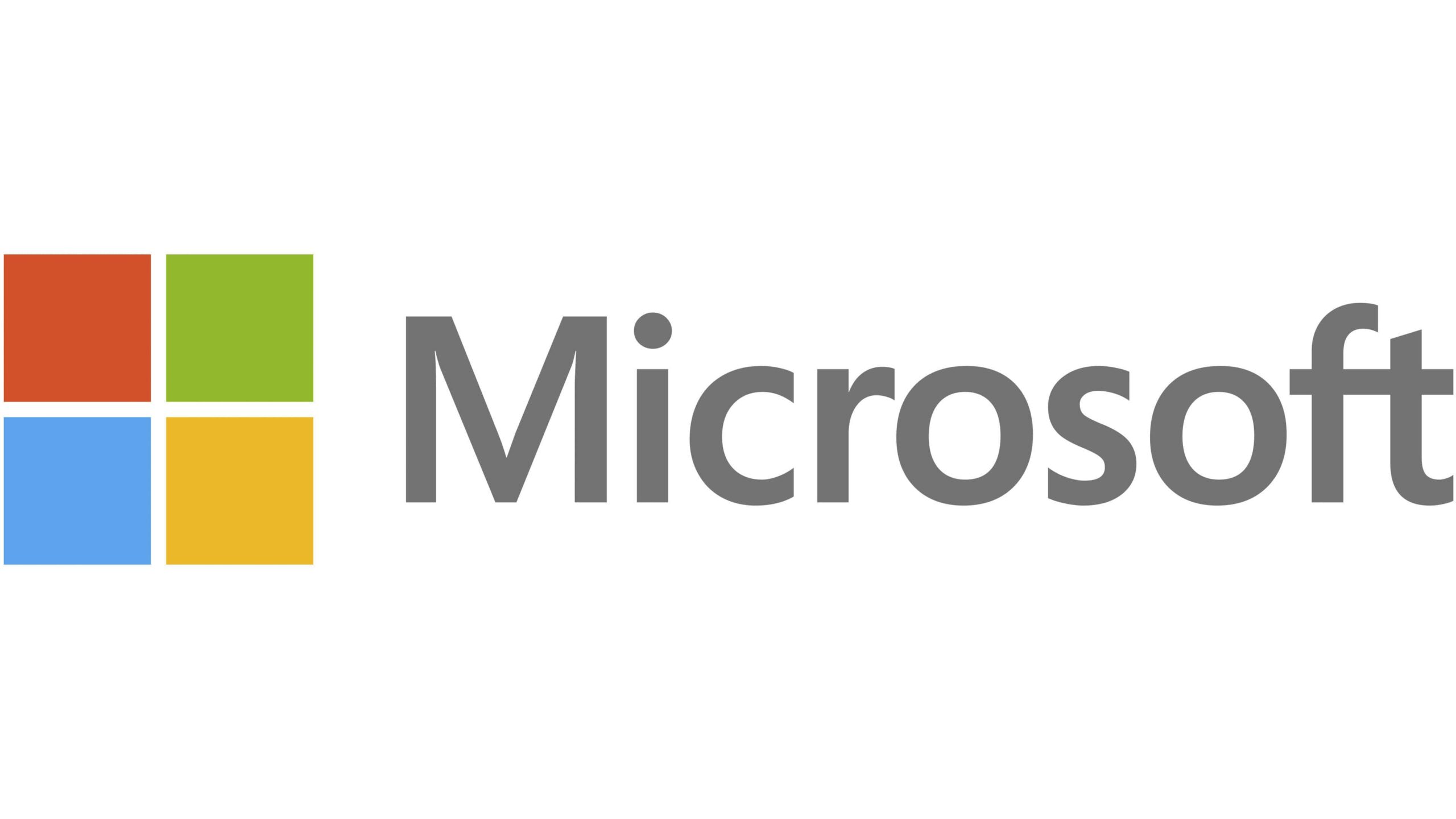
In the year 2012, it is when this new design of the Microsoft logo begins to be used, an identity created by the company's own employees. The design of italic and bold typefaces was left behind, and the way was made to use a different typeface, the Segoe UI font.
However, what is most characteristic of the logo of this stage is the colorful symbol that accompanies the name of the company, which makes it totally different from previous versions. A set of four squares with different colors, which form a kind of window, reminiscent of the Windows window, one of the company's most successful products.
There are many, the theories that have come out over the years of this distinctive element of the brand, one of them tells us that each of the colors represents a product of the company. That is, the red would be PowerPoint, the blue corresponds to Word, the green to the XBOX consoles or Excel, and finally the yellow that would be linked to Bing. In short, a very powerful logo design was built and it is here to stay.
What do you think of the redesigns suffered by the Microsoft logo? Do you think that the current logo faithfully represents the company? For us, it is a simple logo that adequately represents the company. The use of a simple typography and a clean symbol and, with the use of basic colors, give it a higher level and make it recognizable to all types of audiences.