
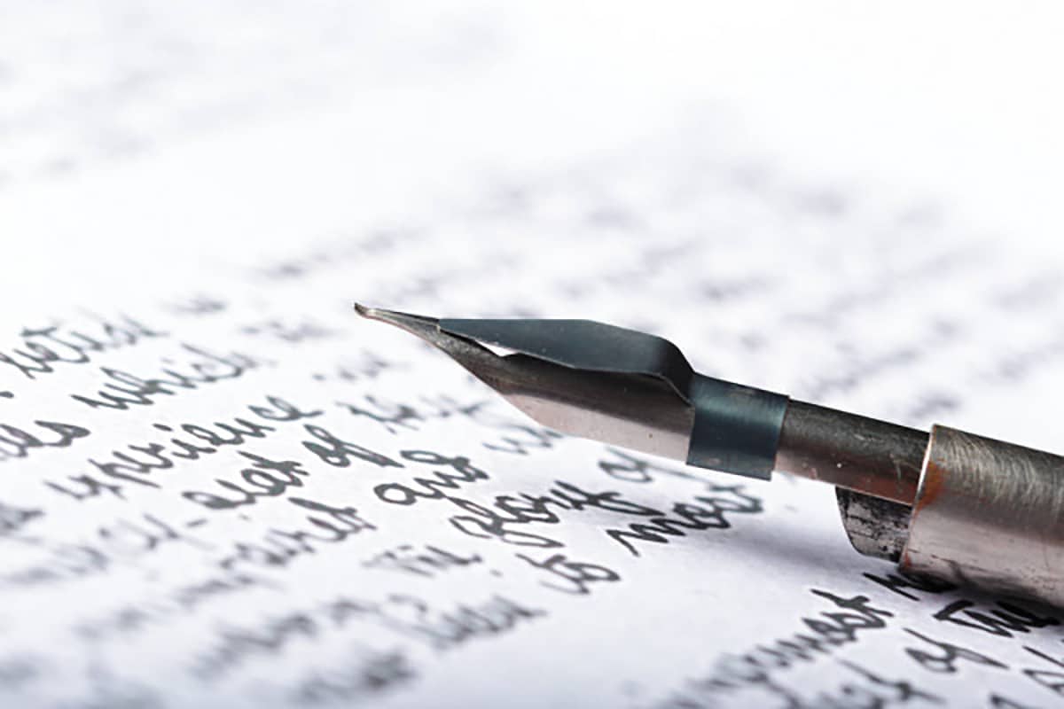
The use of typography has never been considered in design as something superfluous, quite the opposite. The choice of typography, its forms, its composition, have a great visual impact when launching a message to the public. That is why today typography design is a highly valued art behind which there is a long history.
Today we are going to start by exploring the story behind it, briefly, and giving you a selection of minimalist fonts that cannot be missing in your catalog of typographical references.
To understand what surrounds the history of typography we must go back to the origins of writing to the digital age in which we find ourselves today.
Beginning of the journey: history of typography
We have to go back to the second century BC to Mesopotamia, where engravers used punches and dies to carve out the shapes of letters and glyphs. The ancient Roman letters used on buildings have served as the inspiration for many of the serif type families we know today, such as the popular Times New Roman.
We move forward in time, and we are in the twelfth century in Europe, where we find the first handwritten letters made by monks for illuminated manuscripts in which ornate letters could be seen. This technique is known today as Gothic calligraphy, and it was and is a labor-intensive hand lettering technique.
The history of typography as we know it today has its origin in the invention of the printing press created by Johannes Gutenberg in the year 1440, created in Germany. It consisted of a machine that could make type molds for the subsequent printing of letters. This invention made it possible to print the 42-line Bible.
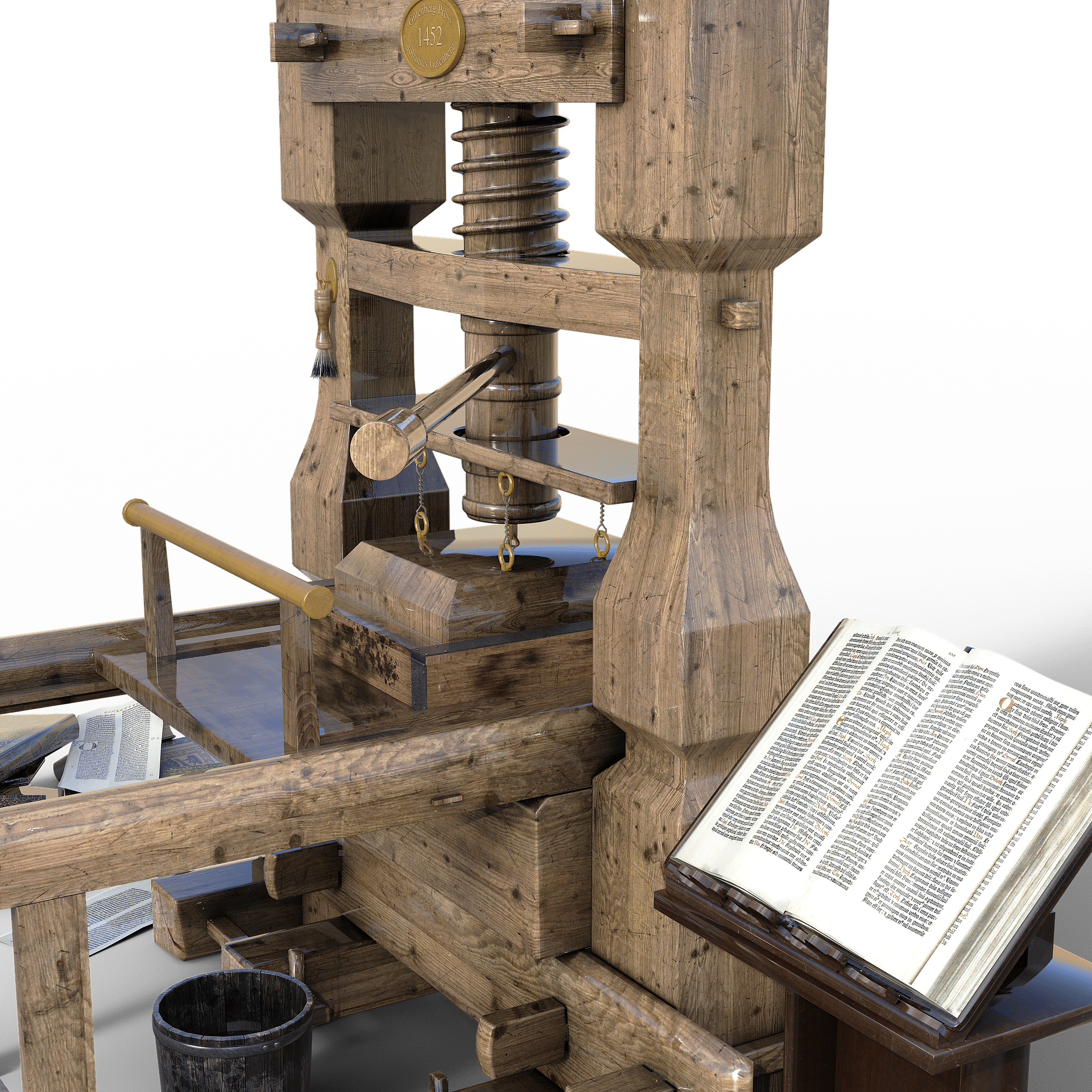
Thanks to the success of the invention, movable type printing reached all of Europe and with it its design was perfected and it allowed open printing shops throughout the continent.
The most important works are given in the eighteenth century, where typography begins to evolve with the improvement of cast types, the surface where they worked and the higher quality of the inks, all this meant a change in the world of graphic arts.
During the XNUMXth century, advances in technology have affected typography very directly, and the event that had the most impact was the appearance of computers. From this moment, information systems have helped designers to understand and create more typeface families.
typographic classification
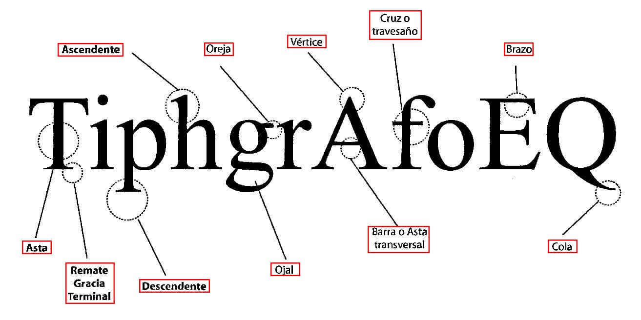
As we know, typography is understood as the set of signs designed with the same graphic style.
Fonts can be classified in different ways, in this case we are going to do it according to their anatomy, so four blocks are differentiated.
serif typography
The most notable difference in this group is the use of the serif in their characters, both at its base and at the top. Its origin comes from the stage of the first stone engravings.
Sans serif or sans serif typeface
The typefaces in this group lack serifs, their strokes are uniform and their characters are straight. The first time this type of typography is seen is at the time of the industrial revolution in posters.
Script or manual fonts
Known as manual fonts, since try to imitate handwriting. Their letters are usually decorated.
decorative typefaces
In this group we will find the typefaces that have been designed for ornamental purposes.
The best minimalist fonts
Once we know the history of typography and its classification, then we are going to leave you a list of the best minimalist fonts for your designs.
The typography that is chosen must be in accordance with the brand with which we are working and its philosophy, in this way it will transmit the message correctly and reach a larger audience.
GAOL
Minimalist typography, very simple but with a very elegant style. Gaoel is a sans serif font in which you can find apart from numbers and punctuation marks, accents for different languages. The only drawback of this typeface is that there are only capital letters.
EQUINOX
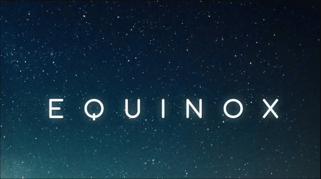
Minimalist and simple font for your projects. Is a modern typography in which you can find both bold and regular, numbers, punctuation marks, alternative letters and also, multilanguage capital letters.
AGATHA
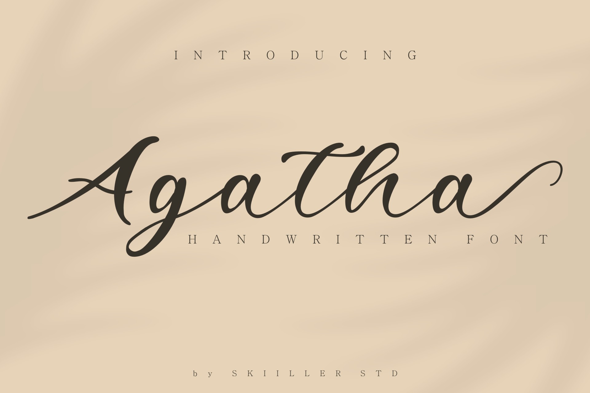
Minimalist typefaces do not have to be only sans-serif, in this case we present the Agatha typeface, which is a type of handwritten style, i.e. it mimics handwriting. It offers us both uppercase and lowercase characters, numbering and punctuation marks.
BECKMAN
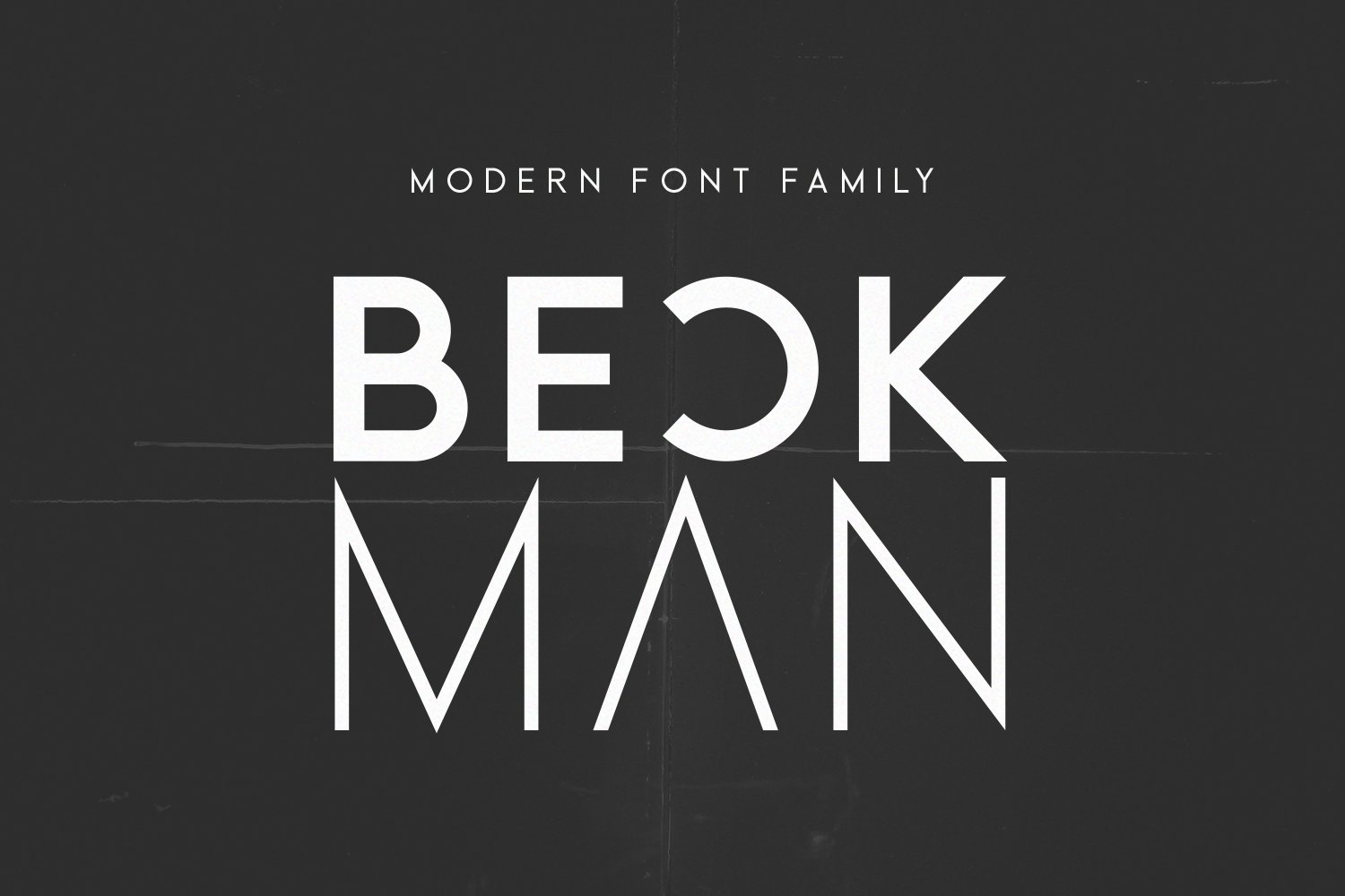
Constructed through geometric figures, Beckman becomes a modern and powerful typography. The positive point of this typeface is that it offers us six different weights, on the other hand, the negative is that there are only capital letters and a small variety of punctuation marks.
GLOAMS
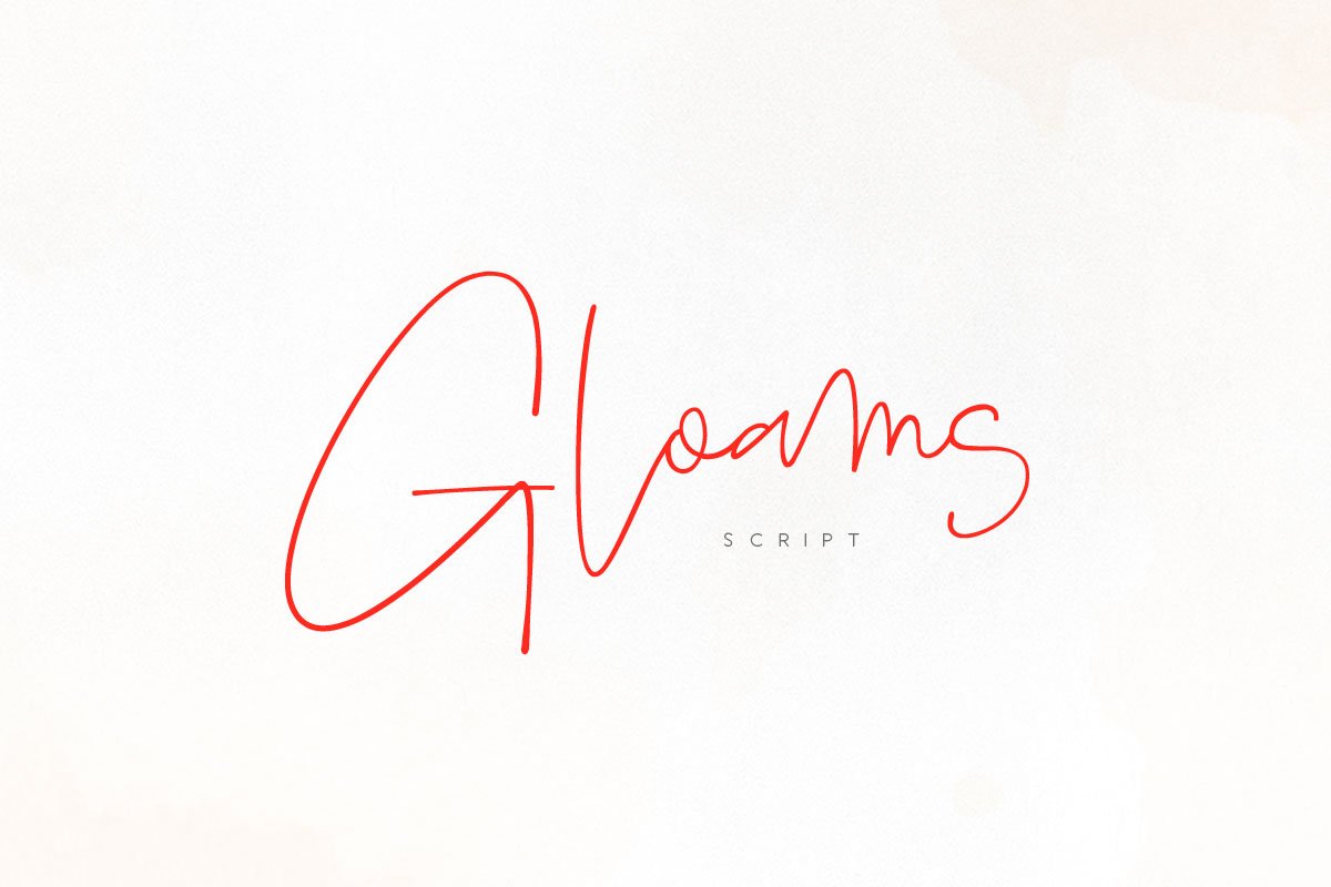
we present you another italic minimalist typeface that will give your designs an elegant and feminine style.
SIMPLIFICA

Typography belonging to the sans serif group. Is a condensed font but with a line width that helps legibility.
PREMIUM
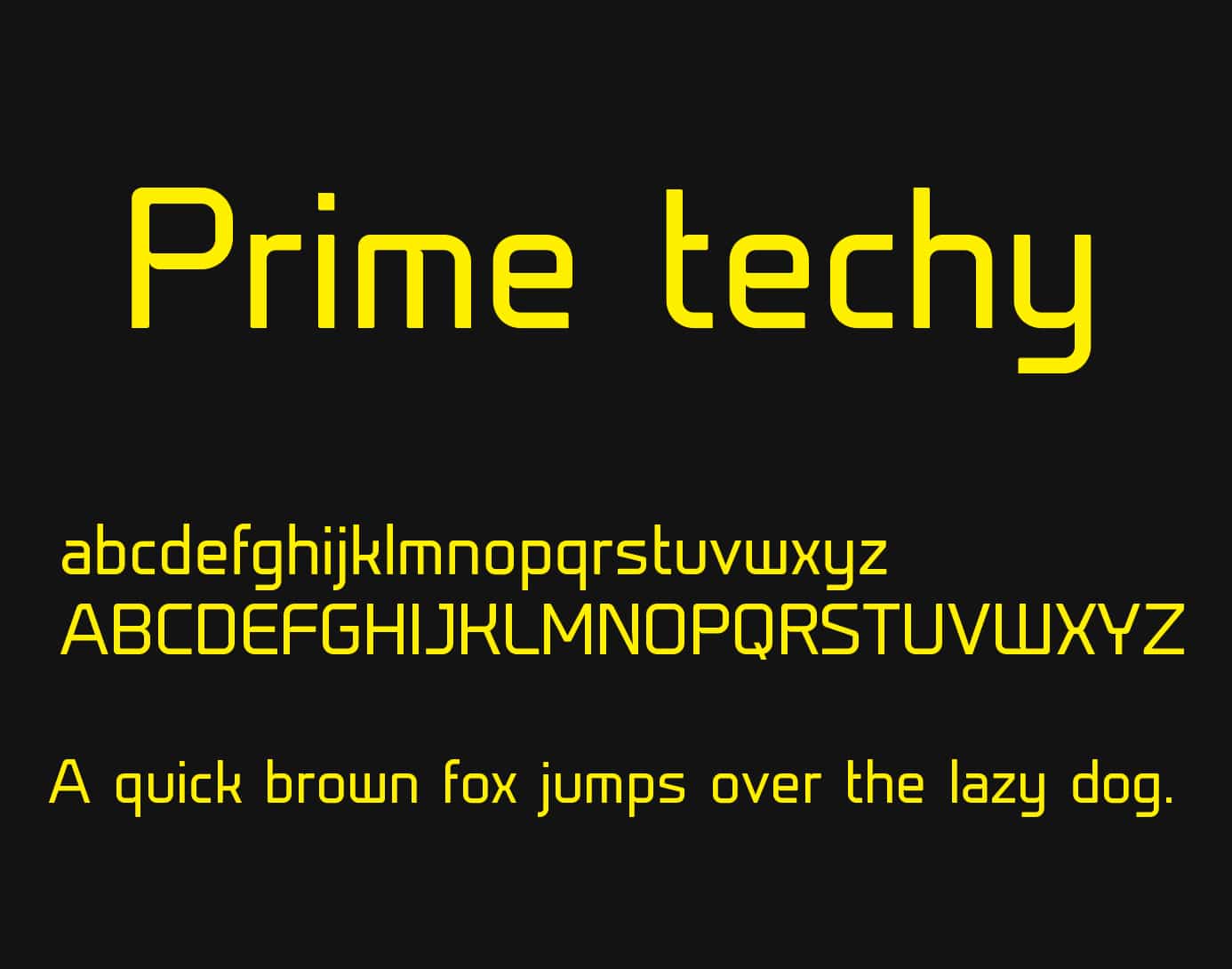
If what you are looking for is a geometric style, here is the Prime font. Geometrically formed typeface with a high legibility value in its two pesos; light and regular.
ZEVIDA
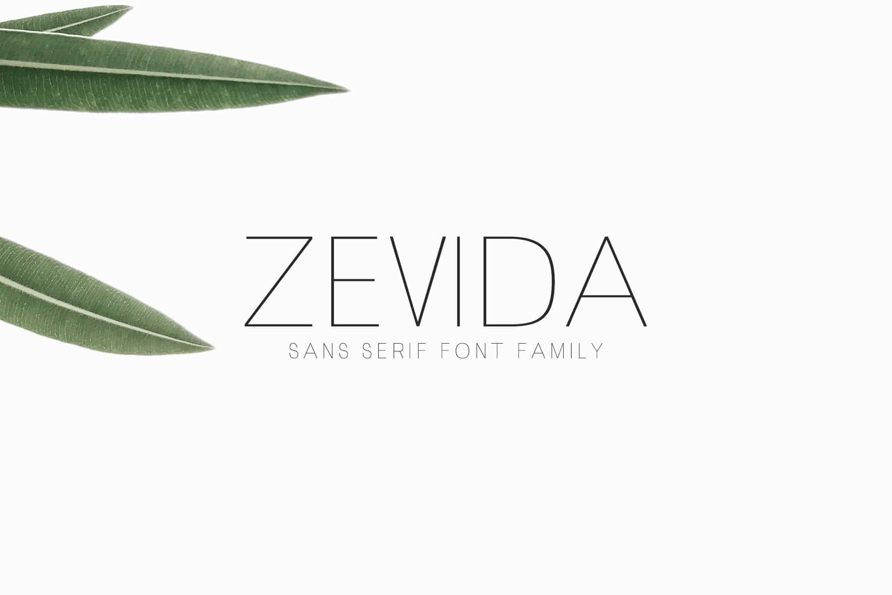
Sans serif font that mix the elegant with the simple. It is a suitable font for titles, headers, footnotes, etc. It presents us with three font weights: light, regular and bold. In addition to, two characters, upper and lower case, punctuation marks, numbers and accents.
NOO
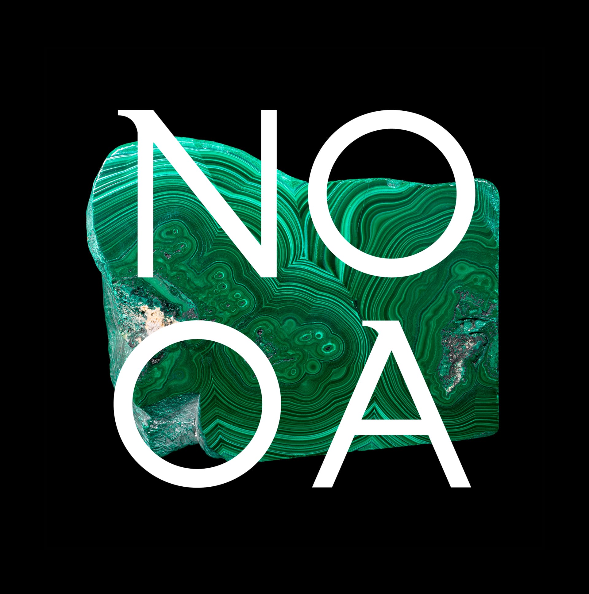
Elegant semi-serif typeface. Provides only uppercase characters. As a negative point we will say that it does not have lowercase characters.
BAIT
Una very complete font, since, presents us with four pesos; light, shaded, double and bold.
Kelson
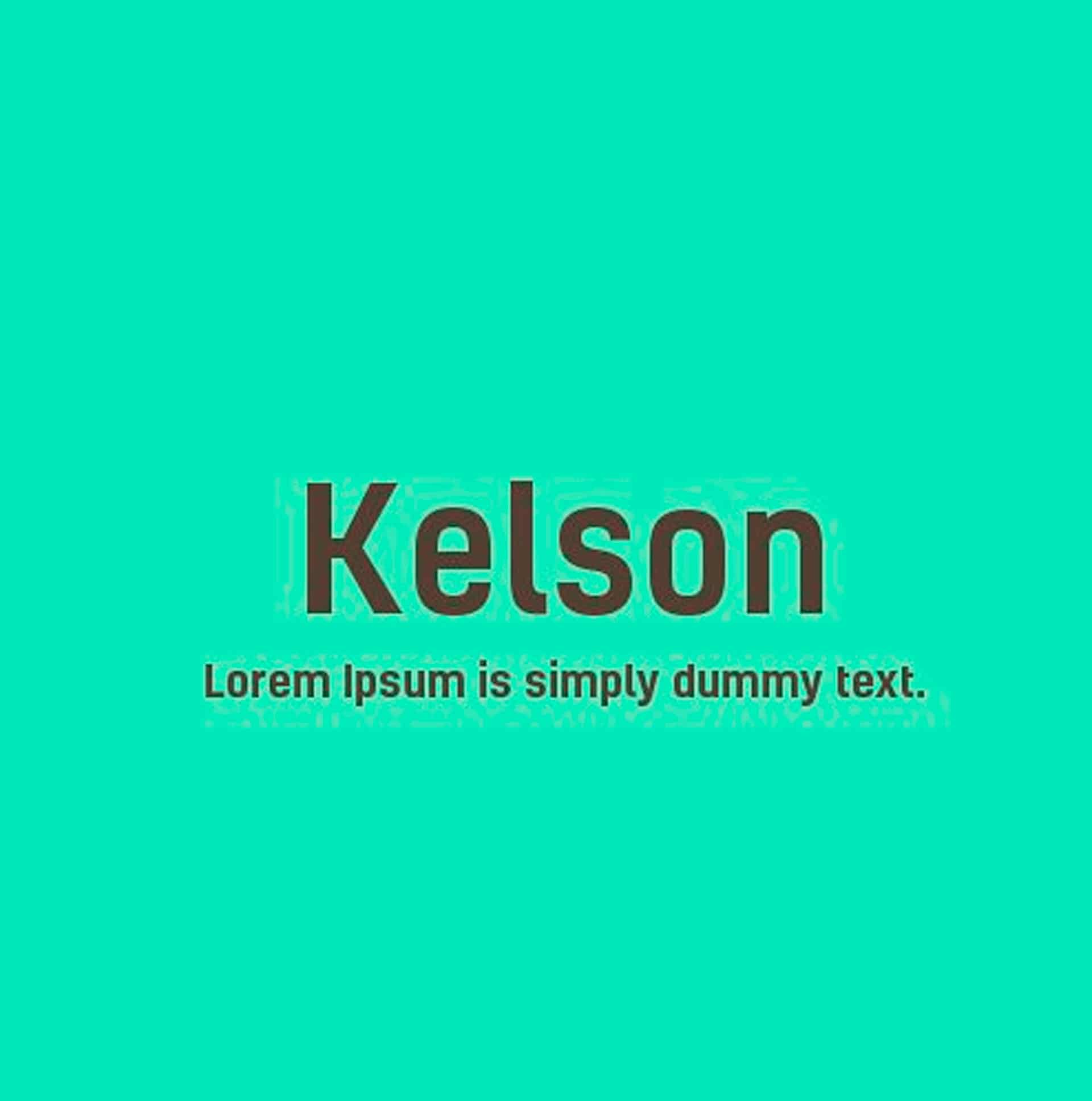
Condensed Sans Serif Typeface. Kelson features six weights and only uppercase characters, no punctuation elements.
Professionals in the world of graphic arts are always in constant change, so they need new ways to communicate creatively, in order to reach your audience, and with the help of typography is the most impressive way to reach it.
Not only designers are in this spiral of change, but also typography and it is not going to stop in the digital age, since, at this stage of history, there are many more possibilities for development thanks to the technological advances that we have today. in day.
If this article has awakened not only your mind for your future projects, but also your desire to encourage yourself and explore designing your own, from creativos online we encourage you.