
Source: Multimedia
There are fonts that help us understand what design is or decipher what it is going to be like. There are others that leave us with the unknown and it is the message behind that tells us how it will be. The typefaces were designed with the aim that all these questions could answer themselves without the need for words.
And it is for this reason that they have been part of design for decades. What few know is the history of some of them. This time, we have come to talk to you about a very peculiar and very representative typeface, Montserrat typography. We want you to document about it because it is one of the fonts that can fit perfectly with what you are looking for.
For this reason, we will explain to you what this important typeface is and why it is. Keep reading until the end because it will be worth it.
Montserrat typography: what is it
Source: Pinterest
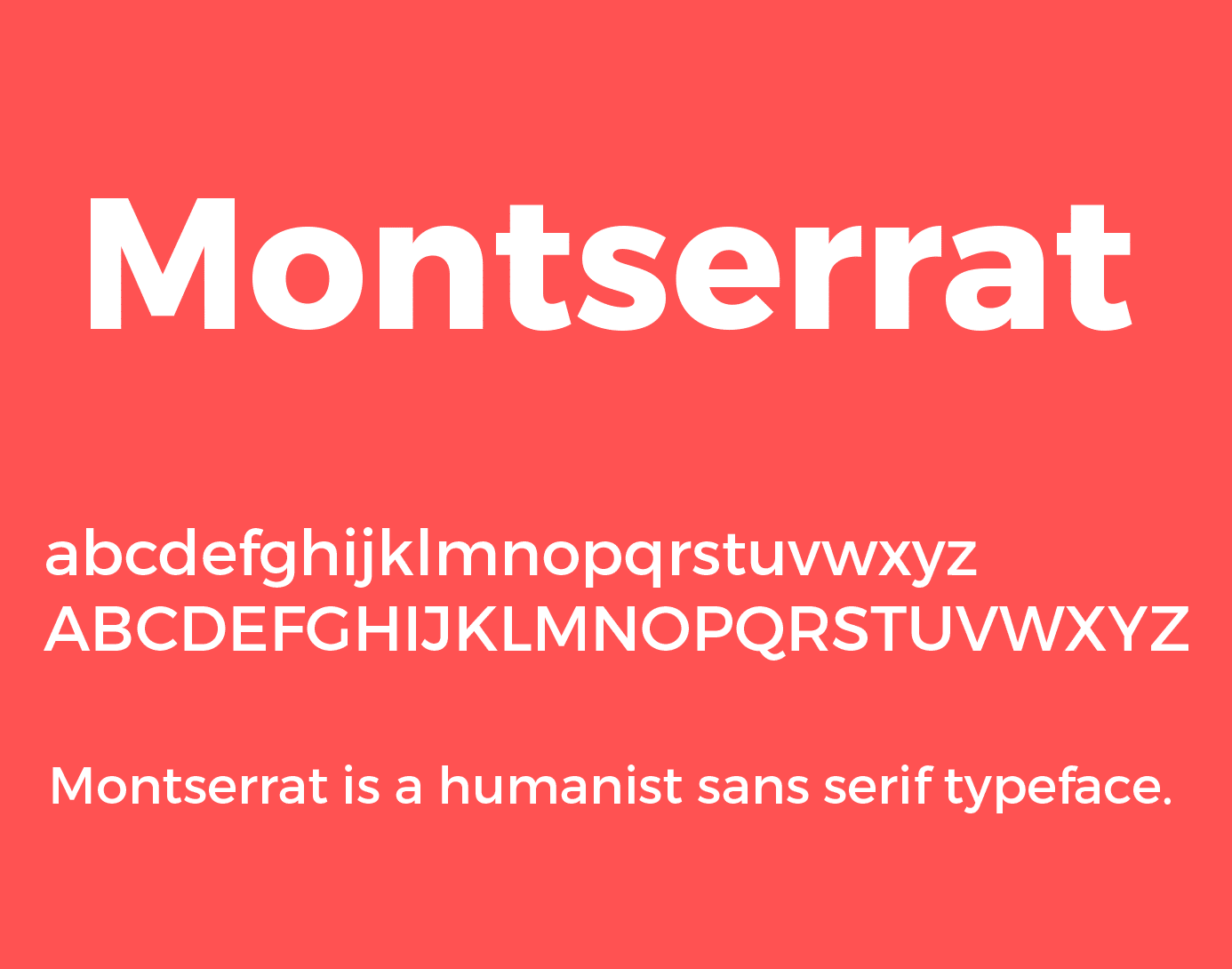
To begin and to be able to understand what this typography is, we must go back to simpler aspects. Therefore, we define this typeface as a font that was created by designer Julieta Ulanovsky in 2010.
As your word indicates, It was inspired by nothing more than the small neighborhood of Montserrat, in addition, it also has a certain tendency to typographical posters of the 20s.
It is not surprising that it is one of the most representative typefaces, as it has always accompanied many brands and many important graphic design projects. It is for this reason that we have also not been able to miss some of the more general characteristics that currently keep it alive and that explain why it is still used as the main element on many occasions.
You would even be surprised to know what they look like physically and what their main uses have been.
General characteristics
Versions
Currently, if we decide to download this typeface we can see that it has different versions in its designs. The regular (normal) version of this font was purchased by the Google Fonts company and we can download it right there for free. In addition, it has its corresponding versions, which makes it much more interesting to see: bold version, alternative version and italic or underlined version. Without a doubt, it is a point in favor to be able to find a typeface that has secondary versions since in most cases, if we use it for headlines, we can play with the thickness and inclination of the font.
Frequent uses
For decades, the Montserrat typeface has not been chosen as a representative typeface for logos or brands, but nevertheless, many brands have used it as an advertising medium for their posters or advertising spots. That is why we can find it in many flyers, websites or places that require much more graphic aspects. Due to its high legibility range, it also inhabits many frequently used applications, making it a suitable typeface for both web and physical media. Without a doubt, it leaves nothing to be desired.
Where to download Montserrat font
Source: IdeaCreate
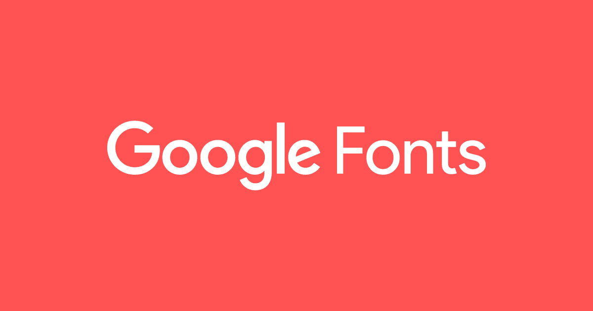
Google Fonts
Google Fonts is one of the most used tools by users on the internet. It is a website suitable for downloading different fonts. All of them are characterized by being free to use and are fonts that contain a high range of legibility. In addition, it has an extensive category of fonts and a search engine designed to find some of the best fonts that represent current graphic design. There is no doubt, it is the best option to start in the world of design.
Dafont
If we had to think of a website where we can download fonts for free and that has more than seven million different styles, it would undoubtedly be Dafont. With this tool, You no longer have an excuse to download some of the best fonts. In addition, it also has a very extensive search engine, which makes it easy for you to find a font that fits your work profile. Don't waste time and start using this super tool, because you won't regret it and you will offer your work a much more creative and personal touch.
Font River
Font River is a tool that functions as a font search engine. It also has the possibility of downloading them quickly and for free. It is characterized in that it contains a broad source category. We can find fonts with a much more gothic design, others with a more technological design, others that are much more handwritten and simulate hand-designed fonts. We also find roman and sans serif sans serif fonts. In short, you cannot miss this tool that is full of fonts of different designs. Also, it is not surprising that your ideal typography may be found in the thousands of tabs that it has.
Font Freak
Our last and not least option where you can download fonts at no cost is Font Freak. Another free alternative that has a total of more than 8 thousand fonts to download where around 400 graphic designers are involved.
What may not convince or has not convinced users who have already tried it, is that we can not modify the color but only the size. It is a rather negative aspect, since color is an important element for fonts.
Other similar typefaces of interest
Source: Canvas
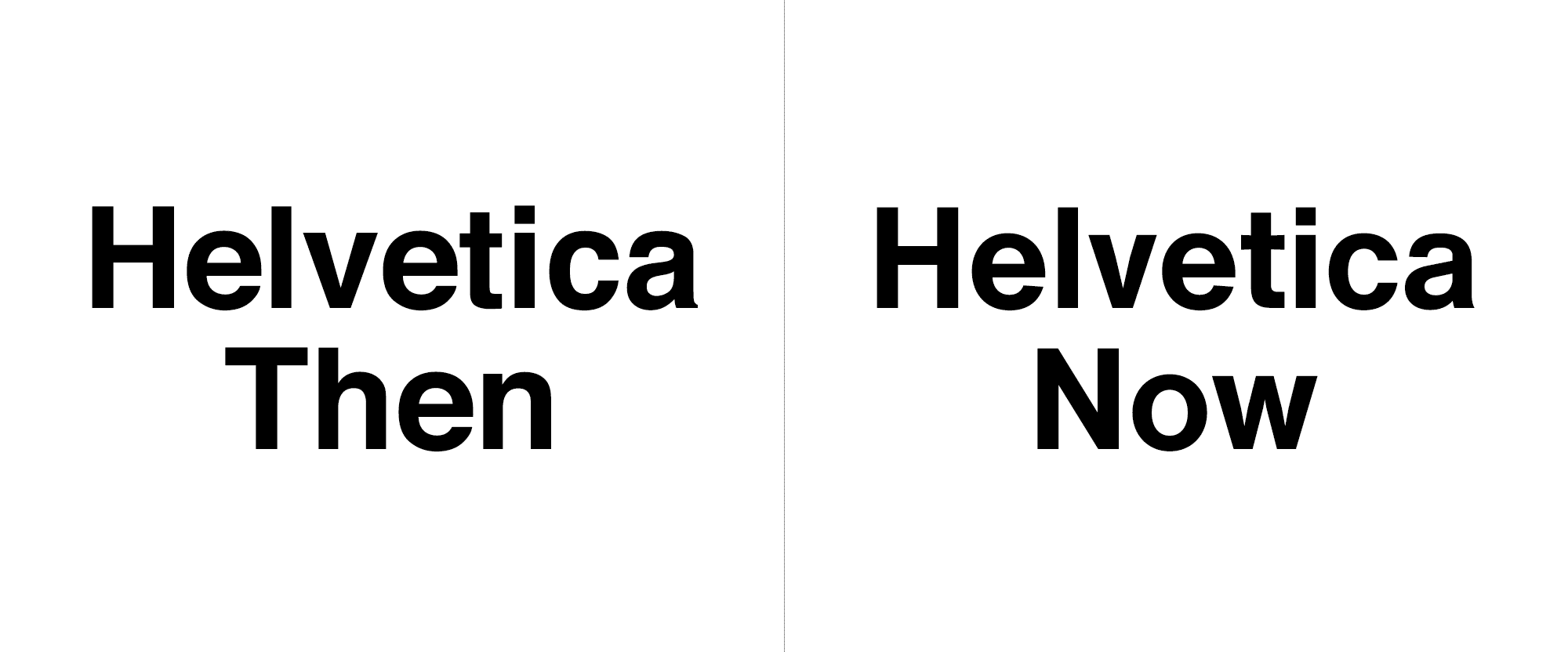
Helvetica
Without a doubt, if we had to choose another star typeface, it would be the Helvetica typeface. It is considered the most used typeface in the world. and it is not surprising, because its appearance makes it a perfectly designed typeface.
It has a wide variety of versions. It was created in 1957 by graphic designer Max Miedinger and Edouard Hoffmann. for a certain company that is dedicated to the design of typefaces. This typeface became the stellar font of the 60s and 70s and thanks to its modernist artistic tendency, it has become the font that it is today.
Futura
Futura is another of the fonts that enter the top 5 of the most used fonts. Designed by graphic designer Paul Renner in 1925, It is a sans-serif typeface influenced by the artistic trend of the Bauhaus. Among its more general characteristics, it stands out that it maintains a fairly geometric physical aspect in its forms, in addition it also has other versions of itself that range from finer strokes to thicker and more marked strokes: bold, semi bold, super bold, etc. It is an ideal typeface for running text and for large text, which makes it a very functional font.
Garamond
The Garamond typeface is a font designed by type designer, Claude Garamaond, also known as a printer and engraver. It was so important at the time that its projects began to have some relevance. Therefore, at a certain point in his career, King Francis I of France commissioned him to design a typography that would have a series of Greek characters typical of the time.
Currently, there are many versions of this font, but the most used is the Adobe Garamond typeface, designed by Robert Slimbach and that we can find in resources such as Adobe Fonts.
bodoni
Bodoni is the star of Italian typefaces of the time. It was born with the surname of its typographic designer Giambattista Bodoni. He created this typeface that has become so famous today, at the end of the XNUMXth century and was the culmination of the extensive temporal evolution of Roman typography. It is a typography that is characterized by containing fine and thick contrasts in its forms. In addition, it also contains some thin auctions that characterize them a lot. There are much more updated versions, such as the one by Bauer Bodoni designed in 1926 for a certain foundation.
Franklin gothic
It is impossible not to see this typography represented in numerous posters, logos, or advertising spots. The creator himself is characterized by being the author of numerous other fonts and designs, which makes this typeface considered an important font in the world of design. Along with his mentor and father, they created around 190 more fonts that are distributed in different typographic categories.
Franklin Gothic was designed in 1904 and currently offers a wide variety of different versions that characterize it a lot, ranging from a thickness suitable for large headlines, to a fine or regular thickness for running texts and large paragraphs.
Conclusion
We hope you have learned more about this typeface that has become so famous and representative in the graphic design sector. As you have been able to verify, many of the fonts that we have mentioned have been designed from an inspiration: a place, a person, an important element in the history of the world or of humanity, etc.
Every typeface or font we find has been designed with an initial purpose. Now it's your turn to continue your search for fonts and document yourself even more about them. In addition, you can also try some of the tools that we have suggested.