
A question that every designer has ever faced in the design process is, what color not to discard when designing a brand, or another approach, what colors should I associate with my brand.
Whether you want a simple logo or a more striking one, you have to follow some basic tips when choosing colors for the brand. In this post, we are going to tell you what these tips are and we are going to help you how to create a multicolor logo, if the brand asks me.
The meanings of colors
The meaning that is given to the different colors that we know, are information that can guide us in the processes of developing a brand.
We already know that they exist different studies on the meaning of color, some more successful than others. And this leads us to ask ourselves, if we really choose our brand colors well or if, on the contrary, we are making a mistake.
The idea that we have to be clear about is that color does not convey ideas or feelings in isolation, but is encompassed in a context. Some of the meanings we give to colors may be more linked, for example, to the design of the shirt and the attitude of the model, than directly to the color.
Knowing that the meaning of color encompasses a context, we are going to know what values you can achieve using the different colors that we know.
RED
We all know that this color has its positive and negative sides.. It is linked with passion, strength, love, etc. But on the contrary, it is also related to pain, blood, danger, aggressiveness, negative meanings.
BLUE
The color of the sky and the sea, which evokes tranquility, intelligence and novelty. It is elegant and transmits confidence and freshness.
Yellow
This color symbolizes light, is related to feelings of happiness, wealth, power and energy. It is one of the most ambiguous colors, since it also has negative meanings such as envy, betrayal, jealousy, etc.
Orange
Associated with excitement, enthusiasm, power. In the advertising world it is said to be the most optimistic color. In addition, it is related to the world of food, since many restaurants use it in their logos.
Black
In Western culture it is associated with death, destruction, lost. On the contrary, in other cultures it is associated with fertility, life and growth.
Blanco
The white represents pure, the innocent, in a western society. In addition to cleanliness, peace and virginity. In Eastern cultures, it is the color related to death.
Verde
La youth, rebirth, hope, and closely linked to caring for the environment. It is a color that encourages a deep relaxation mode.
Purple
If what you want to represent is the elegance and sophistication, purple will help you. On the other hand, it is also usually associated with mystery and spirituality.
Pink
The color of the delicacy, of childhood and sweetness. In Western culture, it is also related to femininity.
Depending on where we communicate our brand, in the East or West, the colors can represent one thing or another, we always repeat, the context in which it is displayed.
Step by step multicolor logo

But what if a brand wants to create a multicolor logo, and we don't know how to do it.
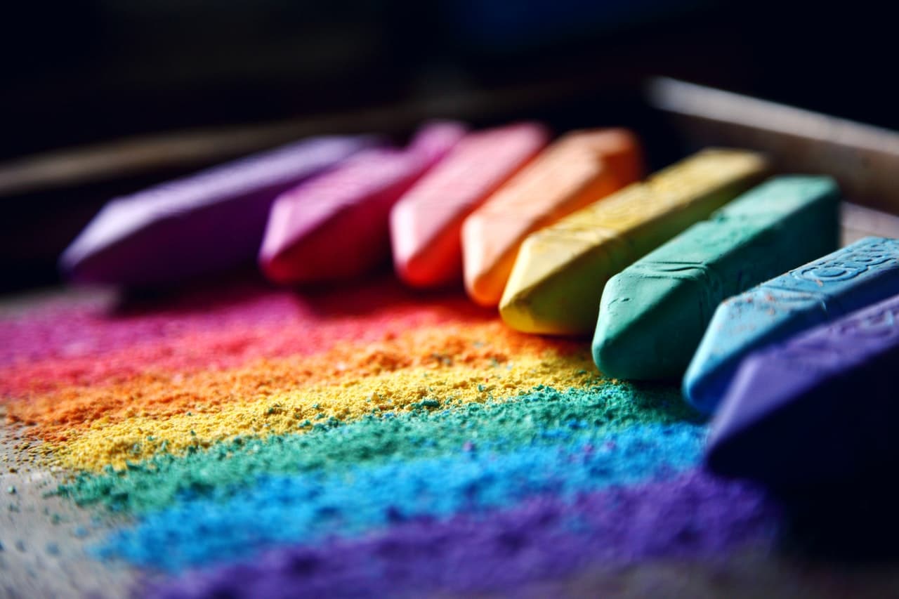
The first thing you have to make clear to us is which cabbage palette you want to use., if it is going to be a logo with the colors of the rainbow, if it is going to be a range of various shades of the same color, if it is going to be a color gradient, etc.
It is important know the meanings of colors when facing a new project. Since if you know these meanings, you can help the client in making decisions and even guide him on the right path, if he is very lost or is making contradictory decisions.
Our brand is going to be fictitious, it is an ice cream shop, called MINIS, and is specifically dedicated to ice creams for the little ones with fun shapes. Therefore we will need colors that are fun, close, knowing in the context in which they are that they take us to childhood.
El first step is to open a new document in illustrator, with the measures that we want, but with a blank background. Once we have it open, our brand is going to have a calligraphic logo, so we will go to the toolbar on the left side of the screen and select the brush tool.
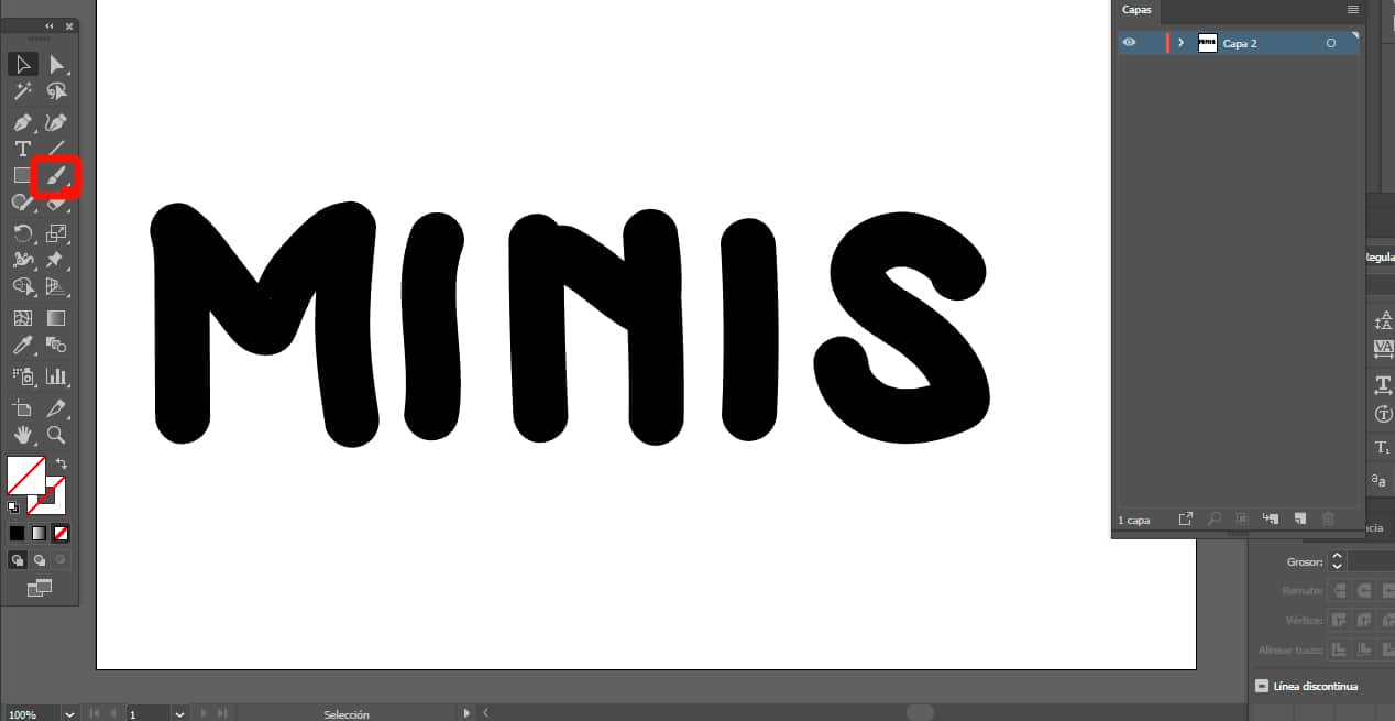
When we have it selected, we proceed to write the name of our brand on the canvas. We already have the name of the company written, MINIS, the next step is again, go back to the pop-up toolbar and find the shape tool and click on the circle.
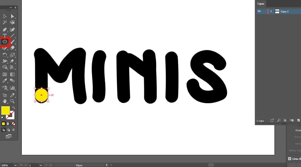
If we already have it selected, we will do the maximum possible zoom to our first letter and we will create an ellipse the same size as the brush path, with which we have written. With that ellipse, we place ourselves in the lower part of our canvas and place it giving it a color that we want or have been asked for.
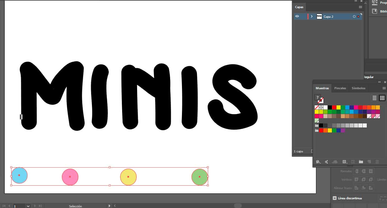
In our case, as you can see, a pastel blue tozo. The next step is select the circle that we finished coloring and keeping the control+alt key on our keyboard. We are going to drag to the right of our canvas to duplicate it, always keeping a straight line. We will do this step as many colors as we have.
Once you have them, you do click on the W key on your keyboard and a small square with dots will appear as a cursor, this is the fusion tool. With this option, we will be selecting each of our colored circles. To create a multicolored haze effect.
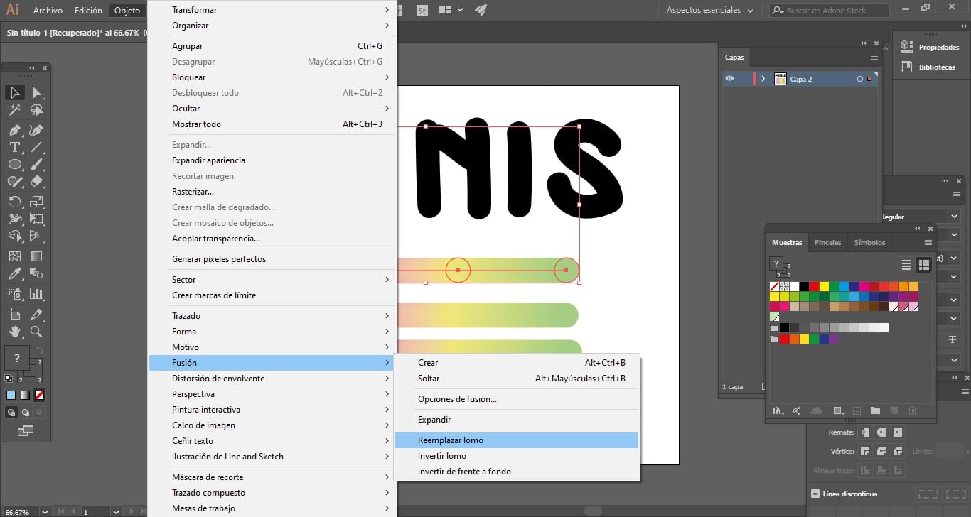
It is important that these circles only have a fill color and not a path color.otherwise the effect will not fit you correctly.
Already having our color element, we select it next to the first letter of our logo. We go to the top toolbar and look for the objects tab, then fusion and click on the option to replace spine. As you can see the colors merge in the letter.
To do the same with the others you have two paths, or copy and paste this color bar as many letters you have or duplicate each of the letters with which you are finishing and merging it into the next one. We recommend the first option.
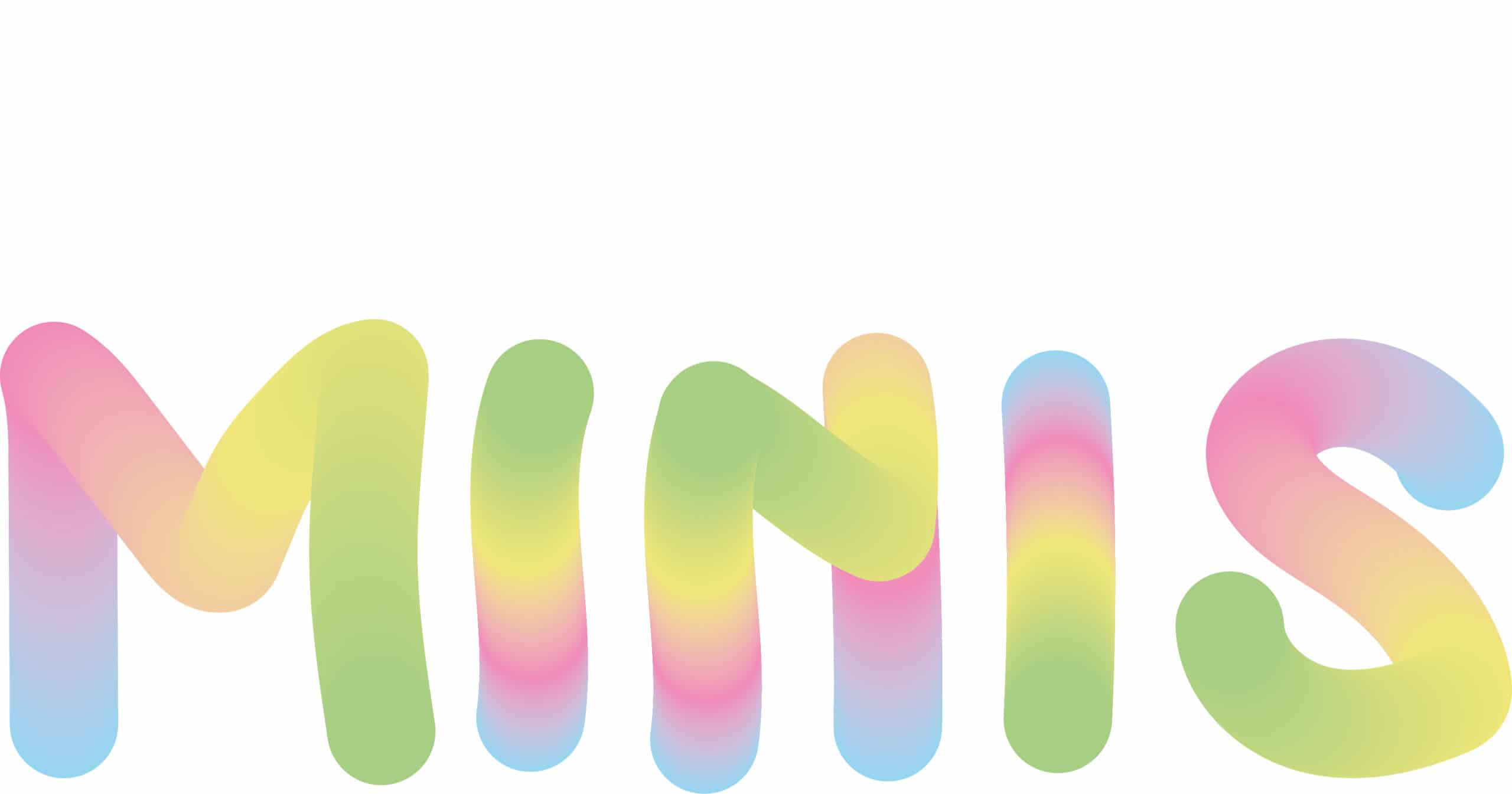
As you see making a multicolored logo is not complicated at all, the most difficult is the phase prior to the design, that of the investigation of the brand values and its context, without this prior phase the logo and the product will not be understood.