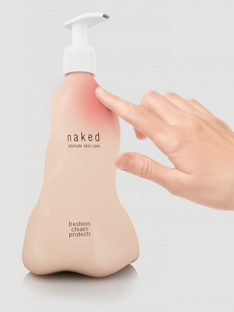
Naked packaging has become tremendously popular on social networks in recent days and it is not strange: It is a tremendously interesting and interactive proposal directly with the consumer. Its design consists of a structure that reacts to changes in temperature in the form of color changes and in this way acquires a life of its own to interact with the user. The objective: Design skin-to-skin contact of the user with the product.
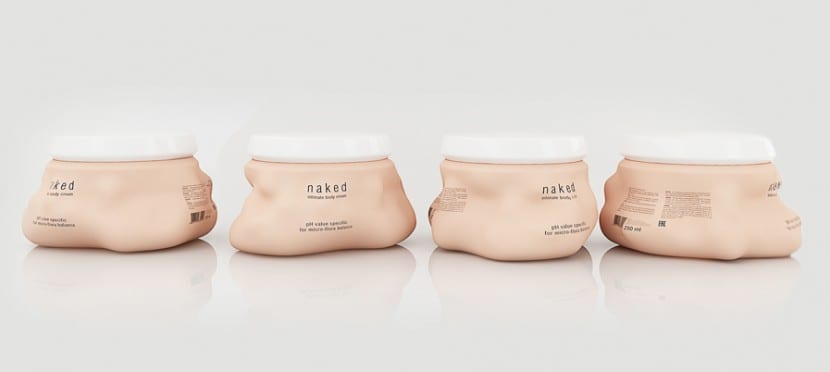
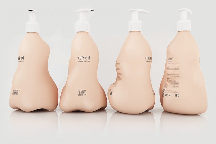
Its creator is the designer of Russian origin Stas Neretin and as the main element he has used thermochromic ink to materialize the discourse and conceptual charge of the product. How will you know Naked means Desnudo something quite intelligent if we consider that it is a product dedicated to intimate care. At the level of color and texture, the design perfectly reflects the features that it is trying to enhance. It is about the imitation of the skin and the human body in the form of all kinds of jars and containers that suddenly take on shapes with organic and sinuous finishes. In addition the use of thermochromic ink It causes reddish tones to appear when pressed or brushed, as occurs when human beings feel ashamed when being touched or naked. Without a doubt, an exquisite and above all intelligent proposal, since it is played with concepts such as touch, closeness, nudity, care and tenderness.
Here are some images of this magnificent packaging: