
When working with colors, as designers there are certain aspects that we must keep in mind to achieve the best result in terms of contrast, legibility of the different tones, that the message that you want to convey is understandable and inspiration when combining them.
Through the chromatic scale, the various color options with which we can work in a design are represented. With the selection we make of these colors, we can create high-level designs. In the chromatic scale there are warm, cold, monochromatic, neutral, analogous, complementary and adjacent colors.
On this day, Let's talk about neutral colors in design. What are these colors and we will point out combinations that work correctly for you to apply in your projects.
Neutral colors in design
This type of colors, neutrals, have become part of the color palettes of graphic designers. They have become the trending tones for some time now, this boom reflects the change in direction that the design industries have suffered in terms of the use of color.
We are not saying that studios, agencies, etc. design no longer use color, we are saying that the increase in the use of neutral colors has been significant. These tones as we all know have always existed, but have had great commercial importance in recent years.
The neutral tones in the 90s, they were the real point of attention in the field of minimalist design, austere and simple creations with as few design elements as possible.
The range of colors that we all know is divided into different categories, starting with primary, secondary and tertiary colors. The primary colors are paramount to get the rest, since they are colors in which their elaboration is basic.
To get a secondary color, two primary colors are mixed in equal parts. while to get a tertiary color, a primary and a secondary are used.
Not only are there these three categories of colors, but there are others such as neutral colors which we are talking about in this post.
The Neutral colors differ from the rest because they are considered colors with low intensity and saturation. In addition, another of the characteristics of these colors is that a tone does not stand out because the light that is projected on them lacks chroma.
The neutral color scale is indicated from white to black.. These two colors that we have just named, are the most characteristic of this category of colors. The white color is the union of all colors, while the black color is the total absence of color.
What are the neutral colors

The neutral color palette that we find is completed by different tones. The most notable difference between one and the other is the intensity of the light contained in each of them. The simplest way to classify neutral colors is the one shown below.
White Wine
Neutral colors are easy to combine with another color, and they do not influence other shades. One of the easiest colors to use in the palette is white.
The white color provides luminosity and freshness. It works correctly combined with other neutral colors, natural colors and even high intensity ones.
Grey
Depending on the range of gray you use, can continue to keep the style light and fresh that we talked about before with the white. Although it can also generate values such as elegance and modernity to your designs.
Light gray tones are a safer bet than dark gray, since they are more risky colors and can turn off the design elements around them. They are colors that work correctly with both light and intense colors.
Black
Speaking of this color, we must emphasize the idea that in the vast majority of occasions that it is used in design, it is accompanied by light gray or white tones. The black and white combination is a winning bet.
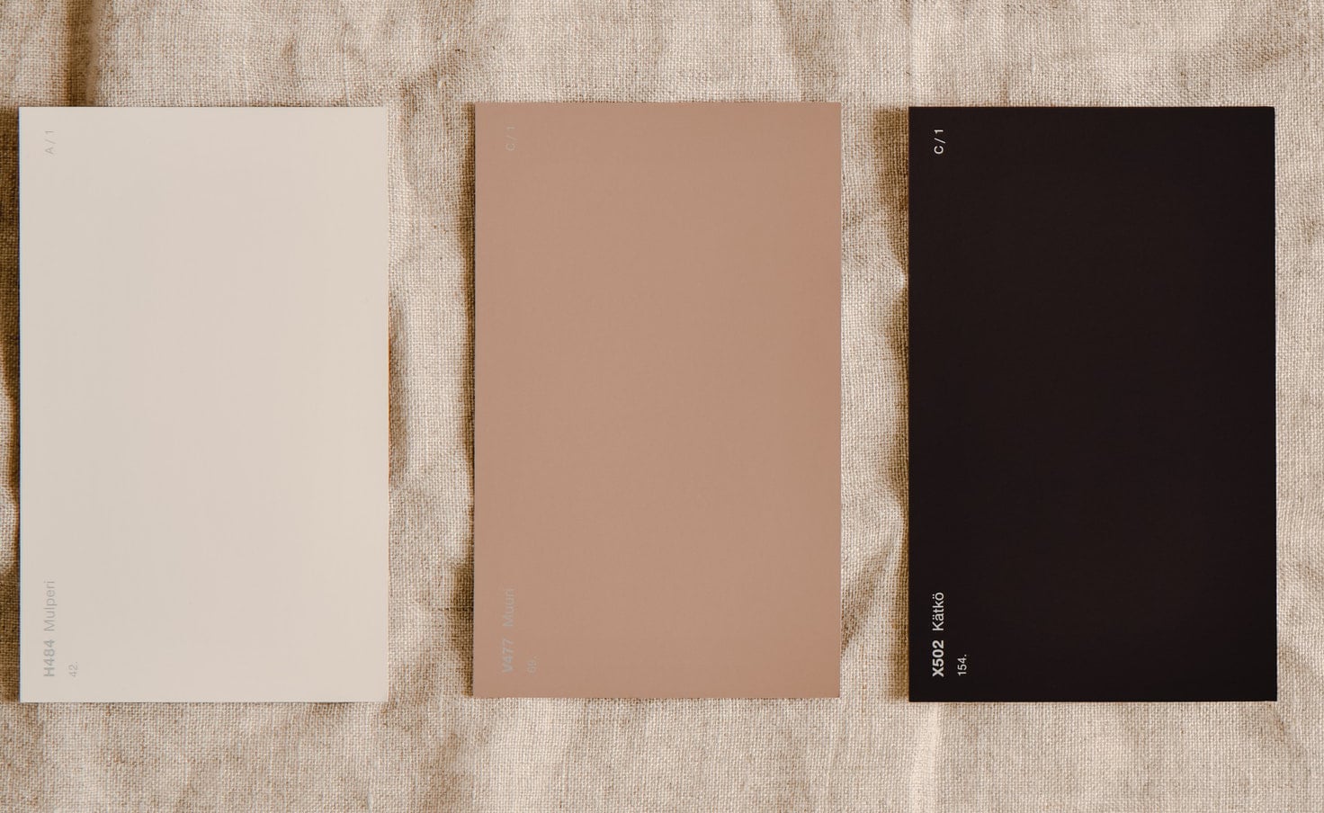
These three tones would be the main neutral colors but there are not only these but we expanded the palette to shades of blue, brown and cream.
Blue
All the grayish blue tones would also fall into this category. This type of colors in the designs, provide a simple style as well as elegant.
Natural
Within this group we place the brown colors, being one of the warmest in terms of neutral colors. We are not talking about all brown tones falling into this group, only the softest brown tones would be.
Crema
In this case we are talking about beige, ivory, nude and cream tones.. They are colors that provide characteristics similar to those we have mentioned in white. Referring to these colors, they generate a sensitive contrast in addition to being subtly more muted colors.
Neutral color combinations
Once we know what the neutral colors are and each of their characteristics, it is It is also important to know the best combinations between them. They are combinations, which you can use to design different projects.
You can use them alone or combined with other colors to give power to the design. Neutral colors, as we all know, combine everything, so it is difficult to make a wrong combination, anyway here we present some of them.
Black, white and gray combination.
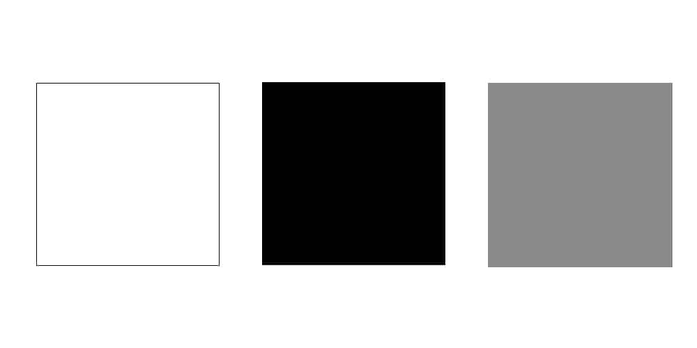
Three neutral colors that make up a safe combination. The gray tones in this combination work as intermediaries between the existing colors between black and white. With this mix, the contrast practically disappears and a dark and modern style is enhanced in your designs.
grays and browns

Combining the gray color with different shades of brown can make it a perfect combination.. Gray works as a neutral color, a cold color that combined with brown tones, which are warm colors, will give your projects a warm and rustic look.
White and black

It is a classic of minimalist and modern designs, using the combination of these two colors. Each one of them contributes to your creation a different characteristic, white luminosity and on the other hand elegance on the part of black.
Neutral and pastel colors
The pastel colors in the design evoke a sweet and cozy feeling. The use of this type of colors helps the compositions to have a greater luminosity as well as even causing a state of relaxation in the viewers. We give you two examples below.
Gray color plus pastel pink
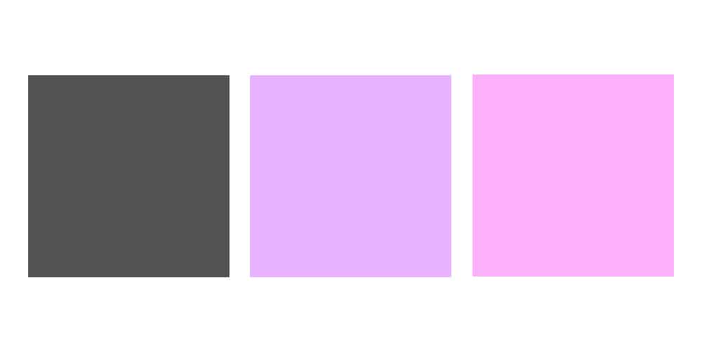
Black plus pastel blue

Bold and neutral colors
As in the previous case, neutral colors work very well with very striking colors, with which to create a high degree of contrast in your designs. These types of combinations can be striking and even strident for viewers.
Neutral color plus bright colors
The combinations of neutral colors with other types of tones would have no end, because as we have pointed out in the previous section, neutral colors combine with everything. You just have to find your winning combination for your designs. Depending on the purpose of that design, you will use one combination or another.