
The Nintendo brand has been active for years. It is one of the most important pillars within the video game sector. And with each console, several logos have come out: the SuperNintendo, the Gameboy... and, the one that concerns us now, the Nintendo Switch logo.
Have you ever wondered what its origin is? When it was created? And what does it mean? Then you have to take a look at this that we have prepared. If you are a designer, you can take it as a reference and it will help you learn a little more about how others work. Go for it?
The origin of Nintendo Switch
![]()
Before talking to you about the Nintendo Switch logo, we believe that the best thing is that you know the origin of the video game console itself. There is no doubt that Nintendo Switch is part of the game consoles that the Nintendo company has created. It is a hybrid console, because it allows us to play portable and also connect it to the television. In this way, it is the first console that was created with the capacity to make the game more flexible for the youngest. In fact, the truth is that adults also play with it.
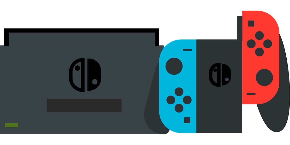
One of the most characteristic elements of Nintendo Switch are its wireless controls that can be connected to the tablet or separated from it and continue to work autonomously. They are important because, when you see the Nintendo Switch logo you will recognize them quite well.
The console was created in 2016 and went on sale in 2017. A lite version, that is, one that only allowed portable play and not connected to the television, came out in 2019. And all of them are part of Nintendo Platform Technology Development.
The creators of this console were Tatsumi Kimishima, Genyo Takeda and Shigeru Miyamoto. They had the idea of creating an unusual console, since they combined, on the one hand, portable consoles, and, on the other, the fact of a fixed console connected to the television. And it is that, they had two different publics. In Japan, which is where the consoles first came out, their audience was more portable because they play when they go by car, by train, by plane... But in the West they changed completely and the users who bought them wanted fixed consoles.
Thus, by creating one that satisfied all their target audience, they managed to reach more. And the company was almost on the verge of disappearing, they managed to raise it up and right now Nintendo Switch is the 'right eye' of the brand.
The Nintendo Switch logo
What you may not know about the Nintendo Switch logo is that there were three variants, not just the current one.
Nintendo NX
That was what it was called when the console was in development. It was actually a prototype, but they created the logo and everything. His inspiration was to follow the line that they already had with other consoles, Specifically with Wii.
Although in the logo Nintendo appeared in lowercase, and the letters NX in uppercase, What had the most prominence was the brand, which also goes inside an elongated oval.
The whole logo was in gray And it didn't stand out too much.
Maybe that was why it only lasted a year, the time it took to develop the console so that it was ready for sale.
NINTENDO SWITCH (2017 to present)
We put it in capital letters because, if you see the logo, all the letters are like that. In fact, the word SWITCH is bigger and bolder than NINTENDO. It was a way to "sponsor" the console but at the same time give it its own space.
And speaking of space, if you notice, Nintendo's lettering spaced further apart to match Switch's and this, being a shorter word, they needed it to be larger than Nintendo.
The logo is a square where, inside, the joysticks appear, so characteristic of the console.. One with the button up and one with the button down (as they are connected). To differentiate them, because they come in different colors, they put one in red with a white border and button, and the other in white with a red button.
Below them the words NINTENDO SWITCH.
This logo is the one you see everywhere. But It also has variants, such as only the joystick part, without the brand name, or with a different background. And one more peculiarity is the fact that, although it seems symmetrical, in reality, the logo of the controls is not. One is larger than the other, although at first glance they may seem the same. But of course, if you are a designer you surely know why (it has to do with balancing the visual weight).
Nintendo Switch Lite
Finally, we would like to talk to you about the logo of Nintendo Switch Lite, the latest console and a variation of the first (although the new version of the console will be released shortly).
This logo jumped in 2019 and the truth is that it is not as "showy" as the one on the console. It is actually the full name on one line, in gray or black.
What is the font of the Nintendo Switch logo and why did they use those colors?
![]()
Bearing in mind the Nintendo Switch logo, you are probably wondering what font they used and why they chose red and white (when the console has more colors).
Actually, what they were looking for was to make a product that was totally different from the previous one, and at the same time, to remember the brand.
If you remember, the Nintendo logo is red and white. AND that's why they used that color, because it represented the brand itself. Now, it can also be found in other colors (grey and white, a variation they created), but the original is this one.
As for the source, the one used was FF Mark which was smooth, grotesque and uniform. But they also had a finer version for what the Nintendo name was.
In this way, they created a logo that you related to the colors of the brand but gave it a life of its own and also, being so visual, allowed anyone to recognize it.
Had you analyzed the Nintendo Switch logo like this?