Designing a logo can take a matter of five minutes. But when they love each other original and creative logos, then the time can be fifty hours, or five hundred. Or five thousand. Inspiration never knows when it will come and you have to take into account many factors that will influence, both the company and the image you want to project with that logo.
Therefore, there are some logos that serve as examples to inspire us and help us understand the great difference between a normal logo and a creative one. Do you want to know some of those examples? We will talk about it below.
What is a creative logo
Before giving you examples of original and creative logos, it is very important that you know exactly what a creative logo would be.
To do this, we must first tell you what is a logo. This is about the representation of a company, the image that it will offer to people that they run into the company, either physically or online.
It is composed of images, symbols and / or letters (that is, it can carry all of that or only a part of them).
Now, what would a creative logo look like? Creative logos could be said to be unique creations, that are created taking into consideration the brand, what it wants to represent, the target audience and a neutral and timeless trend. In other words, we are talking about a symbol that defines the brand itself, even without words, just seeing that image, letters or symbols.
This is the reason why it is so difficult to create original and creative logos, since you have to thoroughly know the company, the values, mission, objectives, etc. and, at the same time, to the target customers that the company has. It is impossible? No, and we have a great sample below that we can show you.
How to create original and creative logos
There is no doubt that having original and creative logos is a thousand times better than one that you take out in five minutes and that is only to get out of trouble, but it is cold and unrepresentative with the brand. But creating them is not as easy as those simple ones (which you can also find similar ones on the market).
A 'great logo' should be characterized by being simple, but not in the sense that you put something and that's it, but that you do not have to saturate but create an attractive visual effect without causing rejection. It should also be memorable, the kind that when you see it the first time you can no longer get it out of your head because it has impacted you. Add the one that's timeless, because logos don't change for a long time. It is true that, to adapt to new trends, variations can be made, but the essence remains.
Finally, it has to be specific to the company or brand and also versatile, that is, you can adapt it to any format without losing quality.
If you comply with all this, you already have a lot of cattle.
Of course, there are aspects that you should always keep in mind, such as images, typography and symbols. And the size. All this has a very important role in the final result of your logo, and it is what can make you succeed or fail.
Of course, you will always have to do many tests and arm yourself with patience until inspiration tells you that "that" is the logo you were looking for and make your client fall in love just as you have fallen in love with that creation.
Examples of original and creative logos
As we know that you want to know what original and creative logos we can show you, we are not going to make you wait any longer. These are just a few of the ones that exist.
Amazon

You sure know what the Amazon logo is. Really, it's just formed by the word amazon, in lowercase and a symbol. The latter is the one that gives the power to the word. And, if you look at it, that yellow bow with another symbol at one end represents a smile.
And what does he smile at? To the word, to 'amazon'. Therefore, it gives the image that the company will make you smile.
Barbie

We are sure that, among the original and creative logos, that of Barbie has to be studied in many careers. And it is that when it was created, in 1959, its creator knew how to convey the femininity of that brand in the logo. It is one of the simplest and at the same time one of the best in the world.
If you notice, the logo is simply the name of the doll. But It is made with a specific font and a pink color, representative of girls (although you know that for a time pink was the color of boys).
It is true that it has undergone variations over the years, but it still maintains its essence. In fact, the current logo is practically the same as that of its origin.
Coca-Cola

More than once we have not known how to write it, right? Sometimes we put Coca-Cola, other Coca-Cola. But it actually has the two 'ces' in capital letters. Now, it is a logo that invites joy, entertainment, positivity, connection or union ...
It complies with everything that we have told you before, and since it was created it has undergone many variations, to the point of going from black to having three crimson colors.
It is true that the first logo, in 1886 and the one now, have nothing to do with it, only the word itself, but if you look closely, the only thing that has changed has been the typography, because they have preserved the essence (especially that of 1887).
toblerone

Why do we highlight this logo? Because as a whole it is a beautiful representation that is related to the company and brand it represents. But it also has many hidden elements. A genius of its own creator.
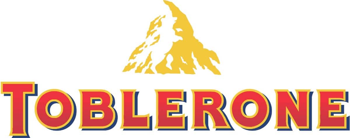
El Toblerone logo is characterized by a mountain and the brand name, Toblerone with a certain typeface and a border on the letters. But the truth is that it has much more.
On the one hand, the mountain that is drawn refers to Switzerland, specifically the Matterhorn, which is in the Alps and is the fifth highest peak in the area.
On that same mountain, you can see that it makes a strange drawing, and if you focus, you will see that it is a bear. This is a tribute to Bern (or Bern), the place where Theodor Tobler and Emil Baumann, his cousin, created this chocolate bar. There the bears are the representative animal, and it appears on its official shield so they wanted to honor it. Furthermore, if you look closely, the name of Toblerone has the city of Bern among its letters toBlERoNe.
Of course, there are many more examples to consider, and that is that creativity and inspiration can make you get something totally unique for companies. You just have to arm yourself with patience and observe because even the smallest detail can light your 'light bulb'.