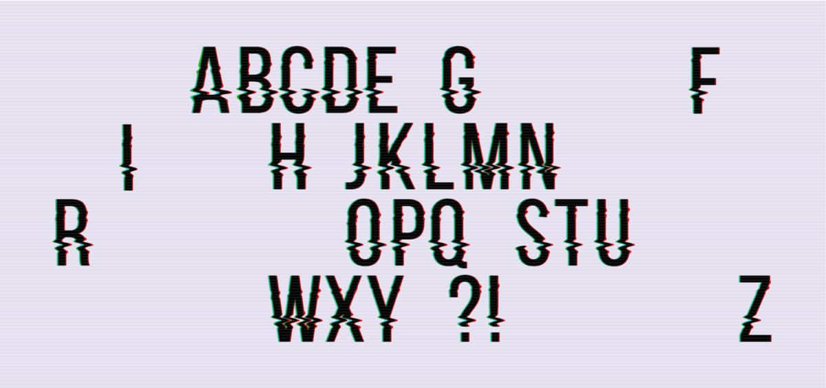
Font: BauerTypes
Some of the best designs are made up of the best typefaces. And it is not to be expected that these typefaces represent a totality of this representation. If you are passionate about the world of fonts and typographic design, this is the post that you were undoubtedly looking for.
In this post, we have not only come to talk to you about which typography best suits your project, but also, we will show you some of the most outstanding families, in this way, you will know the different types that exist, to later use them in your designs.
Do not stay with the doubt and stay with us until the end.
font families
Source: Types with character
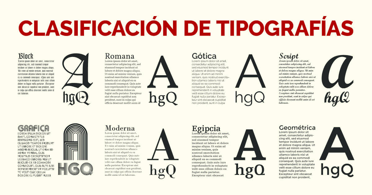
When we talk about font families, We talk about how fonts are distributed or cataloged in design. For example, some typefaces differ from others because of their shapes, or others, on the other hand, because of what they convey.
We start with the first main group, a group that is divided into four main categories and that from these categories, they are divided into others. At first glance, it may seem like an infinite world, but we promise that it will end quickly.
- Roman
- Dry stick
- Labeled
- Decorative
These have been the first 4 categories of fonts, now we are going to see the categories into which this type of fonts are divided.
Roman
Within the Roman group we find five subcategories or types of Roman
- Ancient
- Transition
- Modern
- meccanos
- Incised
The Romans too They are known as serif typefaces. because they contain a very pronounced serif in their forms. They have a fairly traditional design, since they were the first typefaces to be designed, especially in Roman times, carved in stone.
They are very useful if you are looking for a classic and serious look. In addition, they usually understand 95% of the running texts of many books or headlines, due to their high readability range.
Dry stick
If we talk about sans-serif fonts we find two main subcategories
- grotesque
- Linear
Sans-serif typefaces too They are known as sans serif typefaces. that unlike the Roman ones, they are characterized because they do not contain a marked serif in their designs.
They are typefaces that also stand out for their innovative and current appearance. They have a fairly simple character and are also considered readable typefaces. Its use is highlighted in both main and secondary headlines, and also in running text.
Labeled
In the labeled section we find three more subcategories:
- calligraphic
- Gothic
- Italics
These fonts are characterized also for being known or named as handwritten or script fonts. Their appearance makes them quite creative or artistic typefaces. And its use is only derived from large headlines, since not legible fonts for running text. They are also often applied in designs such as posters or postcards for certain ceremonies.
Decorative
In decorative fountains we find two main groups:
- Fantasía
- Time
They are undoubtedly the most artistic fonts, since depending on how they are designed they can be derived from certain genres or different project typologies. One very prominent piece of evidence is the Disney logo.
Examples of fonts for titles
Source: Namesnack
Governor
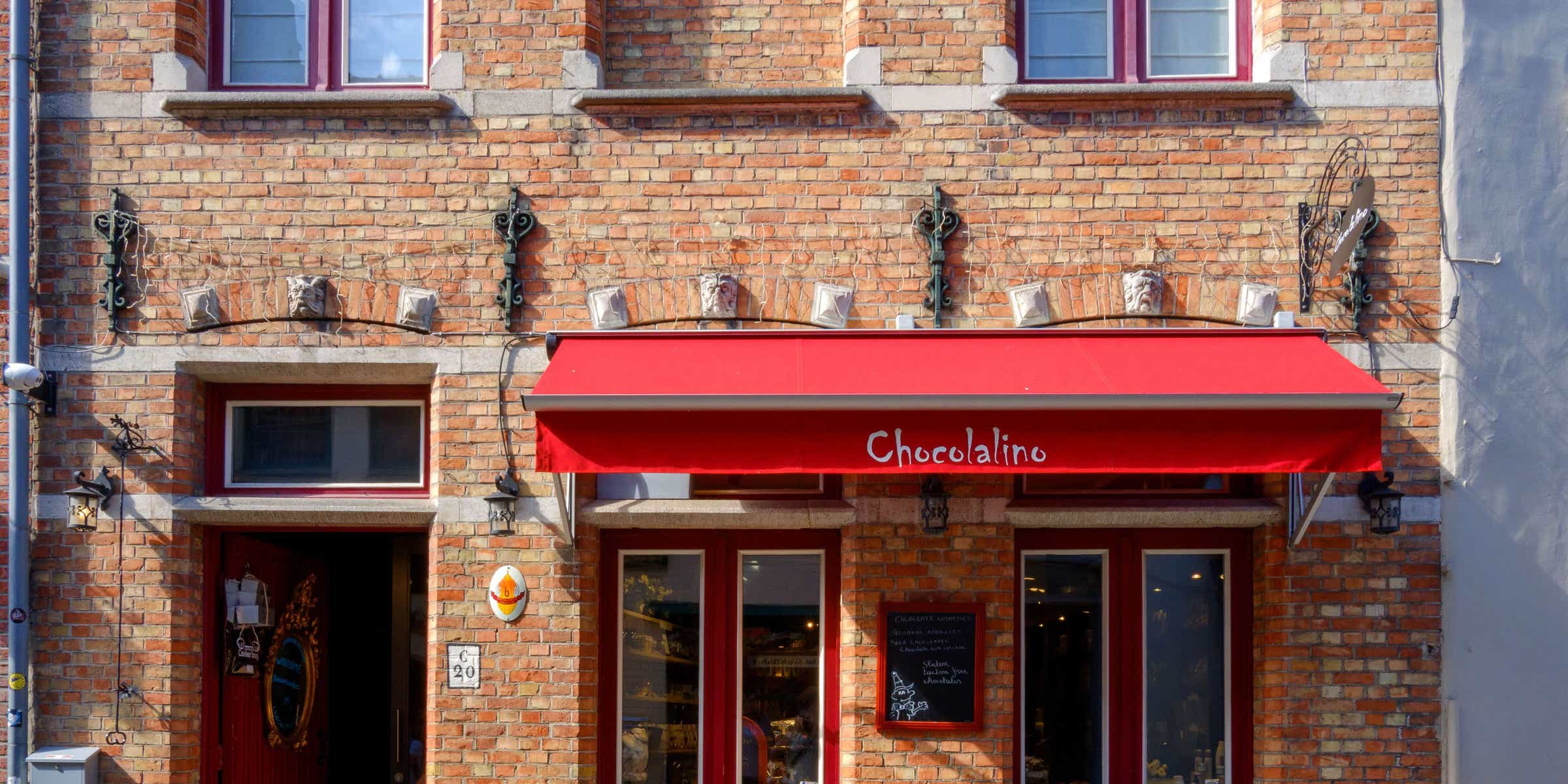
Governos is considered a very creative and striking sans serif typeface, for giving rise to and evoking some establishments typical of some stores in Miami, represented at that time through a design such as Art Deco.
It is considered a fairly friendly font due to its shapes and design. In addition, it contains a thickness that characterizes it a lot and turns it into a typeface of its own for animated and very personal projects. Without a doubt, if you are looking for a typeface with which you want to attract attention, this is undoubtedly the indicated typeface.
Suprema
Font: Font Squirrel
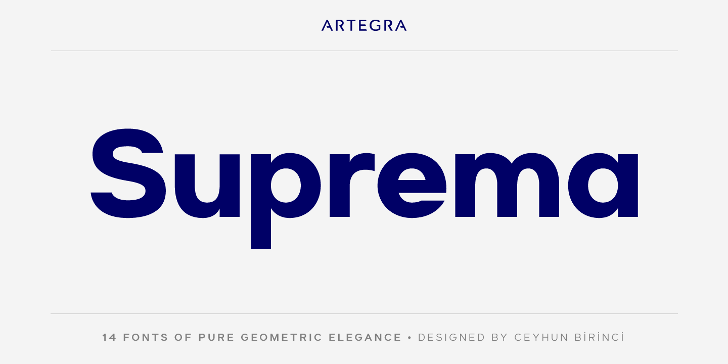
Suprema is probably the most interesting geometric-looking typeface in the entire library that we are going to show you. It is very similar to the famous Futura by Paul Renner, and not that, it gives a very elegant and friendly look to your designs. Another aspect that greatly characterizes this typeface is that it has a high legibility range, which makes it a typeface suitable for any type of text. Do not stay without trying this type of font, since it is quite creative and above all very, very original and attractive.
moonglade
Welcome everyone to the typography of the future or space. It is a typeface that, due to its design, is considered one of the most modern and contemporary. In addition, it contains such fine lines that they are totally suitable and have been designed for reading. It usually combines very well in media such as posters, even in corporate identity, since its design is very creative and personal to be represented in logos. If you are still looking for a typeface that will make your projects easier and even more surprising, you can't miss it, without a doubt.
Kingsland
It is without a doubt a typeface that stands out for its beauty. It is a font that comes from the handwritten family, or also known as the fonts that are designed by hand, like the classic one we know. It is then a font that surprises for its friendliness and legibilityIn addition, another aspect or characteristic that is very surprising about this typeface is that it is quite current and modern despite having its own ancient or classic connotations. It is a font that will help your projects stand out even more, and above all, it will make them even more interesting.
Lombok

Source: Behance
If the geometric-looking typeface that we have mentioned before has been interesting for you, you cannot believe the typeface that is to come. It is Lombok, a font that, due to its shapes, stands out with each line designed in a different and very peculiar geometric shape. It is considered a serif font, although it does not have the classic and pronounced serif that we know and see in roman or incised fonts, it has a fairly modern serif in its designs. An aspect that will undoubtedly leave anyone who sees it represented in any medium open-mouthed.
How much
Source: Behance
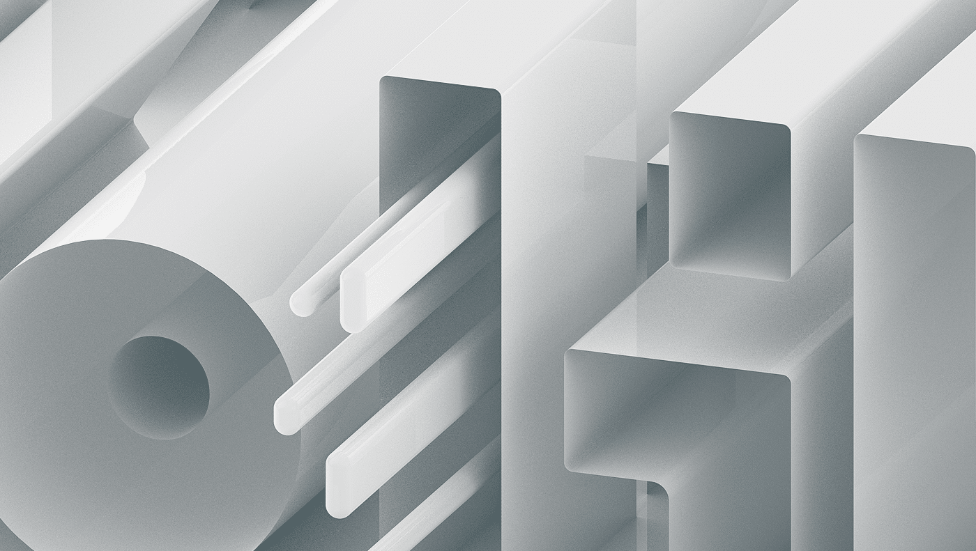
Koliko is a typeface that is characterized by containing a very interesting Latin character. It is a font that, due to its design, contains a bold in its very characteristic and own forms that stands out from the rest. It is a suitable font if you are looking for a typeface that manages to highlight the title of your project or your design, this is your ideal typography. In addition, thanks to its very accentuated shape, you can even use it to highlight small words or letters that are necessary. You cannot lose sight of this daring design, which you will undoubtedly need on your list.
Olivia
Olivia is another of the cursive typefaces, which is characterized by being designed by hand. Unlike the others, it maintains a solid and calm style, a curious and clean typography with which you can take care of your work in a very professional way. In addition, her design does not go unnoticed, since it maintains a character typical of the Renaissance era and plays with some details that are very typical of the current era. It is an ideal typeface to be represented in an advertising spot, where the main objective is to draw the viewer's attention. Don't forget about her because she is perfect.
When
Quando is the simplest and most natural typeface of all the ones we have shown you in this list. It has some very round shapes in its design, an aspect that makes it quite an interesting font. It is a serif font, although the serif it has is very little pronounced, which is perfect for your most personal projects. In addition, it is very easy to find and download, since you have it available in applications such as Google fonts. You have no excuse not to have it in your font folder, it's also free, you can't ask for anything better from it.
Glamora
Source: Fontscrepo
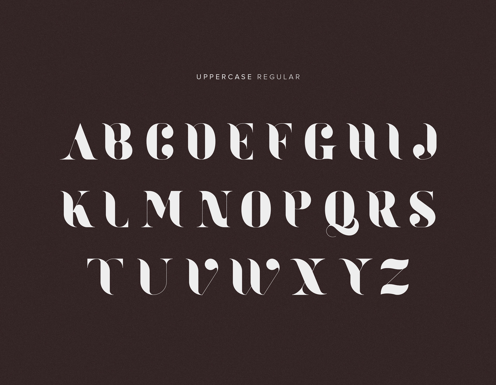
If you look up the term glamor in the dictionary, the image of this typeface appears on any perfume or fashion advertisement. It is without a doubt, the cleanest and most glamorous typeface you will ever see. It also belongs to the serif family, but leaves some details that are very typical of the current era. It is a fairly wide font, which makes it a possible option for your most professional projects.. You can use it for both titles and brand designs, an aspect that plays very well and will benefit you on a good and excellent image of your designs.
poiret one
Font: Font Squirrel
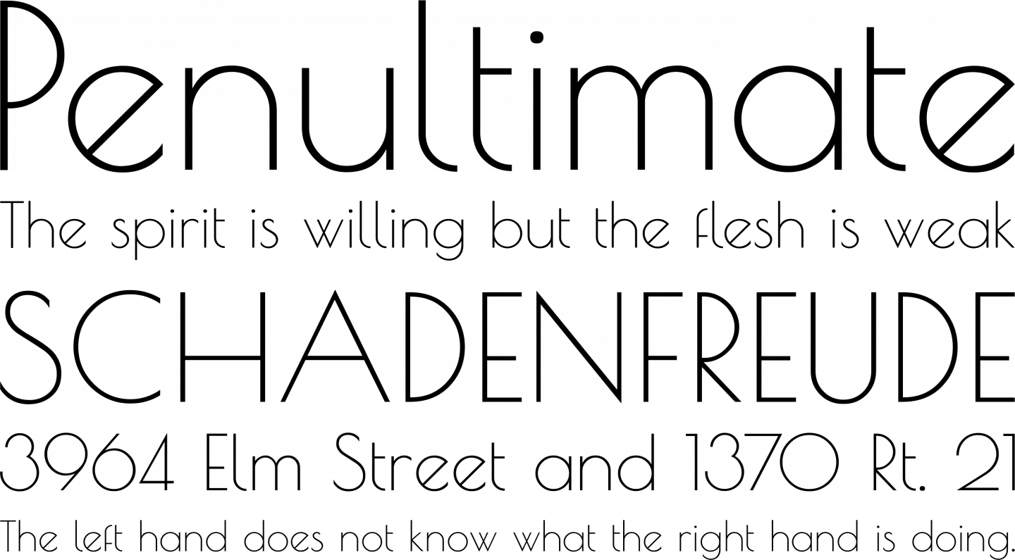
It is a font that, due to its design, we could say that it combines very well for any sign of a luxury pub in Paris. It is a very clean typeface and easy to work with your design. It contains curves and lines that are projected in its design and are very interesting. The only drawback is that it does not contain a very large number of symbols, so it only has the most common characters. Without a doubt, a typeface that will take you back to the most glamorous era and that will make you shine and dream like never before.