
A logo has always been defined as a corporate image that symbolizes the entire look of a brand. For this reason, some brands and companies have established marketing guidelines to design some of the best logos.
The trick? It is undoubtedly to escape from everything rational and compositional, and design with exclusive color palettes and fonts. For this reason, We wanted to design this post so that you can be inspired by the creation of other designs, and thus get away from the more normative designs.
Next, we show you a list with some of the most original logos.
List of the most original logos
barbie logo
![]()
Although it may not seem like it at first glance, the Barbie logo hides a background in its design. And it is that her design is so exclusive and unique, that there is no other logo that we can compare and equal in its physiology and design.
Its design shows a feminine image that fights at the same time, with a refreshing and current aspect. It is undoubtedly the spitting image of a brand that has been around since 1959, and that has reached the big screens with the aim of being part of history.
McDonald's logo
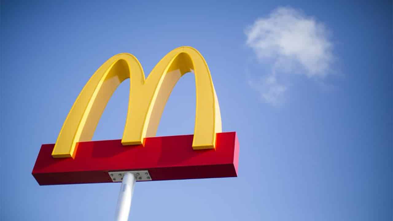
The famous fast food chain does not go unnoticed in its image either. Since we are dealing and talking about a logo that has been in use since 1950. Since then, it has become one of the most publicized and promoted brands on the big television screens.
The logo has managed to draw the attention of viewers through its two main corporate colors, such as yellow and red. In addition, its characteristic logo has meant that we cannot get it out of our heads or associate it with its brand when we see it.
Without a doubt, one of the best marketing strategies ever created.
mercedes benz logo
![]()
We have all seen the Mercedes Benz logo at some time when we have gone down the street, and the truth of this logo is that it fully represents an exclusive and unique brand value that we would be surprised to know about the temporary changes and redesigns that this brand has undergone. in the car market.
The famous insignia of the three-pointed star forms, part of three of nature's key symbols: air, earth and sea. A feature that the brand itself wanted to overlook.
Warner Brothers logo

Warner Brothers is undoubtedly another of the logos to highlight. The famous film and television studio, which has managed to fill the best screens around the world, maintains a unique and interesting corporate image that, over time, has managed to leave an undeniable mark on the world of graphic design.
The brand, which has been on the rise since 1925, has undergone a large part of the corporate changes, starting with its colors and an improvement in the adaptation of the symbology and returning it to its correct temporality.
Lollipop logo
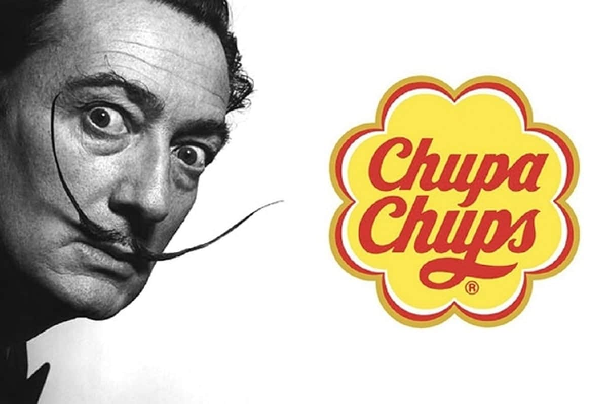
Without a doubt, it is one of the most original and unique logos that no other would be able to replace or replace. It is one of the brands that, to date, has not suffered beyond some other small change in its design.
Its reddish and yellowish colors are expressive and striking enough to attract the attention of an audience. who has been using their products for decades.
It is one of the brands that has best adapted over the years and that still remains exclusive and unique today.
London Underground logo
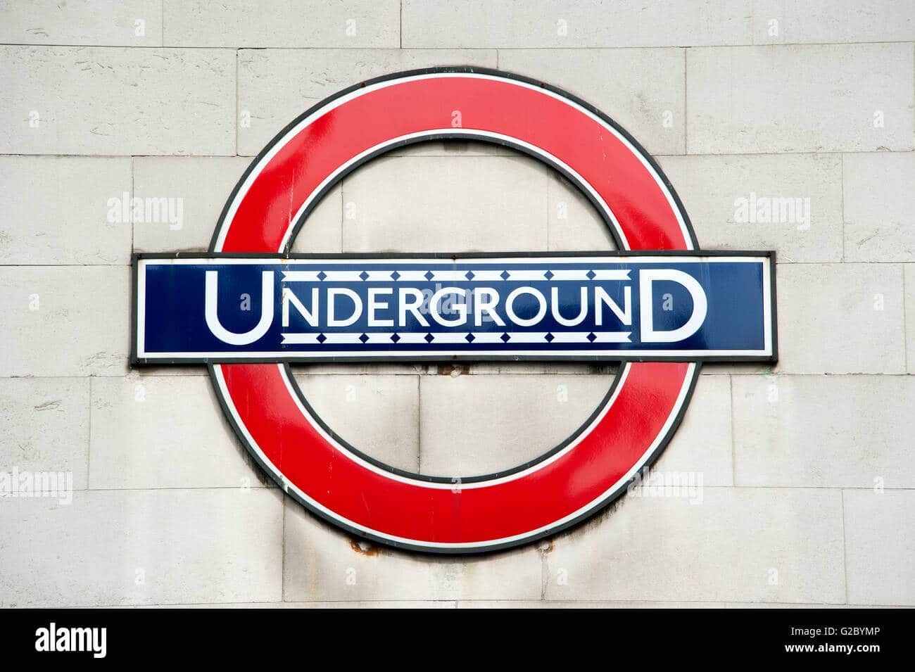
And last but not least, we could not miss this great other seal, more than a logo, which has occupied a large part of the London stations. The famous Underground logo represents in its entirety one of the most successful and original logos that have been designed.
Its corporate colors, red and blue, are part of the flag of the United Kingdom, another of the most common emblems if we visit London. Without a doubt, this logo has become one of the most representative every time we see it, and it still endures in London cities.
Conclusion
All brands are capable of designing, but very few are capable of leaving their mark. For this reason, we have created this list that we hope has been of great help to inspire you and create your own designs.
Some of these brands have gone through different changes, until reaching the ideal and necessary shape so that currently, their design cannot be removed from our heads and remains engraved in our memory every time we name their brand.
Designing a logo with these characteristics and similarities is not an easy task, but we are sure that they will be able to help you on the path of creativity.