The world of packaging is vast and complex, you can use various techniques, from illustration, to stamping or photography.
Packaging has an important role in the design of a brand, is in charge of convincing the user to buy the product. It must attract attention and must convince the consumer. It is the first contact that the person has with the brand, so the packaging must convey all the philosophy and values of the company.
Next, we present you 5 manual-artisan packaging designs that do not leave you indifferent.
Fish Club Wine
Designed by Stepan Avanesyan, Stepan Azaryan, Christina Khlushyan and Eliza Malkhasyan
Fish Club is a restaurant specializing in seafood. The packaging was designed for the house wine, which is offered as a special gift. The design is intended for those who are fish lovers, so the central design is the fish scales. The packaging features stylized representations of a fish silhouette with beautiful patterns.

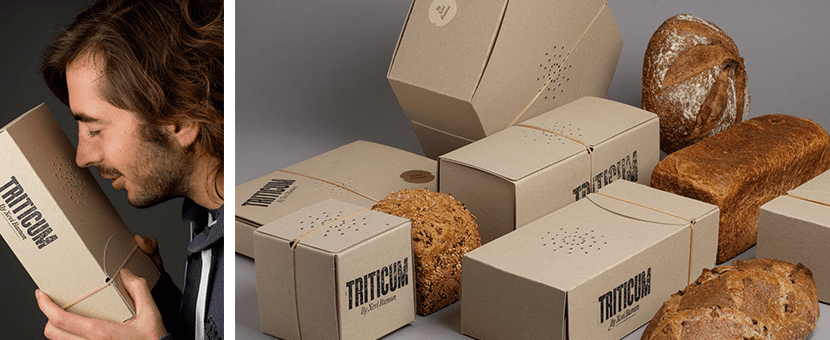
Triticum
Designed by I'm sorry
Lo Siento developed the packaging for Triticum, an oven founded by Xavi Ramon. They use cardboard as packaging and the logo as perforations as an odor amplifier. In addition, the brand's logo is worked with rubber pads. A simple, industrial-style design that enhances the brand's artisanal value.
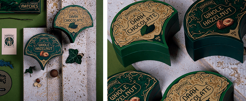
Mamor
Designed by Varduhi Antonyan, Narine Avanesyan, Varduhi Antonyan and Narine Avanesyan
Mamoor is the brand of a restaurant. Its name means "moss." A soft green plant that grows in a layer on wet ground, rocks or trees, is associated with forests and transmits the special energy typical of a forest. This is the concept that the team has used to design the entire identity of the brand. Art Noveau is the style that has served as inspiration for all creation, as well as elements from a wild and mysterious forest.
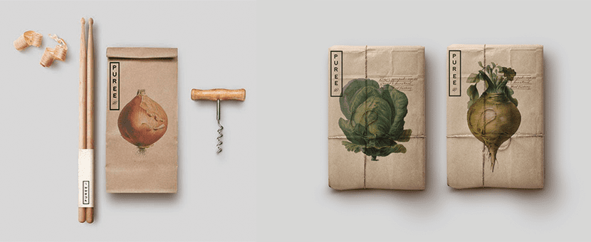
Puree organics
Designed by studioahamed
The Marie & Claude La Ponte brand have the Puree product, an organic medicinal garden where food is produced by the neighborhood. They wanted to focus on the product they produce, as well as reflect the attention and care they put into growing. With this design, Studiohamed wanted to differentiate Puree from other organic stores. In this way, he created a design based on simplicity through illustrations and plant materials.
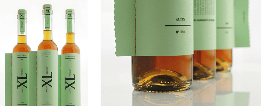
XL Ratafia
Designed by The Graphic Inn
The label of this bottle of liquor is sewn with thread and completed with a list of the combinations of the herbs with their Latin name. Both the design of the label and the proportions of the bottle refer to its naming, which derives from the nomenclature of extra long.