
As in previous analyzes that we have carried out in Creativos Regarding logos, we are going to see another example of how a brand modifies its brand image according to its needs. And it is that, this time it was not going to be less, like any large company that has been in the market for many years, it has had to adapt to the new sales models. This time we will see the evolution of the Pans & Company logo.
And it is that the “Fast Food” company of sandwiches was bornUnlike other similar companies, already with the idea of making fast food in another format than the one we saw. Nowadays we see something very common to have hamburgers, sandwiches, tacos and even battered chicken strips. But this is something that didn't happen before and that now is an idea that even has competition, as is the case with Subway.
In this way, a product that is so typical in Spain, was built in such a way that we could eat it in the same time that you could eat a fast hamburger. This is how Barcelona was born, a franchise with more than 550 establishments worldwide.
What is Pans and company?
Pans & Company is the Spanish franchise of fast food-style sandwiches. In the style of an ice cream parlor, we can choose "toppins" to create the combination we want in our sandwich. This company was born in Barcelona in 1991 and is still active in more than 10 countries today. The IberSol company not only runs the Pans and Company franchise, but also has other models such as Burger King or Ribs, among many others.
They have more than 600 restaurants throughout the group, which is why the Pans and Company brand belongs to a business guarantee space and that is why the yellow brand of sandwiches is still valid among us. It is not surprising that the brand has evolved and changed its image to what we know now. The needs for new styles due to inclusion in social networks and the new audience make it necessary.
The first Pans and Company logo
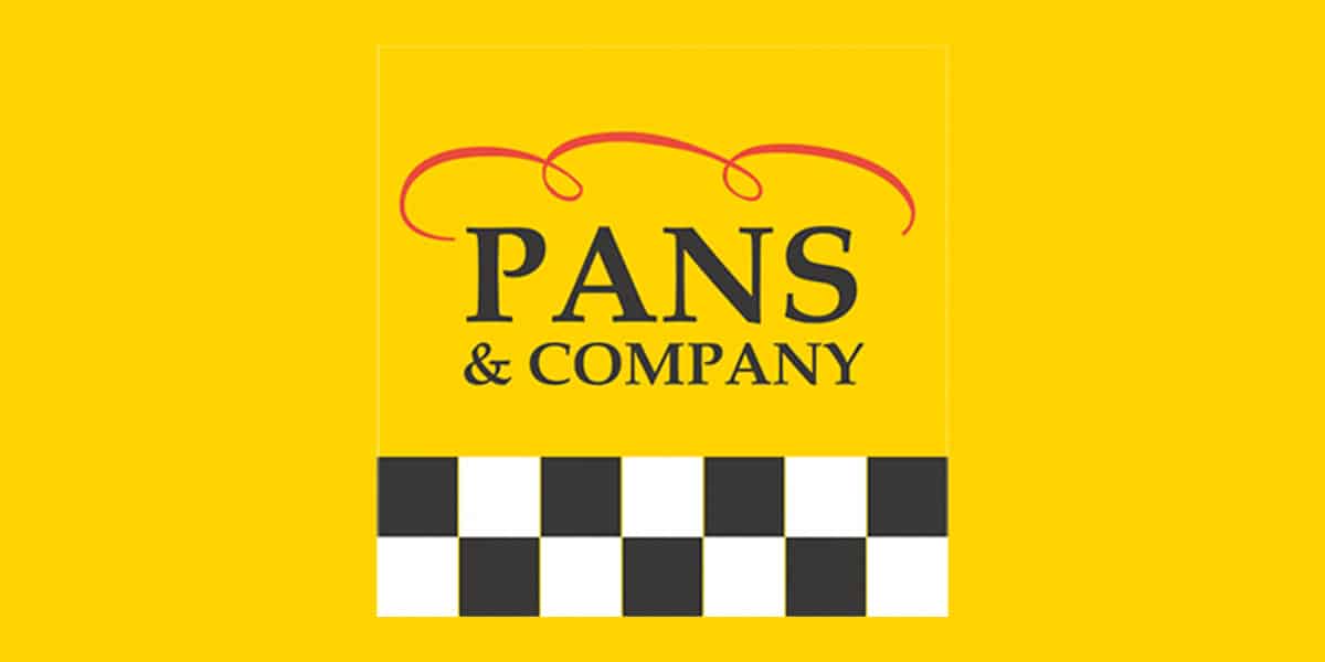
As we have said, the brand was born in 1991 with a very striking image. The color par excellence of the brand would be yellow. This would attract the attention of the little ones by giving a more fun vision. Since this color evokes fun, optimism and is full of energy.
This touch hasn't changed much in its 30+ year history., but the tonalities of it have been changing. At first, yellow was more electric, something that was accentuated when used in print formats and methacrylate with neon lights. In the early 2000s, neon lights and bold colors were a must.
They also added a square stripe, which alternated between black and white at the bottom of the design, as we can see in the image. And at the top, as an image, was what could be seen as the top of the bread. Simulating a sandwich above the letters of Pans & Company. The typeface was an unmodified serif.
A transition that went unnoticed
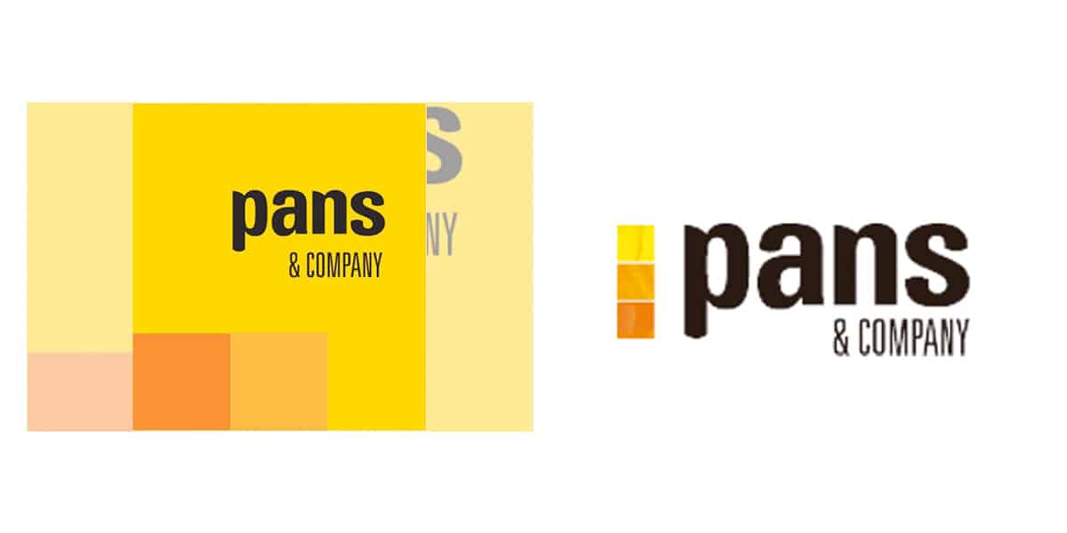
The logo was changed years later, to give more prominence to the lower squares and make it more consistent with the design. Since black and white with yellow tones did not make much sense. The fast food service looked like an urgent taxi service, more than a sandwich chain.
They placed three squares in different shades from yellow to orange. These were placed vertically on the left side of the design. This design eliminated the sandwich element, as Pans and Company was a well-known brand at the time, He did not need elements that distinguished what his brand was about. This design went unnoticed and was not very flashy, since they did not modify much.
The mosaics that formed the elements of the new franchises they were with the squares of different shades and in fact, we can still see in some franchises how it remains the same. The fact of being a franchisee makes you assume the costs of the image change, something that some are not willing to assume or need more time to change it. This is something that happens in all franchises.
The current visual image
The image of Pans and Company today has undergone quite a change. And it is that it has not only changed the decorative elements, but it has also made a change in color, typography and logo in general.
The squares that previously existed as the shape element of the image have been removed. The logo is a square element itself, yellow in color. This is positioned on a white box, where the letters of pans and company appear on. In this way, it can be seen that yellow is another element that the brand plays with.. The typography has been modified this time, giving the name more personality.
The color, as was logical, has been modified to a more pastel tone. This is because brands have to generate more friendly colors for their digital version. Social networks have changed the way brands are viewed and bright colors or more aggressive tones have been rejected.
In addition, the brand has included other services such as Café Pans, where it expands its business vision, by not only offering food in the form of a sandwich, but you can also have breakfast and snacks with a sweet tone.
Conclusion
I think the evolution of the logo of pans and company has been correct, since the previous one had become quite outdated and had clear deficiencies to be displayed in digital environments. And although the brand is still present in many cities, has lost quite a bit of name in recent years due to a low advertising campaign and higher costs than its competition.
Changing colors and removing elements that overloaded the image It looks good but it has not been able to carry out a campaign that highlights all this change for the better. And the sandwiches have lost presence with respect to other services that have been included. The sandwich should be the center of everything.