Pastel colors are a trend. In graphic design they have acquired a new role and are no longer only used in projects related to children or femininity, it has become a highly valued aesthetic! If you want to start successfully incorporating these tones into your designsYou cannot miss this post in which I tell you what pastel colors are and I share with you 50 palettes and ideas to combine them.
What are pastel colors?
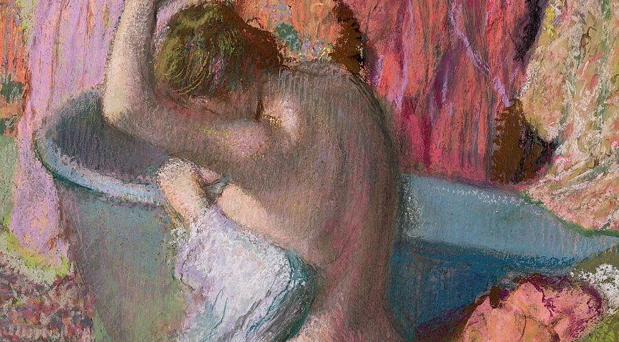
Technically we could define pastel shades as colors that are built with high lightness and low saturation or average But what do they owe that name? The origin must be sought in the world of painting. In the Renaissance "pastels" began to be used, pencils similar to crayons made from powdered pigments and a binder (resin, rubber or clay). In the XNUMXth century they became very popular and painters of the stature of Edgar Degas or Jean Monet used them again in the XIX century.
However, today we use the term "pastel" to refer to colors that convey a sensation of softness. Colors serve to communicate and, traditionally, these tones have been associated with the infantile and the feminine, because they convey a feeling of calm and sweetness. In fact, brands like Evax & Tampax have adopted this aesthetic in its videos and promotional content aimed mainly at women.

Instagram feed of @drcord
However, the discourses in advertising and graphic design are constantly changing. In social networks, such as Instagram, artists and designers have chosen these color palettes to express their creativity, detaching pastel tones on many occasions from the meaning that had traditionally been given to them. In the last year, these shades too have become a trend in the world of fashion and we have seen how the windows were flooded with pastel garments to welcome spring Do you want to learn how to combine these colors to use them in your designs?
How to combine pastel colors
Create monochrome combinations and play with the intensity of the colors
A good choice for combine pastel colors without risk is to create a monochrome palette from a single pastel color. Playing with the intensity of the colors, you will be able to introduce contrasts to the combination and you will achieve a very pleasant aesthetic. You can use tools, like Adobe color, to create this type of palette.
Bet on a predominant color
You do not have to give up the variety of color, if you want to use very different pastel colors, you can do it! Simply, bet on one of them to be the common thread and use it as a base color to give logic and coherence to the design. If you do, reconciling different pastel shades is not going to be a problem for you.
Use winning combinations
There are combinations that are harmonious and pleasant for us. Take advantage of them! For example, pastel blue and pastel orange, being chromatic opposites, they marry perfectly. It is also a very good idea to combine the pastel blue with marine aqua and yellow tones. If you also add nudes colors to the palette, you will be transported directly to summer.
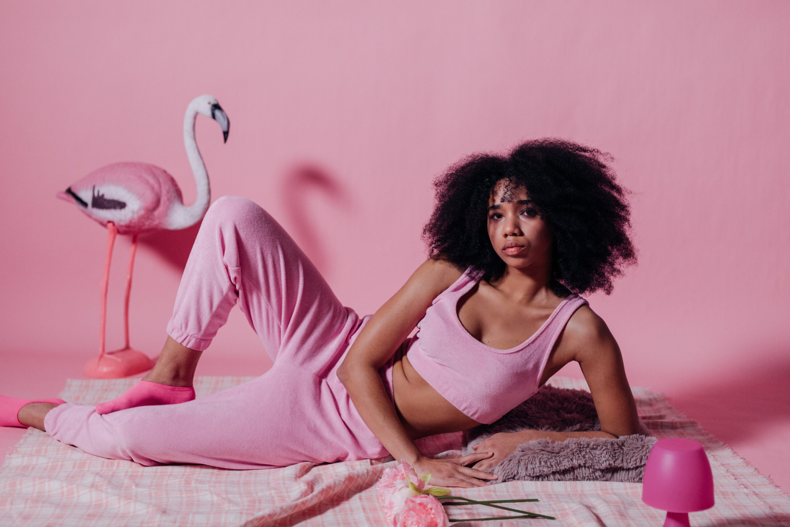
El Pastel green can be combined with its chromatic opposite, the pink. If you want to enrich the color palette, you can use different shades of green and pink. Earth tones, khaki or beige are also good companions to pastel green. The pastel pink, harmonizes very well with the lilac, analog on the color wheel. In fact, it is one of the most versatile, since it can be combined with almost any soft tone.
Introduce neutral tones
You can combine pastel colors with neutral tones, such as gray or white. It is a form of balance design. If your intention is for the "pastel aesthetic" to be predominant, make the neutral color a complement and the pastel color the base of the color palette.
Learn from the cinema
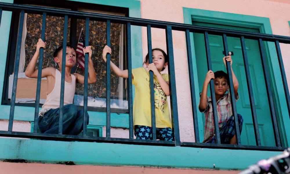
Scene from the movie «The Florida Project»
In the world of cinema, color is one of the most careful aspects in the scenery. In fact, there are films that, beyond their content, stand out and are critically acclaimed thanks to their treatment of colors. Why not learn from professionals? In order to create your color palette you can be inspired by scenes from those movies, configure it based on the tones that predominate in them and paying special attention to how they are implemented. For example, in movies like "The Florida Project" or "Skins" it is clearly committed to this type of aesthetics.
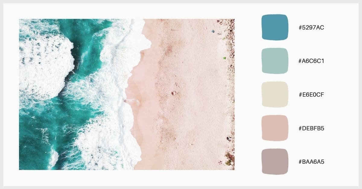
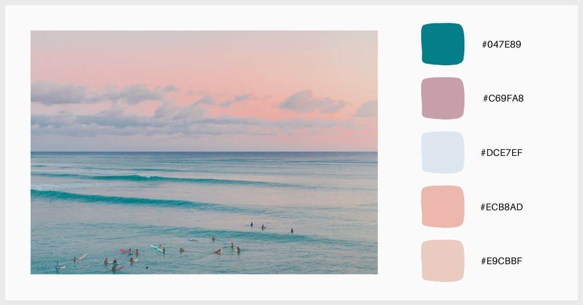
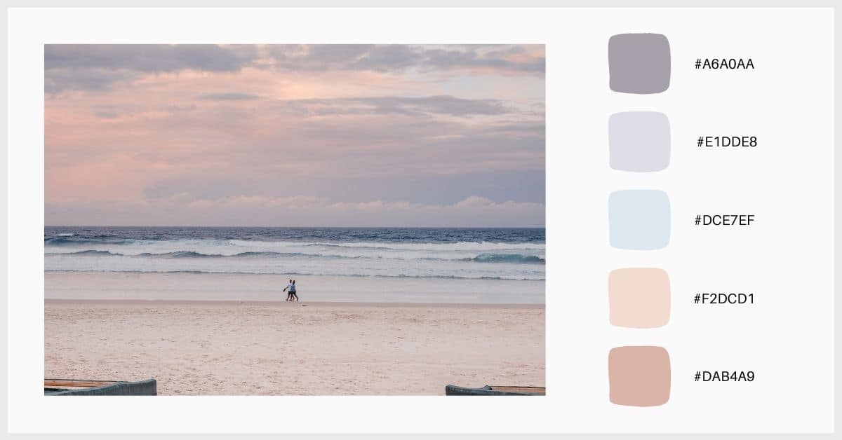
Look for inspiration in nature and photography
Nature is a inexhaustible source of inspiration and ideas. The beach, sunsets, the colors of the rainbow, there are numerous settings that include pastel shades and they are there ready for you to use! Go to photographs of natural environments and urban landscapes, use the eyedropper to identify colors and create a personal and unique palette.
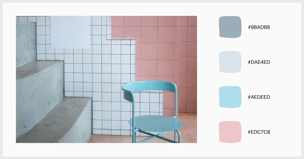
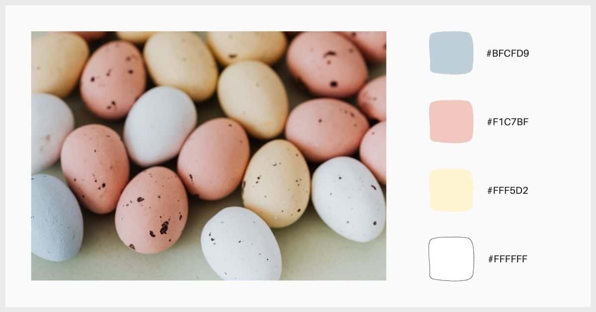
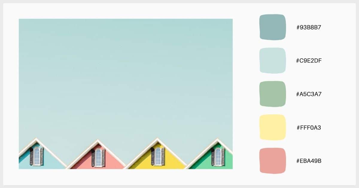
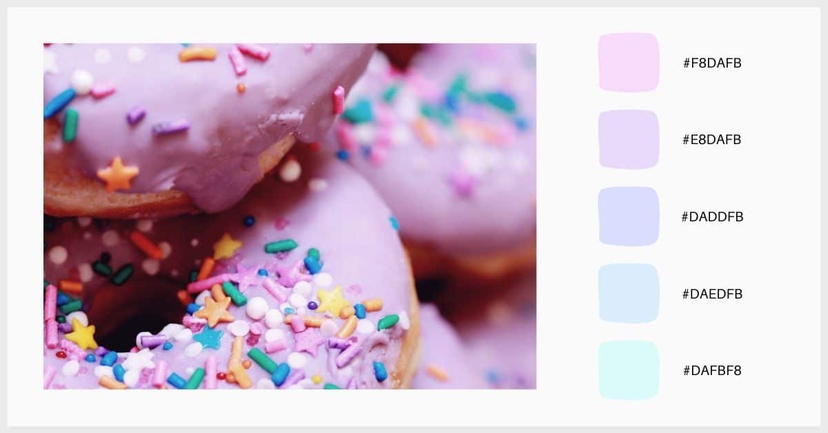
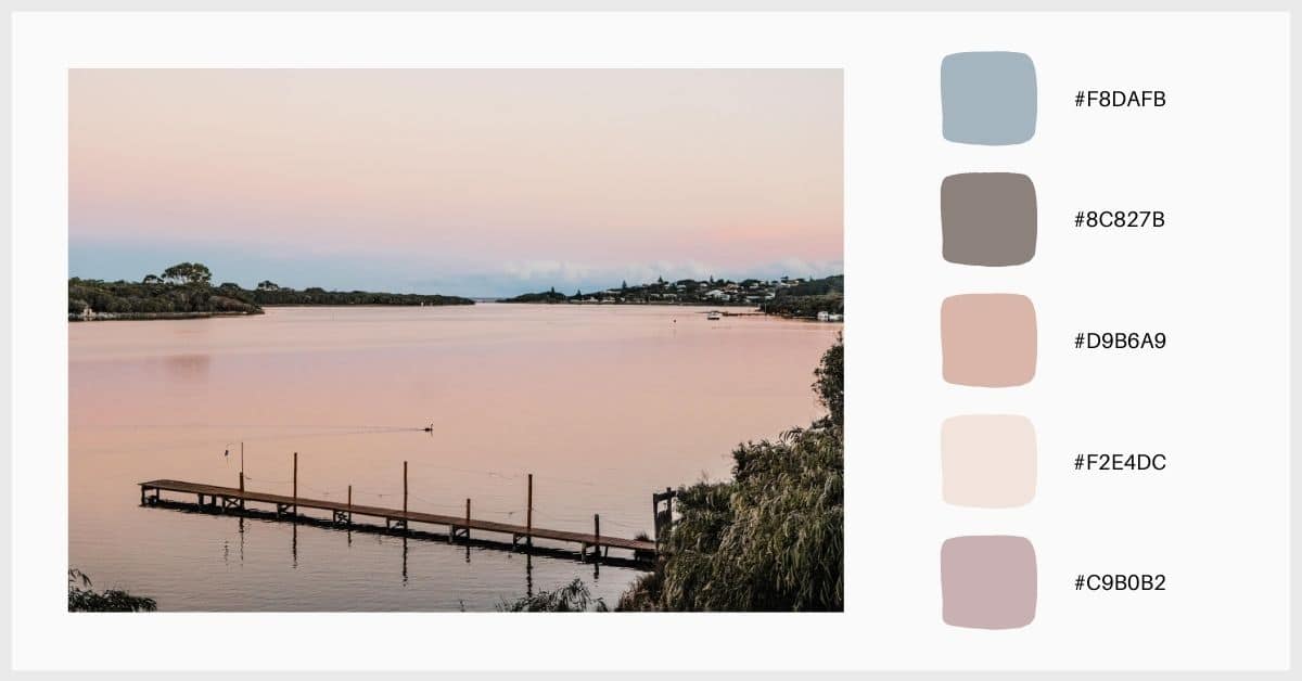
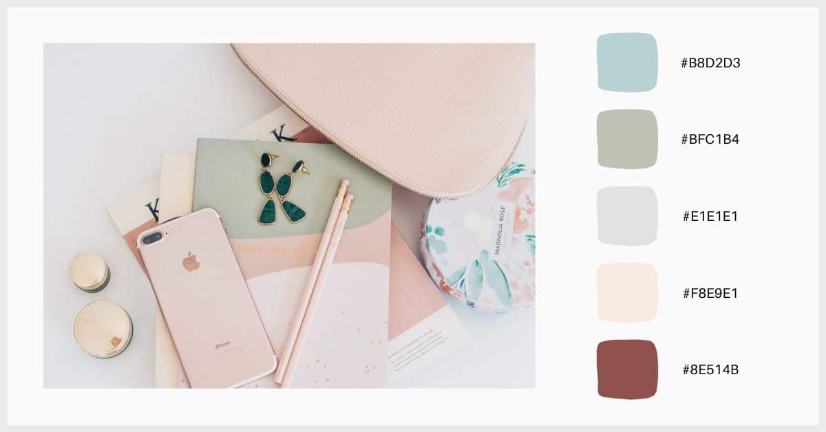
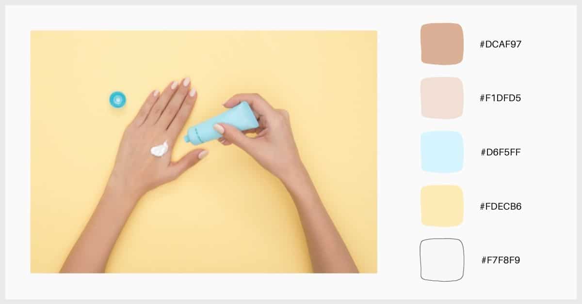
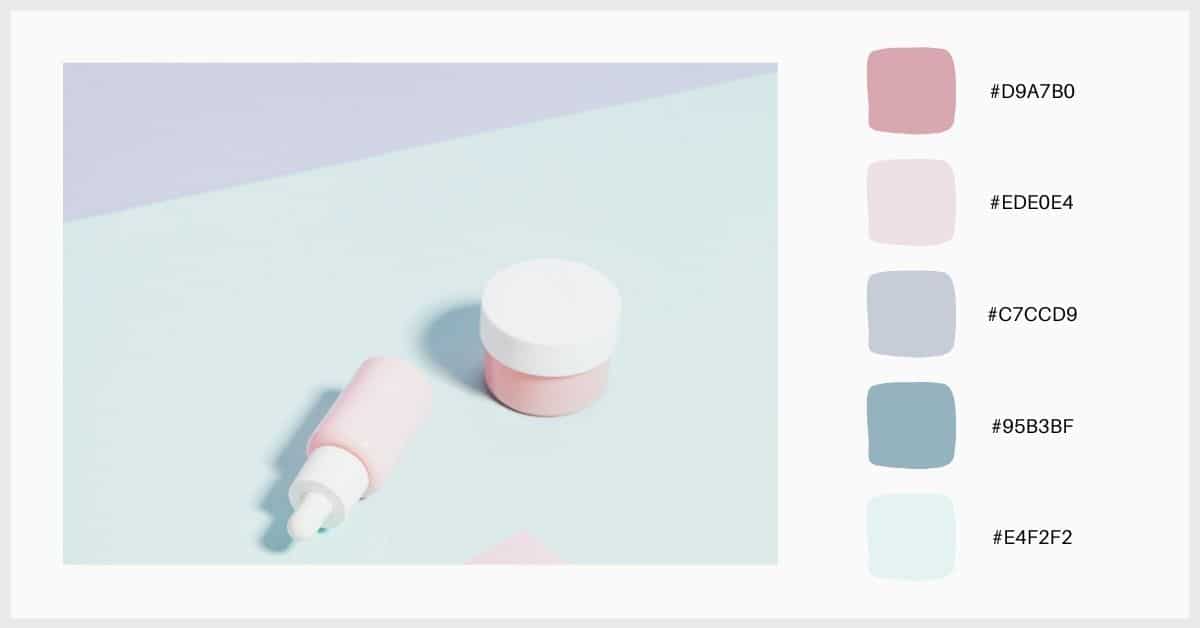
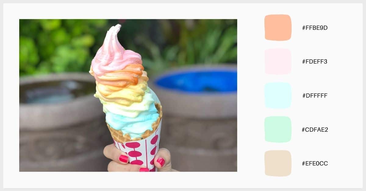
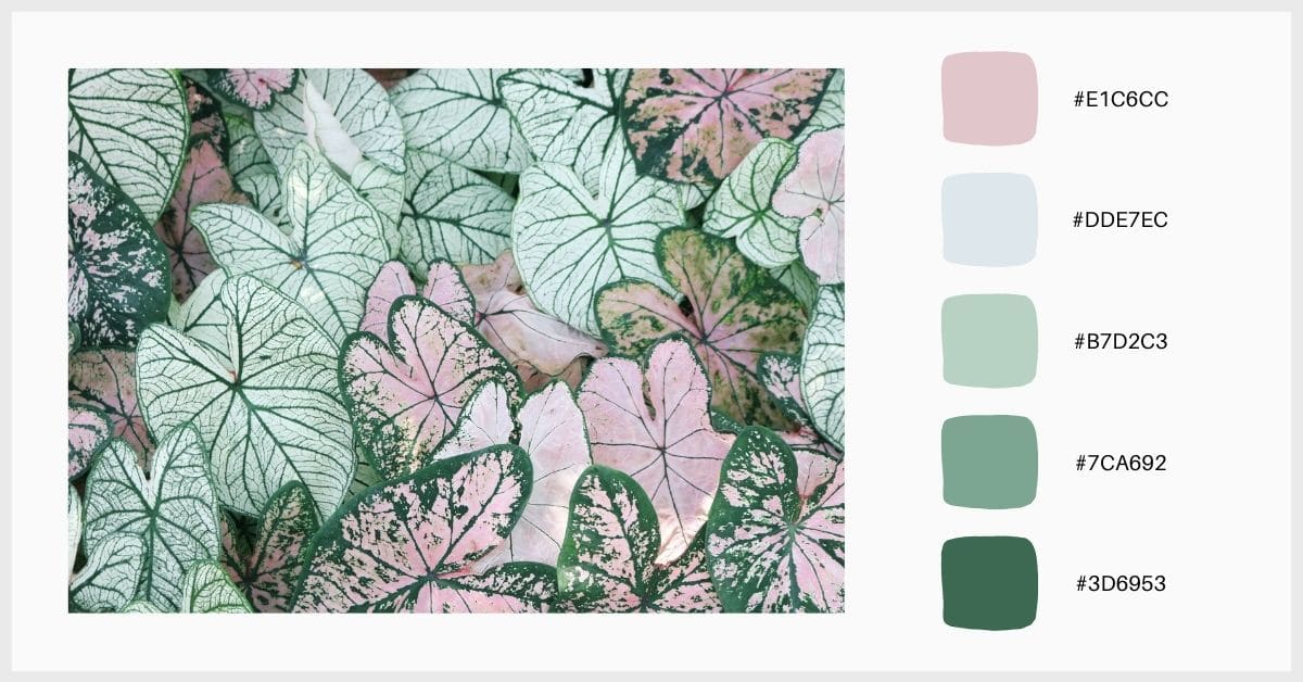
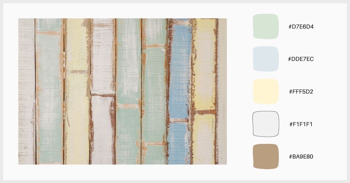
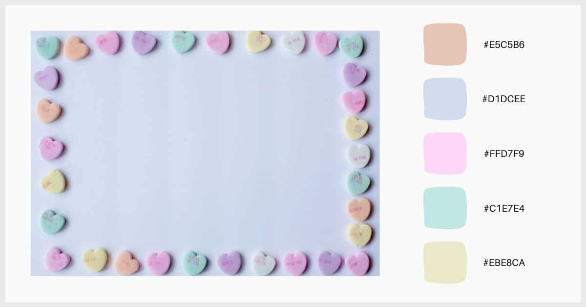
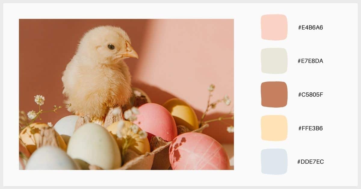
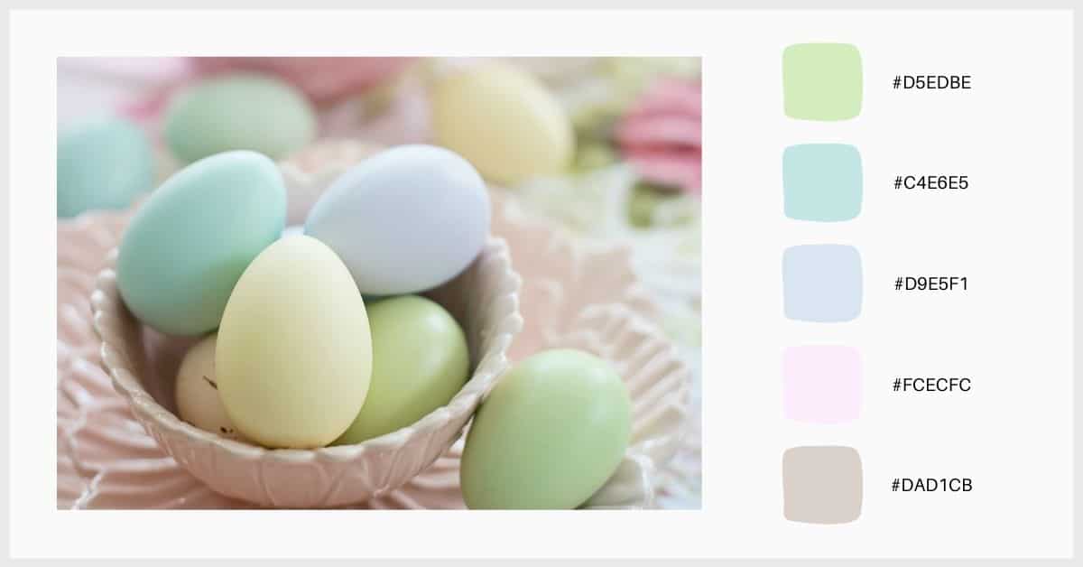
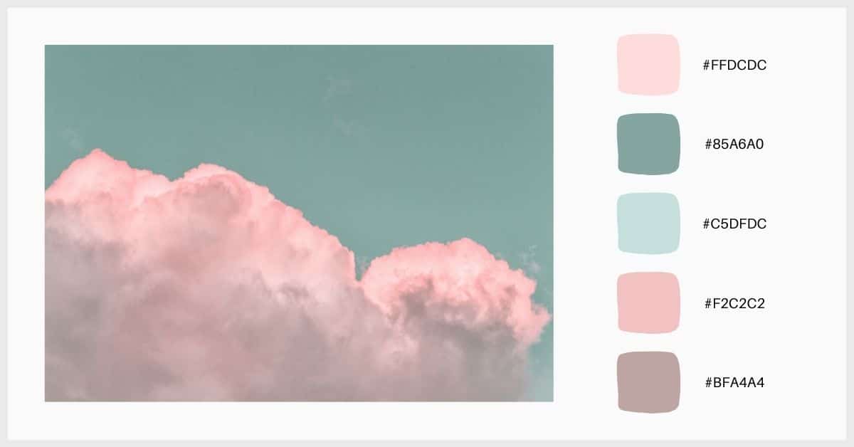
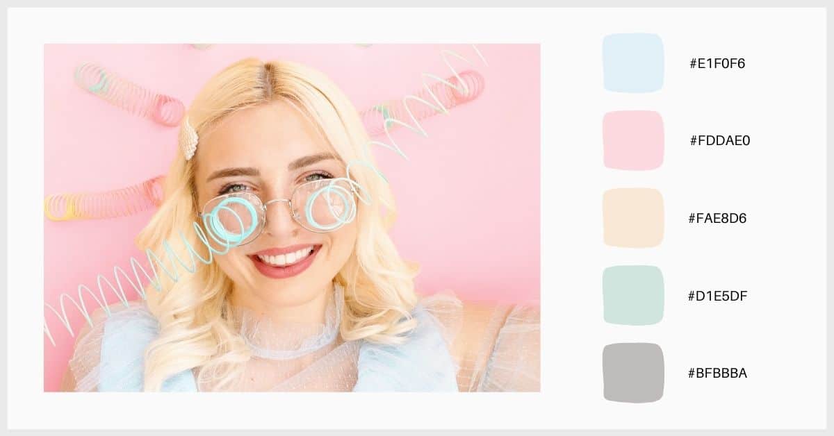
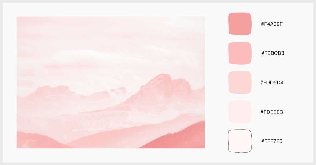
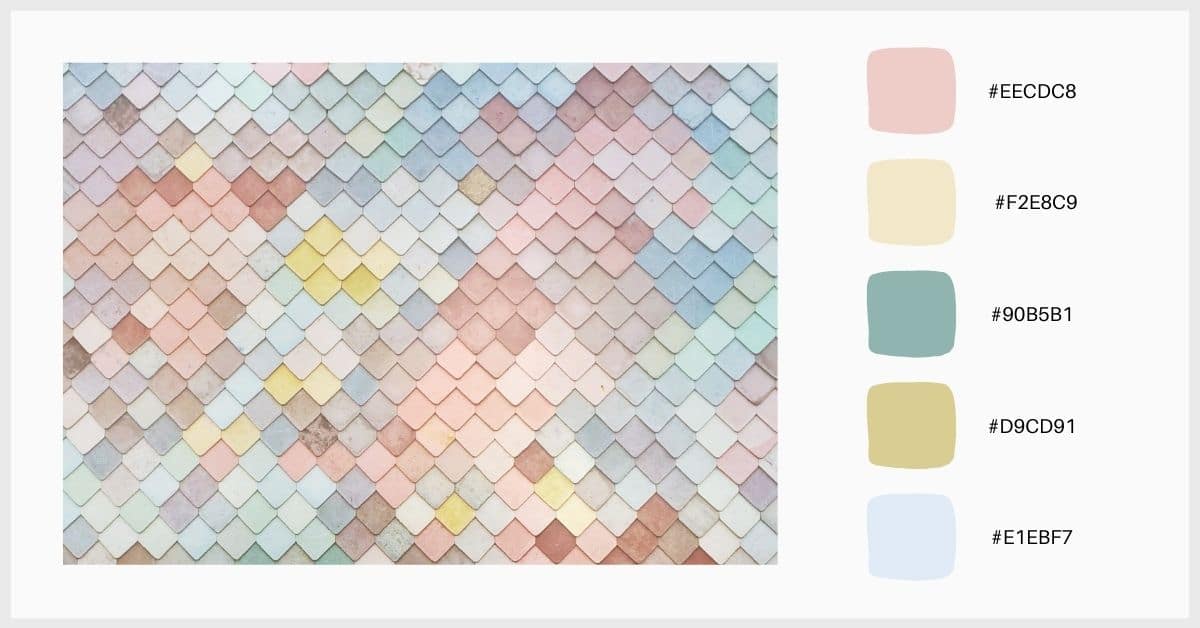
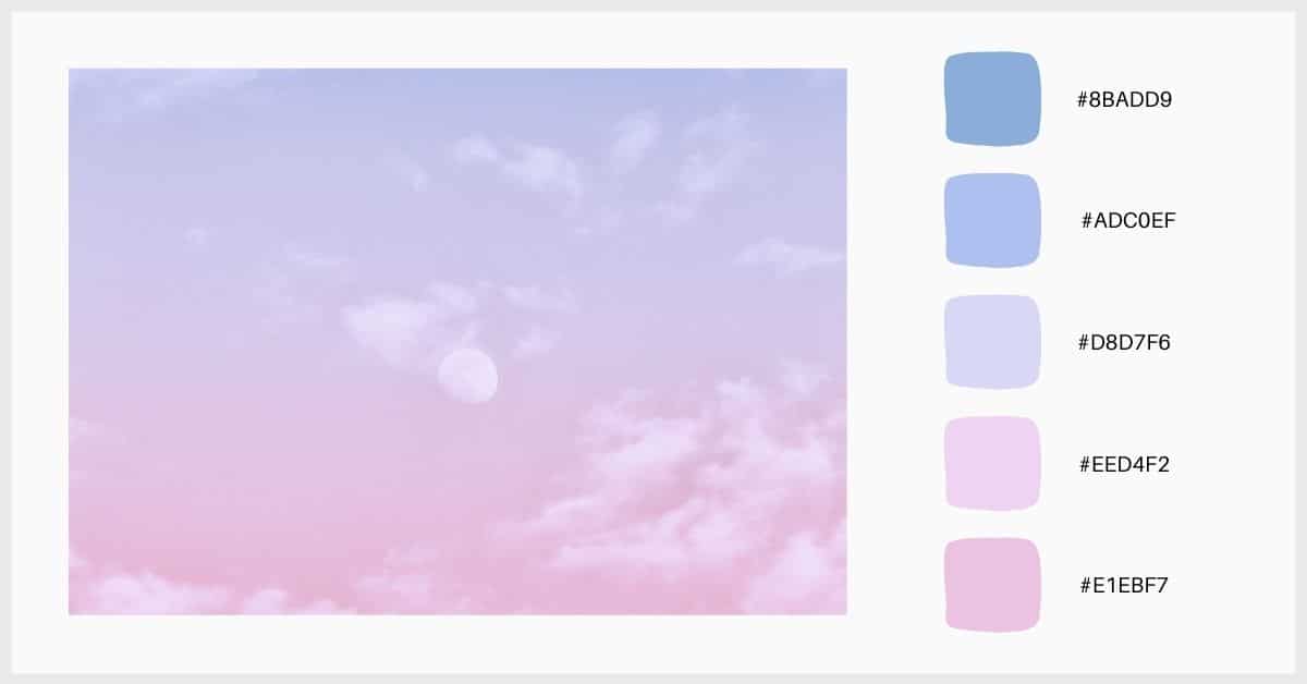
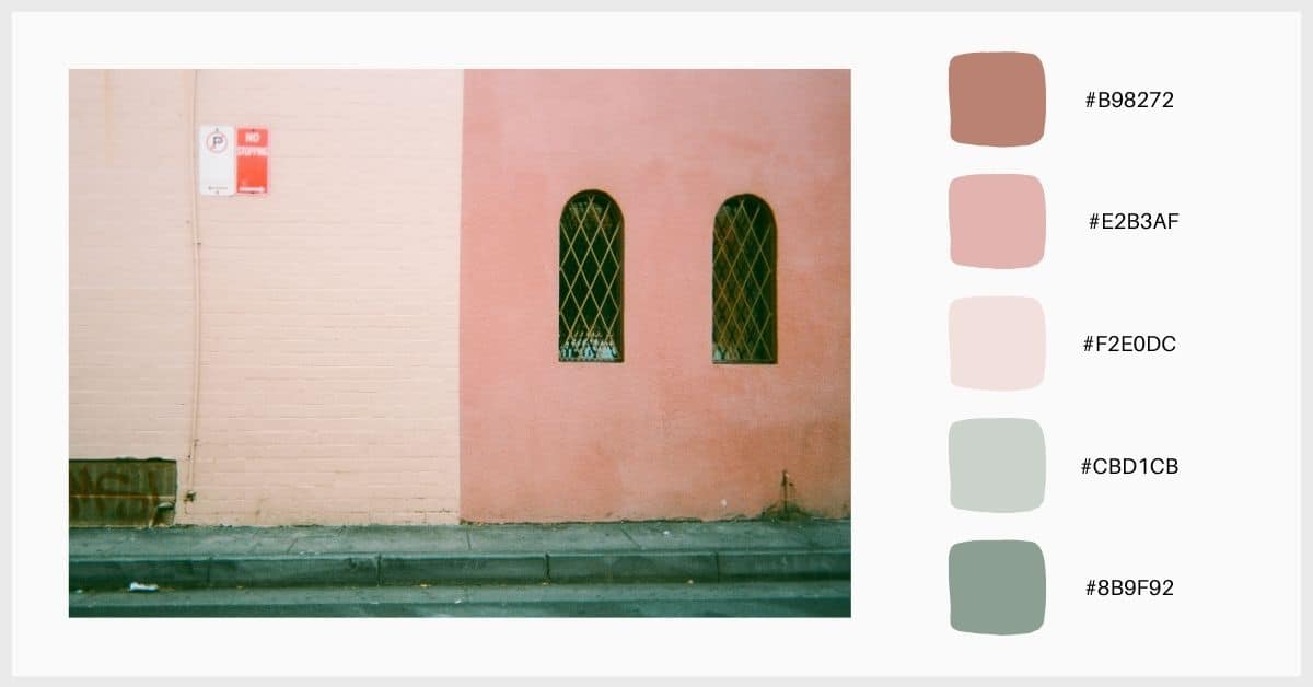
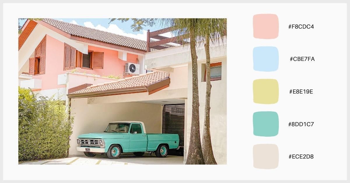
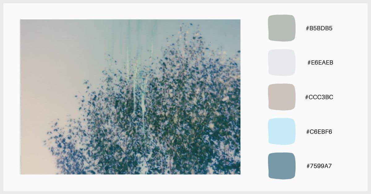
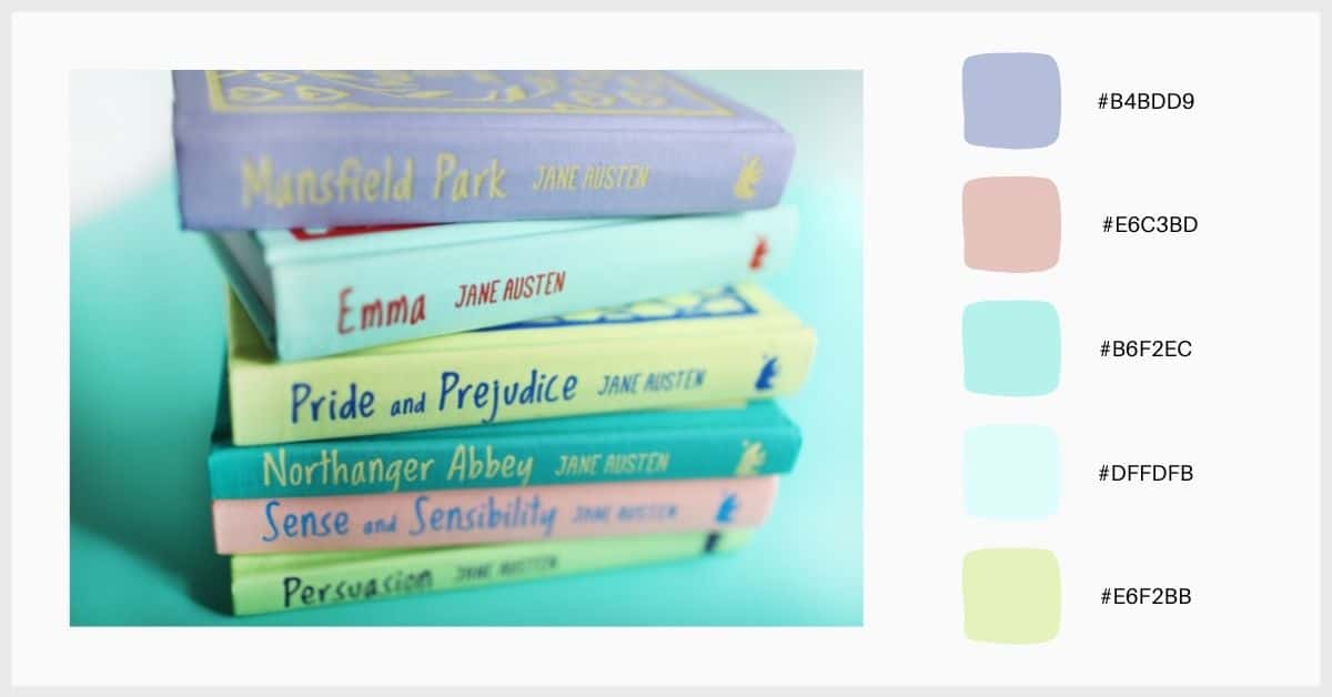
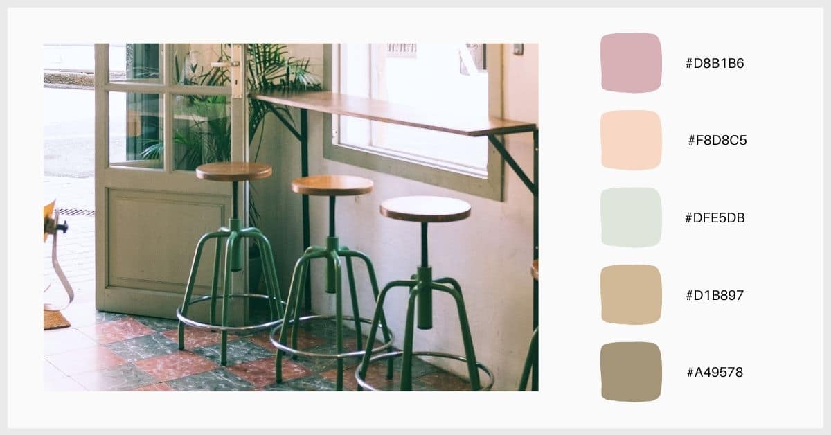
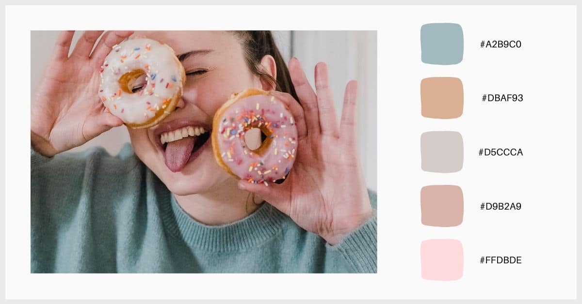
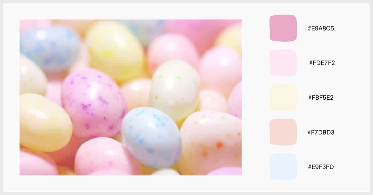
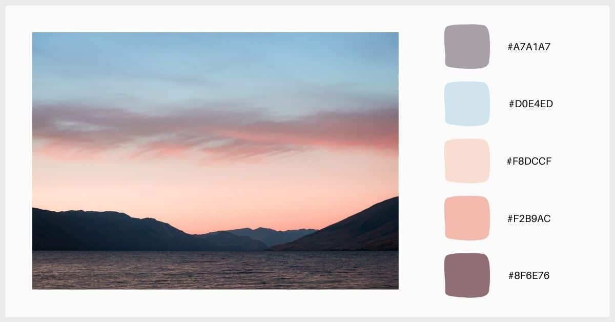
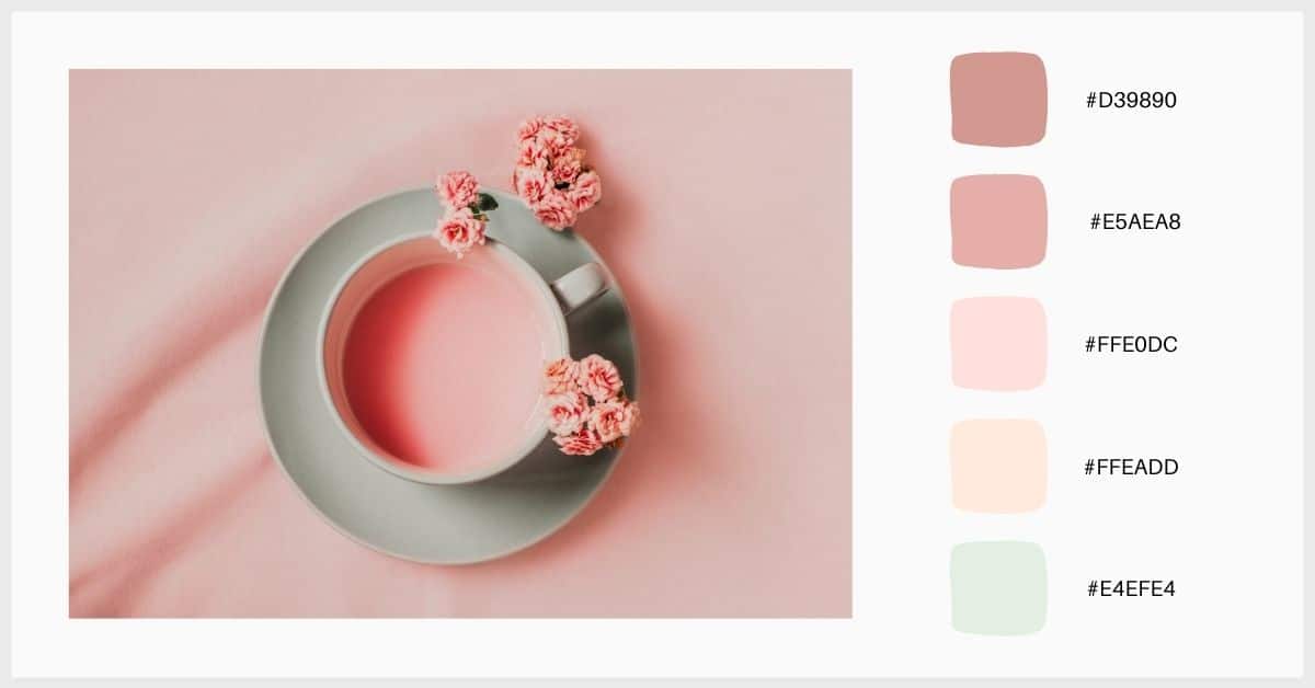
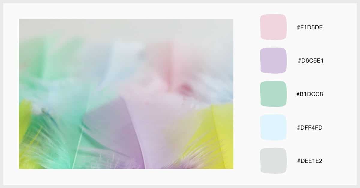
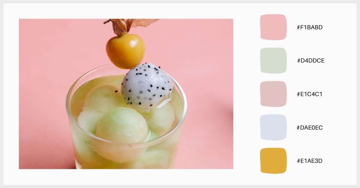
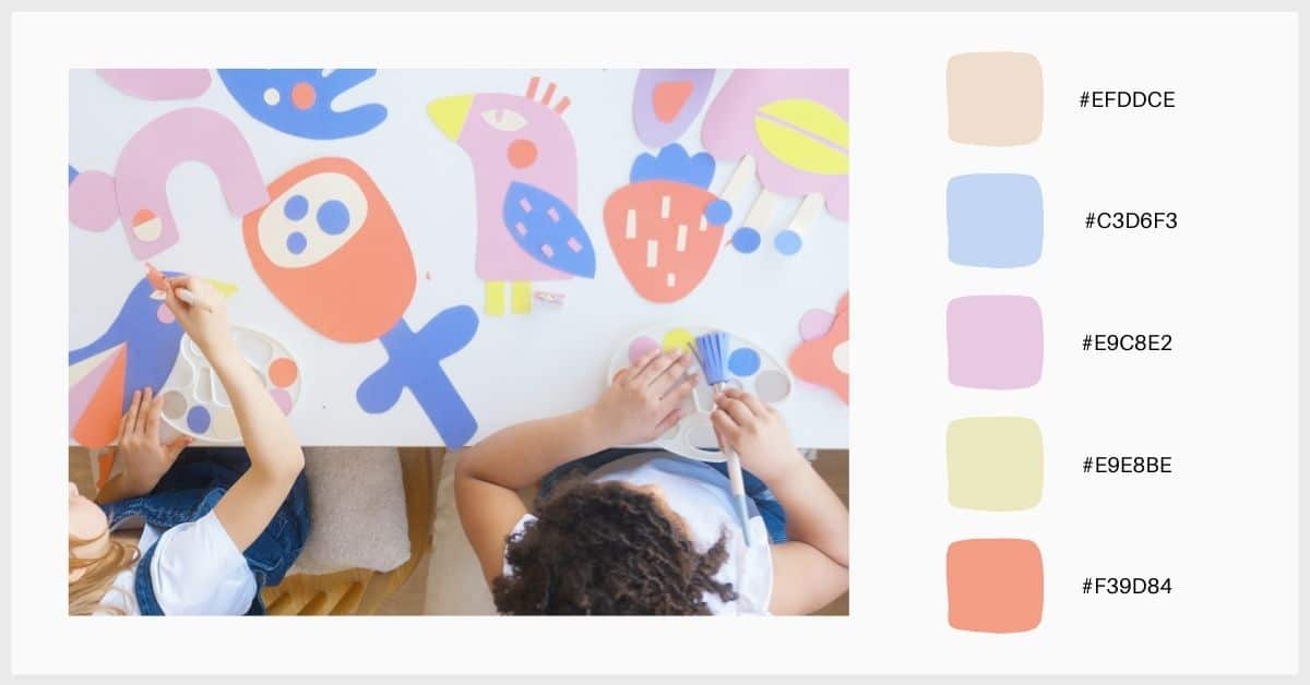
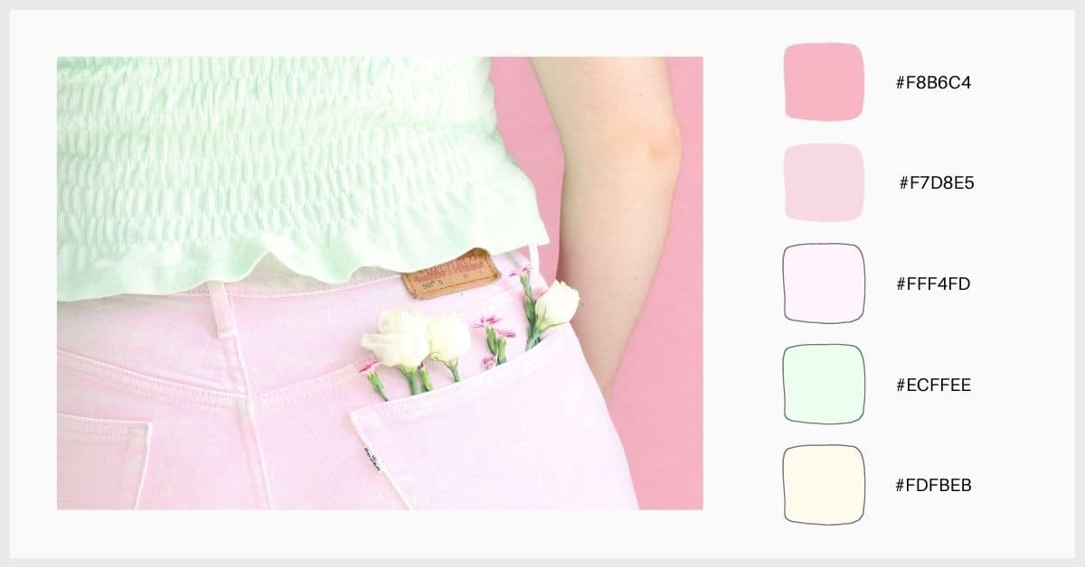
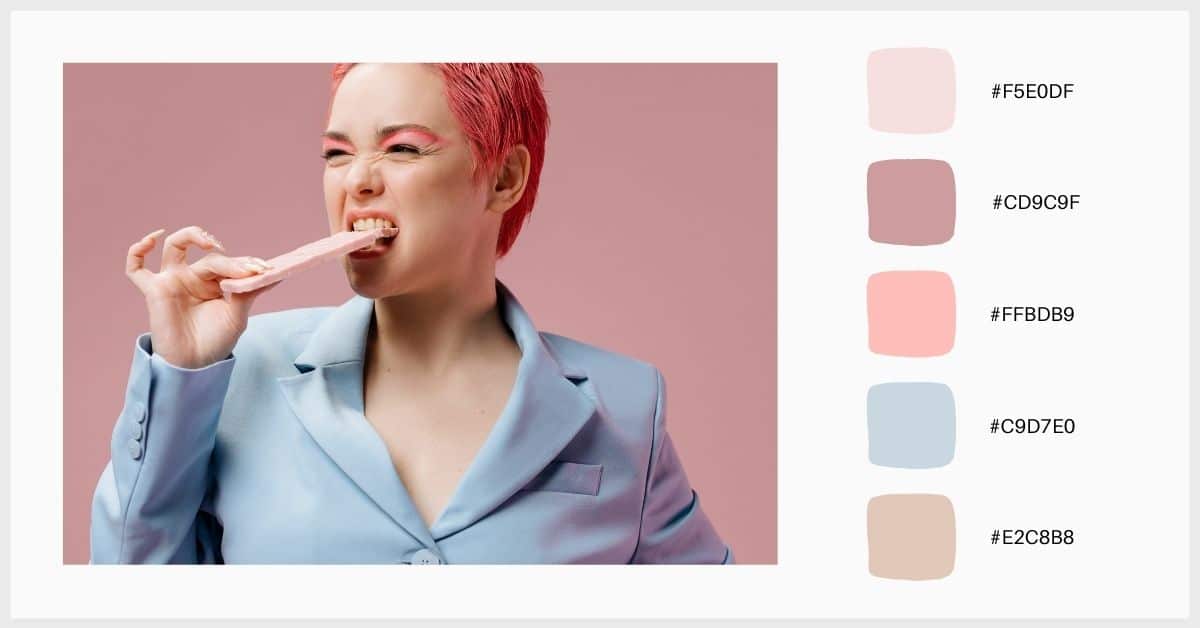
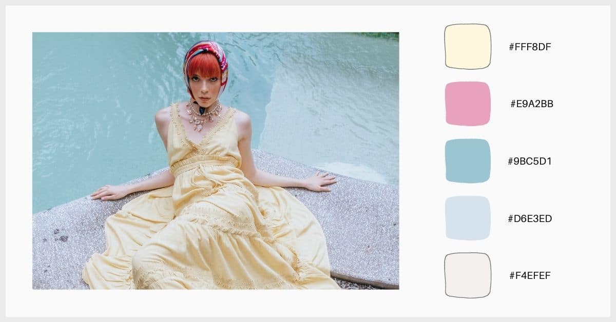
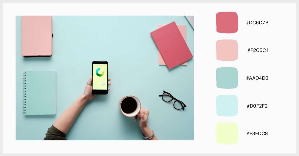
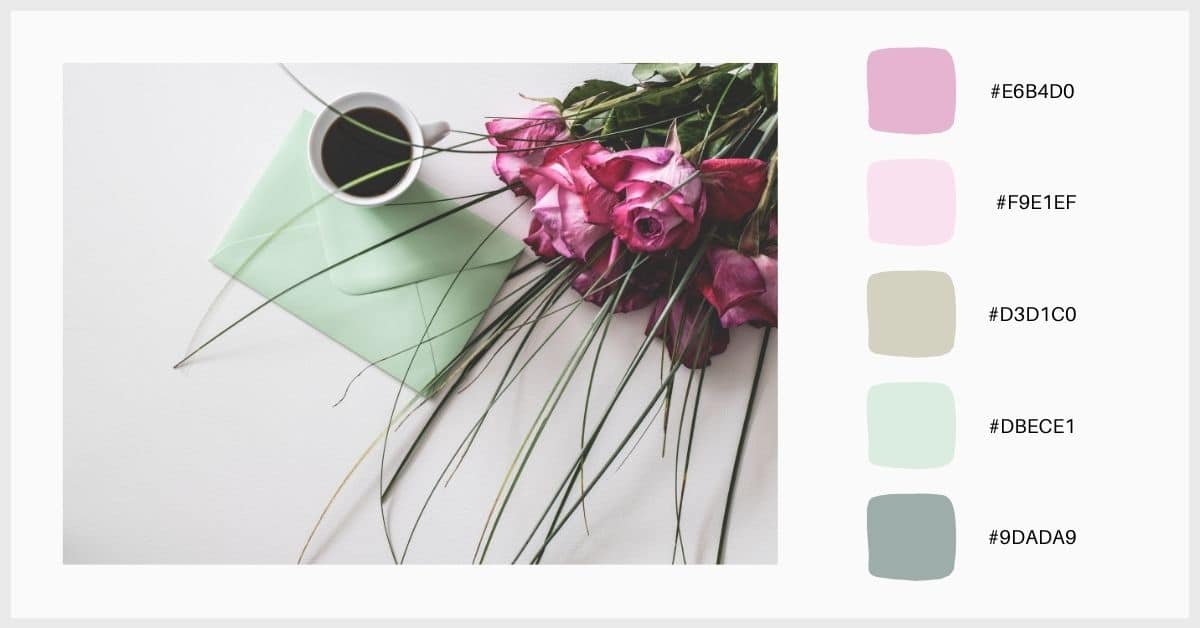
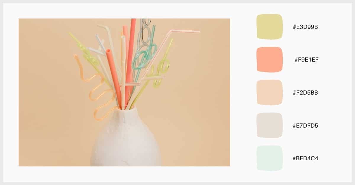
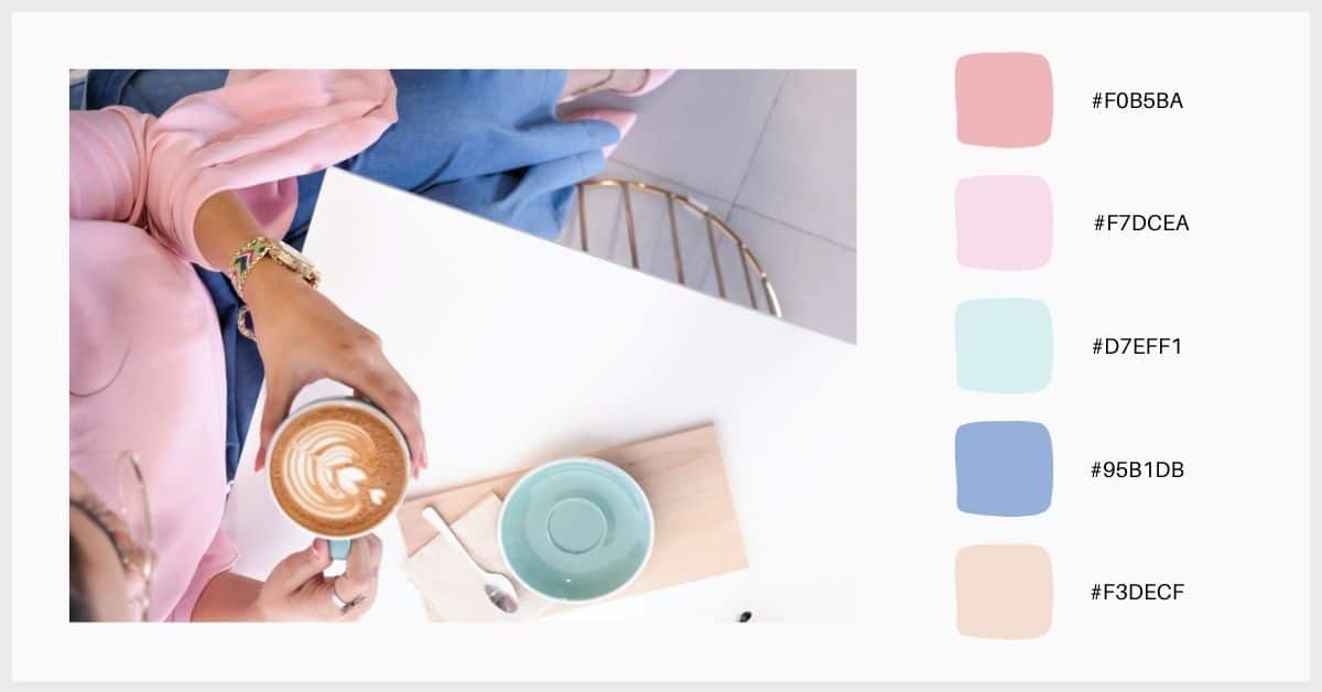
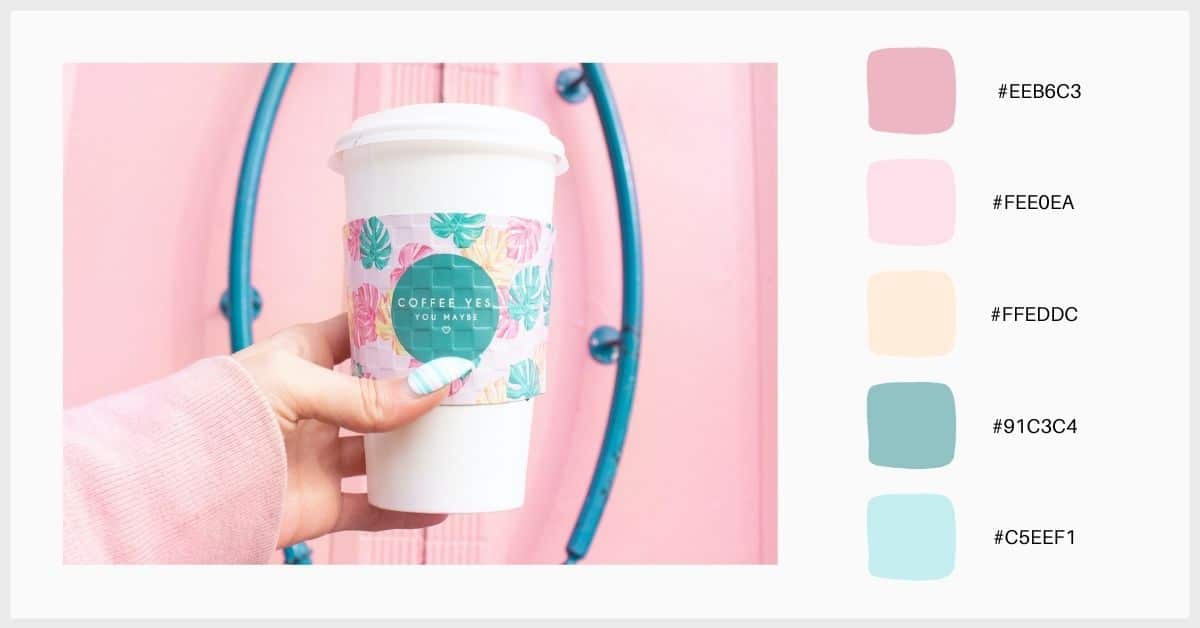
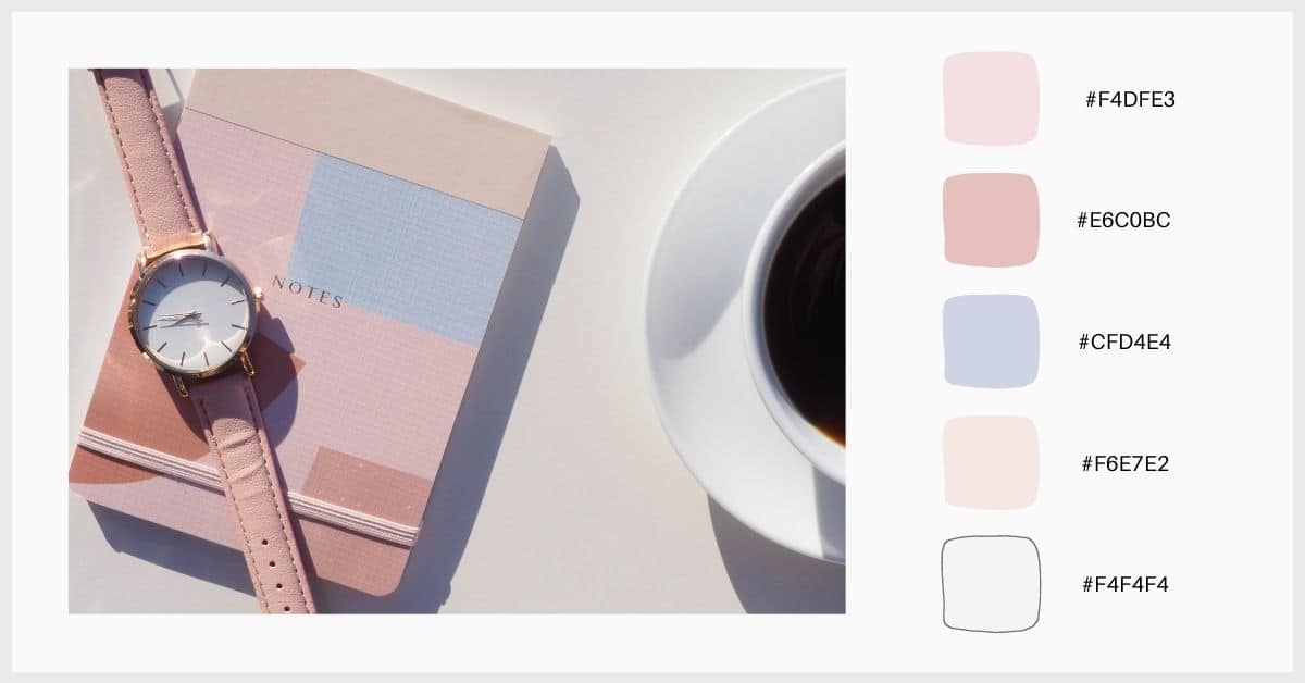
50 pastel palettes
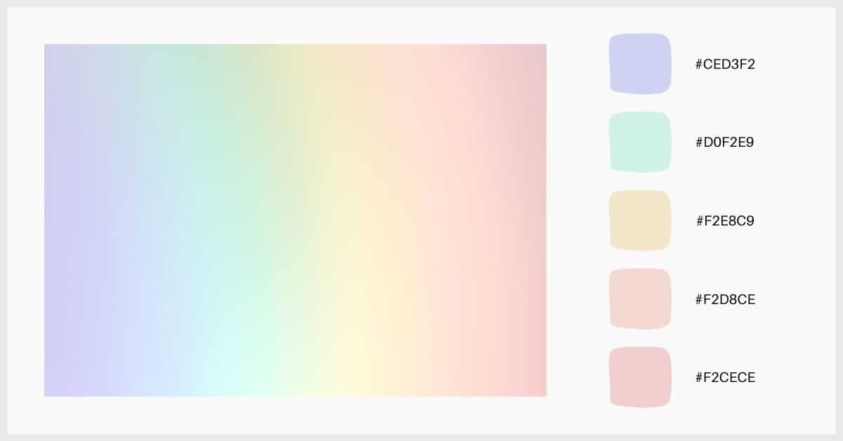
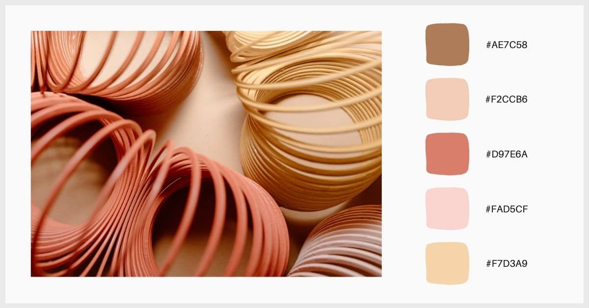
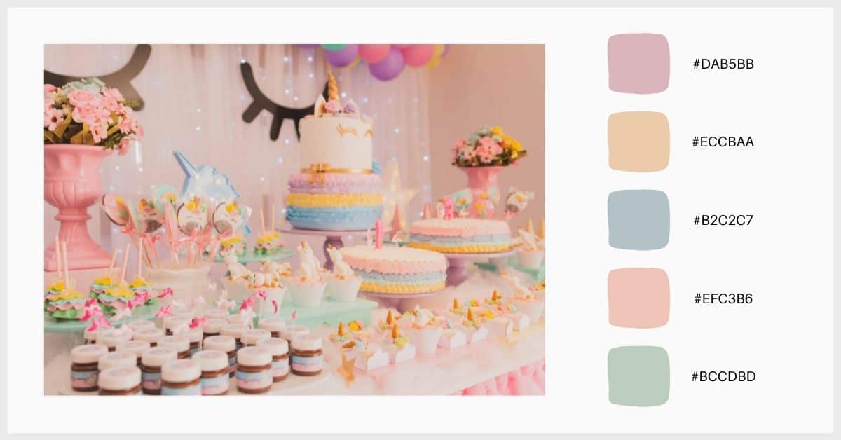
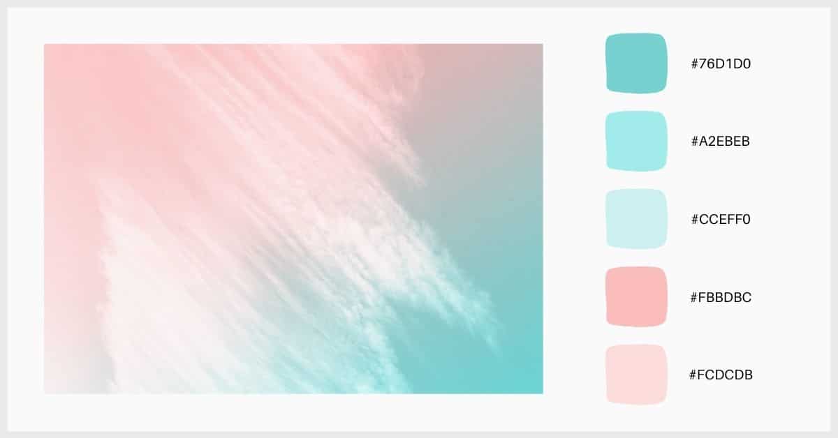
Now, we leave you a selection of palettes that will inspire you and that you can use in your designs. Not all the colors that compose them are pastel tones, but sometimes it is interesting to introduce more vivid colors or some darker ones that add contrast to the range. Everything will depend on what you want to achieve with your design, if you want to create flat, monochrome, or low contrast images or compositions, opt for palettes in softer tones or in gradients of the same color. But, you can introduce colors that break the soft aesthetic of pastel shades It's a matter of trying!
To use exactly the same colors that we propose, write down the color codes located on the right side of the images. Try playing with the paddles! Mix them up, create new combinations and adapt them to your style.