Have you ever wondered What is the history of the Pepsi logo? Each of the logos you see in the different brands you consume have an origin and a story to tell. And in this case, we thought that maybe you would like to know how Pepsi has been in its more than 120 years. Do you know that the first logo was not even remotely like the one now?
We are going to tell you how the Pepsi logo has evolved so that it serves as inspiration and you see how the big brands can also have changes in their logos and get it right. Do you know the history of Pepsi?
The origin of Pepsi

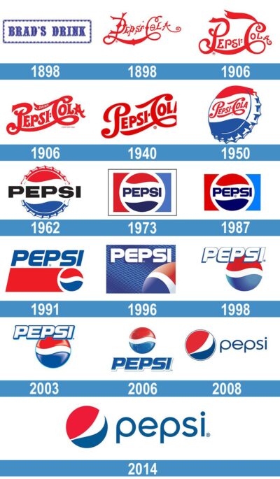
Pepsi is a brand that right now you are able to distinguish visually without the need for the brand to be printed on its logo. And it has been doing this for decades. However, something you may not know is that, originally, Pepsi wasn't called Pepsi, it was Brad's Drink, or translated into Spanish, Brad's drink. Why that name? Well, it was because of Caleb Bradham, the inventor of Pepsi in 1893. And, obviously, the logo that it had did not look even remotely like the one you know. To begin with, it put Brad's Drink in blue with a white border and in a rectangular frame with some decoration.
It was in 1898 when it changed its name to Pepsi, although they made a mistake, and that is that they did not register that name and brand (and they did not do so until five years later).
El Pepsi's first logo, designed by the drink's creator himself, had many similarities to that of Coca-Cola, who was his great rival. Therefore, let's say that they copied a bit (for example the part of the script). But also with that "curvy" and elongated letter that looked a lot like Coca-Cola, only they lengthened the 'P' and the others the 'C'.
This logo began to undergo modifications, but it remained very similar over the years, especially because it continued with the same type of letter although they were outlining it. Until 1940.
The logo change in 1940

Source: 1000brands
1940 was the year of changes for Pepsi because it decided it was time to change and did so with a logo that they wanted to be cleaner and more recognizable. It is true that he continued with the color red on a white background, although this did not last long.
And is that Pepsi's CEO had an idea in 1950, and asked them to design a logo for the bottle cap, adding not only the brand name, but also mixing red with white and adding blue. Why did you add the blue? Well, because, at that time, what they wanted was to make a small "recognition" and "tribute" to the soldiers and the country of the United States for the Second World War (if you don't know, red, white and blue are the colors of the US flag).
Obviously, this struck a chord with the public and that made it a very wise decision, albeit a risky one. And they kept it that way until 1970.
The other drastic change in the history of the Pepsi logo
Another of the most important changes to the Pepsi logo occurred in 1962 when they decided dispense with the word Cola to simply call it Pepsi. In addition, it stopped using that curved and red font so characteristic of the previous logos (and so similar to that of Coca-Cola) to present a straight, thick, black word that stood out from the background that simulated the cap that had made it so successful. given in the 50's.
Of course, it was another hit, making the drink will be identified with young people, which is why many chose it over Coca-Cola, which seemed to continue with the logo in the past.
1970: the year of minimalism
Since the In the 50s, the logo maintained some characteristic elements, such as that circle that looked like a toothed bottle cap. with the colors red, white and blue. But, in the 70s, the logo began to be more minimalist and modern.
He changed the typography of the letter, to one more framed in a circle, no longer jagged, but still maintaining that cover origin. Also, the color of the word changed to the blue used by the logo, which became a bit darker. On both sides of that circle, two colors, red and blue, which did nothing more than highlight the central object.
This logo was maintained for almost 20 years, until in 1991-92 it changed again.
From the 90s to 2000
Another important change in the history of the Pepsi logo was in 1991, when the company decided to separate the circle on one side and the name on the other. To do this, they changed everything, putting the name at the beginning of the logo, then, below, a red trapezoid and, finally, next to the characteristic circle.
It didn't look bad, but it didn't convince, which is why in 2008 they changed again, this time trying 3D. To do this, they placed a blue background to put the circle on it first, with a 3D effect so that it seemed to float and shine, and then, followed by the name that changed to white and a clearer and more minimalist font.
This design was maintained for 10 years, with some minor changes. Until 2008 came.
The last step in the history of the Pepsi logo

Today, the Pepsi logo looks nothing like the first one it had. The last change it underwent was in 2008, and until now it has not changed again. How is it? It is a ball (the same one that was created in the 50s) only by varying the curvature of the colors and enhancing red to minimize both white and blue). You can find just that image or also accompanied by the word Pepsi (and its by-products) with a letter without serif, capitals or symmetrical stripes. Also, that ball changes depending on the type of Pepsi you drink.
The secret of the Pepsi logo
In case you didn't know, that last logo actually has a hidden meaning. Actually several:
- It is a representation of the United States flag.
- The colors refer to Earth's magnetic field, Feng Shui, Pythagorean geodynamics, the golden ratio and the theory of relativity.
How many times has the Pepsi logo been redesigned?

Well, unlike other brands, which have barely touched their logo, or have made very little distinguishable changes, the truth is that in the case of Pepsi this has not happened.
It is known that It has had 12 notable changes to its logo in its more than 120 years. And we do not count the minor changes that it has also undergone.
Is the history of the Pepsi logo clearer now?
Super interesting.
I loved the post
I have shared it in Meneamé… happy visiting trip!!!
abz
Thank you very much, Pedro, both for your words and for having shared it in Meneame.
A abrazo.