If we are not experts, nor have we studied photoshop, some technical aspects of the program we do not get to understand them correctly. Although we know how to use it in one way or another. We test on project and this makes us delay our final delivery. Whether it is to deliver it or see its result when it comes to personal work. The less clumsy our process and the fewer attempts we make to get there, the more optimal result we will always achieve. This always happens with Photoshop blending modes.
And it is that correctly combining the active layer with components of the previous layers is confusing. Surely some of you have tried before finding the key with others such as Clarify, Plot, etc. And you have not achieved the result seen. Or also try video tutorials that by following the steps you get closer to the result you want, but they do not explain why.
In principle, these characteristics are governed by three basic criteria: Base color corresponding to the original color of the main image, blend color for the color you are going to apply (such as a brush) and final color which is obtained once you have achieved the result. This and thanks to mathematical calculations that are carried out in the application, it achieves a different result for each of the existing modes.
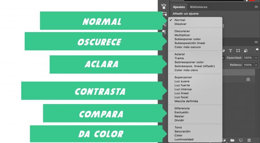
These are a total of twenty-seven different compositions that the photoshop giant has. And for this we are going to have to organize them in up to six different modalities.
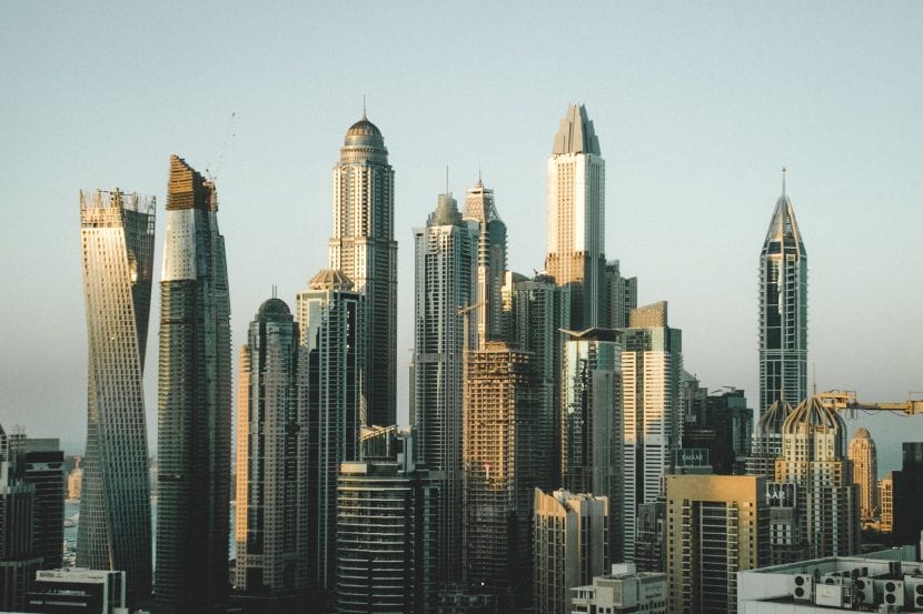
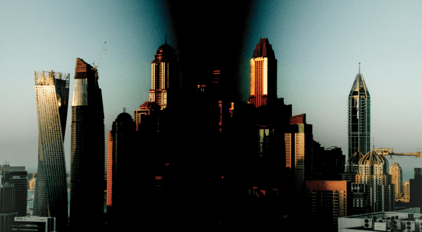
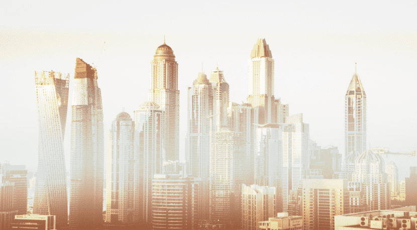
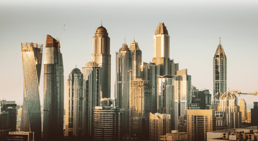
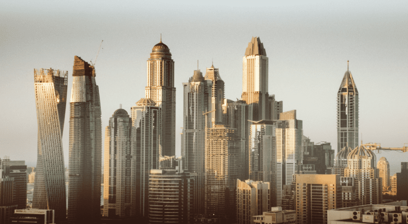
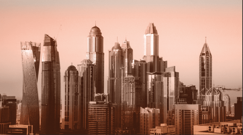
We will use the same image for everything, which will be the following:
Normal
As the name suggests, a normal blending mode. This first option is used by default for any layer that we have made. Each original pixel in the base photo is replaced by the final color. That is, if you use a brush, it will hide what is in the lower layers, covering everything completely if the opacity is 100%.
Dissolve: It is another composition within the category that we have titled as normal. Although if you lower the opacity you will see how one image dissolves over another. Randomly replace pixels with base color or blend color.
Dark
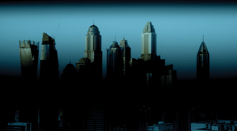
Darken: You are going to select the darkest pixels from both the base layer and the blend layer. If you indicate darken on a white background with a black fusion, the darkest will be the blacks and therefore it will replace everything. If you decide to do it with a brush, it will replace the lighter areas with the darker ones. This means that a 'battle' of pixels wins the darkest.
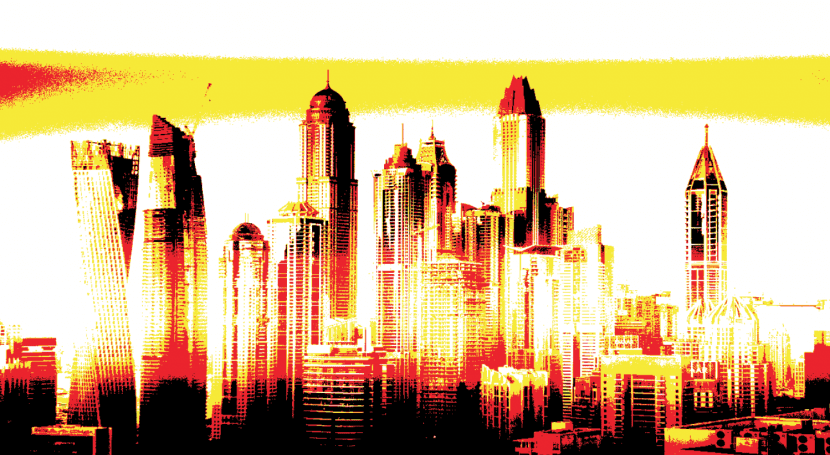
Multiply: Multiply both colors. Although as before, and being in the 'Dark' category, look for the darkest color as the main one. So, if you mix something with black, the area will be black and if you do it with white, the darker ones will not change. The final color will always be darker.
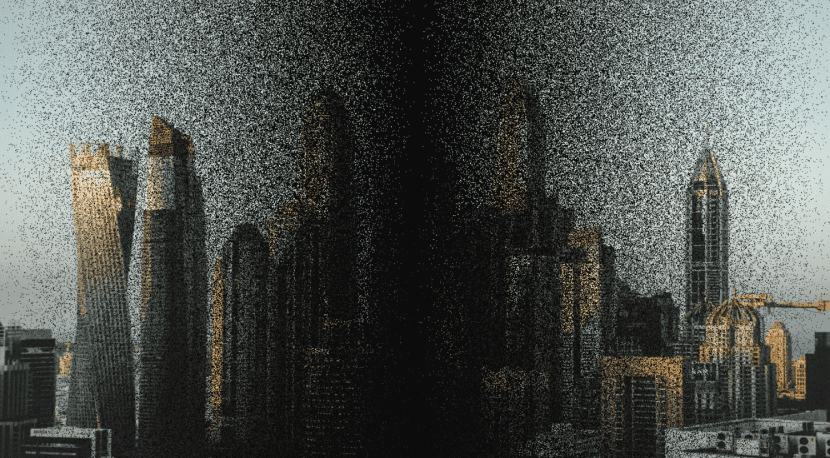
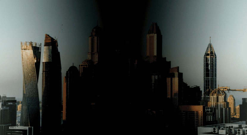
Subexpose color: As you can see in the following image, a medium but very saturated tone is achieved. Increasing the contrast too much. And as before, if you blend it with white, no effect happens. That is why the part of the sides looks sharper and the area where the black gradient is found, looks very saturated.
Linear underexposure: This feature may help you more than the previous ones'Multiply'Y'Color underexposure ', since it also achieves darker colors than the previous ones, but without burning the photograph or saturating it as in the previous ones.
Darker color: We won't stop long in this mode as it works very much like the darken mode. Replace the lightest pixels with the darkest. That is, if you have pixels, for example, that start with # FF349 they will be covered by pixels with a code of # 00349. Since those that start with FF are lighter (white color: #FFFF) and the darker ones are 00 (Black color: # 0000).
Cleared up
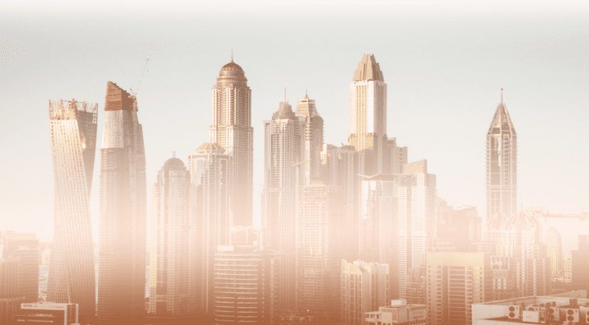
Lighten: Contrary to what we have seen so far, in the battle for colors, in this case, the dark ones will be replaced by the light ones. These will not be modified and the dark ones will be replaced. Comparing pixels one by one and not as a whole. If you need it to be even lighter, you will have to wait for the next 'Color Lighter' mode and maybe you will find what you need.
What the series is about?: It is very similar to how 'Multiply' but in this case in reverse. Multiply the inverse of the base color and the inverse of the blend color. Thus leaving the color lighter at the end. If you mix with a white color, it will stay with white and if you mix with black, there will be no change.
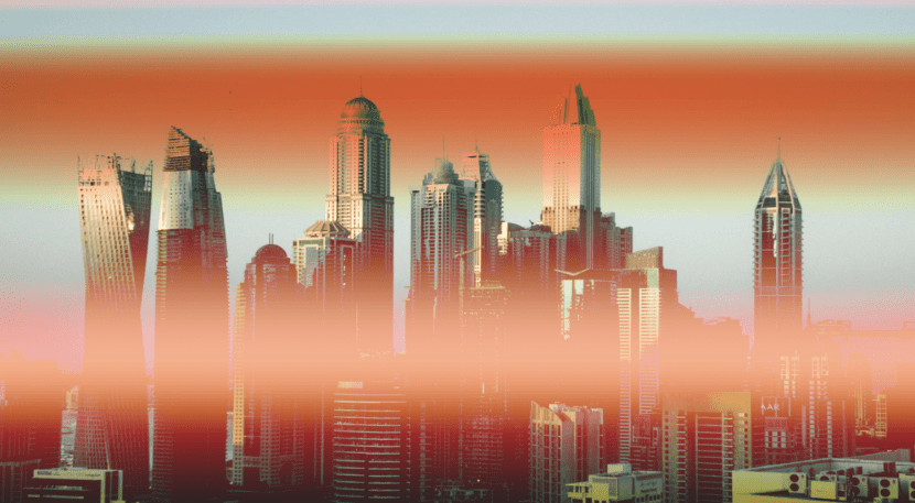
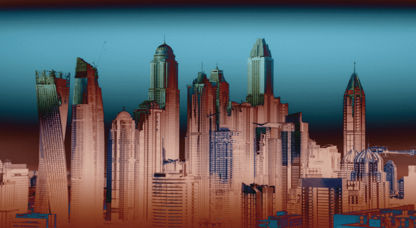
In this case, to give more sense to the photo and denote the effect more, I chose a linear and inverted gradient. With a copper gradient effect that comes by default in photoshop CC.
Dodge Color: We continue to reverse the situation and this time it is the base color that becomes lighter to obtain a less contrasting blend color. This time, if you mix it with black, it doesn't produce any effect.
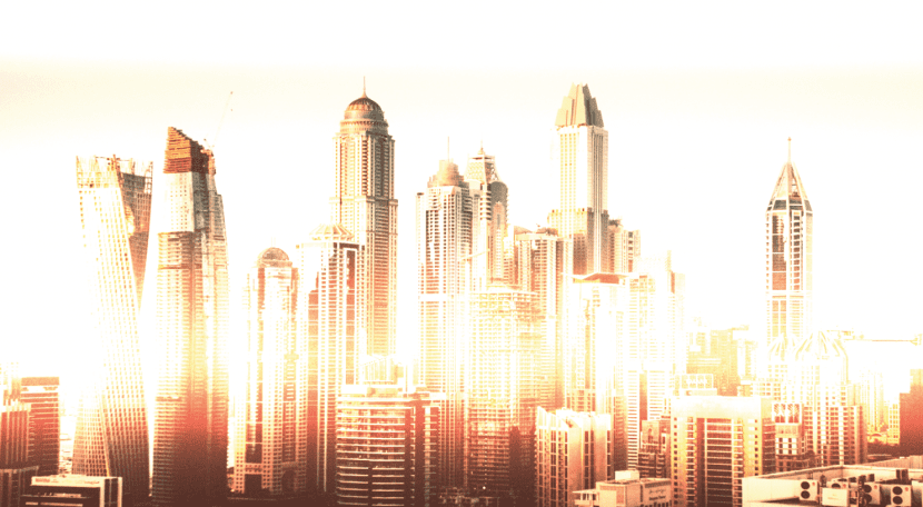
In the example, the copper gradient creates a futuristic result. If you try other types of gradients, you might be surprised.
Linear Dodge (Add): The base color becomes lighter (the image of buildings in this case) and the blend color is added brighter. We speak clearly, of color effects such as the copper gradient that we have given in the previous characteristics. If you add with black, it does not produce any change.
Lighter colour: If you wanted to make an effect that would give another dynamism to the photograph but that would not be very noticeable, here you have it. (If you have not anticipated and you have skipped a step). Replace the darkest pixels with the lighter ones. It practically leaves the image as the original, although if you do a B / W gradient, the black is lightened and leaves a very low diffusion.
Contrast
Overlap: This feature has two options depending on the base color value of the image (In this case, buildings). Depending on its base color, we will find two similar modes, multiply and plot. If used for low-level values it will resemble multiply and if it is in high values it will be created similar to plot.
Soft light: It is the one I like the most, it simulates the effect of diffused light. Depending on the color you use in the blend, make the image darker or lighter. If the color is less than 50% gray, it will become lighter. On the contrary, if it contains more than 50% it will darken. If you use pure black (# 0000) or white (#FFFF), the result will be lighter or darker.
Strong: Works much the same as Overlay Or what is the same, overlap. For low values, the image will appear darker, and even underexposed. For high values, it will be overexposed and clearer.
Intense: Lightens or darkens depending on the contrast variation. As before, if less than 50% is gray, it becomes lighter and on the contrary, if it is more, it darkens.
Lineal light: This time, the linear light function becomes lighter or darker depending on the brightness variation. Counting on the percentage of gray used in the image.
Focal: Depending on the blend color, the color is changed. More than 50% darkens and if it contains less, it lightens. If the blend colors are darker, they will be visible in your blend, if they are lighter, they will disappear.
Although it may not seem useful in the image, if you manage to add more tones or effects and lower the opacity of it, you can achieve great results in your image.
Defined mix: Mix both colors. Base and Blend to provide a lighter or darker color, but always very saturated. Blending with white or black has no effect.
Comparison
Difference: Depending on the highest brightness value, subtracts the blend color from the base color or vice versa. For these types of characteristics, you have to play with opacity, fill and other parameters that will give an optimal result for your project, if you combine it alone, it may not be the result you want to see.
Exclusion: Provides a smoother mode than the previous difference, although very similar. Blending with white reverses the chromatic information of the base color and with black, no effect occurs.
Restar: Subtract the top layer (which would be the blending mode) from the main color (which would be the image)
Split: Divide, as if it were a mathematical equation, the color to blend with that of the main photo.
Color
Tone: Associates the light and color saturation of the photo with the color tone of the blend.
Saturation: Contrary to tone associates the light and color tone of the photo with the saturation of the blend color.
Color: Creates a resulting color with the light of the main photo color with the saturation and hue of the blend layer. It is especially useful if you want to color monochrome images.
Luminosity: Associates the saturation and hue of the main image with the luminance of the blend color. Creates an inverse result to color mode
If now you decide to waste time choosing each of the modes until you find the right one, it is because you think it is convenient to do so. I hope that with this article, get to see faster any of the blending modes you really need, without losing your fingers clicking one on the other.
To get the example photograph, in case you want to see your own results, download it at Unsplash