Pop Art Poster
El Pop art It has been a popular style in graphic design since the mid-XNUMXth century. From advertising, to comics and museums, Pop Art has been used as an attraction, using simple elements and strong colors to grab the viewer's attention. It is one of the best known styles around the world, and it is still very popular today.
Given its great popularity, it is advisable to turn to Pop Art from time to time. Especially if our audience is young, a good Pop Art style poster can help us stand out from other brands or designers. In this tutorial I show you how to create your own images with Pop Art style in a very easy way.
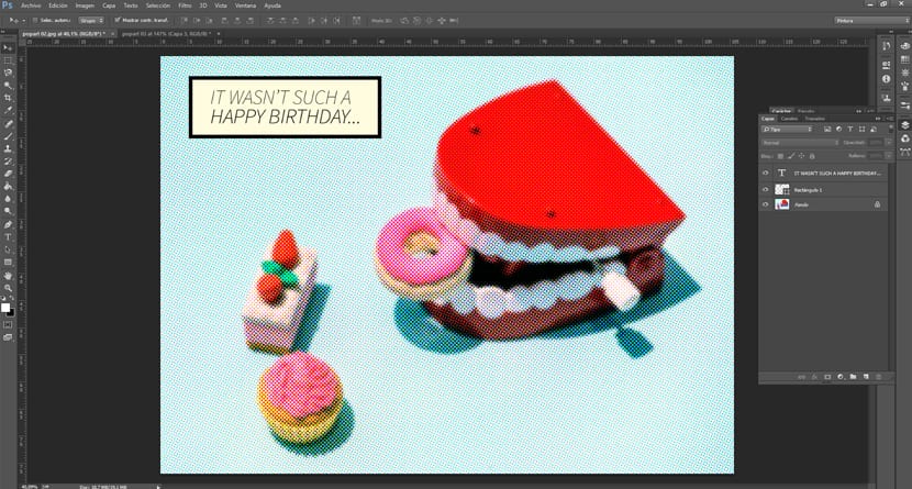
The first thing we need is to choose an image with very vivid colors and a plain background. A flat color background helps us not to mix with the main figures and the image is better understood. In this case, we are going to use this image of candy and a joke teeth. It is a fun, simple and carefree, which fits with the Pop Art style.

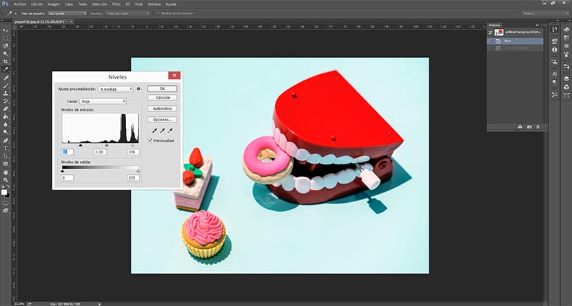
The first step is to open the image in Photoshop and play with the levels, reducing the number of colors to simplify the image. In this image it won't be necessary because it is quite clear. Still, we are going to highlight a little more the red color of the teeth. For this, we go to the tab Image> Adjustments> Levels and we select only the red channel. Next we move the channel pointers to occupy a smaller range of red tones. With this we darken the shadow a bit and give more warmth to teeth and strawberries.
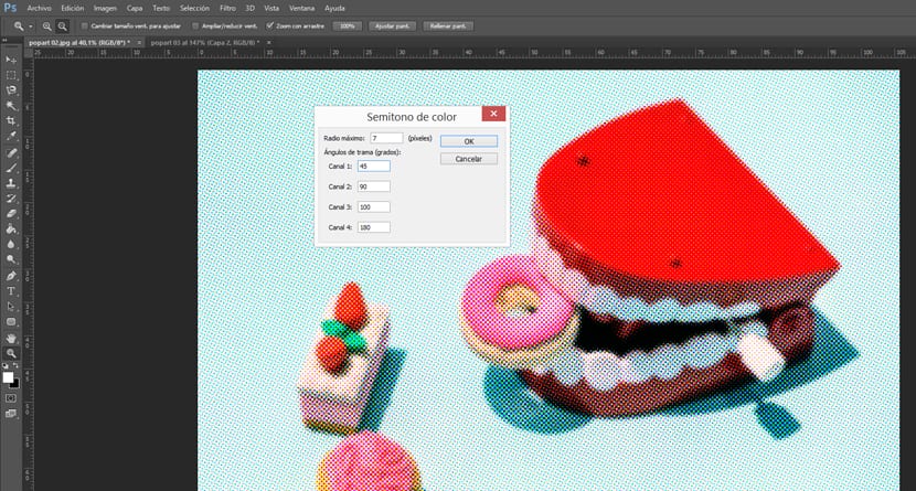
Once the channels are adjusted to our liking, we will Filter> Pixelate> Color Halftone. An options box opens on the radius that the point will have and the raster angle of each channel. Modifying them, we will see that the effect of points that we were looking for is created. From now on, it is only to test the plot angles to show the Pop Art effect we were looking for. For this particular example I recommend a 7 pixel radius so as not to lose too much information.
We already have the image we wanted. Now we only need to add a interesting text with a typeface that fits the style. Any of those used for comic will do, the important thing is that do not have auctions and be in uppercase. In this case, I have used the Source Sans Pro. We will fit the text inside a rectangle in a very light yellow and with black edges to achieve the effect of a page of comic. Once this is done, the image is finished and ready to present.