
Font: Free Fonts Family
There is a very peculiar group of fonts that, due to their designs, we can say that they are characterized mainly by how they are physically, if we analyze their anatomy well.
This is where it comes into play, two very important aspects of this typographic style, one of them is the physiognomy of the source, and the other aspect is rather a psychological characteristic That typography projects us to our emotions and to the character that the design can offer.
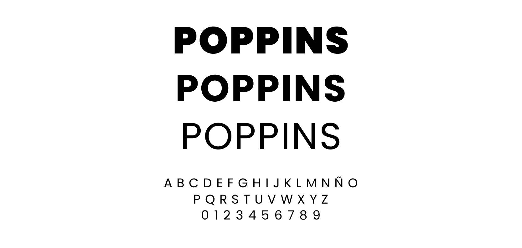
We are talking about neither more nor less than the Poppins typography, a font that has been used in graphic design for years, and that has become, to date, one of the typefaces that best stands out and represents its legibility and its different functions.
Poppins font: what it is and what it is used for
Source: Indelible
poppins typography is defined as one of the typefaces that are part of the Sans-Serif style. It is a typography that is mainly characterized by being geometric in its forms, although it also falls within the profile of sans-serif or sans-serif fonts.
this source, was designed by Satya Rajpurohit and Peter Bil'ak, two Indian designers, whose commission stemmed from an Indian font studio. It is one of the fonts that has a wide range of readability, so it is very common to see it in running texts and in large headlines.
General characteristics
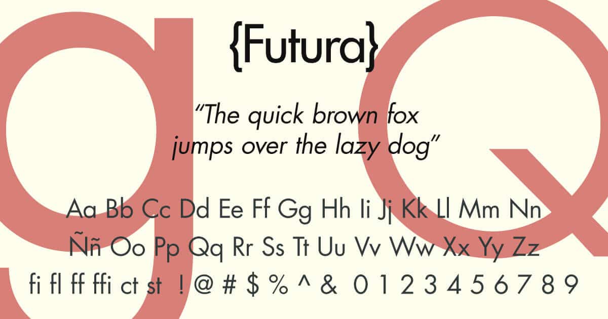
- Both así es, que is often confused with the famous Futura. Therefore, its characteristic geometry stands out, which Futura also shares.
- It is a very varied font and with a great variety of styles, since It has up to nine styles, completely different.
- Regarding its use, it is noted that is officially used in mastheads and big headlines, although it has also been seen in reading texts or in books and magazines.
- It is considered a thorough and minimalist font, as far as, It hides a certain charm among its forms and, furthermore, it is considered one of the most widely used typefaces.
Characteristics of geometric fonts
- Geometric typefaces are mainly characterized by being sans-serif fonts, where a large part of its pronounced elements are based on each of its structures, formed mainly by mono lines, which stand out from the rest.
- All the letters that are part of this family, are equally structured in their forms, so we can observe exactly equal curvatures.
- Some of the letters in high box that appears in this type of styles, or designs, form evoke, and are part of some of the moments in the history of ancient Greece, so it is a fountain that, although at first glance it has a certain contemporary air, the truth is that they are fountains that contain a lot of history.
- In this family, as we have already mentioned, the Futura typeface is the most popular, especially since Paul Renner, the maximum representative of this font, has undoubtedly designed one of the best typefaces.
Fonts similar to Poppins
Source: WNPower
Futura
Source: Types with character
Futura is undoubtedly the star typography of this font design. It is a designer font designed by Paul Rand himself, for what it denotes, that it is a suitable font to be inserted in different uses, one of them could be reading or in large headlines.
In addition, it is not only characterized by its shapes, but also by containing different styles within the same family. It is a font that you can find available in Adobe Fonts and in some web pages for free. In addition, it also has different designs, always maintaining the geometric line.
Pantra Type
Pantra is a font that is characterized above all for including circular shapes interspersed with straight lines and much shorter pieces. It is a font that, at first glance, could also be confused with Futura, so it maintains a very similar style. Despite having a certain current and innovative air, it is a fountain with a lot of history behind it.
Also, if that wasn't enough, It is designed with four completely different styles in their thicknesses, so it is a font that also moves between different styles, within the same family.
Gilroy
Font: Shmosh Fonts
It is a font that, in almost all font lists, is the one that most often stands out. And it's not precisely because it's better than even Futura, but it's because contains up to 20 completely different styles between them.
In addition, it also includes up to 10 different types of italics and some different language methods that help to get closer to typography much faster. The designer or creator of this font has thought of all the details without a doubt, since it has also included up to two different versions, one of them is the Light version and one Extrabold.
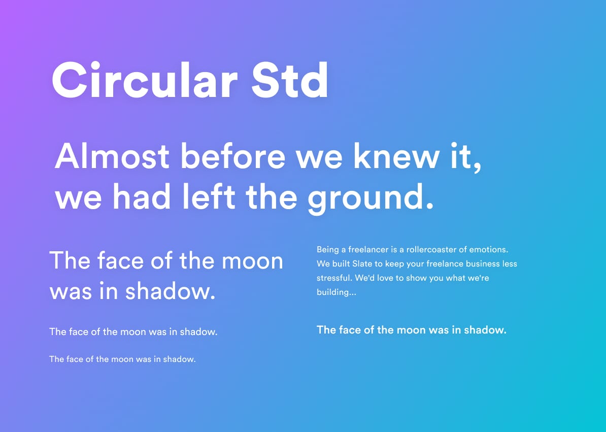
Circular
Source: Captain Design
If we had to choose a font suitable for mobile devices or tablets, we would say without a doubt that it is the perfect font. Circular defines itself as one of the typefaces that has stood out the most in the sans-serif font sector.
Also, if we look closely at their shapes, we can say that it is the source that the Spotify company has included in its applications. And it is not precisely because it is suitable for it, which it is, but rather because of its close and cheerful appearance, which it can transmit to users who use this tool.
Architect font
It is one of the typefaces that at first glance we can say that it may not be entirely geometric, since it is a font that in its design, It has been inspired by handwritten or handmade typefaces.
In this way, the designer himself has wanted to mix a more vintage aspect, in addition, it is also a font that has been inspired and has transformed its design, in the European posters of the time, especially those that were designed in the XNUMXth century.
A typeface with a long history and an image that speaks for itself.
Sites to Download Poppins Font
Google Fonts
It is probably the best tool to date, where you can download all kinds of fonts. All of them are completely free, so you won't need any other tool to download them. Also, if we have to characterize Google fonts from the rest, it is that It has a very large library loaded with sources.
So you will no longer have an excuse not to download any, especially in this option that, in addition to being very easy to navigate through its interface, It has become the top of the many options that we are going to show you.
Dafont
It is, without a doubt, the website with the most typographic options that you can find. It contains a library with more than 30 sections and with more than 50.000 fonts, so you can entertain yourself for a long time, looking for the font that best suits you.
The best thing about this tool is that all the ones you have available are completely free, so you won't need a subscription or a payment method to obtain them.
In addition, you will be able to navigate through its interface and You will see how simple it is.
Squirrel
Font Squirrel, is a web page where you can find completely free fonts, so you will have available a category that is not as extensive as the previous ones, but it will be enough for you to start.
Without a doubt, it is an option that is within reach and in a very simple, comfortable and fast way. Also, all the content they have is free, so you won't have to reject any of the ideas and sources you had planned.
All fonts are very exclusive and unique, adapted and designed for exclusive and unique designers and designers.
1001 fonts
In this catalog, very similar to Dafont's, you can find a wide category of fonts. So you will not have a problem when selecting quickly, since you will have many options to research, try and study.
One of the tools that has an excellent search engine, where it will provide you with everything you need in a much simpler way.
Don't miss out on this website and get hold of some of the best fonts that this program has, and if you don't have enough, You also have them available in different versions.
Conclusion
The Poppins typeface is a font that, as we have seen, has had many uses throughout its creation, so much so that it fulfills many functions.
Sans-serif or geometric fonts tend to have a greater use in brand design, since they are legible fonts and stand out from the rest. Despite being simple and minimalist fonts, they are designed with the main objective of combining the simple with what is most relevant.
We hope you have learned about this font and its very similar designs that we can find in many of the web pages that exist online.