
Source: Visme
The posters, whether advertising or any other theme, have always been interesting thanks to the wide variety of graphic elements that are in them. One of them is fonts, depending on their family and their typographic style, They can be useful and suitable for one type of poster or another.
If you have always wondered what font is the most suitable for a poster, in this post we will help you decipher that question that is on your mind so much and we will also explain why they are so interesting and what makes them so legible.
Let's start!
the different families
Source: ipsoideas
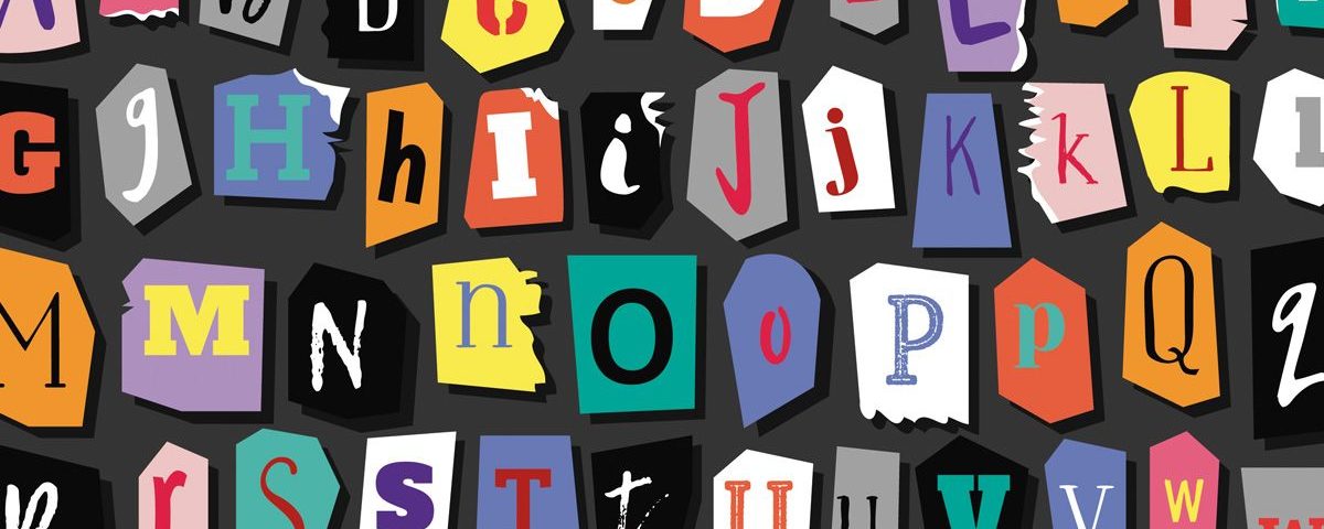
To know which typography is the one that best suits your poster, you need to know what typographic styles exist. For this we have designed for you a small guide that you should keep in mind whenever the question arises: What typography do I put now? Well, let's start.
Roman
roman typefaces, are those fonts that come from manual writing. They are characterized by being quite old and come from the humanistic calligraphy of the XV century. They also tend to be part of Roman stoning, an activity that consisted of designing typography through small stems made of stone.
In terms of their appearance, they are regular and have great contrasts with straight and curved elements and are also very legible. There is a lot of types:
- Ancient: appear at the end of the XNUMXth century in France, from Grifo's engravings for Aldo Manuzio. They are characterized by the unequal thickness of the stem within the same letter, by its modulation and by the triangular and concave shape of the finial, with discreet square points.
- Transition: appear in the eighteenth century and they show the transition between ancient and modern Roman types, with a marked tendency to modulate the stems more and contrast them with the finials, which leave the triangular shape to adopt the concave or horizontal one, presenting a great variation between strokes.
- Modern: appear in the mid-eighteenth century, created by Didot, reflecting the improvements of the printing press. Its main characteristic is the accentuated and abrupt contrast of straight strokes and borders, which originates elegant and cold fonts at the same time. Its characters are rigid and harmonious, with fine and straight finials, always of the same thickness, with a highly contrasted shaft and a marked and rigid vertical modulation.
- Meccanos: they have no modulation or contrast. Among his sources we can highlight Lubalin and Stymie.
- Incised: they are another isolated group within the Romans, like the Meccans, are lyrics in the oldest Roman tradition, slightly contrasted and with a thinned tapered feature.
Dry stick
Source: Wikipedia
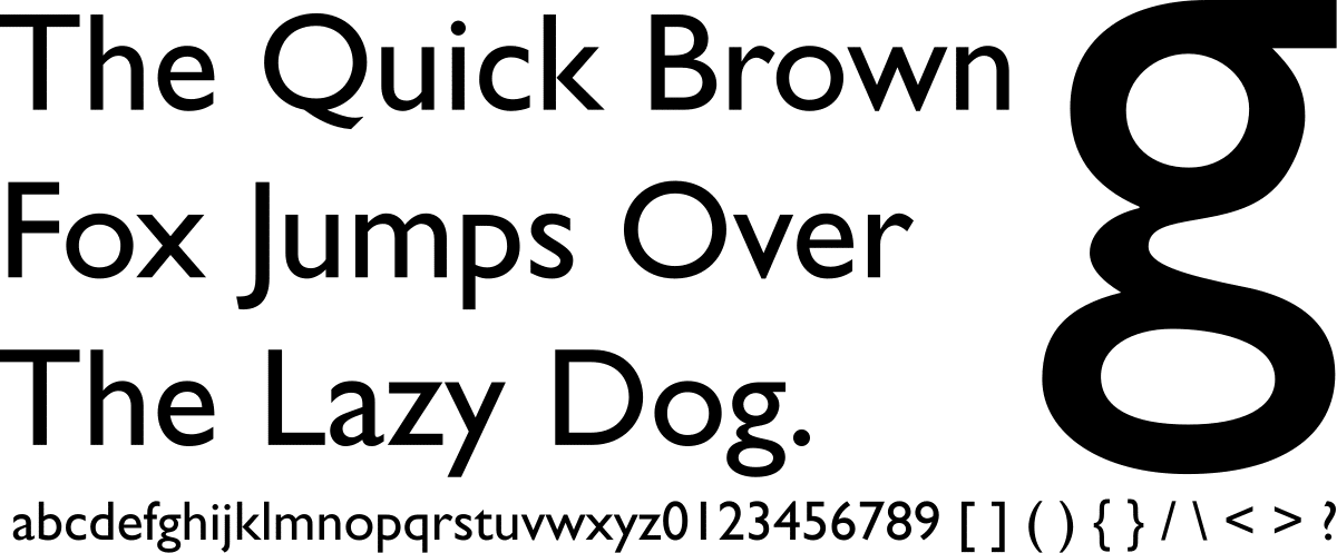
Sans-serif typefaces, also known as Gothic, Egyptian, Sans Serif or Grotesque, are usually divided into two main groups:
- Linear without modulation: they are formed by types of a uniform line thickness, without contrast or modulation, its essence being geometric.
- Grotesque: characterized by the fact that the thickness of the line and the contrast are barely perceptible and because they are very legible in running text. The main font of this type is Gill Sans.
Labeled
Lettered fonts are usually fairly traditional typefaces. Their excessive tradition lies in the way they were designed, since they are quite creative fonts due to their high range of personality.
They are classified into three main groups:
- Calligraphic: are those families generated with the most diverse influences: Roman rustic, Carolingian minuscule, English letter, uncial and semi-uncial characters, all based on the hand that created them. Over time calligraphic writing became more and more decorative.
- Gothic: They have a dense structure, tight composition and accentuated verticality, they stain the page extraordinarily. In addition, there is no connection between letters, which further accentuates their illegibility.
- Italics: they usually reproduce informal handwriting, more or less free. They were very fashionable in the 50s and 60s, and currently a certain resurgence is detected.
Decorative

Source: Wikipedia
They are fonts designed exclusively for titles since they are not designed for reading, due to the presence of their design. They are classified in:
- Fantasy: they are somewhat similar to medieval illuminated drop caps, They are generally unreadable., so they are not suitable for text composition and their use is limited to short headlines.
- Time: are those that are meant to suggest a time, a fashion or a culture, coming from movements such as the Bauhaus or Art Decó. They put function before formality, with simple and balanced strokes, almost always uniform.
Serif and Sans Serif
Serif fonts are those that are characterized by containing serif on the outside. They tend to have a classic and old personality, and they are also present in most of the pages of the books where we read and spend our best time reading. This detail is due to its high readability range.
Examples of serif fonts include Book Antiqua, Bookman Old Style, Courier, Courier New, Century Schoolbook, Garamond, Georgia, MS Serif, New York, Times, Times New Roman, and Palatino.
sans serif fonts appeared in England in the 80s. Unlike the ones mentioned above, they do not have a serif at their ends and that makes them have a much more current and modern personality.
Sans serif fonts include Arial, Arial Narrow, Arial Rounded MT Bold, Century Gothic, Chicago, Helvetica, Geneva, Impact, Monaco, MS Sans Serif, Tahoma, Trebuchet MS, and Verdana.
The most beautiful fonts
Source: Spreadshirt
Next, we show you a list of fonts that may be interesting for your posters. Each of them is designed for a different poster. Now it is you who must choose the one that best projects on your poster.
Old Fashioned Script
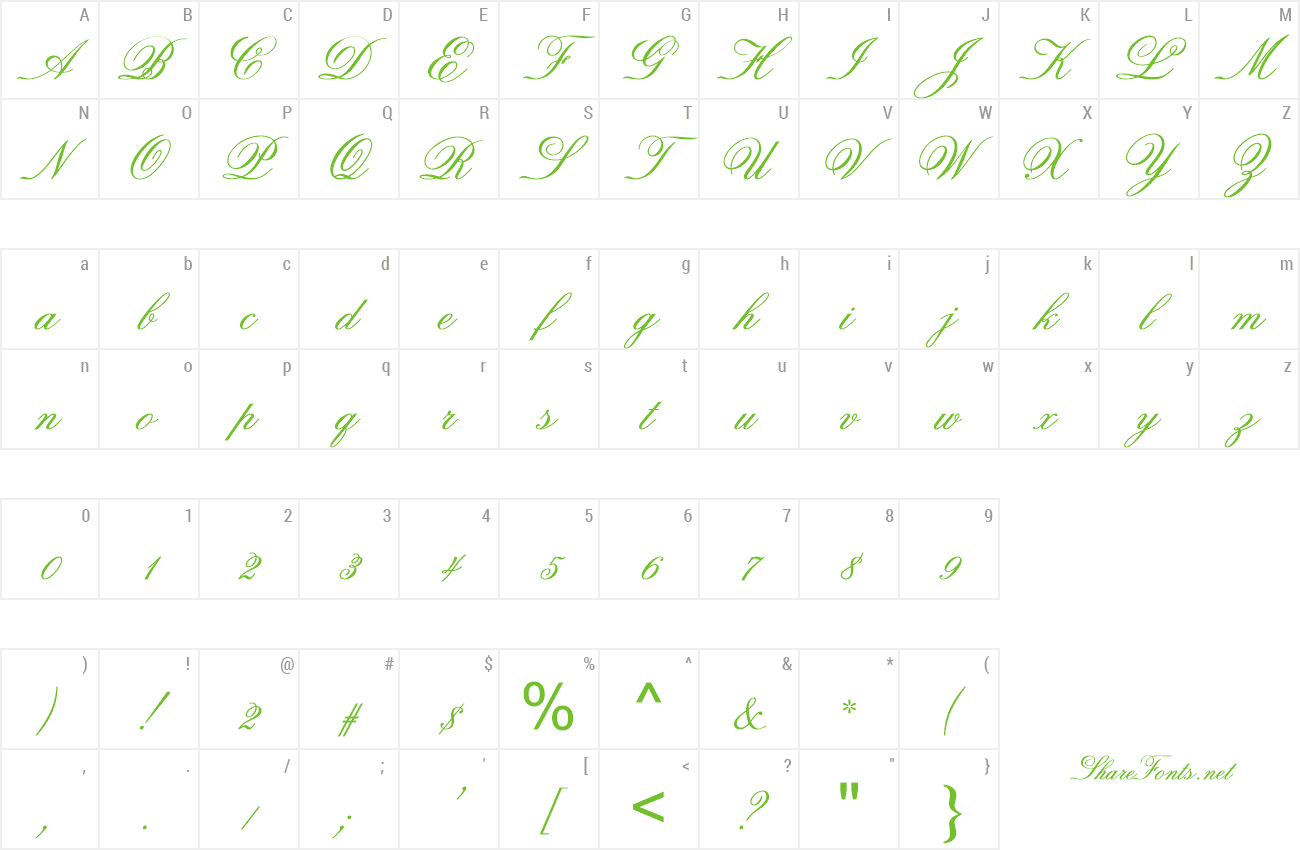
Font: wfonts
It is one of the most elegant and refined typefaces, it has a manual stroke that maintains a serious personality. It is very useful if you need to design advertising posters related to tourism, travel, and even food. However, you can always do your tests regardless of the sector or market.
Gilmer
Font: Freefonts
Gilmer typeface is an excellent typeface if you are looking for personalized posters related to the world of fashion or to create a minimalist design, basically because of its bold geometric style which provides an incredible result in the texts.
In addition, this font also has its own variant called Gilmer Light, keeping the same shape, but with a thinner typeface.
Aleo
The Aleo typeface is designed to achieve a design more inclined to the conventional poster with the possibility of combining them with its other versions in Italic, BoldItalic, LightItalic, Regular, Light and Bold.
In addition, it is not an aggressive advertising font due to its rounded shape, but it guarantees great legibility in titles and texts of informal posters.
Laundry
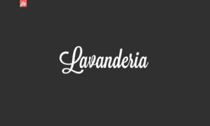
Font: Bestfonts
It is an unusual typeface and that makes it even more attractive. It is a typeface of calligraphic origin and its name derives from the inspiration that the creator of this font had, since according to him, he was inspired by the windows of laundromats while recreating in his head how the shape of his typeface was going to be. .
Is characterized for being a big and elegant font at the same time, we do not recommend it for texts but in titles, it is very suitable for hotel and food sector advertisements and in restaurants.
coldiac
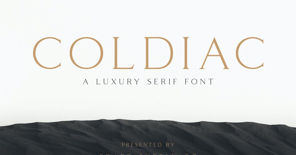
Source: Envato Elements
The Coldiac typeface offers a sense of elegance and luxury to your projects. It is usually introduced in posters where perfumes and jewelery are advertised. The Coldiac font is definitely what you are looking for if you need to reload your poster of majesty and seriousness, only you should look at its fine and thin lines They convey a lot of class.
With this option, you will achieve the necessary balance to stand out with your personalized posters, but do not plan to write with this font because its use falls only in the titles due to the non-arrangement of lowercase letters.
Garamond

Source: Wikipedia
It is undoubtedly one of the best-known fonts in the typographic design sector. It is part of the serif family and has the peculiarity of having light finishes in lowercase and uppercase letters, unlike Sans Serif, where a pointed style was chosen at the ends.
Generally speaking, it is a perfect font for business and academic brands, that's why I invite you to try it in the layout of your business's posters.
Conclusion
We hope that you have documented enough to answer this question that we have all asked ourselves at some point when we hardly knew anything about the world of fonts.
There are many more that provide the character you need in your projects, but we have left you those that can serve you the most as a start. As you can see, we have indicated some examples of all kinds so that you can carry out several tests with all of them until you find the indicated style.
Now the best time has come the time to design.