
Source: Infomanía
When we design a project, it can be informative. This information can be distributed in many possible ways. On the other hand, when we find a project that summarizes everything it wants to tell, in a kind of informational poster, we call that graphics.
In this post we are not only going to show you the world of infographics, but also, so that it calls your attention even more and you know more about it, we are going to present you the best applications / web pages where to design and offer them, of this way, a touch more people to your work.
We will explain to you below.
Infographics
If we had to define what an infographic is, it would be best to start with a visual representation of information and data. By combining text, graphs, diagrams, and video image elements, an infographic becomes an effective tool for presenting data and explaining complex problems in a way that can quickly lead to better understanding.
For this, a good infographic must be a layer of:
- Inform and educate to the users for whom this information is directed.
- It must contain not just one aspect engaging and, without also functional.
- It should also reach the minds of users and their understanding.
For this reason, the concept of infographics has expanded to many industries in the last decade, becoming a powerful communication tool for companies, governments and educational institutions. There is a whole new audience of professionals interested in presenting data in a more compelling, insightful and interesting way.
Tips to create a good infographic
As we have previously added, infographics have the ability to present complex data in a concise and highly visual way. When done right, infographics tell the stories that the data contains effectively, making the information easy to digest, educational, and engaging.
To summarize this point in a more attractive way, A good infographic must match all its information both to the public to whom it is going to be addressed and to the most graphic aspects, that is to say, simple images and icons, a good hierarchy of the texts and a clear and concise typography.
- Good information: The main function is to have some kind of story to tell others, since it cannot go empty, much less not want to report on a specific topic. Once you have this information, each of the key points that have been previously summarized and collected is organized.
- Ease: We don't want the reader to work harder than they have to to get them to understand your work. A highly saturated visual set is not fun to look at and is often distracting from the message. Therefore, it is preferable that simplicity is used as the main resource for the understanding and success of your work.
Examples
It is not necessary that we imagine an image with a lot of text distributed and images that accompany it. In fact, it is preferable that we go back years in history and realize that we have been living with thousands and thousands of infographics.
Paintings
There is no arguing about the fact that prehistoric men were the first infographic designers. They turned everyday life into images depicting births, battles, wildlife, deaths, and celebrations.
Egyptian hieroglyphs
Egyptian hieroglyphs was the formal writing system used by the ancient Egyptians who used symbols to illustrate words, letters, and concepts. They were a unique but widely used and accepted form of communication, dating back to 3000 BC These hieroglyphs primarily represent life, work, and religion.
William Playfair
William Playfair is considered the father of statistical charts, having invented the line and bar charts that we often use today. He is also credited with creating the area charts and pie charts. Playfair was a Scottish engineer and political economist who published The Commercial and Political Atlas in 1786.
Edmon halley
He was an English astronomer, geophysicist, mathematician, meteorologist, and physicist who is best known for calculating the orbit of Halley's Comet. Halley developed the use of contour lines on maps to connect and describe areas that show the differences between atmospheric conditions from one place to another.
Florence Nightingale
She is famous for her work as a nurse during the Crimean War, but she was also a data writer. He realized that soldiers were dying from poor sanitation and malnutrition, so he kept meticulous records of death rates in hospitals and visualized the data. Her "coxcomb" or "rose" diagrams helped her fight for better hospital conditions so she could save lives.
Alfred Leete
He was a British graphic artist whose work consisted of many of the visual and data elements that we see in today's infographics. As a commercial artist, he designed many posters and advertisements, most notably his famous wartime propaganda for the London Opinion.
Otl-Aicher
He was a German graphic designer and surveyor best known for designing pictograms for the 1972 Summer Olympics in Munich. His simplified pictograms became a universal form of communication, appearing on many street signs we see today.
Peter Sullivan
Peter Sullivan was a British graphic designer known for the infographics he created for The Sunday Times in the 70s, 80s and 90s. His book Newspaper Graphics remains one of the few books that focuses on information graphics in newspapers.
Types of infographics
Depending on the type of information that we offer to our public, an infographic can be:
informative
It was one of the main trends that emerged from journalism. Its purpose is to offer timely information or a concept that encompasses such information.
Products
It helps to describe the fundamental aspects of a product. The intention is to publicize a product or service, and it is very useful to present the characteristics of the product, since it helps to emphasize what is most relevant. By highlighting the qualities or characteristics with short concepts and high-quality images, you will be able to give an idea of what that product or service is like and how it works.
Sequential
In this kind of chart, a sequence is usually displayed in an organized way. That is, a list-shaped structure is used, supported by consecutive icons or images. This is very useful if you want to develop quick guides or tutorials and the goal is to summarize that information in steps. It will be ideal when you want to expose the operation of your products or a purchase method.
Scientific
It is a type of didactic infographic to facilitate the teaching of scientific topics, but does not limit its use to purely academic purposes. Use it to explain to your clients complex topics that contain concepts, terms or technicalities, if your company belongs to a specialized industry.
Biographical
This type of infographic describes the life and work of a character, in some cases, it uses icons that help to represent some aspects, such as their studies, their nationality and some activities, among others. When it is necessary to talk about a character succinctly and highlight the most important things in his life, this resource is of great help to explain who that person is or was. Use it to talk about your company founder or leading researchers in your industry.
Geographic
They serve to locate the place of an event by means of maps. They can be used to show a location or expansion network. If your objective is to indicate the place where an event or series of events occurred or will take place, or to trace a geographical route or the stay of a person or object, you can create a geographical infographic
The best tools
After making a brief summary of what we consider to be infographics, below, we are going to show you the best web pages or applications where you can create your own and personal ones.
We start
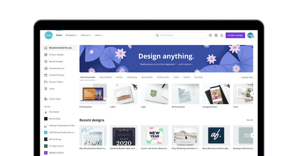
Canva
Source: Canva
Canva is considered one of the free access tools where we can find templates to create our projects. Just choose and download it.
When we enter Canva, we find a registration button with Facebook or through your email. The website offers you a virtual tour to see the possibilities of the tool, which is absolutely spectacular.
The online environment offers you many templates, images and elements, where many are free and others are paid. You can also upload your own images and share your results directly from the browser.
infogram
Source: Martech
infogram is dedicated to the creation of these graphic compositions. His website is pleased that more than 30.000 companies trust his tool.
Its free version has no duration limit, has more than 30 types of diagrams, the possibility of importing Excel files and the option to publish from Infogram directly.
Pixlr
Source: Jobscom
It is a photo editor that contains a slogan that leaves no doubt about its approach: «Turn your daily photos into art». Their credentials begin with a filter palette for your photographs that has nothing to envy to references like Instagram.
According to their own calculations, the union of all its elements results in 2 million possible combinations, so you can be sure that you will not see your design traced elsewhere.
Visme
Visme is a tool for making infographics with attractive images. It comes with several automation functions for publishing and viewing; This allows publishers to set times to automate submissions and online analytics to track the effectiveness of published content.
It is very easy to use and pYou can choose from hundreds of professionally designed infographic templates, 50+ charts and graphs, interactive maps, full privacy social media features, and collaboration tools.. You can also mix and match predesigned content blocks from your multimedia library.
Snappa
Snappa has a free version with no time limit, although it does have downloads, as you have a maximum of 3 per month. It is a suitable software to start in the creation of infographics, since it gives you more than 5.000 templates and more than 1 million graphics in high definition.
You can migrate to their paid plans where you will have advanced features such as online collaboration and uploading of your custom fonts.
awesomely
This online tool helps you create infographics and interactive content, contains thousands of templates with interactivity and animation predesigned by professionals, which you can easily modify according to your needs.
With it, you can upload your own resources or use those that the tool offers you to customize your designs. You can share your infographic with a link, by email or on social networks, even embed it on your website and download it as PDF or HTML.
It is a free platform and you can make unlimited creations and access the free templates and resources forever.
Crello
Source: Crello
Crello is an online graphic design tool for creating infographics from its 50.000 professionally designed templates and an unlimited library of over 1 million royalty-free creative assets. Includes premium images, videos, vectors, and 200 million Depositphotos multimedia files.
Its interface is very easy to use and it is not necessary to have previous experience in design; You can make interesting infographics about statistics, data and dates in an elegant and attractive way. In addition to the templates, with Crello you can create animations of the graphics, make the best texts with its more than 300 fonts and add objects from its integrated library to make your creative process as quick and easy as possible or, if you prefer, you can upload your own content.
Its initial price is free and you can do up to 5 downloads per month, but if you want to expand this number with unlimited downloads, Crello's premium plan is $ 7,99 per month.
Miro
Miro has a whiteboard tool that helps you collaboratively create infographics and share them. It has thousands of templates that you can edit according to your needs. This tool is perfect for design teams working remotely.
Boost your agile process with collaborative retrospectives, create and develop ideas with distributed teams as if they were in the same room, anywhere and at any time. Its whiteboard allows you to work the way you want and has integrations with other applications such as Dropbox, Google Suite, JIRA, Slack and Sketch.
You can invite any member of your team to view, edit or comment on your design for free; However, to make your designs private you must purchase a premium plan from 16 USD per month for teams of 2 to 7 members.
Piktochart
In Piktochart you can use specific icons and graphics to create infographics of all kinds. All you have to do is choose a template, edit the content and share it on your social networks or on your website, quickly and easily.
You have as many preconfigured designs as you want to address, always with a fun and entertaining layout that will attract the attention of your audience.
P
PicMonkey always bet on maximum simplicity in your online editor: reduce the number of actions to the most basic, but also the most used.
Use its graphics to give more life to your infographics, as well as different styles with which you can make lists of steps to follow, present statistics or show a timeline.
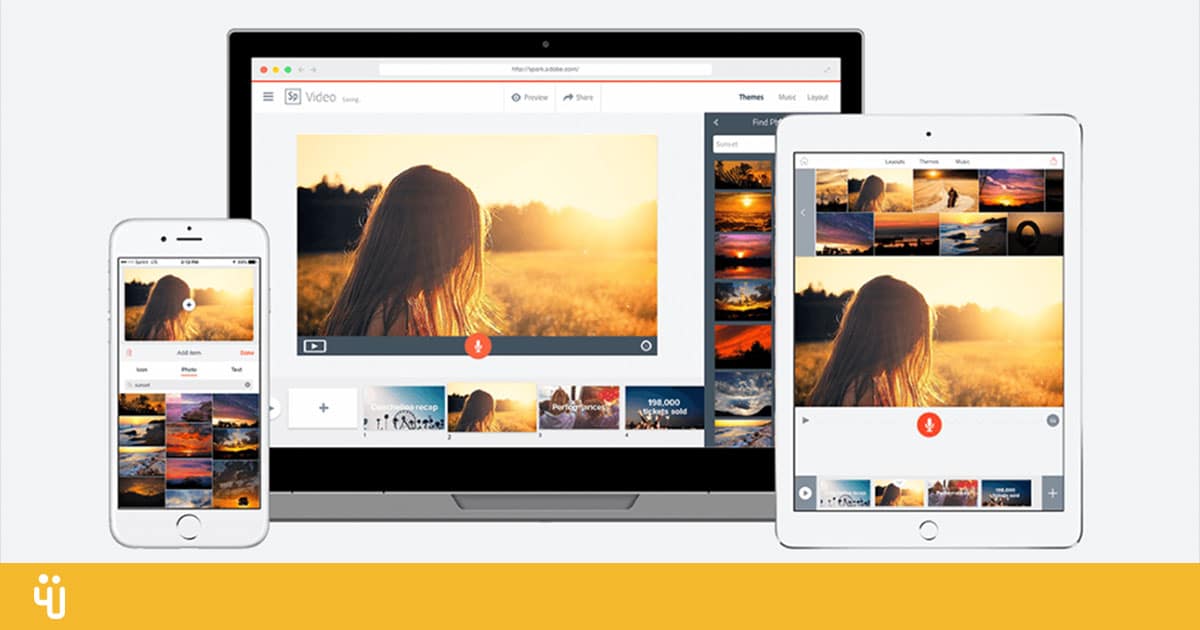
Adobe Spark
Source: weRSM
If you are looking to tell stories through an infographic, Adobe Spark has infographic templates available to design the best ones. Each template is packed with images, illustrations, backgrounds, text, and many other essential features. You just have to customize each template according to your needs and voila: you can print or download your infographic in a matter of seconds.
Its interface is very easy to use and you can try its premium plan for free for 30 days and then the price starts from 14 USD per month.
dot.vu
Dot.vu is a platform that helps you create interactive infographics to capture your audience's attention and meet your content strategy goals. Choose a template from its wide range offered in its MarketPlace and customize the design according to your needs and the guidelines of your brand. You can implement your interactive infographic anywhere you want, you just have to copy the code and paste it in the location you want.
dot.vu integrates with external analytical tools to consolidate your efforts and ensure a complete description that defines and measures the success of all interactive content projects that you carry out.
You can use any Dot.vu feature in your infographic to create a truly unique interactive experience. Its price is USD 453 per month and includes internal services, where interactive ninjas may design any interactive experience for you.
Conclusion
If we have not yet solved the mystery of how to create a good infographic, we invite you to continue investigating and looking for information about this type of project.
It is very simple, it is only enough to be very clear about what you want to communicate and what elements can fit with what we are going to say.
Do you dare?