
Source: Direct Marketing
In the world of design, we are surrounded by both emotions and expressions. There are many subjective and objective characteristics that an image can convey to us. That is why, not only colors are capable of telling us with a kind of code what kind of personality they have or the character they offer in an external image.
There are also other elements such as fonts, capable of transmitting different sensations and playing a role that, both for the designer and for the viewer viewing the project, are essential. In this post we come to talk to you about how fonts influence character of a certain project and how they are responsible for making our audience feel the same way we want them to feel, and this is called the psychology of typography.
What is the psychology of typography?
Source: Canva
The psychology of typography It is understood as the study of the different typographic families and how they are shown in the graphic design sector. Their impact is so great that they can transmit different emotions and thoughts both to those who perceive them and to those who design them.
In many advertising campaigns, typography has always played a very important role in its development. Well, it can become the key element of a great headline that summarizes the entire campaign message. Many campaigns have chosen to use only typography as the main element, and it is not surprising, since we can play with them in many ways and just by including them, the viewer will already know first-hand what emotions we are talking about.
There are many products or elements where this resource is used, but many campaigns appeal to soft drinks or fast food chains. They are good options to use this type of fonts, so it can be interesting.
General characteristics
The viewer
They help the viewer not to lose the thread of the project they are viewing. That is to say, he manages to achieve a kind of line and a chain of sensations and emotions that place him in the exact and correct place.
Identity
It is an element that is also very present in the corporate identity section. When we design a brand, it is important to know what typefaces are going to be part of our brand, because they will understand half or even all of the character and how our company is going to be directed and presented to our public.
Society
psychology in typography, It is something that is also very involved in our day to day. Whenever we take a look around us, we realize the great variety of businesses that have chosen this element as a key element for their image.
Message
It also helps to want to say everything in nothing, that is, by choosing the correct font after having analyzed it, we come to the conclusion that we can say everything with little. It is the magic of personifying typefaces.
In short, there are many characteristics that unite the psychology of typography.
Meaning of each font
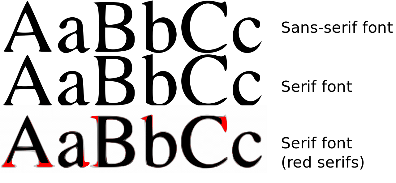
Serif
Source: Wikipedia
Serif typography It is characterized by being the oldest typography. And it is not because it is the one that was born before, but also. If not because it is the first family that was designed and created. Its meaning dates back especially to Roman times. A time when stones were used and each typeface was carved. For this reason, we can appreciate the very marked shots that these fonts contain.
This typeface is often used especially in long texts, due to its shape. It usually has a classic appearance that characterizes them so much and presents expressions and feelings such as seriousness. They are without a doubt one of the most formal typefaces that exist. Normally they tend to use it for rich products due to their value, such as perfumes, chocolates or jewelry.
sans serif

Source: Daily Report
Sans serif fonts are a type of font that, unlike serif fonts, do not have serifs in their body. The non-existence of serifs makes these typefaces change their appearance and are considered and cataloged as the most modern typefaces par excellence.
Unlike serifs, sans serifs are often used in larger texts, thus covering a totality of subtitles and page headers that combine perfectly. They present themselves with a young style, not so serious but maintaining formality and professionalism.
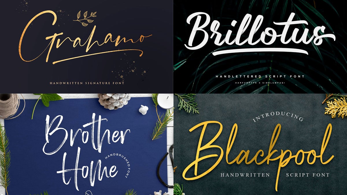
handwritten
Source: Creative Idea
Handwritten fonts are those that are characterized by being designed by hand. Unlike the rest, which may have been digitally designed, these maintain the classic design. They are very nice to see but sometimes, it is very difficult to read. That is why they are fonts designed to be adapted as main headlines and not for running texts.
Its appearance means that it is considered one of the typefaces with a classy and ambiguous air. In addition, they have also been used by different sectors due to their serious and formal appearance. A very prominent example would undoubtedly be the wine or perfume sector. Even high-value chocolate brands have opted for the use of this type of fonts for their brand logos to name one of their products.
In short, they are the perfect type of font to include them in your most professional and serious projects.
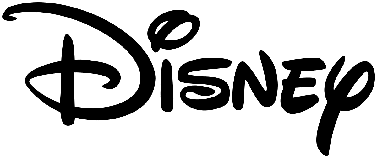
fancy or decorative
Source: Wikipedia
These typefaces are characterized by their shapes, they present very personalized and creative forms, set in Disney stories, hence the Disney logo is designed with a decorative typeface. They are usually the type of typography with the most creative and artistic character, since they are not designed for small running texts but for large headlines.
Many brands have also opted for this font design, and it is not surprising, since being very creative, they tend to draw a lot of attention and the viewer tends to remember them very easily. In short, it is the perfect option if you are looking for something more lively.
The best typefaces
bodoni
The Bodoni typeface is cataloged as one of the most used serif fonts by designers and designers from all over the world. Its popularity has reached so many ranges of use that it is not strange to see it in some of the best establishments, in restaurant menus or in food brands.
It is undoubtedly one of the serif typefaces that you could apply if you are looking for the serious and demure. Its classic and demure form makes it one of the most luxurious and spectacular typefaces, as well as perfect.
Futura
Futura is the star typeface for 80% of designers who work for brands or editorial design. Its creator Paul Renner, one of the most important graphic designers in history and worldwide. This typeface is cataloged as a sans serif typeface, whose appearance is characterized by its regular and simple geometric strokes, and by the perfect linear stroke they have. It is the perfect typeface for any type of text, whether it is a header, running text or headline.
In addition, many brands have also joined this typeface that has a very young and current look, typical of the time.
Helvetica
Everyone who is dedicated to design must know this typography for sure. It was developed by the designer, Max Miedinger in the year 1957 and her name gives rise to a female figure from the classical era of countries like Switzerland.
It is not to be expected that this gentleman has designed one of the most representative typefaces of graphic design, in general in the history of graphic design. What characterizes this typography so much are its shapes, it also presents geometric shapes that make it even more interesting. It is certainly the perfect option.
Rockwell
The last of our options is undoubtedly the Rockwell typeface, this typeface was designed exclusively for headlines. And it's no wonder we've seen her on some of the best movie posters, since the poster for the movie of the boxer Rocky, has it inscribed in the headline of his movie.
It is undoubtedly a typeface that denotes strength and power, and its thick appearance makes it visible from miles away, so it immediately fits in with the viewer's field of vision. It is without a doubt the perfect typeface for your headlines, and the perfect typeface also to attract attention.
Conclusion
The psychology of typography is a study that today serves as the initial basis for understanding its use and purpose. That is why it is important to know and know our typography completely. Whenever you are going to design a brand, analyze your typography first, not only the ones you are going to choose, but the others you have as sketches.
In short, it is a study that has helped many designers from all over the world to get to know and learn more about the world of typography.