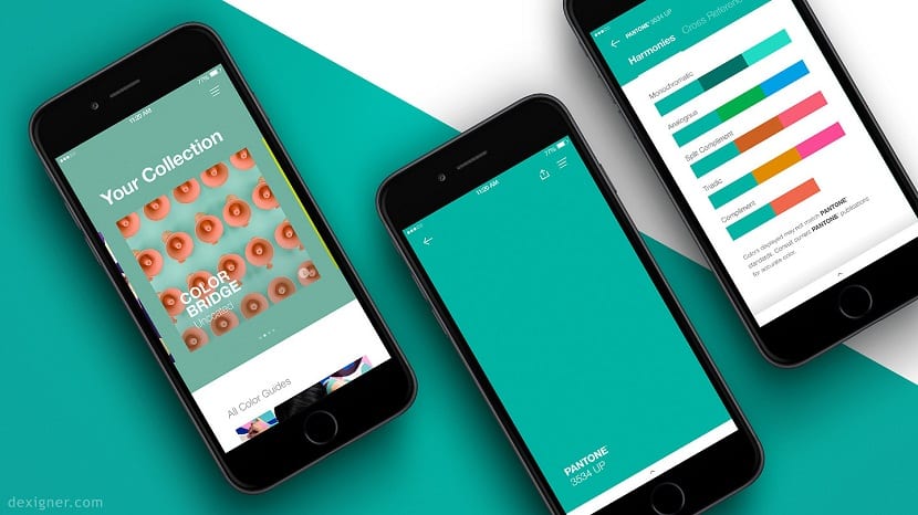
In the world of graphic design color is one of the most important raw materials, we must know its use and tools more universalized to be able to work with them without being deceived by the screen.
First of all it is important to know what is the Pantone system or the Pantone Matching System (PMS) is a system that allows identify colors for printing by means of a specific code. In simple words, is a color matching system, which greatly facilitates the work of graphic designers.
Learn more about Pantone

What the Pantone company produces are the well-known paper-cardboard strips of a certain weight and texture with the printing of a color sample, its name and the formulas to obtain them. But why are they so handy for the graphic designer?
There are many reasons, but the one that can be considered most important is that these guides allow you, regardless of the operating system, monitor or image editor you use that the output color in print is correct. Please note that the screens show colors in RGB mode and that can be misleading many times, but by using the Pantones we can make sure that the print is already in Plotter, Offset or Digital Ofsset is always correct.
Pantones work beyond the CYMK, a subtractive color model. This 32-bit model relies on mixing cyan, magenta, yellow, and black pigments to create the rest of the color palette. This model is based on the absorption of light. The color that an object represents corresponds to the part of the light that falls on the object and is not absorbed by it.
But the world of printing has expanded with the innovation of Spot Colors, colors that use special pigments and that are beyond what the mixture of Cyan, Magenta, Yellow and Black can produce, such as can be metallic or fluorescent inks used so often in the world of graphic design.
On the other hand the real color or RGB, is a color model based on additive synthesis with which lets you represent a color by mixing by addition (sum) of the three primary light colors (red, green and blue). This model does not define by itself what exactly these colors mean, so the same RGB values can display very different colors depending on the device that uses this color model, and even using the same model, its color spaces can vary remarkably. One of the reasons why graphic design adopts Pantone guidelines for their jobs.
Now that you know the differences, working with one model or another is up to you.
Lead Image: Designer.com
When putting together color combinations for our second round of screen printing, I chose my colors using the basic CMYK palette in Adobe Illustrator. I tried to be very careful this time sending the CMYK values and Hexidecimal codes for the colors so I touched all the bases. But when I sent the illustrations and colors to the printer, the results are not as accurate to say. I ask what brand of printer is the most recommended to be able to obtain the color range I want?